Your cart is currently empty!
Byline: John David O’Brien
-

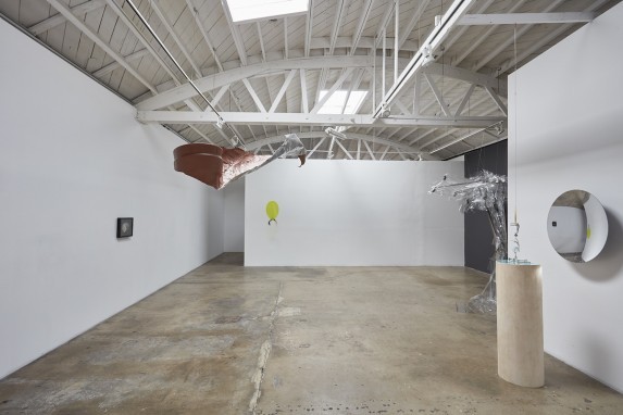
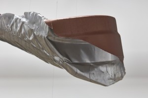
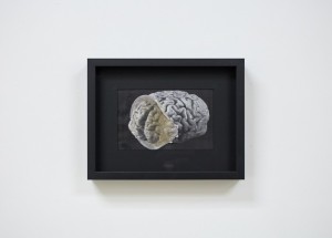
Denk: : Conceptual Craft II
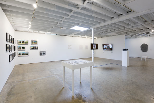
Imagining an art object made entirely without thought and therefore completely physical is a fascinating exercise. On the other hand, trying to imagine as art something that was entirely wrought by thought without a physical trace (and therefore practice) is equally challenging. “Conceptual Craft” seeks to merge the traditions of quote-unquote fetish finish artwork with the traditions of thought-provoking art that often comes under the rubric of conceptual. The exhibition ultimately demonstrates that these categories are no longer mutually exclusive and should not be held as antithetical.

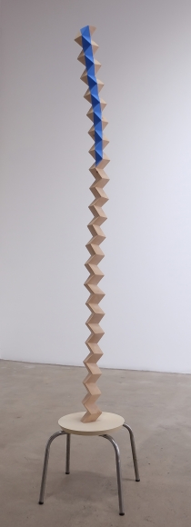
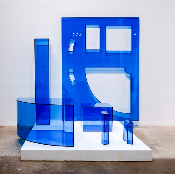
Ross Rudel, Blue Stripe (2016). Courtesy of the artist and Denk. While we mull that over, we can look at the woodwork of Ross Rudel; for example, Blue Stripe (2016), in which very elaborate and yet somewhat minimal interventions combine to make an object whose mystery is more than just the sheer physicality of the work. What is the 6-foot span of precariously situated wood column headed towards?

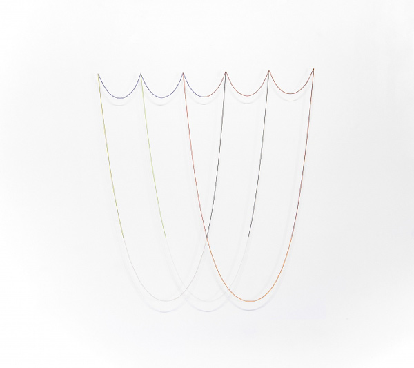
George Stoll, Untitled (11 lengths of colored beads on 6 pins forming 3 large and 5 small catenary curves), 2014. Courtesy of the artist and Denk. We could debate how the very beautiful, ethereal wall works laid out by George Stoll—for instance, Untitled (11 lengths of colored beads on 6 pins forming 3 large and 5 small catenary curves), 2014, with its arching curvilinear delineations, where thinner or larger strands of beads create both patterns in-and-of-themselves and on the wall below with the object’s shadow—constitute an ex novo artwork, or is primarily a spatial manipulation of existing forms. And in that carefully calibrated spatial operation, a very clear tongue-in-cheek is inserted, thus creating an even larger gap in clarity about the difference between the actual making and the thinking of the making.

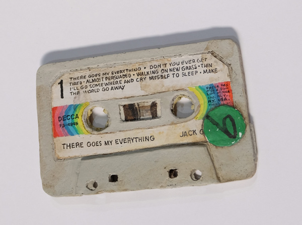
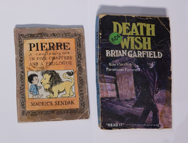
Kristen Morgin, Death Wish and Pierre Who Didn’t Care (2018). Courtesy of the artist and Denk. Or we can trip out on Kristen Morgan’s unfired clay works, like There Goes My Everything (2018), or Death Wish and Pierre Who Didn’t Care (2018), which unless you’re able to touch them, look very much like the cassette tapes, magazines and paperback books that they have been fashioned after. The placement of these very nostalgic-ish objects on a plinth-like table underscores the wonderfully uneasy relationship that epitomizes this exhibition. It excavates how concept and craft co-exist, intermingle and yet still conflict with one another.

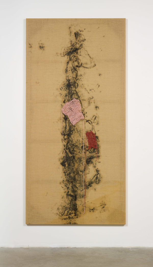
Rachel Lachowicz, C Lycra Knit (2018). Courtesy of the artist and Denk. 
Tim Ebner, Untitled (2018). Courtesy of the artist and Denk. 
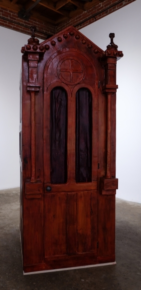
Gioj de Marco, REPLICA OF CONFESSIONAL CENTRAL SECTION – CINEMA PROP F1-1808 A (2018). Courtesy of the artist and Denk. “Conceptual Craft II,” July 14 – August 18, 2018, at Denk, 749 E Temple Street, Los Angeles, CA 90012. www.denkgallery.com
-

ArtCenter: : This is Not a Selfie
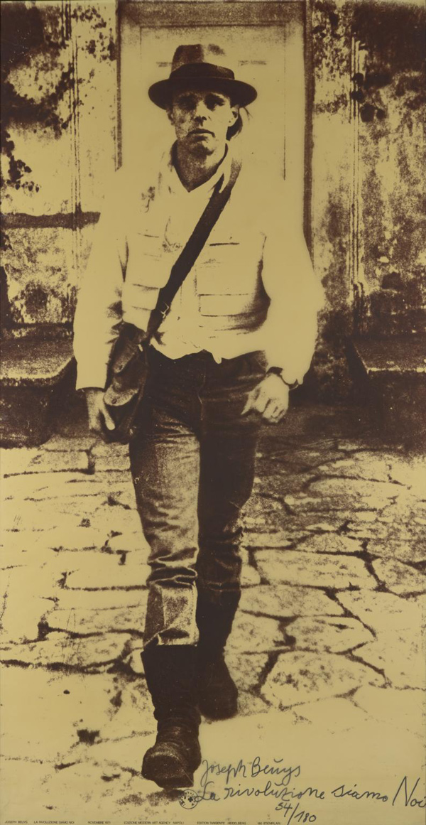
The larger than life-size, amber toned image of the German artist Joseph Beuys appears to be marching out of the gallery, striding forward towards us. In a hand written note at his feet, La Rivoluzione Siamo Noi (1972) grandly decrees, “We are the revolution.”

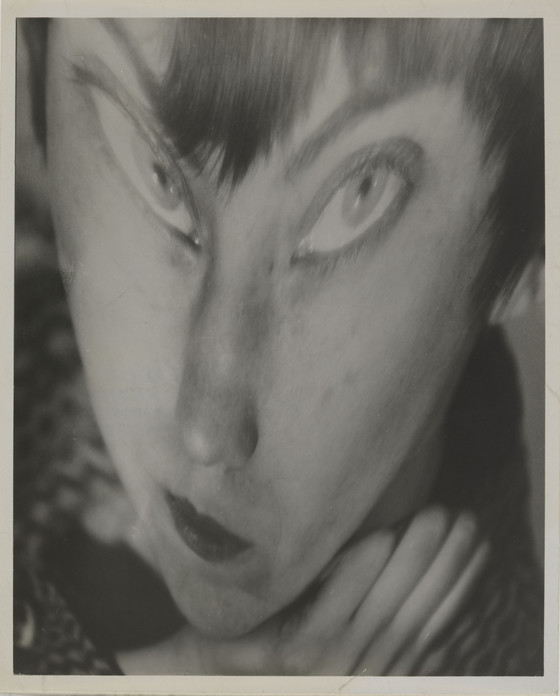
Joseph Beuys, La Rivoluzione Siamo Noi, 1972. The distorted owl-like countenance of a woman holding her head up with a hand and with her mouth twisting wryly gives us Berenice Abbott’s Portrait of the Author as a Young Woman (1930, printed circa 1951). It is a puzzling and numinous portrayal of a spectral animal within.

Berenice Abbott, Portrait of the Author as a Young Woman, 1930, printed circa 1951. Gelatin silver print. Los Angeles County Museum of Art, The Audrey and Sydney Irmas Collection. The small black and white image of a man perennially suspended, frozen in space, as he leaps out from a wall over the street below records Yves Klein’s Leap into the Void (1960, printed 1980) a gelatin silver print that marks off an era. A bucolic panorama populated by the same woman in the same attire in different poses digitally explores the multiplication tables for self-manifestation in Lisa Anne Auerbach’s Take this Knitting Machine and Shove It (2009).

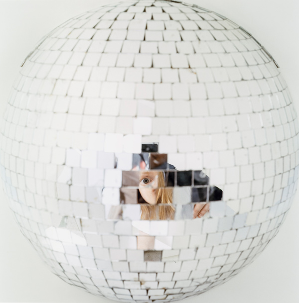
Anne Collier, Mirror Ball, 2004. Dye coupler print. Los Angeles County Museum of Art, The Audrey and Sydney Irmas Collection. The implicit question arises of the exhibition’s title is how the selfie is different, if it is, from the fine art genre of photographic self-portraiture? The answer is nuanced and may differ for individual viewers, but overall that issue is sidestepped by the quality of the 65 images that these artists have fashioned to reflect on their sense of self, or contest a sense of self, or even perform a re-definition of self—images that range from early nineteenth-century traditional photo-based experiments right through to contemporary digital compositions.

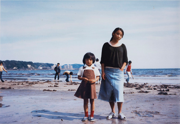
Chino Otsuka, 1976+2005, Kamakura, Japan, 2005. Dye coupler print. Los Angeles County Museum of Art, Gift of the Irmas Family Foundation. One strand that emerges throughout is that these exhibited self-portraits all appear to have a larger historical backdrop as an essential part of their ideation and realization. Unlike the momentary and mercurial appearance of a selfie where the goal is a widespread albeit lighting-like consumption of a self-image in this or that company or place, the more meditated and decanted examples of self-representation of these photos work off of a much slower time scale and with the declared intent to merge the personal with the epochal.

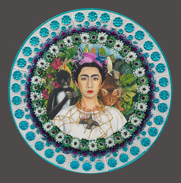
Yasumasa Morimura, An Inner Dialogue with Frida Kahlo (Collar of Thorns), 2001. Dye diffusion thermal transfer print. Los Angeles County Museum of Art, The Audrey and Sydney Irmas Collection. This Is Not a Selfie: Photographic Self-Portraits from the Audrey and Sydney Irmas Collection, February 22 – June 3, 2018, at Alyce de Roulet Williamson Gallery, ArtCenter College of Design, 1700 Lida Ave, Pasadena, CA 91103. www.artcenter.edu
-

JENNIFER ROCHLIN, NICK KRAMER
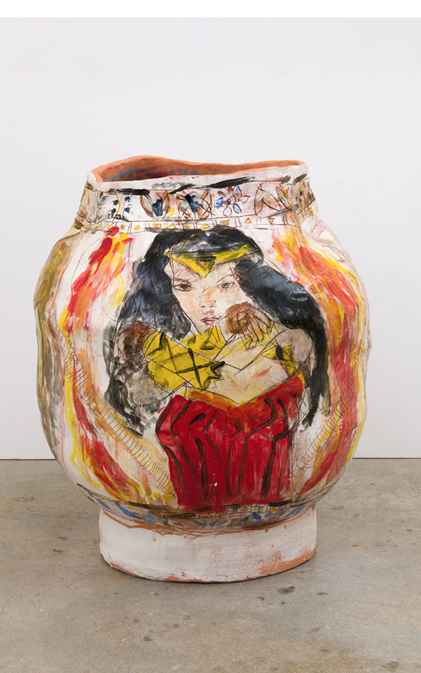
The rough-hewn almost ungainly presence of the ceramic vessels that sit directly on the floor in the small space echoes the distinctly DIY atmosphere surrounding them. Festooned with motifs that draw on images ranging from decorative to topical and from historical to contemporary, the work on display is a kind of diary or handheld sketchbook where the formal qualities of the rendering are subordinated to the graphic immediacy of the research that the artist is conducting. Jennifer Rochlin’s accompanying untitled 2D works of oil and collage on paper underscore the poetic reach of “Wild is the Wind”: it is an effort to fit incongruent categories within the register of art and create hybrids that locate the mundane within the reach of the universal. As with the glazed ceramic urn Wonder Woman, Rocks, Sea, Shields/Rope Pattern (2018), categories are collapsed and hierarchies are leveled.

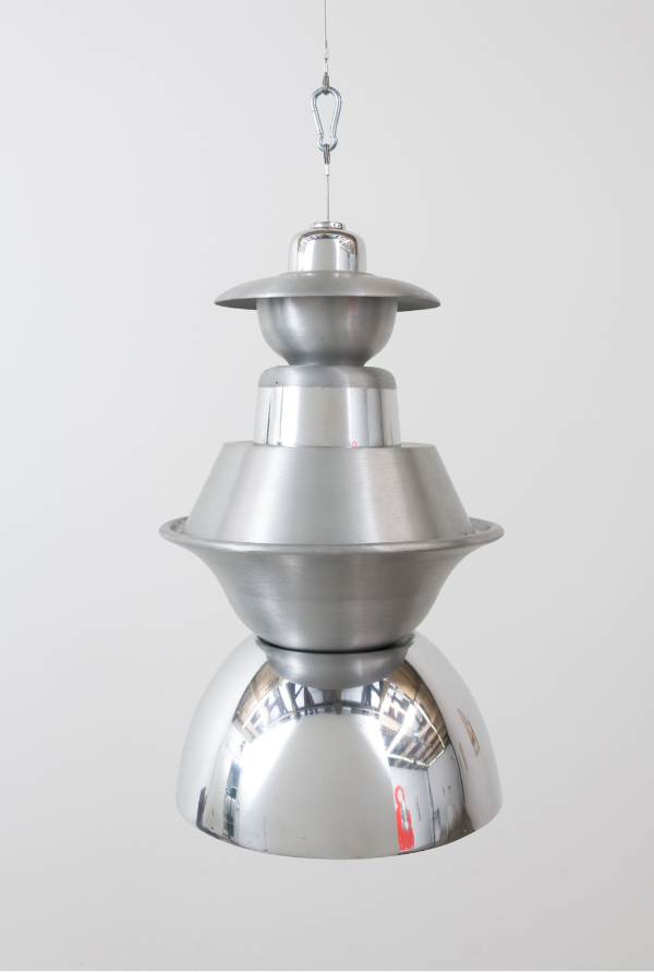
Nick Kramer, Weather Balloon (2018), courtesy The Pit, The Pit II. Charting in another way the convergence of the everyday onto a broader historical plane, Nick Kramer’s mixed-media works in “No Neighbors, Street Lights Are Out” follows an equally winding path through the impressions that the world immediately around him places in the artist’s eyes. A series of works all titled Weather Balloons (2018) appear at first glance to be the somewhat dulled bodies of shrunken satellites or enlarged spinning tops, but on closer inspection are seen to be the shapes of aluminum pots and pans collected, shorn of handles or signs of aging, and aggregated in vertical columns. Proposed as stand-ins for failed near-space exploration devices, they hang at various heights throughout the gallery. The nearby presence of photographs, all titled A Hand of Pots and Pans (2018), in which these aluminum rounded casings are portrayed with handles and stains intact, underscores the somewhat dystopian neighborhood that the artist is exploring internally and externally. Even in the lightness of the polychrome aluminum work, such as Green Moon (2018), with its light green and pink hues coursing below an orange route indicator, an ineluctable melancholy pervades the work.
All in all, the experience of the art at The Pit fluctuates between the forlorn qualities of a metaphorical pit from below and the necessity of pits, like those at the center of fruits. The view from there is not particularly optimistic but it is not entirely about giving up hope altogether. It is more about looking around the corners of the obvious and accommodating the scruffiness of the world in order to see what actually might be in there, even if it isn’t by any means perfection.
-

Brand Library & Art Center: : ONE YEAR
Whatever one’s disposition, “ONE YEAR: The Art of Politics in Los Angeles” at Glendale’s Brand Library & Art Center provides fuel for thought and stimulus to action. Negotiating the polemics of the current political climate and the overarching sense of anxiety felt in the arts, “ONE YEAR” offers a range of art that evinces nuance and directness, anger and vitality, corrosiveness and verve.

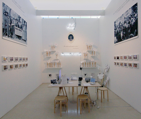
Joey Forsyte, A Band of Voters (2017), courtesy of the artist and Brand Library & Art Center. From Eileen Cowin’s five channel video installation, Fear Itself (2014), situated in a darkened walkway, to Guillermo Bert’s multi-media neon work, Gentrification (2017), which moves beyond the conceptualism of the 60’s into today’s activism, and Joey Forsyte’s A Band of Voters (2017), an interactive platform for promoting action beyond appreciating the artifacts in the gallery and getting out into the world and voting, the visual panorama set out in this diverse exhibition is broad and multifaceted.

Installation view, courtesy of Brand Library & Art Center. Keiko Fukazawa’s Out Of Hand (2017) very slyly comments on the issues that politics and regal gestures evoke, and performed wall drawings by Larry Gipe, New Old Testament No.1 (Baltimore, 2013/SAC Bomber 1953) (2017), in which different types of smoking devices are juxtaposed, provoke questions about our value systems. The melancholy oil-painted self portrait Painting Myself Out of the Headlines (2017), by Kohshin Finley, punctuates the diverse approaches to untangling this time frame.

Installation view, courtesy of Brand Library & Art Center. In Mark Steven Greenfield’s Anger Mismanagement Series (2015) and Scott Grieger’s, United States of Anxiety (2017), quietly outrageous disturbances of language call into question how order gets grammatically arranged. Constance Mallinson’s dystopian landscape, Mountain (2016), calls for understanding the inductive nature of politics while HK Zamani’s Fashion Of The Veil (2017), a large-scale photograph of himself as other, provokes a double take. “ONE YEAR” delivers a depth and complexity of responses, just as is set out so lucidly in Alex Kritselis’ The Offering, Lesbos2 (2017): a proffering of ways in which to suffer, to combat, to contextualize and to try and find our way through the trials of history even when those trials are occurring all around us.
“ONE YEAR: The Art of Politics in Los Angeles,” November 18, 2017 – January 12, 2018 at Brand Library & Art Center, 1601 West Mountain Street, Glendale, CA 91201.
-

Alejandro Almanza Pereda
The objects in the image seem preternaturally still, pushed off to the left side of the frame: a liquefied elastic globule seems to pull down or just barely rest at the very corner of a marble slab, above it there is a chunk of what looks like concrete with rebar sticking erratically out of it that in turn appears to be floating upwards. In Ball and chain (2016, archival pigment print), it is hard to understand how this is happening at first, and then you discover that the artist has been photographing things in water.
While all these things may look to be materials that are lighter or heavier than each other in the regular world, in fact the photo is not relaying the truth. And where is the ball and what is the chain? Photographing through the water also smoothes the surfaces so they all seem to glisten. Linking these unreliable relationships perceived by the viewer to the ways in which societies regulate relationships that are established between people and power, the artist takes us “Outside the Garden,” (the show’s title), that idyllic Eden where all things were purportedly in the proper order.
Alejandro Almanza Pereda’s practice is primarily an exploration and play with gravity, everyday materials, physical tension and humor. The core of his practice concerns the use of everyday objects and the manipulation of their physical, metaphorical and functional paradigms in sequence. Detailed and very meticulous photographs of improbable events occupy the space along with ungainly but intriguing object agglomerations. Pereda’s work calls into question the stability and predictability of our expectations about common physical phenomena and the way things work. He uses an array of art tropes such as still life to undermine the authority of our expectations and create a realm in which norms are subtly and subversively upended.
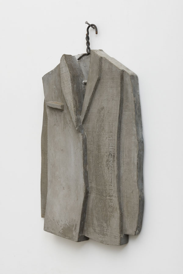
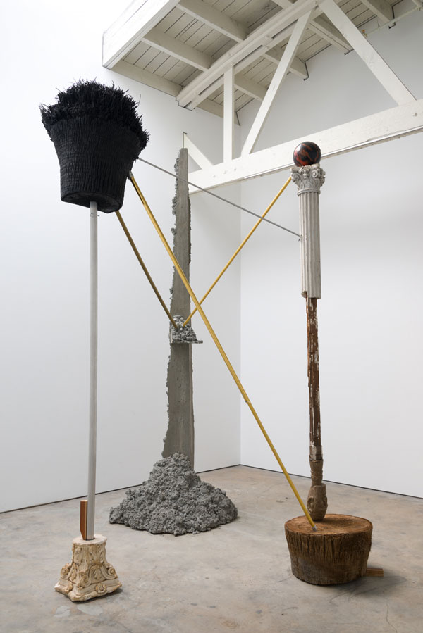
Alejandro Almanza Pereda, Sticks and Stones (California Decline) (2017), courtesy the artist and Ibid Gallery, photo by Jeff McLane In the main gallery there are more dimensional works. One is a cast concrete version of a jacket and pants, both mounted on rebar hangers, titled The Suit Makes the Man (RUA) (2017). The density and clunkiness of the concrete is the antithesis of the floating quality of the photographs, and the way that both the pants and the jacket are cut reveals an almost constructivist quality. It is accompanied by Sticks and Stones (California Decline) (2017) a large tri-part sculpture that occupies most of the gallery. It’s towering presence and oddly stable, though makeshift, quality is perplexing. The vertical elements made of a cast concrete slab, a metal pole and plaster column fragments are connected by telescoping rods and stabilized with a wedge. With a palm tree held aloft by one, a bowling ball by another, and an upturned head resting on a stump, it parodies a monumental colonnade.
Whether it is elliptically evoked in two dimensions or more stridently delineated in three, Pereda takes the viewer outside of the garden where values are inverted and overturned in a much less foreseeable or reliable universe.
-
A Universal History of Infamy: Virtues of Disparity
Much like the Jorge Luis Borges book after which it is named, the 18th Street Arts Center’s PST: LA/LA exhibition addresses history and its delineations, whether entirely or partially fictitious, in order to question the role of master narratives in general, and particularly in the case of the LA / LA (Los Angeles and Latin America) diaspora.
In his collection of stories, Borges gives the “histories” of such infamous people as Billy the Kid and John Andrews Murrell—fictionalized by Borges as Lazarus Morell; while much of what he writes is relatively factual, an ongoing intrusion of invented and modified details causes a reader to question the overall veracity of his accounts.
This ambiguity ties into the small-scale works organized for the gallery at 18th Street Arts Center in that through various modes and utilizing diverse genres, they deal with investigating the shortcomings and inexactitudes of different systems of transcribing and historicizing an authentic telling of the tales about what constitutes Latin America(ness) and its dislodging into the United States.
As with Borges’ writing, these works provide an indexical entrance into the processes and histories being studied, allowing the viewer to follow the deviations and divergences of this art from a ”neutral” historical retelling. In fact, these works together reject any pretense of making history neutral.
A Universal History of Infamy: Virtues of Disparity, Installation View, photo by Rubén Diaz, courtesy 18th Street Arts Center Carolina Caycedo’s Dependencia / Dependency (currency insertions) (2012), uses ink stamps on banknotes that carry the respective values of the minimum monthly wage, a gram of cocaine, and a liter of gasoline in six different cities (three Western and three Latin American) to show both the varied costs and question the means of establishing material values across a globalized culture.
The set of projected color slides that comprise Runo Lagomarsino’s ContraTiempos (2010), faithfully track the artist’s search in the Ibirapuera Park of São Paulo for cracks and stains in the concrete pavement that resemble forms looking like the South American continent.
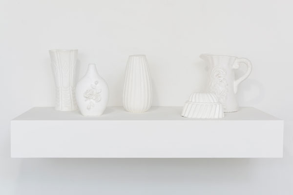
Josefina Guilisasti creates Objetos Light (2014) by juxtaposing a shelf of white cast silicon rubber objects such as vases or pitchers with a video loop in which these solid-looking objects are dropped and become surprisingly fluid things that bounce and shimmer as they hit the ground. Here, the genre of the still life gives way to alternate understandings of objectness and the tracking of unforeseeable histories.
In the end, much like Borges said of his text, it is in the value of contrasting the different versions presented that the meaning of this work is revealed. Its aesthetic bearing reveals the relations that underlie the various and differing interpretive axes, as it disassembles and scrabbles the underlying historical markers. These visual works offer a glimpse into larger research processes, and the viewer is invited to observe and appreciate or to go on musing and extrapolating meaning. If the audience follows through, they will discover a mutable set of historical accounts, which is exactly the point and the virtue of noting the disparities.
-
Richard Turner: Air Becomes Breath
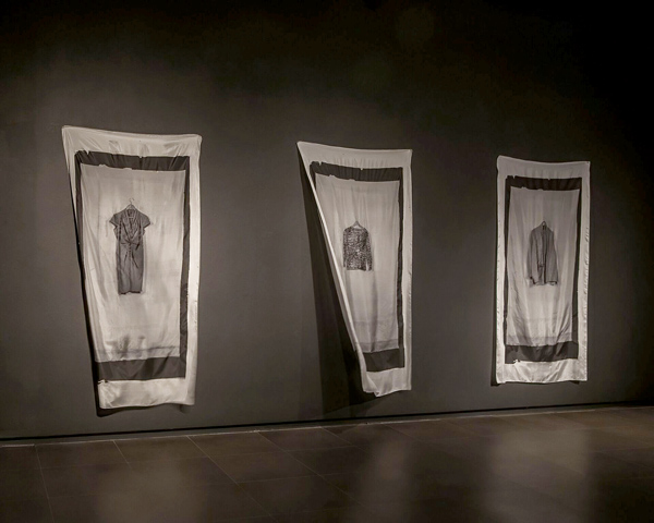
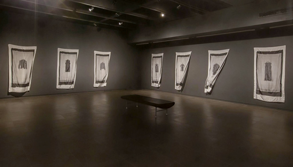
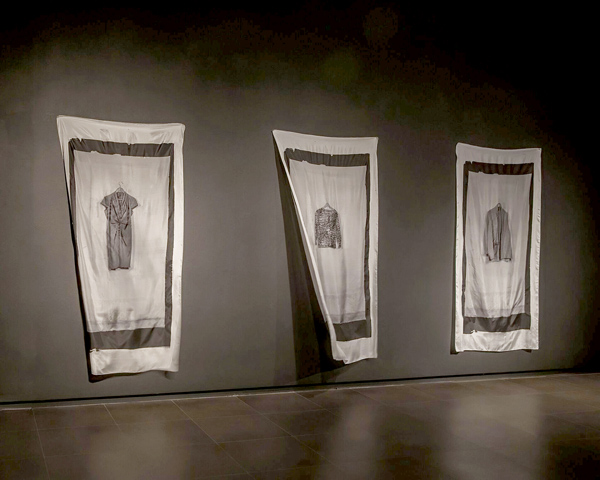
What do we have when those closest and dearest to us pass away and what do we do with the things that were once theirs? Richard Turner’s installation Air Becomes Breath, 2017, takes that question on and has turned the clothing of his recently deceased wife, Sylvia, into the central element of his show. He has made these uninhabited garments into the hinge around which his installation literally swirls. In conjunction with her friends and their daughters, he has selected an exemplary set of secondary skins that her body would wear and then has turned them into elegiac black-and-white printed images on silk banners that fluctuate in the darkened space of the gallery.

installation view The tones of black and white and grayscales communicate both the solemnity of the inspiration and its essential qualities. This grayscale also accentuates with its folds and draping the way clothing models and reveals, while covering the body. That the prints were made on a very fine silk doubles the folding and sumptuousness of the way in which attire cloaks and still reveals the body. Each of the photographic images is very simply isolated, hanging on what looks to be the same wooden hanger and situated in an open frame that is surrounded by the kind of black square that would have been the kind you would see an old photographic images done from a large negative. For someone who grew up in Italy, it is also reminiscent of the stark black bars surrounding the obituary notices that were regularly posted on the walls of small towns to communicate and commemorate those who have passed away. A Philip Glass musical work animates the gallery space and rotating fans keep the silk banners fluctuating in the movement of the wind, completing the installation.
installation view Artists have long sought to create memorials and monuments that carry those who have passed away along with us into the present and future. More often than not, these artworks are made of solid earthy things, possibly in the hope of erecting a barrier against the onslaught of time. The task of celebrating and remembering the lives of the deceased is always a difficult but essential part of the arts. The eternal present of painting and the frozen moments of photography somehow keep the memory of those who are pictured there alive in a tradition of recalling their presence in our lives even after they have physically gone elsewhere. In Turner’s piece, the ephemeral quality of both the materials that are employed and the way that they are treated evokes both the sadness of life’s end, but also the inevitability of all life ceasing at one point. The exhibition is accompanied by a catalog in which these images and the thoughts of those who knew Silvia are passed on and become another trace into a future.
Ends November 9, 2017
-

¡Fiesta Cubana!
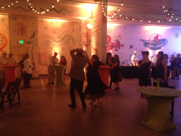
On Saturday, the Pasadena Museum of California Art put on ¡Fiesta Cubana! a benefit to celebrate California art and honor the art and education advocates Reed and Chris Halladay and the artist, Dave Lefner.
Auction of work Dave Lefner’s work Along with those folks, LA art-world figures such as Guillermo Bert, Patricia Ferber, Elizabeth Saveri, Gretel Stephens, Stanley Wilson, Danny Shain, Luis Ituarte and Sigrid Burton were on hand, joined by Center for the Study of Political Graphics Founder and Executive Director Carol A. Wells, curator Jay Belloli, poet Gerda Govine Ituarte and art doyen Merry Norris.

Domino players Taking inspiration from the “Hollywood in Havana: Five Decades of Cuban Posters Promoting U.S. Films” exhibition, the Cuban– and Hollywood–themed party was set up in the museum’s ground floor Kosmic Krylon Garage, embellished by Kenny Scharf.
Partygoers could dance to the Latin-American inspired tunes of musicians from the loose confederacy of Yambu Productions or pose for photos in front of a Lyd & Mo pop-flower wall or in the vicinity of a magnificent Vintage classic car (was that a ’50s Chevy or what?) The food laid out by Baked It Myself was centered on Cuban-themed bites such as spicy little rice cakes and pulled pork sliders while a full bar kept the evening fueled with libations.

Ed Ruscha and Kenny Scharf collaborate A centerpiece was the silent auction featuring artwork by renowned California artists at truly amazing prices, such as Ed Ruscha, Kenny Scharf, Claire Falkenstein, and Frank Gehry. Later the live auction of one of Dave Lefner’s reduction linocuts and a trip to Havana also pepped up the event. If guests needed further activities, tables were set up around the dance floor and food where they could play Dominoes, explore Hollywood trivia, or make flowers and screen prints. If you missed it this time, you’d be advised to watch for it in the future because it is quite the ¡Fiesta! not to miss.
-

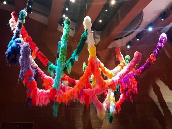
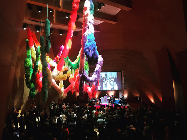
Reykjavík in LA
The Reykjavík Festival at Walt Disney Concert Hall presents an opportunity to experience a site-specific installation by Icelandic artist Hrafnhildur Arnardóttir and a film by fellow Icelander Xárene Eskandar. The Festival brings up a larger question of cultural specificity amidst the ever-expanding waves of globalism, and whether it is possible to understand and integrate the kind of cultural differences presented in this kind of exchange, rather than simply marking them off as expressions of a culture more exotic than our own.
Arnardóttir’s Nervescape VI (2017) hangs above the BP Hall like an ornate and colorful set of boas, frozen in place, as if tossed upward from the floor below. The bright, nearly fluorescent colors of the artificial hair strands from which the individual links have been fashioned stand in counterpoint to the warm, wood surfaces of the surrounding walls. The variety of colors is either thrilling or disturbing, and may be a little of both. Impromptu stage and viewing platforms are similarly bedecked, appearing soft and amorphous, flocked with thick patterns of this hair-like material.
Arnardóttir, who lives in New York and Iceland, explores the use and symbolic nature of hair and the hair-like. Better known as Shoplifter, her transformation from her given name (which translates as Raven Battle Daughter of Eagle) occurred when someone, attempting to pronounce Hrafnhildur, asked if it was Shoplifter. Conceding, she even adopted the American preference for nicknames; she became Shopi.

Still from Xárene Eskandar’s Driving at the speed of the Nordic sun, 2014. On opening night, the Icelandic group amiina played live musical accompaniment to Fantômas (1913-14), the black-and-white French silent film series directed by Louis Feuillade. Standing with their feet thoroughly embedded in Shoplifter’s colorful patterns, the band performed on a mix of traditional string quartet instruments—violin, viola, cello—and saws, kalimba, music boxes, percussion and electronics, which seemed to mirror the visual antimonies that filled the auditorium. Shoplifter’s rich decorative flourishes run countercurrent to the sleek subdued context of Gehry’s architecture; that tension made the relationship between the music, the installation and the site all the more captivating. Shoplifter’s use of humor and her coloristic overstatement obliquely address how identity is established. It is inevitable for anyone from sunny California to think about the origin of this artist in a land in which there are so many monochromatic stretches of land under what must, at times, look like an astoundingly luminous sky.
Xárene Eskandar, who divides her time between Los Angeles and Reykjavik, utilizes video and photography to explore how changes in temporal and spatial modes alter the perception of one’s body. Her single-take four-hour film, Driving at the speed of the Nordic sun (2014), even more overtly references Iceland’s austere landscape. Focusing on the changing horizon on December 11, 2014 from sunrise to sunset (a very brief duration of just four and a half hours), she intently explores the shifting of bodily self-perception that charts her own movement back-and-forth between this far northern location and Southern California. It is a site-specific film possible only in one location in Iceland, limited to a brief window of time. Eskandar spent considerable effort in determining when the extended single-take could be filmed without the interference of clouds or darkness to disrupt the shot.
Hrafnhildur Arnardóttir, Nervescape VI, 2017. Her intent is to relay how one’s perception of self is indelibly linked to one’s incremental understanding of one’s own shadow, and how the radical shifts of a person’s geophysical configurations register that change. The film’s soundtrack samples a six-second segment from composer and Reykjavik Festival organizer Daníel Bjarnason’s Emergence 1. Silence, from Over Light Earth (2013); it is stretched into various lengths, creating new sound qualities and accompanying the film as it traverses the vast atmospheric-panoramic landscape, in its slow but significant changes. The almost monochromatic film sequence tracks along lines of frozen ice and sparsely occupied roadways. Tufts of wind-borne snow drift in and out of view while there are glimpses of an occasional truck or car being passed, and some signage whisks by very quickly.
Hrafnhildur’s story of renaming herself is an apt metaphor for how the differences these artists bring to LA can both be partially leveled and yet maintain the hallmarks of their otherness. Her extended moniker, and all of her a.k.a.’s, engage both strands of the culture-span that she (and Eskandar) inhabit and explore. Both sets of meaning remain at play, and they are not entirely subverted by the kind of permanent renaming that occurred at Ellis Island. Likewise, in these artworks, vestiges of the differences remain visible, encouraging the viewer to consider and straddle the divide.
-

Bruce Conner
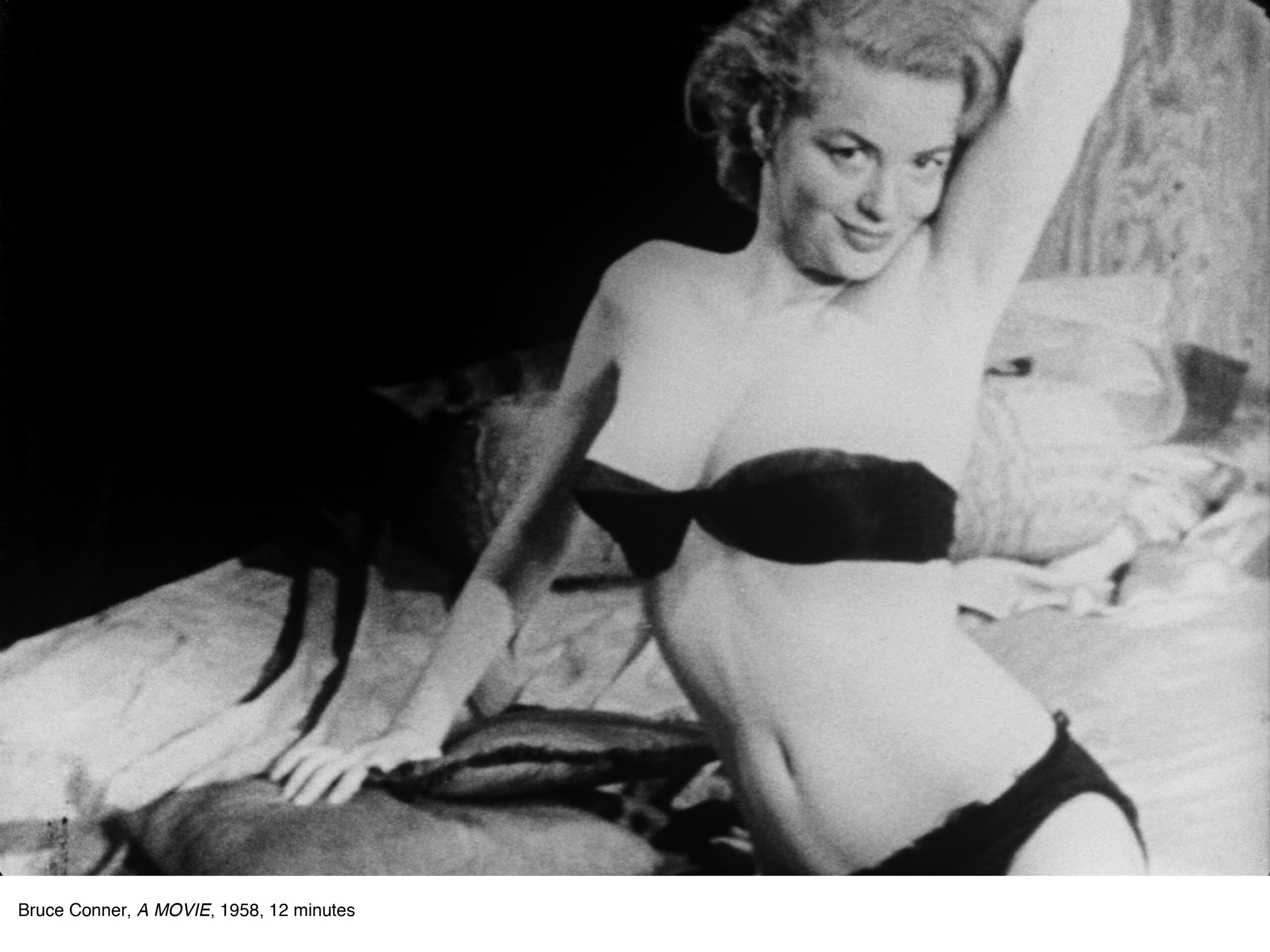
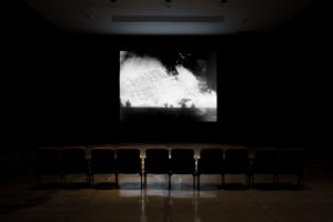
In the darkened gallery, a single row of seats faces a large screen on which a series of images loop. These images run by in rapid succession with all of the characteristic flashes of light, scratches and stuttering of an acetate film. Transitions from one scene to another are made by jump cuts. There are no fades; just one scene after another, sometimes separated by large areas of dead space in which black predominates. Repeatedly, backwards countdowns of numbers and letters, all parts of the film leaders that are attached to the head or tail of a film to assist in threading a projector, as well as text announcing this is The End and large block letters spelling out A MOVIE BY BRUCE CONNER, appear. But it’s light years from the movies. Created in 1958, this 16mm, black-and-white (with sound) 12-minute film is made entirely of found footage. Scavenged from various sources and montaged together into filmic segues, A Movie is, in retrospect, a tour de force exploration of how media will interact with our consciousness of the world at large.

Bruce Conner, A MOVIE, 1958, courtesy of the Conner Family Trust and Kohn Gallery, Los Angeles, ©The Artist Rights Society. Parachutes drop, skydivers descend, ships sink, and firing squads take aim, while the mushroom clouds of atomic bomb blasts billow out in slow motion. Elephants are hacked to pieces, people are shivering and crying, automobiles run off cliffs and flashes of white dots fill the screen. Countdowns continue; women undress. Wagons circle, cowboys and Indians race by on horseback, cavalry arrive, elephants stampede, cars race, spin out, crash, flip and burn. Locomotives surge, tanks arc over hills, blimps fly and crash in fiery conflagrations, a woman carefully unrolls her stockings. The End scrolls by again and again, dead space gives way to women carrying fruit piled high on their heads, surfers take to waves, waves overtake boats, motorcycles race in mud, a plane crash lands on water. There are aerial gunfights, bombs dropping and explosions. Amidst the onslaught of catastrophes, disasters and war, there are moments of grace. A man and woman spin carefully on a high wire over a city, schools of fish and scuba divers swim by and shafts of light reflect down through the water from above. Bruce Conner’s overall sequence however is dominated by violence. It savagely follows the news dictum of “If it bleeds, it leads,” even when the bleeding was only captured in black and white.
Conner’s groundbreaking film crystallized a new technique and mirrored the historical moment of its time. Even his use of sound—Ottorino Respighi’s “Pines of Rome”—marked another innovation. Conner would continue to use this union of sound and image in his films and lay the groundwork for future developments. Importantly, this composer’s tribute to scenes around Rome recalling the glory of the Roman Empire hailed from 1924, when the Mussolini government was evolving into a totalitarian regime and memories of Ancient Rome were exploited to support aggressive and nationalist policies. Bruce Conner shifts the terms of a viewer’s understanding of newsreel footage by using the loaded albeit wordless soundtrack to move against existing conventions.
-

Jane Hugentober
With work that has a firm footing in the traditions of the fiber arts, Jane Hugentober builds the case for a powerful conceptual dimension within a more traditional art-making framework. Far from ironic, the artist looks to precedents such as Mary Kelly’s Post-Partum Document (1973–79), Hannah Wilke’s photographic dialogue with her mother or even the research of Eva Hesse as a way to create artwork that is about its formal and material structuring as much as it is about the narratives related to how human beings, specifically women, balance the myriad of things that go into their existence.
Mixing the roughhewn, particularly her hanging hooks, with the delicate and repetitive quality of sewn and embroidered lines, Hugentober builds a compelling case for why “conceptual” might be rolled back to the more simply named “thoughtful” and thus bridge works without the categorical imperative to renounce anything vaguely looking like it was handmade. Part of a more generalized trend to reevaluate, without a dogmatic edge, the way in which various supposedly obsolete forms of art and artmaking can conspire to create multi-tiered art experiences for a viewer, Hugentober operates as a medium between the material, the temporal and what we might think about searches, roles and assigned places, giving viewers reason to pause and reconsider their own categories and presuppositions.

Jane Hugentober, And That Was That, 2016. ©Jane Hugentober, courtesy of Harmony Murphy Gallery. The artworks are arranged in the multi-leveled and delightfully disheveled gallery space in clusters or irregular groups, taking advantage of the various nooks and crannies and a labyrinth of overhead tubes and pipes. On the upper level, a wall that has been painted in a soft pink hue houses a disparate array of works ranging from the artist’s own output to things that have been collaged together in a clear homage to her mother. It directly addresses the legacy of being both an artist and a mother. The digital video I do remember (2014) records recollections of her grandmother talking about her mother’s difficulty in maintaining a maternal and a creative side to her life.
With this autobiographical turn, the artist opens the exhibition to considering the different conditions imposed on each generation and works to shift the obligation of artmaking from those materials and techniques once defined as high art to include those relegated to craft. Coincidentally, she ponders in exquisitely visual terms, how this hierarchy is also doggedly determined by a gender bias. In And That Was That (2016), the hulking jute and silk skein, treated gesturally with additions of oil, intrusions of wool and slatherings of latex, hangs majestically from oversized metal hooks, bowed but unbeaten. Its references draw on work ranging from Alberto Burri’s arte povera burnt and crackling monochromatic surfaces to Anna Mendieta’s camouflaged earth bodies, without relinquishing its individuality.
Whether she is more actively stressing the physical aspects of her work or mining it for its broader implications as a practice, Hugentober unfolds her ruminations, opening them to sophisticated, revelatory contradictions.
-
Craft Revolution
The Craft and Folk Art Museum—its unlikely frontage peering mischievously over Museum Row—has in the last few years come to the forefront of the LA art scene with its unpredictable exhibitions. Executive Director Suzanne Isken and her exhibition team (Holly Jerger, Exhibitions Curator; Andres Payan, Curator of Public Engagement; Sasha Ali, Manager of Exhibitions and Communications) have smartly built genre-bending shows around signature LA artists, thereby enticing a wider audience.
The ongoing makeover of this idiosyncratic place across the street from LACMA has been building up. The façade, the site of revolving projects by LA-based artists like Shrine, and the side yard, which emerged from invisibility with a riot of yarn confections that in 2013, courtesy Yard Bombing Los Angeles (YBLA), covered CAFAM’s façade in crocheted granny squares, are now as much a part of CAFAM’s identity as the idea that the museum is taking front and center as a place for LA artists to develop unique projects.
The museum’s Fall 2015 exhibition, “Paperworks,” curated by Howard Fox, attested to this striking transformation; categories embedded in the museum’s eponymous titles of craft and folk art were pushed, pulled and stretched in wonderful ways by a stellar lineup of artists to accommodate contemporary artworks from various modes of object-making. While Echiko Ohira, Francesca Gabbiani, Phranc and Susan Sironi all work with paper, the exhibition’s import was not in the cutting, creasing or folding of paper normally associated with craft, but in where it unexpectedly headed. While all of these artists “craft” their work meticulously, what they did here was to take the material manipulations usually associated with craft into territories germane to contemporary art, presenting the work as a complex conceptual knot to unravel.

Timothy Washington, 1A, 1972, aluminum, automotive primer paint, leather, nails, photo by Noel Bass Eager to foreground changes in art-world thinking and develop a unique venue for artists working interstitially, Isken and her team have begun breathing new life into thinking about the interplay between art and craft. That mission-flexibility deftly sidesteps polemics, broadening the playing field for what can be seen in the LA art world by putting on exhibitions that deliberately crisscross the delineations traditionally made between art and craft. In an email interview, Isken wrote, “Contemporary makers use a variety of means of self-expression including the use of traditional craft materials and processes, social engagement practices, and skill-based art forms. Segregating craft, folk art and fine art into different camps is usually a product of art market concerns—a formula used to set value and determine sales. We champion artists with a strong commitment to making work by hand who expand traditional practices associated with craft to discover new means of expression.”
The question of what it means to make work by hand has led to some extremely interesting places. For example, Timothy Washington’s 2014 solo exhibition at CAFAM, “Love Thy Neighbor,” traced the evolution in his artworks from the 1960s to the present, included his invented metal etched drawings and assemblages and recouped an extremely compelling artist who had withdrawn from exhibiting his art. “We felt that Washington has been largely written out of the art history of Los Angeles following his early recognition,” Isken noted. She wrote that the CAFAM curatorial team was attracted by “Washington’s unique vision and intricate, highly experimental practice… as well as his ‘under the radar’ status in Los Angeles’ art history.”
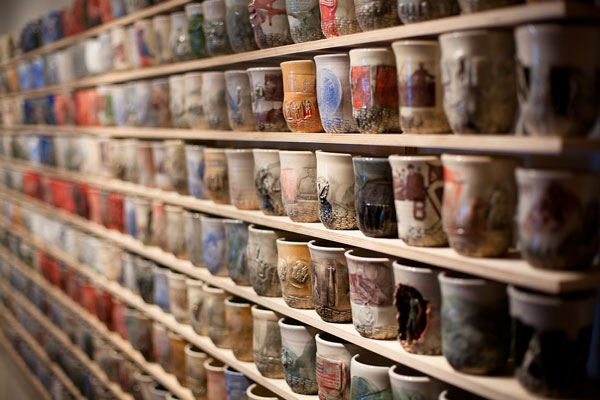
The blurring of fine art and craft distinctions likewise led to “Ehren Tool: Production or Destruction,” the 2012 solo exhibition of the artist and former Marine, who hand-forms vessels. But Tool embeds his vessels with images related to armed conflicts as a means of addressing his interest in pacifism and as a mode for decoding the violent rhetoric of warmongering that is used to perpetuate military interventions. He turns his ceramics away from craft as innocuous pot-throwing and turns to more incendiary tactics.
Clare Graham, Bottle Cap Sculpture, 1992, unused bottle caps, metal wire, photo by Kim Kralj Sometimes craft can be likened to DIY as a practice and by choosing elective affinities. In 2015, “Clare Graham & MorYork: The Answer is Yes” delivered a survey of the artist’s many years of the collecting and aggregating of found materials into large-scale sculptural objects. Graham is an example of an artist who develops alternatives to traditional practices. Graham even built out his own exhibition space in the Highland Park neighborhood, MorYork at the corner of York Boulevard and Avenue 50, when the art world got too cramped for his liking. So the question becomes: What is the mainstream anyway?
Even when hewing to traditional categories like woodcarving or ceramics or quilting, CAFAM’s exhibition premises implicitly pose more questions than answers. The museum gently encourages reconsideration of how we subdivide and classify genres and techniques in the art world. “We believe the idea that only a select few can understand art to be absolutely false, and deeply value the opinions and experiences of our visitors,” Holly Jerger remarked. In addition to creating programming that is informative while leaving room for personal interpretation, “we also focus on the act of making and the knowledge that comes from manipulating a material or learning a process,” Jerger said.

Ben Venom, Killed by Death, 2013, Harley-Davidson T-shirts, fabric, courtesy of the artist CAFAM also tweaks categories. The all-male 2015 ”Man-Made: Contemporary Male Quilters,” featuring work by artists Joe Cunningham, Luke Haynes, Jimmy McBride, Aaron McIntosh, Dan Olfe, Joel Otterson, Shawn Quinlan and Ben Venom, showed deviations from traditional quilting such as the Joel Otterson “quilt,” that consists of interlinking blocks of concrete, stone and ceramics. Even the most traditional sounding of approaches deftly avoids the lowest common denominator definition of craft. For example, the 2013 “Scratching the Surface: Contemporary Wood Sculpture,” featured the works of nine contemporary artists whose sculptural forms derive from wood’s natural textures and irregularities. The exhibition focused on processes unlike traditional carving; that is, it contradicted a definition of craft as a merely repetitive endeavor requiring simple hand-eye coordination absent the imprint of critical assessment of that once simple task’s overall history and contemporary ecological meaning.
As CAFAM’s curatorial range reaches across genres it ends up declassifying and reclassifying ways of thinking about art. When the market and academia mirrored one another, genres broke down according to commonly understood differences between painting and sculpture as major arts; whereas, ceramics, printmaking and other techniques were considered minor arts. Is it still viable to imagine an art world subdivided as it is in university art departments? Isken and her team have extrapolated on traditional categories similar to how artists move back and forth across these artificial boundaries; under her guidance, CAFAM, with its stylishly antiquated mantle and humorous reminder of bygone eras, has been quietly forging ahead.
-

Rebecca Campbell and Samantha Fields
In this two-person exhibition of paintings, drawings, collages, sculptures and writing, Rebecca Campbell and Samantha Fields mine their own personal histories, passing them through the filters of their respective multifaceted art practices, and elevate them to models for critical appraisal, both art historical and social.
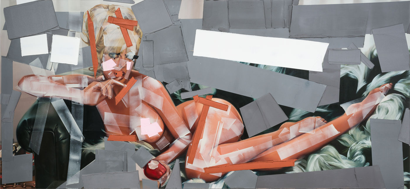
Starting with the curatorial premise that each artist pick an image from around the time that she was born, and, branching out from there by delving into their recent and past output, forging a collaborative improvisational “call-and response,” they provide us with a compelling view into the ad hoc community we call the “art world.” Fields’ Transplant (2015), a work referencing the 1972 landfall of Hurricane Agnes, and Campbell’s Miss April 1971 (2015), a painting derived from that month’s Playboy magazine centerfold, are the loci of this 18 month collaboration in which each work prompted the other artist to create or select additional artworks in an interweaving of thematic leads.

Samantha Fields, Transplant (2015), Courtesy of Samantha Fields and Traywick Contemporary Transplant, from Fields’ most recent photo-based body of work in which she paints landscapes that she traverses, reflects the deformations and modifications brought about by her use of film. Whether representing lens flares or digital blurs brought about by the camera itself or the streaking and flattening of light as recorded through windows and windshields, Fields points the viewer at both the representational and pictorial aspects of her images. Campbell’s painting diverges slightly from her previous interest in autobiography and documenting women she knows: with Miss April 1971, she toys with paint to obscure and draw attention to the nude while engaging formal aspects of painting through a calibrated and systematic use of palette knife swatches and large blocked-out fields of white and gray. Both artists seem to encourage the viewer to oscillate back and forth between seeing their painting as something representative in the world or as paint, which acts in and of its own material accord.
The differences between the way these two artists are normally categorized (simplistically reduced to atmospheric landscape painting for Fields and figurative feminist painting for Campbell) are quietly and effectively dismantled in the overlapping works taken from different times of their overall production and in the multiple vitrines containing drawings, thumbnail sketches, photo-collages, and test paintings from the artists’ studios. In these and in each artists’ writing, themes and ideas are played out in a far less easy to categorize way. The complexity of an artist’s practice is much more effectively delineated in the disorderliness of the studio—recreated in facsimile in this context—than in the reductive format commercial galleries necessitate. With generosity and abandon, Rebecca Campbell and Samantha Fields have produced new artworks inspired by dialogue with one another about the nature of creativity, and in the process, they have given us a view into a time when linguistic categories and stylistic uniformity aren’t the only means we have to understand and appreciate the creation and evolution of artists and their work.
-

Klowden Mann:
Rebecca Ripple
When art is construed to be some thing that translates the tension between its physical and visual manifestation and the more complex thinking and barely articulable feeling-processes of the artist, then the sculptural work of Rebecca Ripple should be described as pushing at that envelope as strenuously as possible. “Surface Tension” manifests this friction as much as it addresses the specifics of how Ripple conceives of relaying the ways in which fragmentation, alienation, territorialization and the diffusion of power are interwoven into our contemporary lives and projected in our collective consciousness.
Rebecca Ripple, Cork (detail), 2016, courtesy of the artist and Klowden Mann. In this series of works, made of widely varied materials, Ripple addresses both purely sculptural concerns such as gravity, translucency and formal arrangements of objects in space, and thematic issues such as information overload, social conditioning and paranoia. Ranging from the aphoristic directness of Cork (2016) to the much more intricate flourishes of Untitled (2015), her work, with its characteristic enigmatic bearing and spatial interest, charts how internalized mechanisms such as city wide transit, surveillance and mass communication in the modern world have created funnels and impasses through which everyone must pass and with which everyone has to come to terms.

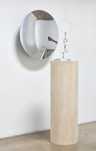
Rebecca Ripple, Untitled (2015), courtesy of the artist and Klowden Mann. Fueled by a sense of dread underlying the uncanny beauty, visitors find themselves mirrored literally and metaphorically in the work: watching themselves being watched. Typical of her artwork, fear 2 (2016) consists of an arrangement of objects: facing out from the wall and positioned above a cylindrical wood column topped with light blue glass, a concave mirror; hanging above glass-topped cylinder, a plastic o-ring, possibly usurped from medical implements, from which a series of stainless steel and silicone tools hang.

Rebecca Ripple, fear 2 (2016), courtesy of the artist and Klowden Mann. At first glance, it’s just a grouping of odd shiny things reflected in another shiny thing reflecting the viewer, but upon closer inspection, these unique handcrafted instruments covertly spell out the word fear. Thus the pageantry of technical precision coupled with an off-the-shelf display is transformed into a study of how we must look below the surface of things. That is very much the substance of the surface tension Rebecca Ripple is exploring with such persistent and fascinating results.
Rebecca Ripple, “Surface Tension,” March 5 – April 2, 2016, Klowden Mann, 6023 Washington Boulevard, Culver City, CA 90232, www.klowdenmann.com
-

PUBLIC DISPLAY
Where cities are being built up and money spent, local legislation has often passed a percent-for-art program; alternately, cities look to create stable partnerships between the public and private sectors, so some of that money is made available for public art, too. In the past, this has meant producing somewhat conventional monuments and commemorative images. Since the 1980s, public art programs have been better administered and present a much more contemporary image of the art world. The general rap: new public art is often quite amazing. Relatively recent high profile additions to the LA area include the following sweet spots.
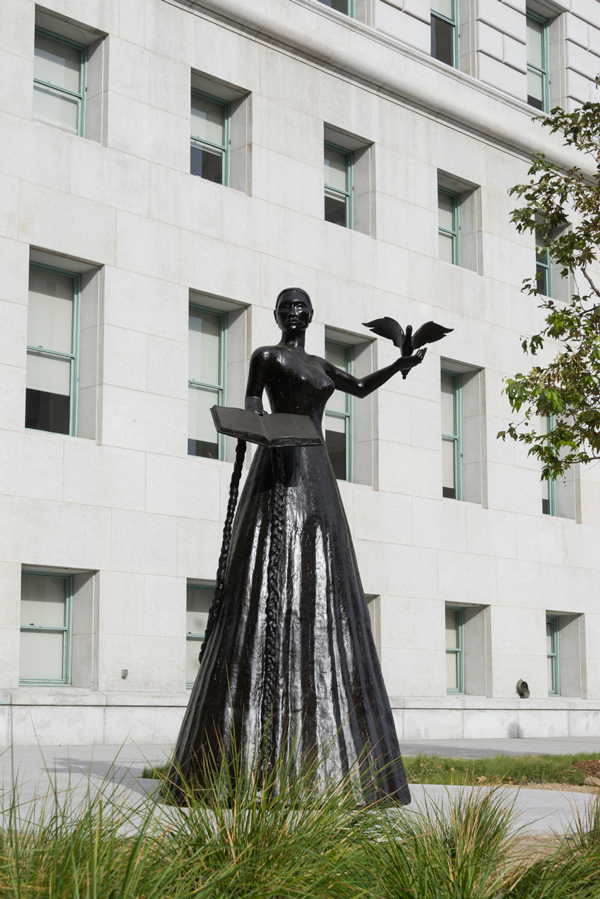
1. Alison Saar, Embodied, 2015
The Hall of Justice
211 West Temple Street
Los Angeles, CA 90012
Saar’s monumental figurative bronze sculpture representing the spirit of Justice stands guard outside the Hall’s garden in all her composite ethnic splendor.
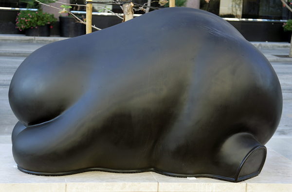
2. Peter Shelton, Sixbeaststwomonkeys, 2009
Los Angeles Police Administration Building
100 West 1st Street, LA 90012
The six plinth-mounted bulky, lumbering, volumetric bronze ‘beasts’ vaguely conjure up simian-like and elephantine vestiges as they silently hold vigil outside the headquarter’s entrance.
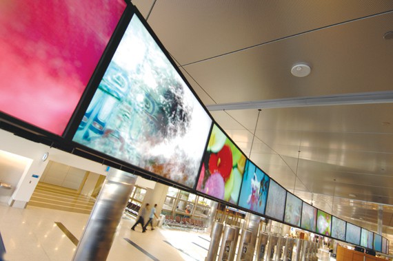
3. See Change, 2012
Thomas Bradley International Terminal
Arrival Area
This 58-screen, 90-foot linear video permanent installation suspended from the ceiling in the TBIT arrival area features 28 site-specific artworks that add up to four hours of moving images from artists throughout the USA.
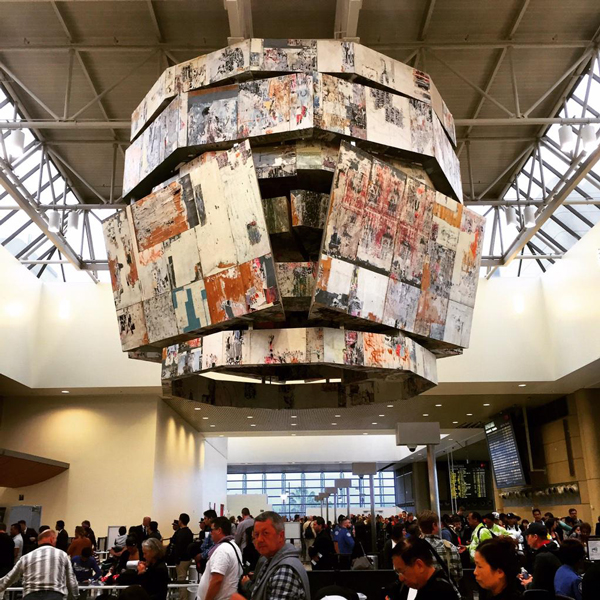
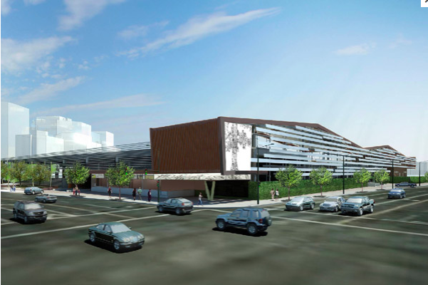
4. Mark Bradford, Bell Tower, 2015
Thomas Bradley International Terminal
Departure Hall
The massive suspended sculpture titled Bell Tower hovering above the passenger securitÔy screening area at TBIT mixes Bradford’s characteristic found wood panels and printed posters into a symbolic heraldic sentry.
5. Christine Ulke, El Aliso de Los Angeles, 2015
MTA/Division 13 Bus Maintenance and Operations Facility
corner of Cesar Chavez and Vignes
Historical collaging make up the highly detailed drawings trees that were transformed into a large grid of LED lit translucent panels turning the corner of this MTA Facility into an icon of transfigured nature by day and a lantern by night.
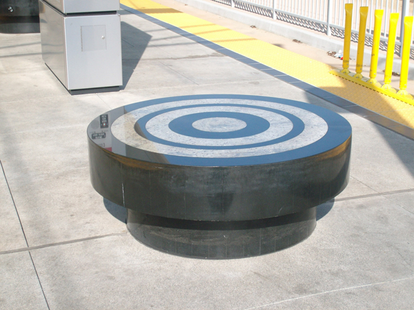
6. Hirokazu Kosaka, Buffer Zone, 2009
Little Tokyo/Arts District Station on the Gold Line
Station canopies that take the shape of three different Japanese archery bows, accompanied by Zen archery target benches replete with concentric circles of black and white, are all set into a platform paving design echoing Japanese tatami mats, collectively recalling how the perfect shot requires exact timing.
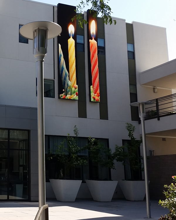
7. Susan Narduli, Timekeeper, 2014
231 S. De Lacey Ave. Pasadena
Four large-scale panels relay 40 hours of image loops about the issue of Time to passersby through animated elements, video, generative patterns and live feeds, conveying meanings that are both personal and societal.
8. Christine Nguyen, Oceanic Cosmic Whisper, 2012
Malibu Library, Malibu, CA 90265
Building up the images for Oceanic Cosmic Whisper ended up by crafting a water-swept dreamscape that take readers into a world where the real world of beaches and surreal world of the imagination converge.
9. Mara Lonner, San Angelo Landscape, 2015
San Angelo Park Community Center
245 San Angelo Avenue
La Puente, CA 91746
Deploying forms derived from vintage illustrations of native California and Mexican plantos, this new 2 and 3D landscape wends its way up and down the outside walls of the building, playing with forms, colors, light and shadow.
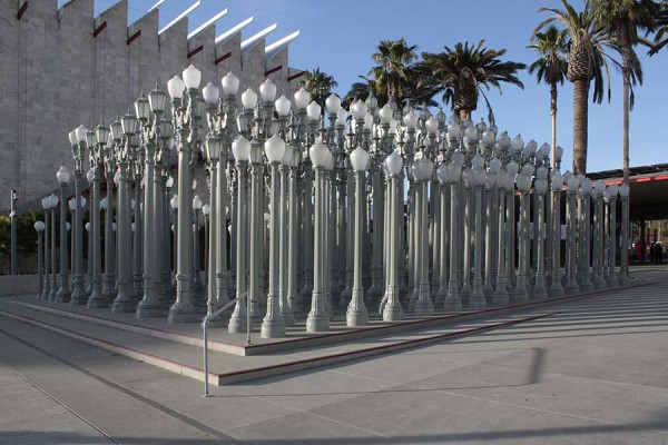
10. Chris Burden, Urban Light, 2008
The Wilshire entrance to LACMA entry plaza is inhabited by some 200-plus old fashioned cast-iron street lamps. Burden’s composition recalls a Classical Greek temple but more importantly and whether or not the lights are on, it has become a destination where anyone can count on making their rendezvous without the usually torturous LA directions. -

Alexandra Grant and Steve Roden
“These Carnations Defy Language” started with Alexandra Grant and Steve Roden’s mutual enchantment with the writings of the French poet and essayist, Francis Ponge. Ponge created a form of prose poetry, in which he worked with highly ambiguous and elliptical language to wrestle with the opacity, even the pre-eminent suchness, of objects. Grant and Roden share with Ponge this distrust, or maybe even rejection, of endowing art with the power to overwhelm the source of its inspiration, and they have each evolved ways of introducing viewers to the precariousness and uncertainty of their poetic assignments of meaning without renouncing their authorship. So like a pongé (a light material mix of silk and wool) both Grant and Roden individually and collaboratively remove a veil and erect a semi-transparent barrier between their art and its sources to keep the viewer circling and seeking an entry without being able to find a single unequivocal route that accesses their core meanings.

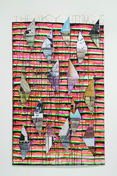
Steve Roden, the sky crying is, 2015, Courtesy of the Artist and Susanne Vielmetter Los Angeles Projects, Photo: Jeff McLane The densely worked images that Steve Roden has elaborated here were drawn from and even taken out of an issue of Domus magazine, dating from April 1964 (the month and year of the artist’s birth) that was a gift from his father. The collaging, drawing and painting follows Roden’s practice of making numerous forays into mark making, painting, cutting and overlaying fragments until the separate elements almost coalesce into a whole. This instability of resolution is the result he creates that allows a viewer to see where he ended up and get a glimpse into his process, at the same time. By placing his poetic ‘solution’ into a set of brackets Roden keeps his art from becoming formulaic, from closing itself off in absolute certainty. His project is to wrest meaning from the world through the visual without losing the sense of the entire framework from which it is winnowed down.
The larger banner-like vociferous painted images from the “Antigone 3000” series that Alexandra Grant has fashioned here draw their impetus from her research into the Greek myth of Antigone. The painting, use of repeating motifs and shifts between layers of foreground and background operate with Grant‘s painterly style and continue her visual research into the use of literary texts as tangential source material for her imagery. The technique with which Grant creates useful quandaries for a viewer include shifting visibly between works in which patterns drop in and out of focus thus forcing a re-viewing of nearby similar, yet simultaneously and subtly different work. By using psychological motifs such as Rorschach-like blots and modern heraldic devices like bold chevrons, the artist pushes viewing between the spaces of intimate self-analysis and external pageantry. Her project checkmates any attempt to ascribe one reading to the images.
“These Carnations Defy Language” is a very satisfying interstitial voyage, and as suggested by the exhibition’s title, excerpted from a quote by Ponge, less about getting all the answers and more about formulating compelling questions.