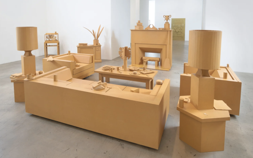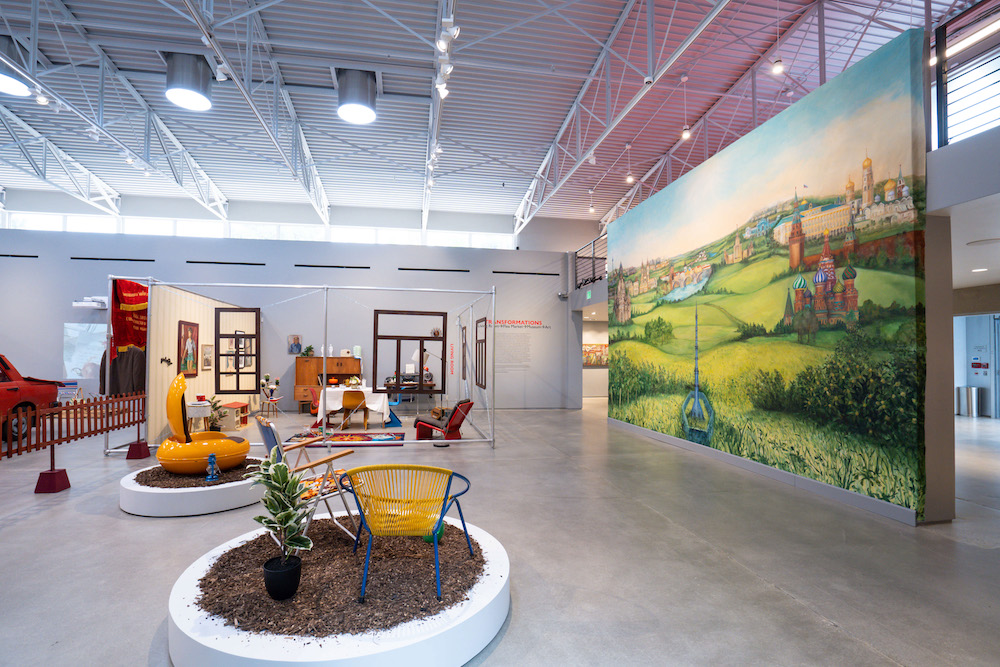
Emil Alzamora’s “Waymaker” is like journeying through a series of time warps. Cement, steel and wood figures loom in various states of decay like Greco-Roman relics in a museum. Yet a modern sensibility invites the sculptures into a surrealist dream conjuring a...
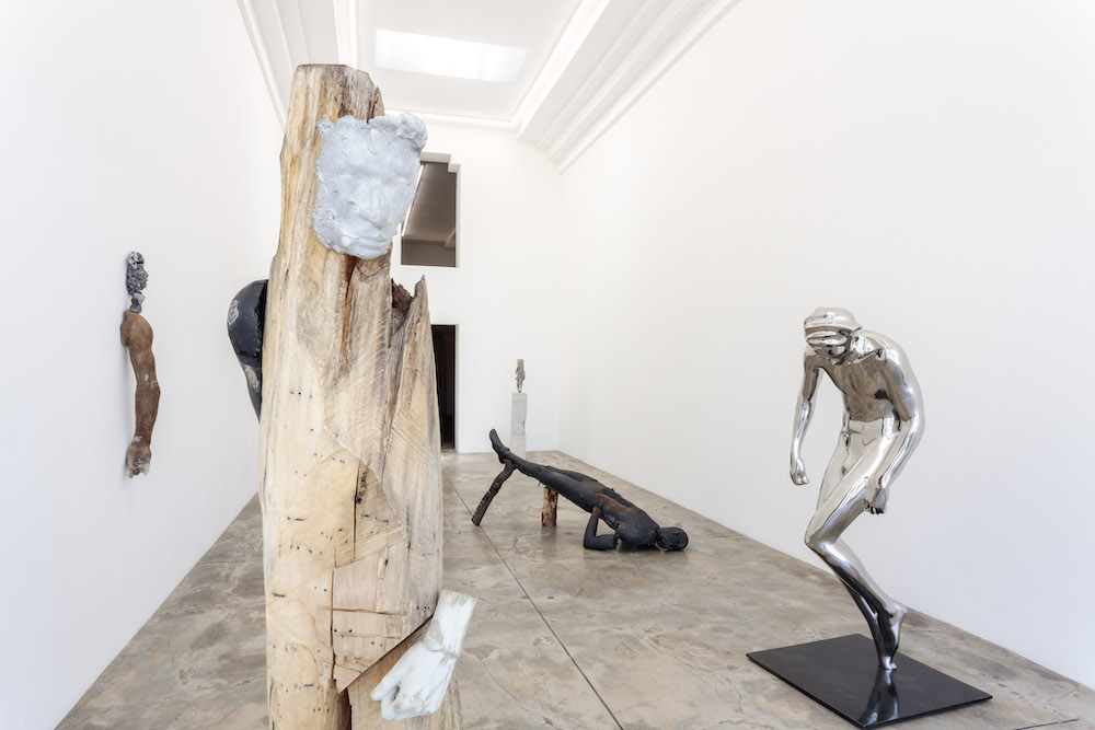
GALLERY ROUNDS: Emil Alzamora Lowell Ryan Projects
read more