Your cart is currently empty!
Tag: corona
-
Arata Tat Tat
A Conversation with Michael Arata
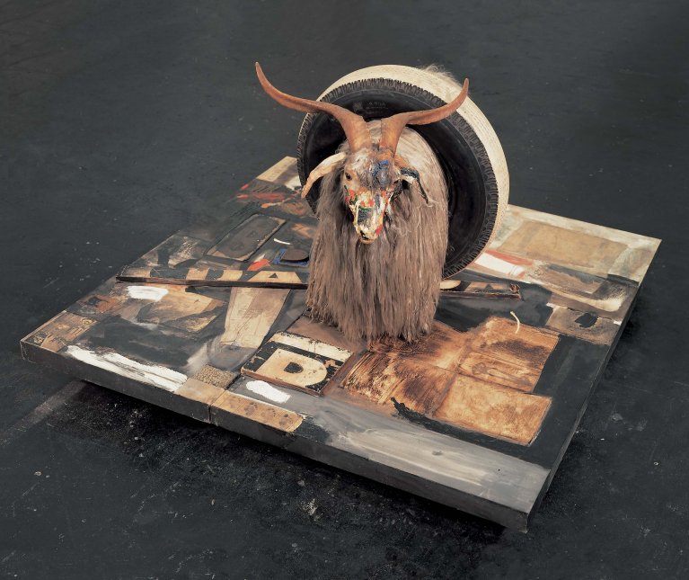
Almost exactly 10 years ago, one of my favorite (and certainly most improbable) curatorial projects was unleashed upon the world: Renee Fox, who was overseeing the development of the Beacon Arts Building in Inglewood (at least its cultural aspect) invited me to do something for their Critics-as-Curators series. I’d been wanting to do something to demonstrate that a museum-scale and quality show could be realized without 1) spending millions of dollars 2) 5 years of planning, and 3) a massive top-heavy bureaucracy. (After which the fake-ass house-of-cards Art World would collapse under the weight of its hubris, ushering in a shining new era of anarcho-syndicalist communalism. Still waiting on that one!)
The Beacon — designed to be a complex of private artist studios — was almost empty at this stage, and Renee negotiated for me to use most of the entire 4-story warehouse space instead of just the dedicated exhibition area on the main floor. I specifically wanted to put together a one-person show, so I needed an artist who was enormously prolific, underexposed, and whose work I honestly admired. Thus was born ARATALAND! A Mid-Career Survey of Artworks by Michael Arata, a theme-park inspired installation exploring the artist’s sprawling, inventive, playful oeuvre. (The text from the rarely-seen ARATALAND! catalog essay — which has one of my favorite titles of all time RIP Ferlinhetti — + a link to purchase same on lulu are reprinted below.)
In the decade since, Arata’s kept up the pace, producing enough new work to fill another museum space. But until LACMA or MOCA screw their heads on right and choose to serve their actual local community, we’ll have to take things on the installment plan – currently, Arata has a solo show entitled FRANTIC up at LSH CoLab, artist Laura Howe’s gallery on Virgil a couple blocks east of LA city college. The show is up through May 8 and the gallery hours are 1 – 6 daily, appointments preferred. LSH CoLab, 778 N Virgil Avenue Los Angeles, CA 90029.
Argument, acrylic on canvas, 40×30 in., 2020 Our operative met with Michael Arata in his Malibu penthouse over adrenochrome cocktails to interrogate his praxis.
(DOUG HARVEY) LESS ART: I think your pictures are neat! Where do you get your ideas?
Michael Arata: Well let’s see, I did 12 pictures of the Mona Lisa with a narrative dialog from the model’s perspective. Since I had to deal with scheduling models for life drawing it was a natural segue to the notion. My Narrative includes her and her sisters substituting as models posing for Leonardo.
The titles of the pictures include some of their takes on how he regarded them and their attitude about working for him. Some pictures are simply personal and reflect a day or thought. The pictures with the titles become gossipy tidbits of entertainment for pleasure. After the basics – food, shelter, clothing – it’s all entertainment! I decided it took 12 sessions to make the Mona Lisa painting because donuts and bagels come in a dozen. 12 inches in your foot, 12 months in a year, 12 apostles, 12 animals in the Chinese calendar cycle, and so on.
Mona Lisa Tenth Sitting: Leo paints the accusatory finger-pointing shrub after Lisa and Leo have words, acrylic on canvas, 40×30 in., 2020 You need to publish a calendar! What are the other paintings, and how do they connect with Mona & Her Sister?
The other 12 or so pictures are variants on life basics — mythology and magic as stories or parables for teaching and entertainment. After the acquisition of basics — food, shelter, and clothing — entertainment, politics, religion, emotion, and drama take the stage. Maybe things get boring when you know all the answers and satisfy basic needs.Pegasus, spraypaint and acrylic on canvas, 40×30 in., 2020 I don’t think Pegasus and Mona know each other, they’re from different times. Their connection is that they’re from history – but different times. Pegasus probably knew Icarus until he had a meltdown. Mona probably knew who modeled for the Venus who knew about the apple in the garden and Eve.
Venus with the Flighty Fruit, spraypaint and acrylic on canvas, 40×30 in., 2020 The myths/stories may have originally been meant as educational and equally entertaining. Many had been reevaluated and re-written a thousand years later, and I am engaging in rewriting and repurposing them another thousand years later. Changing the context to suit the need and time — reworked historical allegory/myth/religion collaged with LA local, national and global genre.
Michael Arata, Shout, acrylic on canvas, 40×30 in., 2020 They seem to share a common stylistic approach – fast, somewhat cartoonish sketches that are sometimes, but not always, fleshed out with more intricately painterly passages.
I am happy with the painting technique, using the simple drawn color outline. The imperfections of the line add a fresh, difficult-to-repeat quality that make it direct, immediate, and sure. I told the gallery to use the phrase “Sgraffito Tango“ in describing the line work for their press release. Filling them in with solid flat color works fine. Blended filled color sometimes works to create illusionistic form and depth, they make a nice contrast when combined.The backgrounds are treated like the fill parts, sometimes painted before and sometimes after or over the subject. In some pictures I started with a black background and used lighter colors for drawing figures and filling the shapes. The visual effect and process reminds me of “Elvis” paintings on black velvet from the 70’s, 80’s.
Frantic, acrylic on canvas, 40×30 in., 2020 What’s with those cakes?
The group also includes sculpture, 2 half-cakes, one yellow and one chocolate. I only like chocolate or vanilla cake and chocolate or vanilla frosting. No fruit- especially if it looks like jam or jelly. Although bananas seem to work with the yellow on white. Chocolate swirly is OK if it has the cream cheese filling like the stuff on carrot cake. I guess strawberries are tolerable.When I first painted the Half Cakes I did solely for the pleasing color and simple high contrast value, a visual choice. Then I recognized they were divided (by color), so politics of the day likely planted the thought. Come to think of it spice cake is good too.
Vanilla – Chocolate Cake, wood, styrofoam, nova paste, acrylic gel, and paint, 6.5 x18x9 in., 2019 And these other sculptural entities?
The other 3D works are “Dats” and “Cogs” — chimeras. The pack/pride Started in 2013. A nod to the divisive positions held socially then and now… which have only escalated. Have/have-nots and so on.Not to mention race and gender! What are the materials for these pieces?
The Dats and Cogs begin with wooden armatures, then they are fleshed out with carved Styrofoam. Shaped with masking tape, then coated several times with NovaFlex, Then a couple coats of NovaResin. Then I paint them with acrylic paint. The population is still fighting like cats and dogs. The pandemic didn’t help that at all.Dats and Cogs, wood, styrofoam, nova paste, acrylic gel, and paint, 2013-2021 How has your personal pandemic been?
The pandemic has affected my practice by giving me more time to work, so not a deficit but a benefit.I like cake. Thank you for your service!
-
Moving Forward with Women’s Center for Creative Work
GRACE AND GRITTo incarnate is to become embodied in form, and form follows function. From the outset of the year 2020, leadership at the Women’s Center for Creative Work began the task of expanding its physical form because they had had the good fortune of having outgrown their existing space. Born out of a series of successful “site-specific feminist dinner parties” in the Los Angeles area, the wishes of the regular attendees of those dinners, and a $10,000 grant from SPArt, the WCCW put down roots in the Frogtown/Elysian Valley area in 2015 as a nonprofit. The function of this form: to foster an intentional, accessible community as publicly as possible. It’s fair to say that co-founders Kate Johnston, Sarah Williams and Katie Bachler (who is no longer with the organization) were extremely successful in doing so.
WCCW Family Dinner, July 2017, courtesy WCCW photo archive. One facet of this accessibility has manifested as a PDF you can download for free from the WCCW website called “A Feminist Organization’s Handbook.” The 75-page image–filled tome is a love letter to the work that they put into building their business: essays, flow charts, photos and documented processes available free and on demand for anyone in the world to download and peruse. By the act of compiling this handbook and giving the world a clear view into their mindsets as they began such a massive undertaking, they have made high-level business planning more accessible. Anyone with the will and courage can use their experiences outlined in the handbook as helpful guidelines to lay their own feminist business foundation without spending hundreds of dollars on coaches and consultants.
With this intentionality applied to their core values, WCCW’s audience and community growth was inevitable. Those core values are radically intersectional and inclusive, with the safety of women of color, trans women and disabled women given the highest priority. When put into practice, these values dictated the programming they hosted in the space: workshops, book clubs, performances and more. It’s part of what motivated the center’s new Communications & Marketing Director, Kamala Puligandla, to move to Los Angeles from the Bay Area three years ago. “I would come down to LA to visit and go to all the workshops at the Women’s Center,” she says in a video chat. “There’s this beautiful way where things collide at the Women’s Center and I’ve always been really invested in that.”
The new Highland Park space, 2021, courtesy WCCW photo archive. There’s so much more that can be said about the WCCW’s role in their community: partnerships with the local elementary school, partnerships with neighboring businesses, contributions to the local neighborhood council, the launch of their in-house publishing platform “Co-Conspirator Press.” Yet it was the uncertainties that came with the pandemic, coupled with leadership’s commitment to intentionality, that led co-founder Johnston to make the decision to reverse all plans of adding to their space, and move out of their beloved home of five years. (The very week they were to sign a new agreement with their landlord to expand into the warehouse next door, the state government began the mandated lockdown.) Consequently, the WCCW downsized: the staff packed up and moved out of their multi-room warehouse space in Frogtown and into a much smaller studio in Highland Park. Yet the ramifications of letting go of the former site have been startlingly positive. Resources that once went into maintaining physical space for a limited number of present bodies have been redirected to creating print and digital space that accommodates hundreds of eyeballs, remotely.
SALIMA Issue 1 cover, 2021. Thus, the Women’s Center for Creative Work has reincarnated: embodiment through online events has expanded its audience globally, and embodiment through SALIMA, a new print magazine just launched this year, keeps the community engaged in a material way. “It’s been a huge learning curve, but it’s been really fun and amazing,” Williams tells me. “There’s so many exciting people and voices and artists involved in all of these different ways. It feels like the [physical] space in a magazine, to me.” This is essentially a win-win for the Center and for people who—because of chronic illness, physical challenges or their location—were not always able to take advantage of the in-person programming available. This incarnation of the WCCW is the most accessible the organization has ever been.
Williams and her colleagues are working on making some of these programmatic changes permanent while tweaking others. The membership subscription they offer— which makes up 15% of their pre-pandemic income—is being restructured to reflect the changes the organization had to make last year. Responding positively to something as momentous and unexpected as a global pandemic while still serving a mission of creating, maintaining and sharing accessible feminist space takes both grace and grit, which the leadership and staff of the Women’s Center have ably demonstrated.
Editor’s Note: After publication of the article, the Women’s Center for Creative Work has since changed their name to Feminist Center for Creative Work
-
A Conversation with Emily Barker
Make it NewEmily Barker (who uses they/them pronouns) is an artist and disability activist living in Los Angeles. They received their BFA from the School of the Art Institute of Chicago and have given talks at prestigious institutions including the Royal Academy of Art and UCLA. Barker adamantly refuses the low quality of life a disabled person is expected to endure and, although critical of the systems that measure a person’s value on their ability to produce, they are not without hope that things can and will change. Presently they are at-work designing and remodeling an accessible RV home that will be both affordable and stylish and a model for future dwellings. We spoke about constructing a meaningful life, the value of small-scale pleasures and friendship, and why radicalizing now seems the most logical thing in the world. They can be found on Instagram @celestial_investments.
Emily Barker, photo by Jass Leuo. JULIE SCHULTE: I wanted to talk to you about the most overused pandemic phrase: The New Normal. I’m thinking of how your incredible 2019 exhibition “Built to Scale” for Murmurs LA placed able-bodied viewers in a replica of your kitchen and created an experience of what it’s like to have everything inaccessible and out of reach. I’m curious if you see this Covid moment as an opportunity for a larger conversation of people rethinking what normal actually means?
EMILY BARKER: It’s a great question because it’s hilarious to me as someone who pre-COVID has been isolated in my house or a hospital for a total of two years of my life, stranded without transportation, and relying on people to give me rides; I am laughing because for me this is normal. In fact, my life has improved during COVID because I finally have transportation. Still, getting to my truck is a challenge because the sidewalks have electrical poles and lack curb cuts, so I have to ride down the middle of the street behind my apartment to get to my truck everyday because there is no accessible parking.
I will say that I do have various degrees of independence now due to surgeries I’ve had. My truck has a crane lift because I have the privilege of using that technology versus a ramp; I have the privilege of being able to drive when I’m not having a CRPS [Complex Regional Pain Syndrome] flare; I’m immuno-compromised so I was wearing nitro gloves and masks to parties and events long before this whole thing and people would look at me like I was crazy.
Emily Barker, At My Limit, 2019, photo by Josh Schaedel. Could you speak about disability narratives being misrepresented and misused under neoliberalism?
I think politics without class-consciousness is the neoliberal demise. When I became disabled 10 years ago these conversations weren’t happening. There wasn’t a “disability twitter.” There wasn’t a community you got to belong to and even now it’s splintered because we’re competing for scarce resources. And, the people in marginalized communities are the people with the most needs and their labor and work to survive is then appropriated because identity politics is something you can capitalize off of. My friends and I joke that we have a myriad of diagnoses that could make our whole lives all about bemoaning how fucked we are. For me, that’s never the point. It’s how to create and analyze systems so that we can all survive this, because my lived experience isn’t some diaristic thing that is personal to me. My lived experience is something millions of people are experiencing. It doesn’t ultimately matter that I have a heart condition, scoliosis, ocular degeneration, paraplegia, etc.—what matters is that since getting those I don’t get to have any quality of life within privatized healthcare.
But yeah, relying on other people: We do. It’s really messy and it’s really hard. So many people barely have the skills to care for themselves, so when you have someone with specific needs it creates tension. I have friends abused by parents because they need 24-hour care. They’re trolled for needing to pee too much! I experienced this abuse firsthand, and often it’s not even recognized as abuse. You know, being force-fed when I can’t stop vomiting because of all the cortisol dumped in my stomach. Ultimately, our society has normalized abuse to disabled people. Just the other day we had Disability Day of Remembrance where we honored those killed by caregivers. The people who are supposed to care for someone are the ones most likely to kill them—and still we live in a society where they should be grateful for what little care they get! Ableism is just so overwhelming that I want to focus instead on capitalism, because I know I can’t change people’s hearts. No matter how nice I am, I can’t make people give me dignity and empathy.
Emily Barker, Untitled (Grabber), 2019, photo by Josh Schaedel. Right, Marx speaks about there being no accounting for the health and well-being of the worker—just the ability to produce.
Yes, and Marx also said “from each according to his ability, to each according to his need.” But people can’t fathom the economic need. Friends of mine have monthly caregiving needs within the tens of thousands, and they soon find—even if they get settlements—a million dollars won’t take care of them for long. I am surprised more disabled people aren’t radicalized! To me, it’s common sense. Your only value is the labor you can produce with your body. We aren’t allowed to make money. I have to be in poverty to receive the care I need. I do all this work for free so I can educate people because my survival and others like me depends on it. It’s like planting seeds in a forest.
Emily Barker, Untitled (Austerity), 2019, photo by Josh Schaedel. It seems the shift to online shows is an afterthought/crisis response institutions benefit from for appearing accommodating. I don’t see this carrying into future design plans though. I read you’re presently designing accessible spaces. Could you tell me about where that’s headed?
The pre-concept for the Murmurs show was the 3D modeling my dear friend Tomasz Jan Groza and I were working on. We wanted to build a space that debunked the stereotype which accessible equals unaffordable. It’s a myth disabled people will lean into, but it’s totally wrong. What’s unaffordable is that for new building they don’t consult disabled people! We’re an afterthought. If we weren’t it wouldn’t be expensive. The majority of people in their lifetime—especially in America—will lose their mobility. And yet we’re living in this fog. This odd idea of reality that ignores the body, ignores gravity. That’s why I am building my own accessible RV. I’m hoping to have the RV finished by June, which is when the moratorium on evictions will be lifted, but crip time, just isn’t the same. It’s a long way to go and I have to rely on people laboring for me.
I don’t want to sound like a downer. I will say despite all of this I am happier now than I was before my accident. Before I was anxious and depressed, but now I see the things that frustrated me were out of my control and from the system itself. It’s something all of us are suffering under to varying degrees so all we can do is do our best to find ways to have a livable life and give our lives meaning. Buy all the teas. Own dogs. It may be small-scale but hey, you’re my friend and you want a Matcha latte with strawberry purée? You can have it. I’ve got that for you at my house.
-
GALLERY ROUNDS: Shockboxx Gallery
“Dude Unmute Yourself” at Shockboxx Gallery“Dude, Unmute Yourself” is a sprawling group exhibition of Shockboxx Gallery regulars that the pandemic-smart title reflects the need, particularly in these times, to speak out through art.
Mike Collins, Wake Up, Wake Up, Wake Up, 2021 A few highlights are in the backroom where Randi Matushevitz offers two innovative digital works that are conceived from her original oil paintings, transforming them into riveting motion-filled digital pieces that end as projections on the gallery wall. The most mutable, Queenie (2020) explores a wide range of human personality and emotion in a cornucopia of physical forms and shapes, including blinking eyes and mouth movements.
Randi Matushevitz, Queenie, 2020 Another backroom standout is Drica Lobo’s painting with a fresh, vibrant take on a beachscape in the spare Bright Future (2021) with its striped reflective rainbows in the water beneath Hermosa Beach Pier.
Aimee Mandala, Yellow Is My Favorite Color, 2021 Aimee Mandala’s, Yellow is My Favorite Color (2021) presents a charcoal-gray landscape dazzled by the glowing light of windows within a remote, mysterious home. It works well beside a range of abstract, primarily gold works from Amrta, such as her erupting gold cracks in Kintsugi, (2020) and the cascading, dancing gold of Falling Together (2020) which recalls the stippling of sunlight through trees on a forest floor.
Krista Wright, Your internet connection is unstable, 2021 Krista Wright’s representational work has a powerful surrealist painterly edge in her unique approach to watercolor and gauche painting with a muted pastel palette of greens and purples. The large canvas, nearly 3 x 4 feet is humorously titled Your internet connection is unstable (2021). This Bay Area–based artist is one to keep an eye on.
Shockboxx Gallery
636 Cypress Ave
Hermosa Beach, CA
runs through April 17 -
Women in Repose: Hayley Barker
We are in a time of global pause. A moment where everyone for the most part, is by mandate, confined to their interiors, forced into slower, humble domesticity; those with children are responsible for lessons, many are taking up culinary endeavors, and for the ambitious, some home projects. With very little chance for public presentation—save dressing oneself for afternoon strolls around the neighborhood with precious little dogs—it feels as if suddenly the world has been propelled into the traditional feminine.
In looking through photos friends share of their long, amorphous days lounging in their homes, I’ve been reminded of scenes rendered by Frederick Childe Hassam, The New York Window (1912) comes to mind, Joven Decadente (1899) by Ramon Casas, really anything in a room by Wyeth. If we find ourselves hungry for complementary images of women in repose, art can lift up its hoop skirt and reveal a bounty of paintings over the centuries. And because of this, and the conditions in which we’ve found ourselves, I’ve returned to the book by French philosopher Gaston Bachelard’s Poetics of Space and what he calls “the imagination of repose.” In “House and Universe” he notes for Baudelaire, for the dandy, for the opium-eater, interiors are a chance for “an artificial paradise”—Bachelard writes, “if while reading we accept the daydreams of repose it suggests… it soon brings tranquility to body and soul. We feel that we are living in the protective center of the house in the valley. We too are ‘swathed’ in the blanket of winter.”
The River 3. 22.25x 20.25,” (2020). Oil on linen. Courtesy the artist and Bozo Mag. Repose here offers a balm, a comfortable space in which to dream, opium-induced (if we’re lucky) and decadent; repose is, I would say for men, the comfort and allowance of an invisible mother, to lounge and to think and create as one pleases.
But repose is, and has always been, more charged for women.
Hayley Barker is an LA-based painter, raised and educated in the Pacific Northwest, gaining well-deserved attention recently. Her first solo exhibition is upcoming at Shrine NYC this fall. When I visited Hayley Barker’s studio in late January, pre-pandemic, we spoke about just this. Can a woman ever really rest?
Barker taps into the implicit, frenetic energy of the classical female pose—how precariously they sit—and through her splendid use of color and brushstrokes, all the activity of sitting still. One feels the energy of a clenched toe, a bent leg, as the figures maintain their position.
One of my favorite paintings of hers, River 3 (2020) features a nude female figure in the foreground, seated on the trunk of a tree at the water’s edge; the rest of the work is distant cliffs, waves, and leaves—a Romantic’s Eden. The figure has her arms up, to precariously rest her elbows, a diaphanous robe slipping down across her lap; her gaze is demure as her head turns down fixed on her one foot dangling just above the water’s surface. The combination signifies the Classical woman—nude, posed for viewing, in nature—and yet, what prevents her from sliding down the rock if not tight muscles, hyper-vigilance, or the cleverest detail of all, the figure’s finger poking into the side of the tree?
What instantly compels the viewer in Barker’s oil paintings is color. She employs a pastel palette with flourishes of neon; these electric hues enlivening idyllic scenes from our art historical repertoire plunge us into anachronisms—what could be a field for Roman goddesses is now rendered with colors that remind us of the byproduct hues from labs and factories, from man’s clever creation-as-destruction—deadly, poisonous and alluring. I commented on her use of radioactive color admiring the atomic sherbet and chemical-leak lime: “It’s as if a bomb has just gone off or will. These could just as easily be impending doom or post-doom.”
Barker confirmed the intense feminine anxiety embodied in the figure in River 3 and her work as a whole. I asked her if she found the word apocalypse in relation to this charge in her work, a ridiculous term, or rather a male term, something too external; my feeling is that many women exist in aftermath. That the “bomb” is really our own experience with our bodies—moving through sexual assault, miscarriages, endometriosis, hysterectomies, giving birth, orgasms and aging. She agreed, and we laughed for a moment that women don’t need alien invasions, explosions and martial law in a dystopian downtown to feel destruction at bay; writing this in April, I would add, nor do we need a pandemic. Barker said her work involves addressing and healing from trauma, but healing is not calm, and should not connote placid faces and banal serenity. Barker is intent on capturing the chaos of integrating both painful experience, and the illumination born of inner work and spiritual practice.
Swimmer, 20.5″ x 25″ (2020). Oil on linen. Courtesy the artist and Shrine Gallery, NYC. Considering this, the anachronisms of her work move beyond aesthetic play and serve to capture experiencing time in a new way, or rather, a way that rings truer. I asked Barker if we might indulge a term like “female apocalypse,” and if so, did she feel it existed outside of an isolated event: was the female apocalypse ever-present? Barker expressed, what matters most is the fluidity of time for women, made more apparent when set against nature, as the beautiful must also contain complicated things, violence and disorder, so in this way: it is happening, has happened, will happen at once.
Because the lounging figures in Barker’s work appear active, they command our attention. Like Matisse’s Interior with a Young Girl (Girl Reading) (1906), we witness their interior world spilling over, and radiating out. But with Matisse’s figure, I feel separated from the girl, that what is being radiated from her is—if not veiled from us—still very quiet; Barker’s figures are here to have us look and let us know; they are in radical opposition to the derisory epithet I hear all-too-often of women who are “too much.” Barker told me, personally she is embracing this phrase, inviting in her shadow self, and allowing being “‘too much” to serve as a kind of superpower. Thinking back to Barker’s Bozo Mag exhibition in 2017, and the series of faces she showed, I was reminded of one titled Extra.
The concept of being a little “extra” means embracing the very qualities women have long been shamed for: loud, indulgent, commanding of space. In the world of social media exchange, it might be an image of Rihanna walking down the street with an oversized wine goblet or Maria Callas as Medea with the caption “mood.” Being extra is about being monstrously female and reclaiming it. Considering this, it is of no surprise that Barker is influenced by Kristeva. Barker’s drawings especially are about embracing the monstrous. As Julia Kristeva’s 1980 book The Power of Horror opens:
There looms, within abjection, one of those violent, dark revolts of being, directed against a threat that seems to emanate from an exorbitant outside or inside, ejected beyond the scope of the possible, the tolerable, the thinkable. It lies there, quite close, but it cannot be assimilated. It beseeches, worries, and fascinates desire, which, nevertheless, does not let itself be seduced.
In 2017, Barker, in collaboration with LA gallery Bozo Mag, published a book of Bed Drawings: Dark Goddesses, Queens, and Swamp Things a companion publication to her “Open Studio” Exhibition. The book contains eight 6-inch drawings, black marker on paper, all done, as the title suggests, from bed. Barker explained how important this morning ritual is to her art. To work in the early hours, in the same spot she sleeps, to grasp onto a liminal state a little longer, recall dreams, and revive the images is both therapeutic and generative. For Barker, and for women, the bed, perhaps the greatest symbol for intimate space, is not “swathing us” in rest in comfort from the outside, but a space for confronting and plunging psychic depths and claiming whatever surfaces, in this case compelling and horrific and lovely monster faces. The abject made manifest.
“Some Shade,” 25″ x 20.25,” (2020). Oil on linen. In Barker’s painting, The Next Time You See Me… (2019 Oil on Linen) we behold a grotesque profile, blue eye fixed at us, hooked nose, sour bottom lip, and wild cotton-candy hair. The title, I think, is a threat; that the phantoms return, that the next time we might we might appear unrecognizable as we tiptoe towards assimilating our complex feelings of attraction and revulsion to our most hidden parts. Barker, as if reading my thoughts completes the title’s ellipses: “…I Will Be 1 M Times More Beautiful.” The greatest threat of all: monster metamorphosis and the concealed shadow of beauty.
As the world outside coughs up another clever meme on “Waiting Out the Apocalypse” and laments the unbearable restlessness of rest, I keep returning to Barker’s paintings and thinking about the homeless, frenetic energy of a human body staying still.
I called Barker this week, to congratulate her on her online group show with Shrine NYC , “Connections,” and to ask if anything has shifted in her practice with the recent stay-at-home orders.
She said, “the realm of the intimate, of self-reflection, psychological states; the relationship with oneself and with other women, the earth and art history is finally on the radars of others. One result is there more appreciation for the subject matter. The world, forced to go slower, is more tuned into notions of healing from trauma. There is I feel, a broader relevance to my work.”
The stunning paintings of Hayley Barker reimagine the woman in repose. This time she has embraced the terror of pre-doom and post-doom and rests, not as a retreat, but as a radically deliberate act: as one radiating triumph in stillness.
Hayley Barker: https://www.hayleybarker.com/
-
The Met Loses $100 Million! A Mere Pittance
The Metropolitan Museum of Art reported on March 12th that, as a result of closing until July due to the ongoing coronavirus pandemic, they would take up to a $100 million loss and are considering the furlough or layoff of many of its staff members. This, for many in the art community, was the first major sign of the crisis that has befallen us. As of April 13th, the vast majority of museums in the United States have shuttered their doors, either voluntarily in the interest of public health and safety or as a result of wider government action; for one-third of those museums, those doors won’t open again.
The Met, however, is not one of those museums.
Losing $100 million: a statistic that certainly grabs attention, but what does that really mean to an institution like the Met? I’ve decided to put my business degree to good use and crack open The Met’s 2018-2019 Annual Report to find out. The first figure that jumps out is the obvious one: a $3.8 billion endowment. This endowment—like the majority of museum and nonprofit endowments—is broadly invested in a variety of long and short-term investments that earns the museum a passive income. The Met also has $354,405,000 dollars in liquid resources—cash, cash equivalents, and lines of credit. From these figures alone, we can all be assured that the Met is not in danger of closing any time soon; in fact, one begins to wonder how such a cash-rich institution is considering laying off its staff. Are their compensation expenses so high?
Not so much: in 2018-2019, The Met spent $227,190,000 in compensation. This means that, with the entirety of its endowment and cash on hand, the Met could afford to pay its staff at this annual rate for the next 10 to 12 years while still maintaining its entire collection and property. And yet, they are considering layoffs just weeks into a closure. At this point, the majority of you reading may feel understandably outraged at The Met considering cutting staff; however, the other museum finance nerds like myself out there have probably noticed a critical oversight. The vast majority of the funds in a museum’s endowment come from restricted donations, with the funds earmarked for specific purposes like maintaining a collection or a particular curatorial department. Aha!—clearly, the board members have shackled The Met in a pair of golden handcuffs.
When a person donates to a museum, they often voice an intent alongside the donation in order to ensure that their money is being used properly. In the majority of cases, they use that money to shore-up their particular interest in donating. And I agree that this is the right of the donor; it’s their money, they should be allowed to decide how it’s used. The problem is, very few people that donate to museums would stipulate or allow for that money to be used to compensate staff in case of a long-term closure—which is exactly what the museum needs right now. While I haven’t seen any of the donation contract information, I can guarantee that this isn’t just an issue with the Met or art museums generally; this is a fundamental flaw in the concept of philanthropy.
Very few acts of philanthropy are actively altruistic. Instead, the majority can be seen as exchanges and investments, not unlike purchasing a car or a house. The donor receives not only the benefit of a board position, special events and tax breaks, but also the social capital of being recognized that they are a cultured and important individual. To see how this desire for social capital plays out in real life, one only has to look at one of the most common stipulations attached to incentivize large donations: getting your name on the gallery wall. This incentive is how we ended up glorifying people like the Sackler family, and is a very effective way to get donations. This social capital is also how major cultural institutions like the Met have $3.8 billion endowments and only rely on earned income (i.e., what they’ll be missing out on because of closure) for just 18% of their annual budget. The Tenement Museum in the Lower East Side, by comparison, has just a $2.7 million endowment, relies on admission to cover 75% of its annual budget, and its future on the other side of this pandemic is far less certain. Everyone knows what the Met is, so the social capital is massive; not so for The Tenement Museum.
Philanthropy is inherently flawed, as people don’t donate money equally or without strings attached. But to imagine a world—especially the art world—without philanthropy appears impossible; how will our public institutions function without charitable wealthy donors? The answer is as simple as it is impossible in American society: raising and reallocating taxes, making educational and nonprofit institutions a priority for funding. Instead of hoping that billionaires and millionaires would donate unrestricted amounts of money towards all of the institutions and causes we view to be valuable, we could simply tax them an equivalent amount, allocating the money more efficiently across all institutions and allowing them to do whatever they need to do with the money. This would make museums into truly nonprofit, public institutions, but it won’t happen anytime soon for a very simple reason: it’s a lot more beneficial for the powerful, wealthy elite to be heralded as the heroes and protectors of our cultural institutions with their names ostentatiously engraved and emblazoned on the walls than to be simply taxed more, even if the latter would be more efficient and helpful. Philanthropy is a system which benefits the charitable targets so long as those making the donations are celebrated, and so long as they can say what to do with the money. Proper and fair taxation, as well as equitable distribution of public resources towards cultural institutions, is just boring.
Let’s return to The Met. As I said previously, it would be easy to think that the donors who I’ve spent the last paragraphs detailing are the ones stopping The Met from properly paying their staff—but that would be wrong. Yes, the majority of the $3.8 billion endowment is locked-up in long-term financing and restricted donations; but, as clearly noted in the 2018-2019 annual report, page 53, The Met has access to $935 million of unrestricted, board-designated endowment that “could be made available if necessary” at any time, for any purpose. I cannot think of a more necessary time to use that money than right now, in the midst of one of the direst moments in recent memory.
And so, to President Daniel H. Weiss and Director Max Hollein, I make a single and clear request: please, pay your staff. Yes, the art is important and the large endowment is necessary to maintain it and the museum, but right now people are scared and vulnerable and without other options—the art can’t get sick. It’s easy right now to not think about the people as stock markets crash and a $100 million loss looms, but don’t forget every individual that made the museum run day in and day out, that helped to build that large endowment and without whom the loss would be far greater than $100 million. Don’t forget the curators, the educators and especially the janitors and the security guards. The Met is the vanguard of museums in the United States, one of our most treasured establishments and one that I and many in the art world look to as a leader. Please, don’t back down from this opportunity to lead.
Finally, for the reader, take this nation-wide pause to consider how our system works; it seems to have exposed many of the flaws in our systems and made the impossible seem likely. Take note, take a deep breath (or several), and get ready to take the first step. A world without coronavirus is ahead of us, and though it may be far, we need to be ready to fix what we can as well as we can. In the meantime, support your local, small museums, galleries, magazines and newspapers, restaurants, bookstores, coffee shops, gyms, and anywhere else you are excited to return to soon.
-
Robert Rauschenberg’s Monogram, 1955–59
No wonder your president has to be an actor. He’s gotta look good on television.
Emmett Lathrop “Doc” Brown, Ph.D.
Back to the Future, 1985It stands triumphantly—a voracious junkyard goat surmounting a catafalque of the written word, a bier of gibberish, a babel of ancient symbols. Pen pals, gone; cursive gone, love letters now exchanged in childish icons. Having eaten everything we said, consumed everything we heard, it has trod upon the leftovers and smiles, faced rouged like a drunken courtier, still hungry. It took four years, an entire presidential term, for the goat to finally surrender its meaning but since then, 60 years and counting, it has done nothing but reiterate its prophecy.
While Cold War paranoia was a fog that settled upon nearly every aspect of American life, from the modernity of its kitchen appliances to the quality of its rocket ships, one aspect of U.S. culture was irredeemably doomed despite educationalist fist-shaking and hosannas to its import—the American literacy rate. Invisible Soviet chicanery or celebrity Hollywood pinkos did not doom Johnny to illiteracy; it was a homegrown and eagerly awaited advent, and Vice President Nixon, although he didn’t know it at the time, was its turning post.
But he should have known better.
He was a cautious and successful poker player, and a decorated war veteran—just like his upstart rival if not so gaudily decorated. While some people were convalescing, writing books and winning Pulitzer Prizes, Richard Nixon was dutifully fulfilling his obligations in the senate. And had he not been Vice President of the United States, a heartbeat away from the most prestigious position on the planet? How could he lose? Although he knew not to underestimate his opponent he measured himself against Kennedy, honestly and soberly, and saw that on every metric of suitability for the nation’s highest office that he, Richard Milhouse Nixon, was the more prudent presidential selection. And that the debate between the two candidates would take place on a live television broadcast assured Nixon that the American people would be able to make a choice based upon the merits and experience of the competing candidates. He had full faith in the intelligence and fairness of the American people. This was not the high school debating society from which the rich kids had barred him, this was the serious business of the greatest country in the world. Nixon was no stranger to television. He had confronted and defeated suspicions of financial dishonesty with his televised speech about his everyman bona fides, his wife’s cloth coat, and their distinctly non-kennel club dog, Checkers. He had even bested Nikita Khrushchev on television.
While it would have made a fine coat, one that Mrs. Nixon might have worn quite smartly, Robert Rauschenberg’s goat was meanwhile giving him fits. In the various iterations of Monogram (1955–59) Rauschenberg sought to elevate the angora goat—spotted in an office supply resale shop—to a component in one of his combined artworks but struggled to find an appropriate usage. The goat was too much itself and would not surrender its aura. “First, I tried to put it on flat plane, it was obviously too massive. It had too much character. It looked too much like itself.” Then was a drawing of a vertical plane with the goat raised and placed transparently behind a ladder, with the painting behind. No dice. It then had been hoisted and hung on a shelf attached to a painting, like a hunting trophy on the wall; he removed it and let that painting live a life of its own as Rhyme (1956). “So I took it off the wall, put it in the room and built a (narrow) upright panel, but then it looked like he was a beast of burden. He kept looking as though he was supposed to pull it.”
Rauschenberg in his Pearl Street studio with Satellite (1955) and the first state of Monogram (1955–59; first state 1955–56), New York, ca. 1955. Image courtesy of the Rauschenberg Foundation. The presidential contest was also a struggle. On substance, the debates were neck and neck. Nixon had significant White House experience and was a knowledgeable attorney. But he had been ill. After two weeks in the hospital, he was some 20 pounds underweight; he looked pale and weak. While the Museum of Broadcast Communications allows that on the substance the debates were extremely close—radio listeners called it a draw—the 70 million viewers who tuned in by television could not have avoided noticing Nixon’s sickly appearance. Still recovering from the nasty infection in his knee, exhausted by a speech to a labor union earlier in the day, and refusing the cosmetic essentials offered repeatedly by television professionals, Richard Nixon looked less like the man who indicted Alger Hiss, than the reputed communist himself. It was a disaster. Nixon recovered, less exhausted and wearing makeup for the three subsequent debates, but it was too late, by then he looked as if he were a trickster, despite woolen coats and fluffy dogs. Advantage: Kennedy, 49.72% to 49.55%.
Nixon hadn’t lost because he was unprepared for the debate; on the contrary, he was eminently qualified for the job. His next step should have been the oval office. His loss was a matter of style over substance. His expert words were tainted by his inept appearance. And as countless grandmothers have told youngsters again and again, one never gets a second chance to make a first impression. His first impression as a candidate was a failure not because of words but pictures. Words had become subservient. It was a bitter lesson that Nixon would not forget; eight years later it was his presidency that established the White House Office of Communications, a professional media operations division, with television as its prime concern.
This should come as no surprise. The advantage of pictures over words was already clear. The written word. The spoken word. William Conrad, who was a sinister standout presence in the Burt Lancaster films The Killers and Sorry Wrong Number, was for a decade the star of the hit radio series Gunsmoke. But he did not make the transition to television in 1961; too short, too portly, too balding. The role went to the less talented but better looking James Arness, who played the space monster in the classic sci-fi film, The Thing. While the cinema required us to remove ourselves from our homes the television indulged our tendency, even preference, for indolence. And, so that we didn’t miss a thing, we even invented provisional furniture to replace the dinner table so we would not let slip a moment. It was a trend with legs. Our growing physical indolence—the average American man gained 30 pounds between 1960 and 2017— paralleled our intellectual torpor; by 2017 Americans were averaging 166.2 minutes per day watching television, outpacing their reading time—16.8 minutes—by nearly a factor of 10.
Monogram, like Nixon, was initially passed over. It was first shown in 1959 by Leo Castelli Gallery. Robert Scull, New York taxi king and noted art collector, was so impressed and certain of its iconic future that he suggested it should immediately be accessioned by the Museum of Modern Art. He would buy the work himself for the collection. Alfred H. Barr, Jr., director of MoMA and author of the white-cube exhibition aesthetic, was less impressed with the work and the offer. Now, one the most important works of postwar American art makes its home in Stockholm, at the Moderna Museet.
Second state of Rauschenberg’s Monogram (1955–59; second state 1956–58) in his Pearl Street studio, New York, ca. 1958. Photo: © 2013 Estate of Rudy Burckhardt/Artists Rights Society (ARS), New York The postwar economic boom fueled job growth and with it, product purchases. While in 1947 there were just 14,000 televisions in America by 1962, 90% of American families owned one; some 56 million homes. In order to finance content for all of the programs on all those televisions Madison Avenue dutifully supplied the advertising. They sold the products that sold the programs. They were the purveyors of entertainment by way of marketing and their contributions to the medium of television were nearly as important as the characters in the programs themselves. Everyone profited from television—the actors, the sponsors, and the advertising executives but it was the clever ad-makers who fired a consumer culture that kept America spending by telling us what to buy. They had become economic soothsayers. These Madison Avenue hotshots wore the Madison Avenue look and one haberdasher was particularly preferred, Brooks Brothers. Midtown, Uptown, Downtown, the iconic brand was omnipresent in Manhattan and their ancient and now legendary logo, as clothier to ivy leaguers and presidents, was readily recognizable. The Brooks brothers had stolen it, of course, in order to give themselves an instant pedigree but as the mediaeval Duke of Burgundy who started the club was not using it (dead for the last 403 years) there was no need to find a cash-poor Count willing to sell his title. Why not just take it? They did. In this way a man and his counter-jumping sons invented on-the-spot ancestry for themselves and became suit sellers to the soothsayers. It was Philip the Good who had in 1430 founded the knightly Order of the Golden Fleece—its symbol a golden ram suspended from a chain of order—and the wool merchants guild had used the symbol first anyway, since 1182, albeit without the ribbon.
Both Rauschenberg and his colleague, friend, and partner, Jasper Johns, both featured texts and objects significantly in their works and the Brooks Brother’s logo, the lamb suspended by a ribbon, as if a baby hanging from the bill of a stork, was already iconic. Brooks Brothers was by then 147 years old and founded just a mile away from their Front Street studios. With their Gatsbyesque cash-flows the admen were media princelings and needed the clothes befitting their station. What better badge could signal their arrival.
Rauschenberg, with his eye attuned for media imagery, could hardly have been unaware of the smart gents sporting the lamb logo, or the dozens of billboards featuring the suspended bovid and it was through this that his problematic goat-in-the-studio mystery had been solved, the hirsute horned creature would become his contemporary golden calf; un-look-away-able, ready for worship. The horizontal plane, that he had previously rejected, returned. It now made sense. No incised tablet, however sacred, could take the place of this ravishing golden-haired beauty. No words would ever upstage it. Let it stand upon the painted word, ready for its star turn. Like the Hollywood royalty who now gave us audience in our living rooms, Rauschenberg—like Brooks Brothers—awarded himself, and us, the Order of the Golden Fleece. He girdled the goat with a tire, for by then it had become gospel that what was good for General Motors was good for America, and upon the collaged and painted deck with discarded remnants of movable type it became another kind of beast, inviting and reveling in our gaze, surmounting print—words now subservient to images. Elevated. Historical. Mythical. Mercantile. Ever ready for its closeup. The passing resemblance to Satan was added value; better the devil you know.
Shortly afterward, in California, an actor began dabbling in politics. When his new hobby began conflicting with his television day job, as host of General Electric Theater, he retired from show business. A handsome man with a personable delivery, he was not idle for long. Four years later he was elected Governor of California.
-
Lari Pittman at Lehmann Maupin NYC
Lehmann MaupinFast on the heels of Lari Pittman’s most comprehensive solo exhibition in decades, which ran until January at the Hammer Museum in the artist’s hometown of Los Angeles, “Found Buried” is his first at New York City gallery Lehmann Maupin. The exhibition features a brand new set of large-scale paintings and a subset of smaller works on paper, all of which were produced in 2020 and provide a timely, fascinating glimpse into Pittman’s practice of late. “Found Buried” resumes with the thematic concerns, graphics, materials and methods with which Pittman has long been preoccupied in his practice.
As a gay man of Colombian-American descent, many of Pittman’s concerns have manifested in the thematic content of his work: a dialogue with his own sexuality and identity. Pittman’s work has also long displayed his personal interests in historical injustices like the HIV/AIDS epidemic and those found in gender relations. This show continues this legacy of responding to legacies of past injustices — its overall iconography and aesthetic suggests themes relating to the colonial American project. The paintings are large, and half of them feature humanoid figures and familiarly rendered objects amidst seemingly chaotic compositions. The other half prominently feature Pittman’s characteristic patterns and motifs of the decorative and applied graphic arts. Accompanying the paintings are a subset of smaller works on paper, distinct in content and composition: portrait-like profiles are the center of focus, and color schemes range between muted reds and browns.
The series is split between those numbered and those subtitled. People and objects feature prominently in the former. Humanoid figures are rendered akin to straw dolls, positioned like marionettes, seemingly lifeless but not fully so. They are clothed in either Native American or colonial dress, possibly both. In Found Buried #1, a figure is splayed on the upper half of a pictorial field, looking sick or mutilated and is bent over vomiting something cryptic and flesh-colored that could be seen as an extension of its body. It is enclosed by an oval of axes and surrounded by the steeple-dome-roofs of old buildings. Elsewhere, elements such as an antique automobile, a sailboat—of the type Pittman is so fond of utilizing, a volleyball and a bird icon encased in a solid light green circle, float about. A floral pattern of muted reds, blues and whites functions as the connective tissue between the elements.
LARI PITTMAN, Found Buried #2, 2020 The evocation of a floating body or figure is echoed in #5, this time over a landscape of towns and mountains; the architecture and aesthetic of which has the feel of the rustic and folk. The figure holds a pipe in its mouth, its headdress made of feathers, unsettlingly, it is tied by its neck and limbs by rope. Doing away with full-body figures, #9 offers up an interesting arrangement of profiles similar to the works on paper, all smoking pipes and wearing feathery headdresses, Pittman’s oft-utilized lamps occupy the edges, while an abstract symbol of bright cyan against orange shocks from the homely but beautiful brown-and-gray floral pattern just beside it.
Among the subtitled paintings, Textile for Casket Lining, has Pittman composing and conjuring with sailboats and scissors, complex shapes complementing the interactions of blacks, browns and yellows, with touches of reds and blues. This imagery of domestic material culture likewise features centrally in sibling paintings like Textile for a Courtroom and Textile for a Prison, where hammers, painted eggs, straw-filled miniature birds, scissors and flowers in tones of blue pop out amidst layered patterning. The subtitles of the paintings point to the everyday goings-on of human activity—events, customs, institutions—from crib linings to courtrooms, wedding dresses, hospitals and even revolutions.
The paintings and works on paper in “Found Buried” feature much of the visual vocabulary Pittman’s work has been known for. Legacy and the contemporary are provocatively conjured through a singular iconographic-oriented idiom, potently expressed through the artist’s ever rich and intricate multimedia paintings.
-
Mark Spencer
Currently on display at the Center of Contemporary Art in Santa Fe is the 30-year survey of Mark Spencer’s paintings. Entitled “Beings,” this is a rare and all too brief opportunity to experience an important artist.
Mark Spencer, Blue Streak, 2019 Some artists’ practice is to work slowly and deliberately. The measure of their oeuvre manifests over the full arc of a career when their work can be gathered and viewed as a whole. This is the case with Mark Spencer who has been working in Santa Fe, away from New York, Los Angeles, Europe, the art fairs and major galleries. But I feel that “Beings,” (which didn’t include his significant output of pencil drawings and monotypes) would successfully hold forth in an institution like UCLA’s Hammer Museum. I can think of several Los Angeles curators who would do justice to an exhibition of Spencer’s full body of work. In my opinion, a full retrospective exhibition would be equal to that of artists like Lari Pittman, Llyn Foulkes or Vija Celmins, who were presented so well at the Hammer. It is time Spencer was seen by the Los Angeles arts community and recognized by a major national institution.
Mark Spencer, Pygmalion, 2016 Spencer’s work takes on a great spiritual conundrum of our era, which he describes as the inherent conflict of Nature vs Human Nature and how it has become a threat to the planet and a block to the evolution of the species. His deep philosophical engagement with this question is accomplished through an examination of his unconscious processes, beginning with abstract sketches that evolve into highly polished oil paintings. The total output is a metaphorical representation of the world we live in and pass down to future generations.
Mark Spencer, Vernal Equinox, 2014 His oil paintings and monotype printing are currently some of the more remarkable hybrid representational-expressionistic productions I am aware of. 1984’s Heart of Darkness (72 x 58”) presages overarching concerns that will underline future allegorical works. Two central figures are wrapped in a cornucopia of tangled materials, capped by a wolf-like animal killing a white bird, anchoring the dramatic misc en scene. This metaphor of bound and confined is repeated throughout his imagery. Dangling from the hand of one of the figures is The New York Times, revealing the news of the day. The headlines announce, “Nuclear buildup threatens world peace; El Salvador at odds with death squads; South Africa in revolt; and Israeli jets bomb Palestinian’s in Lebanon.” Mixed in with these weighty world conflicts are more domestic bylines with an overtone of black humor, “Jealous husband has shootout with wife’s lover, 2 die; Giant carp kills 15; and, Spencer’s Heart of Darkness causes art-world stir.” There is something in the work that traverses the ridiculous and the sublime, giving us just enough air to breathe while looking at Spencer’s paintings, boiling over with psychodramas.
Mark Spencer, Beings, 2018 Twenty-five years later Spencer would make Beings (2018, 60 x 108”). He describes arriving at this work by “I gain awareness of what part of the conflict between Nature and human nature that I’m dealing with. The image then begins to evolve and take on a life of its own. It becomes a being.”
This articulation in oil paint lays the central conflict in his work at the feet of the male ego, driven to dominate nature through greed and power lust, to which both men and women can succumb. Pictorially the work is animated by what appears to be a struggle to find balance. The resulting art, Spencer says, is a “hybrid reality, a bridge between the world of personal experience and the collective spiritual dream.” A series of paintings in the exhibition, like Vernal Equinox (2014, 74 x 96”), Chaos (2016, 24 x 36”), Pygmalion (2016, 52 x 80”), or Blue Streak (2019 72 x 108”) exemplify this statement. The irony, of course, is that this exhibition is shuttered at CCA by the coronavirus pandemic, at the precise moment in time when Spencer’s overarching project is so profoundly in focus.
-
Kathleen Ryan
Kathleen Ryan’s second solo show at François Ghebaly, “Bad Fruit,” is a masterclass in contemporary object-making. In her massive fruit sculptures, the duality of decay and the cycle of life is on display as Ryan combines the industrial with the natural, the glamorous with the ignominious, and the old with the new, all while questioning the essential nature of material consumption.
Kathleen Ryan, Bad Grapes, 2020 The first encounter with Ryan’s work is the aptly named Bad Grapes, which sits alone in the first room of the gallery. The desiccated mass lies lifeless on the ground, appearing on the verge of internal collapse; and yet, the sculpture solidifies, as the thousands of glass beads and stones glint and shimmer, showing stability. This stability is reinforced with the copper pipe stem, which stands rigidly in contrast with the deflated orbs of the grapes. The subsequent rooms contain the collected shards of a discarded watermelon, burst asunder seemingly from its own internal pressure, and collecting mold and insects. Ryan again uses glass beads and stones to form the flesh of the fruit, but the rind of the melon is something new: the recycled husk of a 1973 Airstream van, complete with a lifetime of scratches, rust and dents. Flat, gray metal becomes a glittering semiprecious stone, just before disappearing from view again. Stonework insects and green mold ravage the flesh of the shards and threaten the integrity of the fruit itself. One of the largest chunks occupies the better half of a small room, roughly 9 x 5 feet tall, forcing the visitor to navigate around the piece and consider its mass and dimensions.
Kathleen Ryan, Melon (Moldy Slice), 2020. While the exhibition is superficially about decay, Ryan actually wants us to engage with the entire process of living—including inevitable decay. In each sculpture, there is a reminder of the vibrancy of life and the continuation of the cycle in which we are all beholden. These sculptures are created out of the immortal materials of stone and metal; and the essential nature of the art object is one of undying, creations and ideas which will exist beyond our limited lifetime and hopefully inspire those that will come after us to continue creating.
Kathleen Ryan, Bad Grapes, 2020 (detail) Through her work, Ryan is imploring us to consider our own consumption; what food do we allow to go to waste, what materials go unused and unloved? Take, as an example, the Airstream: this literal recycling of the airstream imbues the material with new life, even if it is beyond its originally intended purpose as a vehicle. Ryan’s sculptures illustrate the realities of life, art and consumption in 21st-Century society while showing the viewer how we can overcome this challenge through the inventive use—and reuse—of materials.
-
Ave Pildas
The repetitive quality of the overall patterns in the grids in Ave Pildas’ show at Tufenkian Fine Arts create an almost animated effect, a little like standing in one place over a long period of time and blinking slowly. The different figures traverse the space that is framed and look like stop-action films without fostering the sense that there is the continuity of one figure linking them all together. The off-kilter turning of architectural and landscape scenes makes the horizontal and vertical vectors that we normally orient ourselves with turn into a dynamic optical pattern in which it is hard not to feel a slight topsy-turviness.
Then there is the effect of how a viewer’s imagination shrinks down into the wonderful and often black-and-white world looking for telltale details. How that one’s head is turned this way or that, another one’s hand is raised this way or that: a single location is mined for a highly differentiated set of circumstances. The work both elicits a strong sense of fixity and place and an equally strong sense of how these places that are in fact momentarily occupied by people become extraordinarily active. The interactions span different geographical locations and move from ground level to aerial views. At times it appears as though the environment superimposes itself on the figures traversing it, at times the figures almost blot out the background place in front of which they are being frozen.
Ave Pildas, Carlos Slim, 2017 In the nine-part horizontal grid that constitutes Converse, 2013, the foreground consists of people walking along a street that in the background is a wall of printed images of people standing in various poses. The walkers are all single figures turned to the side and have been cropped so that you see most of their body but not their calves or feet. The people on the wall are all facing forward, legs akimbo, arms in various expressive poses and the superimposed feet of this human chain link underscores the advertisement by sharing the same shoe: from all different walks of life they converge on their footwear. Pildas proposes the opposite: not all those walking share the same path.
In the closely cropped images that make up the grade for Capital Stairs (2019) it is the geometry of the highly contrasting steps that take up most of the space. Images of feet and lower legs predominate although there are interspersed images of waists and thighs. Both images utilize the high contrast of black and white as an expressive coefficient and they both effectively express the strange, implicit contrast and compares that occurs to anyone who is standing still and watching a crowd flow by. Ave Pildas’ years of watching the world move through his lens brings us the highly refined sensibility of looking for compelling details of the ordinary.
-
SHELTER-IN-PLACE: Remarks on Oxblood
Red is a color that should never be messed with, diluted, bastardized, cross-pollinated or otherwise appropriated, which calls into question the reason the color oxblood exists at all. If you cut open the belly of an ox, would the seepage of viscera reveal this sickly, mutant shade, like blood mixed with fecal matter? I imagine most ox would find this offensive.
Blood is a substance that commands seriousness and always holds our attention because without it, we are nothing. Literally, we are drained. Metaphorically, we are completely ineffectual. The color of blood is undeniable – simultaneously alluring and dangerous, and seeing it raw, alive and pulsating suggests the kind of visual experience one falls into completely, immersed from head to toe in its musculature and complexity.
Cindy Sherman, Untitled, (1989) Which brings me back to the ox, more floridly known as a bullock, a bovine trained as a draft animal. In India, these creatures are revered, often bedecked in flowers and found traipsing the streets of Mumbai. It is true that some are brown, but many more are the deep and harrowing black of a stick of charcoal, or a warm ochre. Then there are those ghostly hides — a dirty shade of white. Each is a sacred beast, yet in our collective imaginations, an ox is almost always a dull and witless brown.
Francisco Goya, “The Third of May 1808″, (1814). Oil on canvas, 106″ × 137”. Oxblood is burgundy without the sex appeal. Neither here nor there, it longs to seduce and be seduced, beef stew without the beef. It should only be worn at two in the morning on a Sunday and should generally be reserved for over-priced leather couches, your fathers’ favorite corduroy jacket circa 1977, car seat upholstery and well, a moldy toupee.
Caravaggio, “Madonna of the Rosary,” (1607). Oil on canvas, 143.5″ × 98.2″. -
SHELTER-IN-PLACE: Lars Von Trier’s Melancholia
Editor’s Note: In lieu of our usual reviews and gallery rounds, we will be running a special SHELTER-IN-PLACE series for the duration of social distancing. This series will focus on that which can be enjoyed from home: musings on stream-able films, online art, and memoiristic reflections on colors and craft. Thanks for sheltering with Artillery, and we hope to see you at our usual gallery rounds soon.
Here at last
is love to set the world on fire.Gwen Head, “Liebestod” (1975)
It would be disingenuous to say that Lars von Trier’s film Melancholia (2011) is not about the end of the world, that it is not an apt film to be used as a metaphor for our current situation. What we now face, however, is not the self-consciously fascistic apocalypse that Von Trier presents, which is marked by spectacle and destruction on the grandest and most beautiful scale. As Justine (Kirsten Dunst) lounges in the rays of the planet that will soon destroy her, we long to be her, to have our bodies torn apart by the aestheticization of war, and we feel the circularities of Richard Wagner’s Tristan und Isolde that result in an orgasm experienced a thousand times over because it is the final time that one will ever be experienced.
Our apocalypse, however, is a crisis of the interior and of confinement and of boredom, so what I have always understood to be the truer meaning of Melancholia has become inevitable in my mind: it is the most pressing wish of the suicidal person that the world ends of its own accord, that a resolution finally comes and knots the sonic and erotic strands at last. Handsome men come and go and all that is left is the blessedly empty interior of the mind, which holds not colliding worlds or piles of sickened bodies, but rather the simplest desire for still time, for the final silencing of words meant to console.