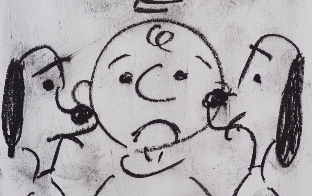
Gary Baseman hosted a pop-up show in the long-shuttered Johnie’s Coffeeshop, kitty-corner from the Wilshire/Fairfax stop. Which is fun, because Baseman is big into kitty cats. “Off the Menu” shows a collection of drawings Baseman has done on menus of restaurants across Los Angeles.
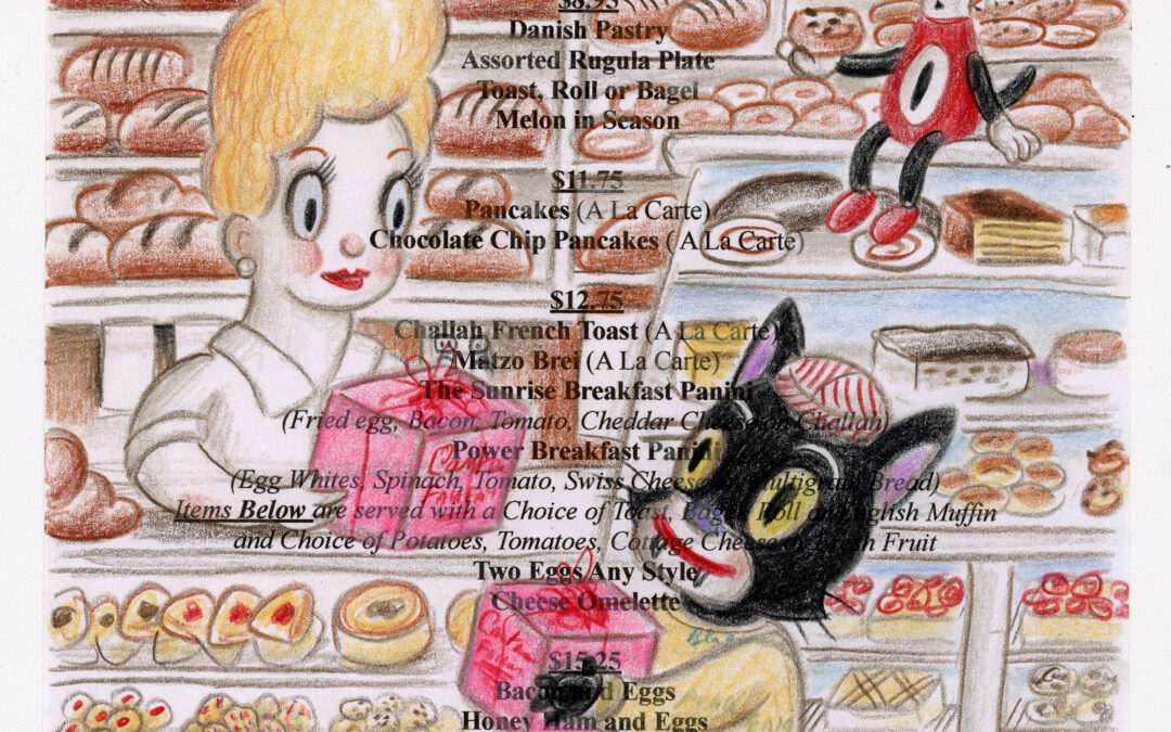
GARY BASEMAN at Johnie's Coffee Shop Restaurant
read more