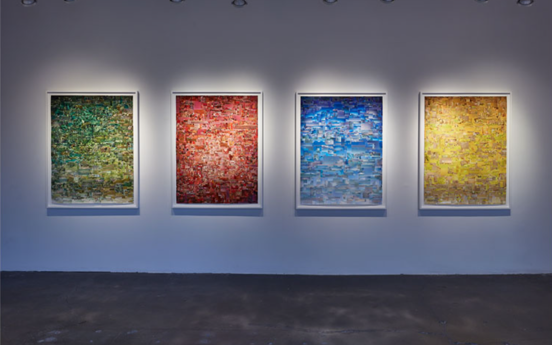
The City of Namara is a fictitious place created by Robert G. Achtel. In the photographs that define this curious and digitally fabricated location, Achtel presents Namara as a place devoid of people and filled with modernist architecture. Each building is shot...
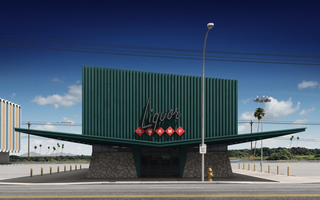
GALLERY ROUNDS: Robert G. Achtel Marshall Gallery
read more