Your cart is currently empty!
Month: November 2013
-
Ward Schumaker
The buzz around San Francisco’s new art hub—near the Design District along a stretch of Utah Street and nearby Potrero—resonates throughout Jack Fischer’s expansive new space. Its inaugural exhibition, “Years of Pretty,” is a mini-retrospective of SF-based Ward Schumaker’s work from the past 10 years.
Schumaker’s day job for 35 years has been commercial illustration for clients like Hermès and Kronenbourg. While his hand is finely trained, in his fine artwork he chooses to let other energies come into play. Roughly brushed, intuitively composed paintings mix randomness and design, the skillfulness of the hand revealing itself slyly in the flip of a brushstroke—the blunt, ragged dragging of paint which obliterates text just so.
While Schumaker presents his gestural musings in a variety of formats, it is the presence of seven hand-painted books that carry the most weight. The hefty books on Stonehenge paper mesh expressionistic paint-handling with washy fields, at times disrupted by stenciled text. Beneath Krakatoa (2004) offers dense black passages enlivened by brush tracks or faint gestural figurative suggestions in hues of pink or red, the rich, energetically composed fields in effect constituting a thick stack of paintings packed back-to-back between bindings.
It was in a class at the San Francisco Center for the Book where the artist first experimented with mixing bookbinding paste into acrylic paint. The resulting pages caught the eye of a gallerist from Shanghai, who offered to show them as paintings. The work has since drawn attention from many in the art world—finding its way into the collections of Eric Fischl and Ivan Karp, among others. Schumaker enjoys the hard, tactile quality and glossy sheen that the medium lends to the work, stating that it adds an element of uncertainty, which he enjoys.
Elixir Refused (Make Happy) (2005) draws narrative from the Bhagavad Gita, while Weather Patterns (2003) offers atmospheric fields of apricot and pale aqua broken by quirky biomorphic forms. As one becomes immersed in Schumaker’s images, it’s almost a process of getting to know how he thinks. Certainly for those with a painterly orientation the work compels prolonged viewing, soaking in the impressions of form and color both as visual nourishment and as a challenge to decipher technique and meaning.
Rounding out the exhibition are large and small wall-mounted works along with his “dumb boxes,” an assortment of sculptural objects combining geometric forms, cubes, rectangles and sloping planes, with roughly applied geometric designs. One-eyed Afternoon (2012) features a pair of cubes, 7” on a side, joined across the bottom by a plane on which they both rest. Roughly brushed with white gesso, the interior spaces are tightly filled with squares of corrugated cardboard.
While elusive snippets of text throughout intrigue and tease, some, such as the repeated phrase “I Am Big Heaven,” clearly demand attention. Schumaker maintains an active meditation practice, and one might reasonably conjecture that these words are offered as a form of mantra for both artist and viewer to latch on to—if only in order to let go.
-
Kevin Yates
Witnessing natural disasters, such as Hurricane Katrina, motivated Kevin Yates’ earlier works that employ motifs of reflection and twinning. Doubling continues with uncanny effect in new representations of decaying decorative/architectural elements, inspired by Edgar Allan Poe’s use of the doppelgänger in his gothic tale “The Fall of the House of Usher.” In the story, the narrator visits a childhood friend and his twin sister, who have both become physically ill due to some mysterious effect of their insidious and dilapidated family estate. The sister, believed dead, is entombed within the house only to emerge days later, a bloody, ghostly figure, who frightens her brother to death as she finally dies at his side. As the narrator escapes the edifice, it sinks into the tarn, consumed by its own reflection.
Upon entering the gallery, one hears a soundtrack of cheerfully twittering birds, which seems at odds with the gravitas of the sculpture at the far end. Against a white backdrop, a dresser, an innocuous domestic object, becomes imposing and disorienting when it is doubled and stacked end-to-end, linked by a memento mori: an aquarium displaying a reclining skeleton. Yates’ entire exhibition “Usher the Fall of the House” (all works 2013), becomes a memorializing work for an imagined context and unknown user, while also functioning to remind viewers of their own mortality.
Yates’ projection Bird Wallpaper (Torn), made with his brother Robert Yates, an experimental filmmaker, simulates shabby and tattered wallpaper. The cheerful chirping suddenly makes sense as small black birds emerge from the foliage patterns. These twittering creatures simultaneously bring life to the damaged décor while also emphasizing disrepair as though the setting has been taken over by nature.
In a distinct space in the gallery, three sculptures of doubled houses, and a video work again created by the two Yates brothers in collaboration, initially seem disparate from the dresser and wallpaper. These pieces move away from the realm of fiction, but continue themes of doubling and disrepair. Unlike the life-size dresser and wallpaper, the sculptures are diminutive and build on the Hurricane Katrina work. Previously, pieces depicted homes shortly after the disaster, whereas these are inspired by a recent trip to New Orleans during which Yates saw damaged dwellings that have remained untouched.
The video Waterline shows a photograph of the kitchen of a home that was abandoned after Katrina. The image’s inversed duplicate moves across it vertically, creating the impression of a reflection in rising/receding water. The gentle ebb and flow is accompanied by a soundtrack of waves and soft saxophone music evocative of a livelier scene than this forgotten kitchen. Most sobering is the glass door at the back of the room in the video. Easily missed, a “0” signifies that no dead were found in the house after the 2005 hurricane.
Yates’ repetition of the seemingly forgotten emphasizes absence, but also invokes a subtle despair in his audience confronted with the disorienting doubling of the dilapidated.
-
Edmund De Waal
All indications are that Edmund de Waal is a polymath and a scholar. Deferring his place at Cambridge, he apprenticed himself for two years to study ceramics, then graduated with first class honors. In the ’90s he wrote a searching study on Bernard Leach, a prominent British studio potter, and in 2010 published a best-selling memoir, The Hare with Amber Eyes, which traced the journey of 264 Japanese netsuke, wood and ivory carvings, through five generations of his Jewish-heritage family. This book is now the work for which de Waal is most widely known. These facts form a narrative arc of potential triumph or debacle with his new exhibition at Gagosian’s Madison Avenue gallery: Will he maintain his brilliant trajectory, or will this show be the moment he falters in his treasured medium?
The answer to both propositions is frustratingly both yes and no. De Waal’s show, “Atemwende,” (or “Breathturn,” after a collection by poet Paul Célan) on one hand shows him to be an artist rigorously keeping faith with his studiously gestural approach to ceramics. Here (all works 2013), the medium is porcelain, mostly cylindrical cups, which he impresses with idiosyncratic touches. The main of the exhibit consists of four cases against one wall shelving small clusters of the cups (breathturn I-IV). Other stand-alone cases situated opposite (black field and I am their music) contain shadow versions, black and smoky gray cups along with a few saucers. Both the finessing of the materials and their arrangement create a tender visual tension. The cups in breathturn vary in hue, from white, to bone, to celadon, to parchment. They vary in height and shape, and some gleam with glaze veneer while others are left paler orphans. The smaller collections of obsidian cups and saucers dramatically oppose the lighter shapes. De Waal has made these objects gently suggestive of personality. Each cup recalls a body, unique in its abject indentations, lopsided lips, contorted curves. In their small groups they seem actually huddled together.
Yet, on the other hand, the work evades de Waal’s intensely curious intellect, instead appearing as objects vicariously generated by a Svengali profiteer whispering in his ear: “Let’s make you look more upmarket. I’ve got exactly the right gallery for you to enhance your brand.” The work presented here feels depersonalized and overly precious. It reminds me of Damien Hirst’s pill cabinets: ostensibly about human fragility, but on examination about turning the underlying supports of our precarious, ungainly lives into pretty, modernist objects to be habitually consumed.
The gallery’s press release claims this work confronts “intimate craftsmanship with the scale and sequence of minimalist art.” No, the intimacy is overwhelmed by the commercial sheen of a modernist look that uses the strategy of repetition not to add meaning but perceived value for the price. A docent approaches me as I take notes to tell me one of the cases just sold for $450,000. Of course it did. This show is exemplary of smug modernist opportunism in that it not only makes lovely work generic—it also misrepresents an artist’s singular spirit.
-
Eugene J. Martin
Someone keeps making an appearance in Eugene J. Martin’s work, and I have no idea who, but I still recognize an old friend. He might be just passing through, with not much in the way of legs on those big orange feet supporting a boxy red body. He might be the silhouette of a black man, bent in sadness or just catching up on the daily news. He might be the debonair figure nestling a face rendered in shorthand into a cocktail glass, or the profile nursing a cigarette. To judge by titles like Detective Jones, Clever Sheriff, or Food and Drugs, he could be on either side of the law. Truth be known, he does not look much like the artist, but then Martin had more than his share of personalities within a single work, and they got along just fine.
He might be the artist himself, checking in to see how the work is going—it is going well. If this is portraiture, its real subject is painting. And painting here begins and ends with abstraction. It includes the enigmatic touches of color in place of a face, the spare horizontals of a top hat, or the circles bubbling up within a head. At least as often, it is a brighter geometry that lays the ground and then, increasingly, takes over the joint.
Martin, who died in 2005, is only now receiving his first long-overdue show in New York. That makes it easy enough to assign him any number of labels, all of them wrong. There are questions of racial identity in his enigmatic figures, while his color contrasts resemble those of Romare Bearden. He almost fits the profile of an outsider artist. Yet he studied at the Corcoran, and his drawings, in overlapping curves of graphite or pen-and-ink, make plain his knowledge of Cubism.
Martin, born in 1938, sometimes described his art as “satirical abstraction,” knowing full well that it is not at anyone’s expense and not entirely abstract. Yet the label does get at the seriousness, the comedy and the eclecticism. Like many younger artists, he might have leaped straight from an earlier Modernism to the graphic novel, with barely a nod to Abstract Expressionism in between. (Well, some of those floating fields of color do have a parallel in Hans Hoffman.) One can see him as putting abstraction through its paces.
A line of one color might leap across a single rectangle, over a brushier field, to land on the other side. Another line might have its own horizontal grid, like color swatches as a check on everything below—and at least one such color palette erupts out of a dark circle surrounded by feathery white, like a final vision. Maybe the star has finally taken over the show.
-
RETROSPECT
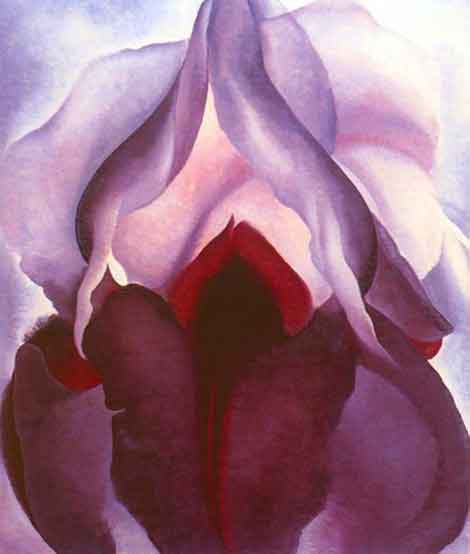
If sex has been around in art for so long, then why do O’Keeffe’s vulvalistic flowers generate so much special negative attention, as in the phrase, “Yeah, she’s good but I don’t like her—too obvious, too sexual.”? Is this because her sensually-charged paintings of innocent desert flowers remind one (deep deep in the tunnels of imagination) of what he faced last night with his wife, or a one-night stand? Or is it because O’Keeffe’s painted flowers resembles a vulva? (Okay, now it’s out there on the table—splat—the VULVA, the mighty vaginal orifice, endless black hole of creation, eater of countless little pink dicks, the red flag that demands action from the male member or else he is an ineffectual pussy.) Can’t “IT” be just a pretty flower?
I hoped we had advanced, you know, gotten over this hump where every skyscraper in New York makes you feel good, but all the swimming pools in LA just make you want to take a nap.
Don’t get me wrong—I am pleased that Art has taken up the gauntlet of sexual satisfaction so seriously. Take for instance, the female breast. From her first ponderous appearance on the chest of Venus of Willendorf to Wesselmann’s pop-art target tits, including a bevy of thinly disguised religious exposures, she has been a welcome player in the art arena. The same can be said for the male phallus, which although sensibly disguised dominates everything from the humble frankfurter to the Empire State building rather elegantly expressed in Warhol’s most endearing movie, Empire. Not until Conceptual art—the only art that has rid itself of any pleasure having to do with sex or beauty—did the role of the sex object come to an end.
What is art if it is not expression beyond the normal, beyond the cage of our perceptions? O’Keeffe’s line is more beautiful, fuller and more ecstatic than is natural, just as Baryshnikov’s leap is higher than humanly possible. That little bit of genius, that extra grace applied to a common seashell, that subtle emphasis that shadows the simple curve of a leaf effects us so slightly yet so deeply that we are moved passionately without understanding why.
Apparently this terrifies us and the only way to end the terror is to give it a name, SEX. But why call it sex? Neither O’Keeffe’s flower nor Baryshnikov’s leap is sexy—they are ecstatic, thrilling, an inch closer to the divine. Imprisoning O’Keeffe in the camp of “female” sexuality is a put-down so that no one has to feel threatened by her simple combinations of beauty and passion. It is a shameful attempt to relegate Georgia O’Keeffe to the realm of porn in order to protect their terrified sensibility from the iron talons of her talent. -
LONDON CALLING
London has an ancient history. Londinium was established on the current site of the City of London around 43 AD and served as a major commercial center for the Roman Empire. Since then it’s grown like layers of alluvial rock to create a complex palimpsest that from time to time throws up tantalizing clues to our past and the rich mix that has made us who we are. Digging up the road to mend a gas leak is liable to reveal a Mithras shrine, Roman foundations or shards of medieval glass.
Now an empty wasteland site behind University College Hospital just off Tottenham Court Road has been taken over by the British-Israeli sculptor Daniel Silver. In conjunction with the innovative commissioning agency, Artangel, which was behind such inspired projects as Rachel Whiteread’s legendary House (1993)—a concrete cast of the inside of an entire Victorian terraced dwelling exhibited at the location of the original house, 193 Grove Road, in the East End of London—Silver has created “Dig.”
In a concrete shell, overgrown with buddleia and horsetail, that feels like the sort of disused car park where nasty things happen in gangster movies, there appears to be evidence of some kind of archaeological dig. Entering over rickety duckboards we come upon a series of wooden trestle tables where rough mud, marble and terra cotta figures have been laid out in rows as if to be classified. Are they the remains of some ancient civilization or part of some forgotten fertility rite? What are they doing here and who made them? Were sacrifices and offerings once made to propitiate these apparent gods?
There are busts of bearded men with a philosophical mien and women with the sort of elaborate hairdos found on archaic Cycladian figurines, as well as a many-breasted goddess reminiscent of Diana, the goddess of the Ephesians, and a priapic hairy faun. Some of the figures are deformed or eroded as if by time or plunder, others are no more than broken shards. Marble fragments—possibly a foot or an elbow—lie apparently waiting to be reunited with some implied whole. On a subterranean level, arrived at by makeshift scaffolding steps, larger figures stand on concrete plinths in nooks and crannies amid a bed of muddy green sludge. The day I went it was raining and the constant drip of water made the place seem like a lost sacred spring.
Fascinated by Sigmund Freud’s collection of archaic sculptures, Silver ponders on what it is we choose to reveal and what secrets or phobias remain hidden and forgotten. Archaeology is a way of understanding the past through objects but it also acts as an apt metaphor for delving into the subconscious. The installation seems to imply that in a secular society, belief systems are no longer cohesive and that doubt and uncertainty, rather than faith, are the default positions. By implication these fragments and totems invite us to question what remains when the meaning and significance of religious rites and rituals have been lost in the mists of time and all that is left is a cluster of shards. You can’t help wondering what future generations will make of our own icons and detritus. How we will be understood by archaeological digs several centuries on.
Though born in London in 1972, Silver was raised in Jerusalem, a city that itself is a kind of historical collage. His background is complex with migrations between Israel, London and South Africa that have led him to feel, like many of Jewish descent, rather homeless. The work suggests that a quest for roots and meaning is hardwired into the human psyche.
Silver’s approach to sculpture is idiosyncratic. There’s something impulsive and childlike about it, regressive and scatological. Though if one looks carefully it’s possible to see the influence not only of archaic and Greek sculpture but of Easter Island figures, the Chinese terra cotta warriors of Xian, of Picasso and Rodin, as well as Anthony Gormley’s “Field for the British Isles” (1993)—that carpet of thousands of little clay figures that filled gallery spaces like a Lilliputian army. But more than anything “Dig” suggests the human need to make totems and artifacts that tell us who we are and how there is an essential thread that links those who lived in the past with those of us living in the present.
-
BOOKS: Art Powered by a Past Era
Steampunk is a recent Populist art movement that glorifies unique, handmade objects and fashion from the Brass Age, an era lasting from the first large scale manufacture of nautical brass around 1830 until the mid 1920s, when automobiles no longer used brass fittings. During this time steam was the dominant source of power and machines built to take advantage of this new development tended to combine the gratuitous ornamentation of Victorian design with mechanical necessity. The machines in Jules Verne’s tales of exploration were based on these inventions and in 1954 the Disney version of Verne’s 20,000 Leagues Under the Sea became the first blockbuster movie to introduce what would later be called Steampunk style by presenting the gentleman explorer as a Victorian hero. Still, the people who emulated that look didn’t form into a serious artistic subculture until the Digital Age’s straight edge forced them to become public activists for 19th-century industrial design. As critics of society they were punks, and in 1987 science fiction author K. W. Jeter invented the phrase “steam-punks” to describe them.
Some Steampunk artists eschew anything modern, subscribing to an alternate present where Victorian industrial design is still prevalent. Others honor that style, but not its mechanical and electrical inefficiencies, advocating instead the partnering up of forward scientific thinking with Brass Age tech. This is an important distinction but the philosophical camps exist together comfortably, and both ultimately recognize Steampunk as a way of life as much as an art form. As a relatively new movement it has attached itself to other trends in order to get noticed; Steampunk men and women crowd the comic conventions and even show up with brassy steam driven “autobats” at car shows.
Richard Nagy, “Datamancer Steampunk Laptop,” 2007 In 2009, the Oxford University of the History of Science mounted “the world’s first museum exhibition of Steampunk”. Art Donovan, a designer and Steampunk artist, curated the show of artists that share a common passion for Victorian design and its interface with contemporary electronics and mechanics. The resulting exhibition catalog, The Art of Steampunk, is an essential guidebook to the genre and this new edition introduces other industrial designers, jewelers and artists who best exemplify Steampunk.
In most works of art, what an object appears to accomplish is more important than what it actually achieves. Filip Sawczuk’s assemblage sculptures seem to have once served as rough tools to fix an industrial machine that no longer exists and hearken back to the early primitive stages of coal-fueled steam power. Jos de Vink’s tabletop engines, made of machined brass and powered by the heat of tea warmer candles, accomplish nothing, yet their movements amuse and seem to be critical components of reality. Haruo Suekichi’s wristwatches function successfully as timepieces but their bulk makes any practical use impossible. The irony here is that the numerous scuffs and dents make it appear as though they had been used repeatedly; most Steampunk objects are presented in pristine, unused form, as if we are encountering them fresh out of the laboratory.
Steampunk is at its best when it presents modern tech in obsolete packaging, bringing form and function together in a successfully insistent way. Richard Nagy makes computer terminals and keyboards from old mechanical typewriters, combining the approachability of organic design with the digital age’s severity. Joey Marsocci’s Victrola Eye-Pod camouflages a USB charger in a gaudy four-footed tarnished copper stand that perfectly matches the modded iPod Nano it serves.
Then there is the wonderfully modern look of Evelyn Kriete’s Victorian fashion designs. Taking on both factory girl utility and the elegance in discipline of high couture from that period, her clothes seem to amplify Victorian self-restraint. The charms and trinkets of Amanda Scrivener (AKA Professor Isadora Maelstrom) joining materials like broken watch parts with traditional jeweler’s materials, resulting in remarkable body ornaments. Her piece, Old Camera Lens Monocle, combines leather straps with black and silver camera parts, as though built in the dungeon of a mad scientist.
As years pass and Postmodernism ages, it has become more difficult to pillage unexploited eras of yesteryear for cultural influences. The simplest and most direct styles of the past have already been mined, so all that is left are the eras of complex aesthetics and antiquated morals. But perhaps in this day and age the idea of crafting a romantic new standard for modern goods while sexing up Victorian abstinence isn’t so far-fetched; all one has to do is disregard the child labor, Imperial wars and incurable diseases of the past, the same things we ignore today.
The Art of Steampunk
Revised Second Edition by Art Donovan
Fox Chapel Publishing, 2013
ISBN: 978-1-56523-785-8Top to bottom: Tom Banwell, Sentinel, 2010; Richard Nagy, Datamancer Steampunk Laptop, 2007; bookcover
-
DECODER: Immune from Criticism
I spend a lot of time finding ways to make paintings that (I always hope miraculously) look like they aren’t paintings.
And then I get what I wish for and they get mistaken in print for collages or computer things or photos of people by journalists who didn’t read the wall label. And then I get angry. And then I get a deadline for a column and write about it, like a jerk. Because it’s on my mind.
And then I look at it, and it’s a stupid rant about fact-checking written while the government’s about to default on its debt and Syria burns and Guantanamo still isn’t closed.
But, indulge me—I’m going to make a pitch for fact-checking art reviews being, maybe, part of something important.
LET’S ASSUME YOU’RE EMPLOYED.
Think about the walk to the back office, or the phone call from whoever’s in charge: The discussion of your performance.
How bad does a thing you did have to be before you get fired? Not, like, rubbing snot on the boss’s nipples—not something personal—something that would demonstrate that—whatever the basic skill you need to do the job is—you don’t own it.An art critic agrees to deal, like every writer, with grammar, usage and deadlines, and, unlike every writer, with recording their opinion.
So once you can write at all, it’s pretty hard to do job-endingly wrong. Its least nebulous requirement is giving the impression that one meets all its nebulous requirements.It can, however, still be done objectively wrong. There is such a thing as a literally worthless opinion—a rose isn’t a rose if you haven’t got a nose and a man without a mouth should not be judging sundaes. In art criticism, this happens: they don’t send the blind out but they’ll send the lazy. So you get reviews of shows unseen. I noticed it first when I was an intern—the titles didn’t match, the critic had obviously only looked at the catalog.
You couldn’t have an opinion more bad than that: one totally uninformed in the simplest sense of the word. You (and think how rarely you get to use this sentence literally) do not know what you’re talking about. And critics don’t get fired for that or things like it.
We don’t and can’t and shouldn’t live in a world where we can identify a wrong taste in art. All objects from mute cubes to kitsch cabin oils have their counterargument. But we have tools to identify those too stupid or negligent to even be making arguments—but we don’t use them. So anyone who wants to think about art has to wade not only through a necessary democratic noise but also through a gratuitous criminal noise. It can be important to hear the ideas of an 8th grader who doesn’t know much about art but knows what she likes but it can’t ever be important to hear the opinion of a middle-aged multi-graduate who doesn’t even know what it is he’s liking. The art journalists who make up things because they can’t read the labels or ask for clarifications don’t suck any less at their easy job than the police and political journalists who are destroyed by the scandal of their fabrications, it’s just that the former’s fuck-ups fuck up only art, where the stakes (at least in the short term) are desperately low.
The real job of an art critic in most news organs is to be part of a bigger machine: it’s just the art part (a minor but colorful part) of a larger opinion engine’s thrust.
A paper’s culture section projects a certain attitude, finds people who want to hear it projected, and finds objects to project it onto. But that’s just Twitter, and Twitter’s free. The demand for lines of strung adjectives flung blindly is high, but so is the supply. Without thought or analysis grounded in things that actually are, the market in these ideas will go rapidly down—and without some attention paid to making sure the observers are actually observing, the things beneath the surface will cease to be recognized, then cease to be rewarded, then cease to survive.
-
Stellar Stoller
“Insights into Architecture,” inspired by architectural photographer Ezra Stoller (1915–2004), who is known for chronicling modernist architecture from the late 1930s to the 1970s was on display at the Palm Springs Art Museum from May 25 to October 6.
To comment on Stoller’s photographs, his ability to capture the life and lines of a building is like witnessing a green flash. There is a moment of space, time and structure held in his frames. In his photograph of the Salk Institute (Louis Kahn, architect) it hides the iconic rhythmic symmetry, and instead focuses on the materiality and light of the architecture. Another photograph of the McMath Solar Telescope at Kitt Peak in Arizona (Myron Goldsmith, SOM architects) centers the crystalline-shaped arm of the building and pushes your eye to look out into infinity. Scale and context are heightened by the blur of a person standing near the base. Other images on display include Frank Lloyd Wright’s Falling Water house and the World’s Fair Finnish Pavilion by Alvar Aalto, which is said to have jump-started Stoller’s career in 1939.
-
BUNKER VISION
In a world where art is purchased to display as trophies, it can be hard to remember what a real art patron looks like. While researching my new favorite television station, I stumbled onto somebody who might qualify as the best art patron ever.
The station is Classic Arts Showcase. It shows amazing clips of things that are derived from the world of classical arts. A great deal of this content comes from the early days of television, when it was assumed that the general public would be happy to watch great conductors, dancers and opera singers. In some cases where a performer was too late for film, or died young, these television appearances might be the only existing footage of performing legends. CAS is often used by PBS stations to fill the time slots when they don’t broadcast, usually late at night.
They create an eight-hour block of clips each week, which are given for free to cable and satellite providers. The format is a bit like early MTV, right down to the block of text at the beginning and end of each clip, with useful facts like names, dates and websites of the releasing companies. The station turns 20 in 2014. They purposely don’t publish a list of the clips they show, as they favor the element of surprise. When discussing the station online, viewers love to cite favorite juxtapositions of clips. In one case, they showed three clips in a row of the same aria sung by different divas. The head of programming is an opera singer with an encyclopedic knowledge of the classic arts.
Were this station Lloyd E. Rigler’s sole claim to fame, he might still be considered an art patron of legend. But the station is only the tip of an iceberg of largesse. With his “business” partner, Lawrence Deutsch, (those were more circumspect times) he ran a foundation that had much to do with bringing opera and ballet to Los Angeles, while funding various arts organizations, and even creating the venues where they were shown. Rigler was instrumental in the restoration of the Egyptian Theatre in Hollywood.
When Rigler was faced with an Edith Windsor-style tax dilemma after the death of Deutsch, he created a nonprofit entity (The LEDLER Foundation) and started a project that allowed anybody to purchase a copy of any recording in the Library of Congress and five other repositories. Many reissued recordings owe their existence to this data base. The LEDLER foundation also founded a program to address marriage equality issues by focusing on unmarried couples. The logic was that by taking the emphasis off of gay-only issues, those issues could fall under a bigger umbrella of human rights.
Rigler’s focus from day one has involved sustaining arts that were more at risk and ethereal. His motivation to start the TV station was based on the simple observation that the theaters where he was seeing these arts were starting to play to smaller audiences. The next time you spot Mr. Rigler’s name on a building, remember that it is an honor well-earned, and not another paid advertisement.