Your cart is currently empty!
Month: November 2013
-

Sundry and Complicated
LA’s rise as a major architectural center, chronicled by the Getty Research Institute in Pacific Standard Time’s ongoing and extensive set of shows, is difficult to reconstruct despite the copious evidence. The architectural history of Los Angeles is multifaceted and heterogeneous; each of the historical strands that make up that complexity forms a complicated set of relationships with a larger, equally fragmented and increasingly globalized postmodern meta-history.
For example, the PST exhibitions carefully explore the relationship of a built Los Angeles inextricably linked to the explosion in the 1960s and ’70s of interest in “vernacular” architecture and the “planning” of sub- and exurban sprawl. These trends have been analyzed and valorized by many, including the historian Reyner Banham and the postmodern theorists, teachers, and designers Robert Venturi and Denise Scott Brown, aided and abetted by colleagues and students, LA artist Ed Ruscha and others, including the pioneer Esther McCoy. Yet this is hardly the only postmodernism to which LA can be linked. David Gebhard and Robert Winter’s seminal Architectural Guidebook to Los Angeles, for example, points to the relentlessly historicizing vision of the original Getty Villa, a flamboyant yet archeologically precise replica built in 1974 by Langdon and Wilson, while Fredric Jameson locates the architectural ground zero of his postmodern “cultural logic of late capitalism” in John Portman’s Bonaventure Hotel (1974–1976).

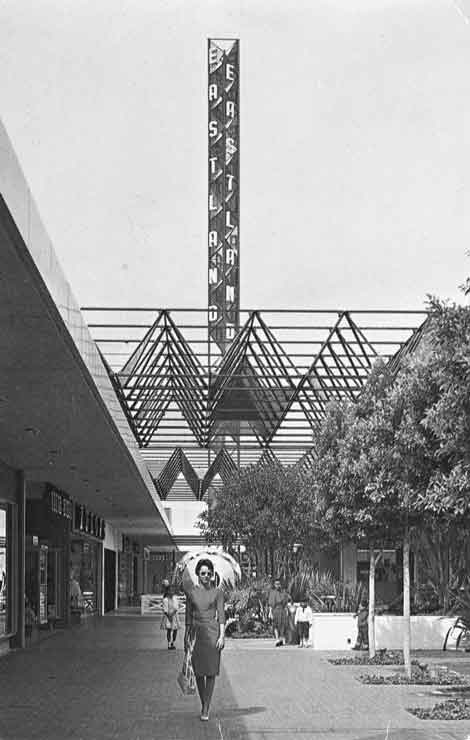
Eastland Shopping Center; woman in red dress, about 1957, A. C. Martin and Associates and David M. Mills, Chris Nichols Collection Given the considerable possible pitfalls, the GRI has done an admirable job in collecting and collating an enormous amount of material. The series of exhibitions that have been mounted at nine different venues from Pomona to Santa Barbara lay a solid foundation for an ongoing historical, academic, political and social conversation about the development of a truly region-specific architecture in post-modernity. Angelenos—as policy-makers, citizens, critics and historians—can come to a better understanding of where our city and region have been, where they are now, and where we might want to take them in the future—in so far as we can influence a living and evolving built environment that will never be under anyone’s complete control.
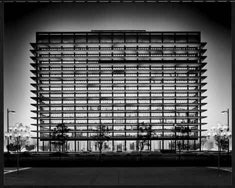
Any attempt to assess the GRI’s architectural initiative must begin with the Getty’s own exhibition “Overdrive,” which provided the hard-core historical, demographic, economic and developmental background upon which LA’s history of a built environment is necessarily inscribed, like the massive grid of freeways that increasingly crisscrossed the landscape during the 1950s and ’60s. As an exhibition, “Overdrive” was dense, exhaustive, and exhausting—absolutely a multiple-visit show. Its thematic organization was diffuse; but the choice of topics and the amazing objects and images assembled by the curatorial staff made the visitor’s struggle with the exhibition’s massiveness completely worthwhile.
As an icon of LA’s fabled mobility, the 1970 photograph of Joan Didion with her Corvette Stingray by Julian Wasser, here mobilized in the service of a disruptive feminism, was alone worth the price of a parking pass.
The catalog, edited by Wim De Wit and Christopher James Alexander, was itself a finely tuned vehicle for navigating the ecologically diverse terrain laid out in the show. I was especially intrigued by Becky Nicolaides and Dana Cuff’s essays in the section “Developing Communities,” although virtually every essay provided essential information as well as contributions to what eventually amounted to a fine mini-archive of architectural, historical and perfectly pitched contextual images. Overdrive: L.A. Constructs the Future, 1940–1990 will remain an essential basic text for a long time to come.

Jef Raskin, Bloxes, 1970–71, rebuilt 2013, installation view from “Everything Loose Will Land,” ©Estate of Jef Raskin, Courtesy of Aviva Raskin, Photo by Mark Escribano On a quite different scale was a small but wonderful exhibition curated by UCLA’s Sylvia Lavin in the MAK Center space at the Schindler House in West Hollywood. “Everything Loose Will Land” was a brilliant look at a particular set of interrelationships between art and architecture, what the curator dubs a kind of “de-architecturization” of architecture during a particularly freewheeling decade—one that saw the publication in Design Quarterly of Ed Ruscha’s little known follow-up to his seminal deadpan photographic series (beginning with 1962’s “Twenty Six Gasoline Stations”), the thoroughly tongue-in-cheek Five 1965 Girlfriends. Here, one might fruitfully compare Erika Skoda leaning negligently on her Porsche to the much more forced informality of Ms. Didion’s self-presentation with her Stingray.
“Everything Loose Will Land” worked via a temporal and intellectual frame that was carefully calculated to maximize our appreciation for the interpenetrating, multivalent, cross-fertilizing ways in which a surprisingly semi-permeable “architecture” has interacted across numerous less-than-rigid disciplinary boundaries to constitute an environment at once thought, imagined, drawn, modeled, built and lived. The catalog is equally sharp; especially appreciated is the section titled “Works on Paper,” which re-publishes in semi-facsimile a number of important primary sources in a way that facilitates our visual appreciation of the material under consideration.
Finally, a word about LACMA’s “The Presence of the Past: Peter Zumthor Reconsiders LACMA.” This galvanizing exhibit focused on the solution proposed by Pritzker Prize–winning Swiss architect Peter Zumthor to resolve the ongoing problem of LACMA’s diffuse and difficult-to-navigate campus. Beginning with a collection of bones from the Page Museum’s La Brea Tar Pits collection balanced against Charles R. Knight’s magnificent 1925 mural recreation of tar-pit life (and death) during the Pleistocene, Zumthor walks us carefully through the early history of the site and then through every phase—built, planned, projected or imagined—of the ongoing build-out of the campus, up to his own controversial attempt to link museum and tar pits into a single spectacularly undulating whole.
However, this small but trenchant exhibition could have profited enormously from an accompanying publication. Losing sight of all this material after the close of the show is a real loss to the continuing conversation over LACMA’s past and future. Indeed, this show—as well as the beautiful installation of material related to Frank Gehry’s National Art Museum of China competition entry, appended to the “New Sculpturalism” exhibition at the Geffen Contemporary (reviewed in our last issue)—suggests that in a moment of profound self-reflection, the GRI might consider a show or (better) a series of shows on the history of museums in general (not just the art museum) as iconic instances of the preservation and presentation of our collective cultural memory.
-

UNDER THE RADAR: Prosthetic Enthusiasms and perverse harnessings
In retrospect, Machine Project—the Echo Park storefront operating for the last decade as a rapid-fire curatorial clearinghouse for founder/director Mark Allen’s tireless curiosity—would seem to have been one of the most influential artistic endeavors of the new millennium. Bridging the faux-institutional critique of the Museum of Jurassic Technology and Center for Land Use Interpretation with the collaborative rhizomatics of Generation Occupy, MP has been both a model for a host of subsequent networking nodes, and one of the busiest neural clusters in the increasingly web-like cultural underground.
But for all its nonprofit camouflage and programmatic eclecticism, MP very much retains the profile of an idiosyncratic artwork bearing the signature of an individual curatorial author. This is the link back to the MJT and CLUI—and even further: think of Jonas Mekas’ Anthology Film Archives. But where Mark Allen splits forward is with the ostentatiously exhaustive range of phenomena that take refuge under the Machine umbrella. Robotics, kimchee-making, avant-garde theater, permacuture, fractal models constructed from business cards, flower volcanoes, deep-frying parties, nude readings of conquistador reports punctuated by weeping fits and the eating of fancy ham—you name it!
Machine Project ends up being like the coolest magazine ever—reconfigured as an immersive, interactive, constantly changing environment. Which may not be mere happenstance, since Allen started out as a zinester back in the day, with a Houston-based DIY publication called SCAM. Much of the mutual aid bohemianism, “prosthetic enthusiasm,” and counter-institutional thinking for which Machine functions as a nexus is directly traceable to the pre-digital slackerism of the zine era.
Machine’s latest project is essentially a video zine documenting a representative sampling of typical MP happenings from 2010–12. These range from an opera starring dogs to a guy singing “I Left My Heart in San Francisco” through a megaphone while climbing a hill in San Francisco; from a relational aesthetics museum residency for houseplants to a drag tableaux-vivant reenactment of scenes from the Marlene Dietrich western Destry Rides Again; from the perverse harnessing of the kinetics of an aerobics workout to churn butter to a workshop on how to escape from the trunk of a car “so that the next time you’re kidnapped it doesn’t have to ruin the rest of your day.”
Directed by Allen and produced, shot and edited by Emily Lacy, Machine Project Selected Films 2000-2012 is highly entertaining in its own right, and a more-than-adequate précis of a curatorial vision that doesn’t lend itself to reductive translation. Personally, I would have liked to see less of the poetry readings and more of the how-exactly-is-it-you-get-out of-that-car-trunk. But I guess if it makes me want to get off my ass and participate in more of Machine Project’s uncategorizable offerings, it’s probably achieved its aims.
An equal but opposite dummy institution is the Boston Visionary Cell, though I’m not sure it ever involved anyone but founding artist Paul Laffoley. Which is fine, because the guy could probably fill two dummy institutions. Since the late ’60s, Laffoley’s information-dense paintings have successfully straddled hermetic mysticism, paranormal phenomena (including alien contact), fringe physics, and utopic architecture and engineering, not to mention some badass graphic design. Articulating an ornately modernist didacticism—while predicated on a radically reimagined psycho-spiritual function for art—his exquisite charts defy easy assimilation by the mainstream art world, as well as the lowbrow and outsider.
When I first encountered Laffoley’s work, I wasn’t clear about his sincerity—could this be merely an elaborate but superficial appropriation of the vocabulary of expanded consciousness and paranoid conspiracy cognition? The newly published Premonitions of the Bauharoque dispels any such concerns, delivering a mother lode of Laffoley’s writings dating back to 1972. Though tagged as “Journals” the bulk of the volume consists of three facsimiles of hand-scrawled manuscripts: “Principles of Alchemy,” a 93-page treatise on the ancient system of symbol manipulation; “Visions of History,” which seeks “to determine the extent to which the philosophic category of meta-history or the philosophy of history can converge with the various historical or contemporary art-forms”; and “The Bauharoque,” Laffoley’s sprawling 1989 anti-Postmodernist manifesto, part memoir, part revisionist art history, part call-to-arms.
Quite apart from their value to Laffoley fans and scholars in fleshing out the sometimes cryptic philosophical concepts diagrammed in his visual work, the texts themselves are phenomenal examples of the kind of audacious free-range intellectual inquiry that can usually only be found in the kind of self-published mail-order treatises these “journals” resemble. I have to confess I haven’t quite put it all together yet, but I enjoy trying. And when I finally do, Laffoley seems to promise, it will be a shining and joyous cosmos beyond the end of time. Now, I may not know Art, but I know what I like.
Paul Laffoley: Premonitions of the Bauharoque
Henry Art Gallery,
University of Washington, 2013
ISBN: 978-0-935558-52-4Machine Project Selected Films 2000-2012 AKA Machine Project’s Greatest Hits
DVD available from
store.machineproject.com -

Escape from LA
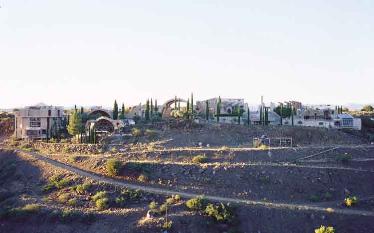
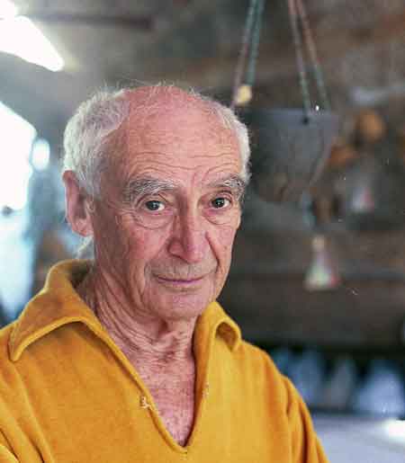
Paolo Soleri’s eyes sparkled from under bushy eyebrows, deep-set in a grizzled face; they projected intelligence tinged with a spark of irony. When I met Soleri (who died in April) the first time, back in 2000, he could at times appear weary, like a man called upon to explain his simple idea for the umpteenth time to someone who is having difficulty following. But the shadow of exasperation would quickly dissipate and once again he would patiently speak of his dream: the vision that was taking shape in the red earth of Agua Fria Canyon, halfway between Phoenix and Sedona.

Paolo Soleri in 2000, photo by Luca Celada By the time I visited him in Arizona, it was apparent that Arcosanti, the city he had been hand-building in the desert, would never be completed. Not in his lifetime at any rate. But this did not stop Soleri, then 81, from scampering down the rocks to the bottom of the canyon to give a tour of the habitation prototypes he had initially built there with his students; concrete cubes strewn across the playa like toy building-blocks forgotten by a boy-giant. Like the imposing unfinished city up top, they were fruits of an unending passion for building and experimenting. For Soleri, erecting structures for living was a basic human compulsion, at once archaic, fundamental and ripe for revolutionizing. The passion he acquired as a student in his native Turin had brought him in the ’40s to Frank Lloyd Wright’s experimental studio at Taliesin West, and he had worked with the old man until his own strongly held views had led to an inevitable parting of paths. But the desert’s crystalline light and vast space had by then seduced the young Italian and so Soleri stayed on, opening his own studio: Cosanti, which he named by fusing the words “cosa” (thing) and “anti,” an implied endorsement of questioning conventional wisdom. Cosanti is still there—even though in the intervening years the Scottsdale suburbs have encroached on the desert where he first built earthen mounds, poured concrete over them and then dug out the dirt, leaving miraculous domes to float upon the land. This was the outpost where, between firing pottery and smelting bronze bells, he began to formulate his philosophy for building—an unconventional conception to say the least.
In 1967 he entered a competition for an airport in New Jersey with a design that would have housed the population of the entire state. It was an early example of hive-like city-buildings, massive structures that subsequently informed the idea for Arcosanti. Soleri was a prophet of density in the land of sprawl, capable of imagining the Western landscape dotted with city-states alighted on the desert like giant motherships, somewhere between Pueblo Indians and Star Trek; the Arcologies, as he called them, purported to reinvent cities from scratch. “I’m certainly not the first one to try that”, he told me then: “just think of the Roman legions, laying city grids as they conquered.” His notion of cities as physical embodiments of civic life was also a classical Greco-Roman concept, updated to his place and time. “What we’re trying to do here,” he would explain on the steps of the Arcosanti amphitheater, is “to offer American society an alternative to Los Angeles.” His brazen proposal was in fact to build in the American West cities as fabled and fantastic as the Tower of Babel, or the hanging gardens of Babylon: city-organisms inspired by a sort of superior natural order. “All organisms are three-dimensional and cities need to adopt that fundamental tenet of organic life. They need to reject the gigantism that is killing them, starting with the cars that push them into absurd horizontal dimensions.” The cure he advocated was the “implosion” of both cities and dwellings: “We need very small houses instead of ever bigger ones” he would exclaim, making his point. “We need miniaturization!”

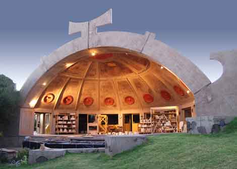
Ceramics Apse, photo by Tomiaki Tamura Paolo Soleri was a great utopian dreamer in the vein of Gaudi and Sant’Elia, visionaries most of whose visions were destined to remain unbuilt. He abhorred the ubiquitous preening of “fashionable” architects and referred to their multimillion-dollar commissions as “orchids,” flashy monuments to vanity, believing instead that architecture had a deeper mission as the art and science of giving physical shape to human habitation and to cohabitation. Like many desert gurus and high priests, his philosophy flirted with mysticism, some would argue a New-Age tinge. He believed for instance in the “noosphere,” the idea of an all-encompassing planetary consciousness, a superior collective cognition capable of seeing humanity through to a new transcendence. Ultimately he believed in mankind’s destiny in space: “We can’t limit the presence of life to this tiny corner of the universe. If we truly value it, it is our duty to try and export it.” Envisioning space colonies and orbiting arcologies put him, some would say, in the “moonbeam” camp, and he did in fact have a long relationship with Jerry Brown, who often interviewed him on his radio show We The People. But beyond the esoterica, his formula for cohabitation made some fundamental sense, and elements of it have since become the inspiring principle of New Urbanism. Cities, he would say, need to go back to being “the locales where work, knowledge and conviviality converge and coalesce into a living culture.” And in that sense there is a little Soleri in every mixed-use development currently cropping up, right here in “gigantic” LA. A pioneer in many areas, including the “crowd-funding” to finance his project, he was above all a builder of cathedrals in the desert, much like Simon Rodia or, say, Michael Heizer. But Soleri was no conceptual artist. His impossible grandeur was real, as concrete as the cement he amended with native sands to infuse Arcosanti’s buildings with the natural colors of the desert. A city-in-progress where he cultivated generations of drifters, students and dreamers that made the trek to Agua Fria, where—even if you didn’t find the future of cities—you just might find yourself waking up at dawn in the Sky Suite overlooking the central basilica, and it was one helluva view.
-

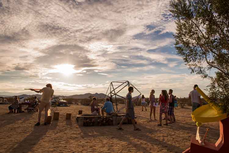
Desert Shindig
Like its Himalayan literary counterpart, Joshua Tree’s Shangrila is a utopian vision; part dream, part tourist destination. Concretely, it’s a one-bedroom residence on Shangrila Lane, overlooking a seemingly endless expanse of undeveloped, government-owned desert. It’s remote enough to seem completely isolated, yet close enough to civilization that you can feel the earthquake-like blasts from simulated bombing raids at the U.S. military fake Iraqi training village in neighboring Twentynine Palms. Originally a homesteader cabin built in 1947, the Shangrila lot was decrepit when artist and curator Drew Dunlap purchased it in 2005 while enrolled in Otis College’s MFA program. In addition to envisioning his future home as a vacation rental, Dunlap also wanted to establish a sporadic artists’ residency where one could create works inspired by epic surroundings. Today Shangrila resembles a mid-century modernist spec house with a swing set and three conspicuous shipping containers in the back yard.
In 2008 Dunlap executed his plan, inviting a few dozen artists for a weekend of experimentation and imaginative planning. They planted the seeds for what would become “Shangrila”: the art event, which debuted in June of 2010. For this first weekend event, Dunlap curated art and performances investigating questions of utopia. I participated in this show as an artist, and again the next year (which, in the spirit of full disclosure, probably dulls my critical edge a little). While there were many fine works on display in that 2010 show, Rob Faucette’s intervention stood out as particularly poignant. Faucette invented Girlfriend Beer, a fictional company that “sponsored” the event. The artist stuck DIY labels on cheap beer cans, posted roadside ads, and distributed free branded koozies to visitors. I couldn’t help but take his work as a preemptive inoculation by satire against corporate sponsorship.
As the perennial art happening matured, Dunlap shifted his role, co-curating “Shangrila: New Moon” with artist Michelle Chong in June of 2010. During the day, Veronica Duarte’s iconographic self-guided tour relayed meandering information about Joshua Tree and its history, while at night Taylor Tschider’s galaxy in a cardboard box beautifully echoed the Milky Way above. In early fall of 2011, Dunlap turned the event over to the collective Durden and Ray, who put on “Shangrila: Oasis.” I missed out on this iteration, but stories of naked BBQ cooks, stalagmite campaign signs by Elizabeth Gahan, and Brian Thomas Jones’ glowing super-phallic inflatable tube confirm that I should have been there.
Unlike other desert art events like tech-yuppie Burning Man, or the more elite High Desert Test Sites, Shangrila remains emphatically emergent and wonderfully unpredictable. Somewhere in between the blazing Friday sunshine and the hungover Sunday drive home (after a transcendental visit to the Integratron sound bath a few miles away), Shangrila morphs from nervous art opening into a temporary autonomous zone where people transform in strange ways. I’ve witnessed buttoned-up academics get shit-faced and near-naked with people navigating in and around in-situ artworks pursuing nocturnal trysts.
This year, the curatorial team of Steven Bankhead and Jesse Benson organized “Shangrila: Burrito Deluxe,” which included 50-plus artists. To manage the expansive undertaking, they enlisted other curators. As Bankhead notes, “Jesse and I both distinguish ourselves more as organizers… We weren’t so interested in curating specific types of art but rather organizing a group of artists that are doing interesting things.” On Friday, Calvin Phelps hosted “Supper,” a performance/gourmet meal inspired by the desert. The collective Elephant created an impressive temporary stage resembling their LA outdoor space. And with the help of Michelle Chong, Elephant scheduled a series of performances throughout the night, many of them by members of the LA sound art organization, SASSAS.
One of the greatest things about Shangrila is the ability to encounter work in the surprising desert landscape. As Benson puts it, “While some works were immediately recognizable in the environment, others were more difficult to ‘discover.’ Stumbling through the desert at night with a flashlight and encountering a work is of course different than seeing a work in a gallery.”
This experience is a welcome invitation to create site-specific installations, exemplified this year by Fatima Hoang’s small inflatable sun, which kept rising and falling throughout the night, commenting on the promise of new beginnings while comically punctuating Joshua Tree’s picturesque vista.
Like any event incorporating lots of artists with multiple agendas, Shangrila always has hits and misses. While some works fall flat in their new desert context—especially those that cling to the safety of the property’s shipping containers, which mimic the white cube—others remain indelibly memorable because they reimagine our relation to the desert landscape. In the end it’s the strange weekend-long event that creates the critically important space for contemplation.
-

Dong Hoon Jun
I often feel the need to escape the insincerity of Los Angeles for the non-ironic nature of the desert. Hollywood’s slapstick tradition seems to have similar desires. A rock, maybe a bit browner than his companions, sits at the bottom of a boulder-pile. We watch the video—wind tapping the mic, sage swaying—for nearly 30 seconds thinking: This is one of the most boring Discovery channel shows I’ve ever seen and—did that rock just move? For the next 30-plus, somewhere between caterpillar and snail, the rock of Dong Hoon Jun’s Rock slithers into a more comfortable spot in the shade. Keep watching and the second part of the video has the artist emerge from another rock pile, hoist a hitherto multiple-ton boulder, and walk off with it. No minds would be blown if Buster Keaton entered frame, wondering where his rock disappeared to.
Dong Hoon Jun’s videos: office chairs spinning on their own, attempting to levitate, inch-worming across the floor, have a comic—as in Merry Melodies—aesthetic to them. The same with his photos: lots of the artist’s legs dangling from or emerging into places they don’t belong. Jun often uses quotidian spaces for his antics, recognizing, as the early slapstickers did, that this type of humor needs a straight man. Or straight location: the desert—harsh, barren, prickly.
The other side of Jun’s work, the fantastical of the everyday, also harmonizes in the location Hollywood has used for distant planets, or symbolic of unknown terrain. Jun, born in Seoul, Korea, uses this alien space to explore alienation. The movement of a rock alludes to migration and dislocation, Bugs Bunny hid behind a movable cactus to sneak past his gun-toting foe Elmer Fudd; Mexican immigrants, hidden in rocks, now must sneak through the desert past equally trigger-happy Texans.
In the photograph Rest, a man lies face down in the sand, seconds from the Pacific Ocean, footprints in the sand behind him. It’s a clever usurping of the man-looking-for-water-in-the-desert scenario used in New Yorker cartoons. Jun’s work of late is those desert views or overtly verdant, wet, landscapes. He’s captioned this series on his website “Dong sees america.” Like Buster Keaton jumping through dreams in Sherlock, Jr., it’s easy to edit these together and see the vaudevillian Jun picking up a rock from the desert sand in his video Rock, spooning with it in the photo series “Rock” and, attempting to find water, crawling West, and so close, finally passing out on the damp sand of the Pacific that laps the U.S. on one side and Asia on the other.
-

CURFEW: Graffiti Since the Beginning of Time
Graffiti Since the Beginning of Time
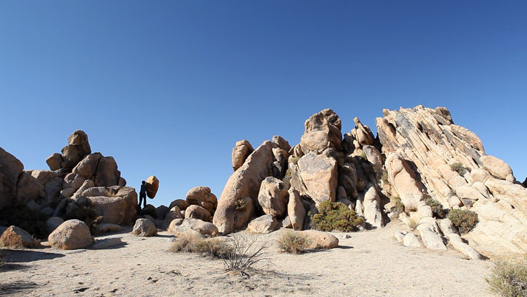
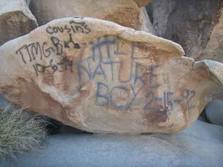
As ubiquitous as its namesake trees were the laminated warning signs recently posted around Joshua Tree: “Rattlesnake Canyon Temporarily Closed Due To Vandalism.” In January, a few markings appeared on the massive boulders that pile into the air like the feces of God’s dog. Those responsible posted their work online, others trekked to the same spot to add their graffiti, and by April, “to protect park resources from further damage,” (Broken Window theory maybe) an emergency closure was declared—meant to last a month but, as of this writing, still in effect. Caught and convicted, those responsible could face fines up to $5,000 and six months in jail. Penalties could be greater, park rangers said, if these vandals are convicted of defacing historic Native American sites, locations where nomadic Indians once left petroglyphs scribbled on these same rocks. I didn’t speculate whether they were “vandals” when I visited the National Park recently. All my wonder was, why two groups, separated by centuries, felt the need to impose their writings on these rocks?
The connection between the Caves of Lascaux—where ancient cultures drew animals deep inside crevices—and modern graffiti has been overly discussed. Banksy even has a piece of a cleaner painting over the glyphs. Joshua Tree still has areas where glyphs left by the original visitors are visible, black etchings in not-too-hidden locations. Did these Native Americans face similar condemnation? Did the Chief chastise them for defacing Nature? Glyphitti? Maybe names were represented by animals in both the society of Lascaux and the Morongo Valley, and the glyphs were actually tags. I’m not suggesting people be allowed to tag Joshua Tree, or maybe I am (in certain locations)—and this is coming from someone who fantasizes about visiting JT. I’m only trying to understand why both visitors to this area were moved to mark the desert landscape, and if it’s the same reason why the city of Twentynine Palms, topping the park, is known, because of their abundance, as an Oasis of Murals.
Joshua Tree makes me existential in ways Sartre and the jerk professor who taught me about Sartre never could. Surrounded by trees older than I’ll ever be and rocks I can’t even conceive the age of, questions of how I fit into the grand scheme of nature, and my own mortality—not only because I’m named Joshua—emerge. Anything left erodes. Perspective is shifted—even if you’re not 5’4”, you feel insignificant. Marking these rocks is a way of saying “I was here,” but also of mastering the terrain by—as the rangers rightly say—denigrating it. Just as signs make a journey less scary, familiar images make the massiveness of this inhospitable terrain less overwhelming. Even with the rock piles, Joshua Tree has a horizontal plane, and both graffitists chose, as did the muralists, tall vertical spaces to project their images. A way of disrupting the seemingly non-disruptible flow of desert time. When it came time to share what they had done, these recent glyph-makers chose a telling location: their Facebook Walls.
Above: Graffiti at Rattlesnake Canyon, Photo: Courtesy The National Park Service
-

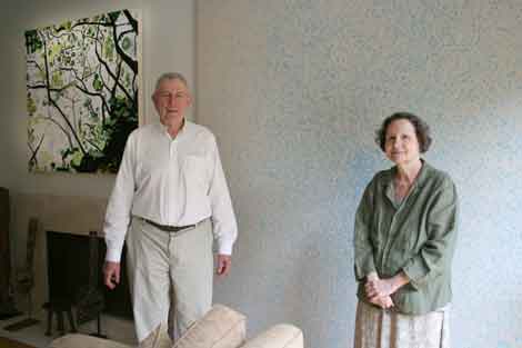
PRIVATE EYE: LA Collectors Herb & Lenore Schorr
The Schorrs’ collection and career as collectors are bifurcated by their move to LA in 1989; before that, they were New York collectors, enjoying Soho parties and the tutelage of intellectual dealers such as Leo Castelli, plus the availability of great contemporary paintings to look at in person, starting with Abstract Expressionism. What coheres the collection, since they became “veteran bi-coastal collectors of emerging art,” is their speciality. As Lenore puts it, “We collect young art.”
One of the reasons I wanted to talk to them about collecting was about LA art specifically, the other is their apparently intuitive connection with young artists. They are well known as early adopters of Jean-Michel Basquiat. In an essay included on the Basquiat estate’s website, writer Fred Hoffman quotes Lenore as saying, regarding Basquiat’s inclusion of a flashlight in Acque Pericolose, a painting they acquired from the artist soon after it was completed: “For Jean, everything of value was in the mind.” I reached the Schorr’s by phone as they had just returned to LA from a junket to New York.Artillery: How did you start collecting art?
Lenore Schorr: We started in the ’70s. My husband liked Jackson Pollock when he was just a kid in school, and that is really unusual, because for most people it’s an acquired taste. I was in love with van Gogh. Herb had to pull me up to the contemporary world of Abstract Expressionism—Pollock, de Kooning, Guston. We’re basically transplanted New Yorkers. We did not arrive in Los Angeles until 1989.
Herb Schorr: The only LA artist we had was Richard Diebenkorn.
LS: It was a crazy time, the time of AIDS. We were friends with Keith Haring; he died soon after he came out to visit in LA. We were close with Basquiat; he died of a drug overdose. We used to spend time with Andy Warhol, and he died—I guess it was ’87. So there were a lot of changes in the art scene at the end of the ’80s and early ’90s.And that’s when you moved. What was the first thing you ever bought together?
HS: Miro prints in the late ’60s. And then…
LS: We went to Picasso prints.
HS: In ’71, someone said, for the amount of money you’re paying for a Picasso print, you could buy a de Kooning painting. A small one.What’s the difference between being a New York collector and an LA collector?
HS: We were educated.
LS: We grew up in the Museum of Modern Art and all the New York museums.
HS: The Museum of Modern Art was our bible, in a way. I didn’t realize it until recently, but that’s sort of the track. LA has wonderful collections, but I think they were a little later. They had their own community of artists who came up in the ’70s, but there were no museums here besides MOCA or Pasadena, and my impression is they didn’t show much LA art.
LS: We didn’t buy the hot artist of the moment—Julian Schnabel and David Salle—so I guess that says something about following your own vision.
HS: No, it says a little more. We started before [there were] art advisors. So you had to learn the damn stuff yourself, have a very big library, which I would advise people to do. The other thing is, before we bought our first de Kooning, we went and looked at every de Kooning painting we could find in the New York museums, plus books. There used to be a healthy inverse. Going to LA galleries, I would buy something that was so desirable in New York, I couldn’t get it; here I could buy it. A lot of LA collectors would only buy in New York. I think that’s changed.
LS: LA has many more collectors now than it used to have. But the galleries still sell more out of town than to LA collectors.What else is in your collection?
HS: I’ll give you the California contingent. What we have in LA, almost all was bought out here. There’s Jonathan Polypchuk, if you know him, Monique Prieto, Laura Owens, Kevin Appel, Sanya Kantarovsky, a very young artist.What happened when you walked into the first show you saw of Basquiat’s?
LS: I saw a few pieces hanging in Annina Nosei’s gallery in SoHo, and we liked them a lot. She sent us downstairs to meet the artist.You got to see the basement?
HS: It had windows. It was not completely underground. We spent the afternoon looking at and picking out a picture. Annina said, ‘Well, that was the one I was gonna buy for myself!’
LS: We bought the painting and it was in the 1982 Documenta.What did you see in that work, the first time you saw it?
LS: Basquiat was part of the continuity of New York art. I could see de Kooning, Rauschenberg and Twombly.
HS: And Picasso.
LS: Everything that we had learned was there. And he had his own message. It was his life in New York, as a young black man. I thought it was pure magic. And he used color brilliantly, which I’m very sensitive to.What is the “signature” of your collection?
LS: It’s personal. It has a viewpoint. I need to see the artist on the canvas, a personal poetry. And one of the questions I ask is, How do I know it was made in 2012, or 2013? It has to bring something to the table, in a personal way.
HS: What I’m looking for is some sort of genius.
LS: And that’s hard to tell, at the time.You set the bar even higher, because you’re looking for marks of genius from young artists.
LS: That’s the challenge, the fun. We keep looking. We get involved with the artist. We like to see what the second show, the third show, looks like—to follow the development. Some get better and more exciting. But sometimes you see the work of a young artist, and it jumps at you. It’s a little different or a little personal, and I haven’t quite seen it before.
HS: If artists are really very good, genius maybe, you keep looking at it, you get something from each time you look at it. We don’t buy things and put it in the warehouse, let’s put it that way. -

Jim Skuldt
During a studio visit, Jim Skuldt points out that milk crates around the world don’t come in a single standard size and shape, as one might have thought. He points to a few of his that are filled and stacked beneath a large desk and loaded onto roadie carts that came from the purchase of Neil Diamond’s well-worn touring stage, which he has repurposed in the service of art. Such mundane things hold high status in Skuldt’s work. Why? As he eloquently explains, objects like milk crates are components of modular systems, which in turn function as key players in networks that increasingly grow more complex and integral to a globalized, 21st-century culture.
If you can imagine combining the diverse sensibilities of artists like Andrea Zittel, Martin Kersels, Mike Kelley and Bas Jan Ader, you might have a hint of Skuldt’s art. But nothing prepares like checking out his website (www.skuldt.com), where physical and mediated reality are intertwined. Creating and appropriating modular elements, spatial diagraming, mapping and graphing are all activities central to Skuldt’s art-making. He combines an engineer’s or city planner’s approach with the imagination of an adolescent to solve problem conditions in his own personal space or, alternatively, on the scale of the world. But whether the artist builds sculptures or performs for an audience in a gallery or through an online video, there’s an element of myth-making that makes the viewer unsure of what has in fact happened or is perhaps imagined.
In fact, Skuldt’s website may be a better indication of the artist’s psychology than seeing his studio or even his most recent exhibition. Past and current projects come across as a reflection of a seemingly schizophrenic and deeply subversive sensibility, with incredibly funny deadpan descriptions of project goals, obsessive plans and diagrams, internet-appropriated photographs for analogy, and reportorial-style videos with deliberately garbled voice-overs. The modular mapping of space is a constant thread in activities as diverse as documenting his neighbors’ littering habits via daily blog posts to a high-concept plan to outsmart and trap stray alley cats in need of neutering.
In a recent exhibition at the Armory Center in Pasadena, “Island Effects,” how land evolves over time is the ultimate subject of paintings, drawings, sculpture, and a video, with the tragi-comical implication that California will (again) be subsumed by ocean. Skuldt’s current and most ambitious project is his dream of traveling around the world literally as container cargo, within a customized apartment of his own design. The compartment would require refrigeration/heating, plumbing, and electricity, not to mention the logistics of arranging travel and—here’s the expensive part—the cranes to hoist his DIY hotel onto ships, planes, and other modes of transport.
Skuldt has been planning this shipping container project since 2007, and you can see representations of the idea in much of his art to date. Lately he has secured institutional support in order to make it happen within the next three years. As he documents his great journey, it will no doubt be impossible to separate out the factual accounts from myth. But then, who would want to?
-

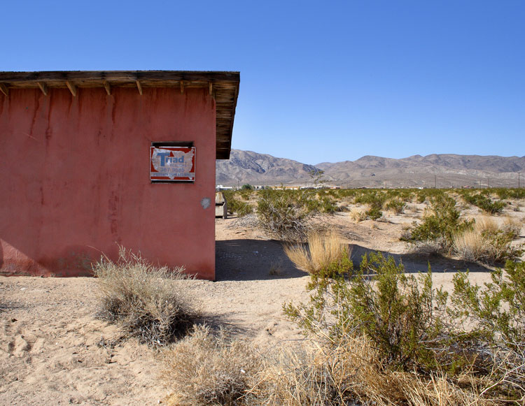
Kim Stringfellow
Kim Stringfellow’s photographs of derelict cabins that sit within the high-desert landscape of the Mojave provide a necessarily familiar entry point into “Jackrabbit Homestead: Tracing the Small Tract Act in the Southern California Landscape.” This, the artist’s most recent project, is a bit like an iceberg with mass mostly hidden beneath the ocean’s surface: the research, digital media, photographs and other materials in the show merely hint at the full scope of her project, which digs into regional history and social movements, requires attentive listening and reading, and invites viewers to directly experience the desert.
In spite of the somewhat virtual and expansive nature of the exhibit, the photographs at the Culver Center for the Arts are the visual core of “Jackrabbit,” and they elicit an immediate draw. These images of abandoned structures succumbing to the inescapable pressures of entropy and the relentless incursions of the harsh desert environment suggest a narrative of failed dreams, yet they also reflect the idealism and pioneer spirit of the American West that set homesteaders on their hopeful track.
The subject of Stringfellow’s project, the Small Tract Act of 1938, colloquially known as the Jackrabbit Homestead Act, created opportunities for individuals to homestead federal land. The 1938 law differed substantially from the Homestead Act of 1862 with respect to the size of the homestead. Whereas the 1862 law provided for homesteads of 160 acres, Jackrabbit homesteads were only five acres. Most of the Jackrabbit homesteads were located in Southern California, concentrated in the Mojave Desert around the Morongo Valley, Wonder Valley and outside of Twentynine Palms, and were not especially suitable for cultivation due to the lack of water.
Documenting the Jackrabbit Homestead Act, a display case houses copies of Desert Magazine’s six-part series from July–December, 1950, “Diary of a Jackrabbit Homesteader,” along with a how-to article from Desert Magazine offering tips to would-be homesteaders; a copy of Five Acres of Heaven, a 1955 vanity publication showcasing the skills of a land locator for hire; and a handful of photographs of homesteaders on their claims. Stringfellow’s book, Jackrabbit Homestead, is available on a wall-mounted pedestal next to an iPod-listening station loaded with her six-part audio tour. And paired with each of Stringfellow’s 18 photos is a facsimile of the land patent—the homesteader’s equivalent of a deed of trust.
As a photographer, Stringfellow divides her attention between exteriors, which situate the cabins within the landscape, and interiors that personalize the sense of decay. Signs of occupancy, and the residue left after the owners’ departure, offer a more intricate human narrative than the iconic building-in-landscape. The exteriors find a visual precedent in John Divola’s “Isolated Houses” series (1995–98), in which Divola photographed dwellings in remote locations in roughly the same geographic location—titled by their latitude and longitude. While Divola describes “Isolated Houses” as a sign of man in the landscape, Stringfellow’s homestead exteriors are a sign of man retreating from the landscape and the indicators of his presence being re-absorbed by the desert.
Stringfellow’s photos, like Divola’s, reveal the vastness of the desert, the isolation of these modest structures and their insignificance in scale. The small size of the homestead cabins becomes clear from the Culver Center installation. The layout of a popular model—the Nugget Cabin—offered by a local construction company and illustrated on the gallery floor in black adhesive, reveals just how tight 400 square feet can be.
Stringfellow’s website includes the audio tour as a download and a companion piece for those who wish to see the remaining cabins in the open desert. The site also provides GPS coordinates of known cabins uploaded to Google Earth, and Stringfellow encourages others to upload the locations of cabins not currently documented. The inevitable demise of the remaining abandoned homestead cabins assures an end to the interactive portion of the project, which is one of the more interesting aspects of “Jackrabbit.”
Stringfellow’s project is compelling because it does not simply address questions of beauty, or why people find the desert alluring; rather, she traces people’s dreams and the tenuous relationship humans have with this extreme environment. It is sobering to note that Los Angeles is a similarly arid, (though slightly less so) region that also depends on imported water for its survival. Stringfellow’s project surveys the determination required to flourish. Her photographs, which engage in a discourse with highly romanticized images of human structures in the landscape, are both elegiac and optimistic.
-

Farrah Karapetian
It’s been a productive year for Farrah Karapetian, a participant in “The Black Mirror” group show at the Diane Rosenstein Gallery, L.A. Louver’s 2013 “Rogue Wave” survey, and the 2013 California-Pacific Triennial at the Orange County Museum of Art. She has also been writing a Tumblr blog, Housing Projects, concerning the house “in and as contemporary art.” Although the blog at first seems not so different from similar online journals, its relation to her art practice is clarified by her first pre-photogram work and her most recent work.
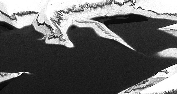
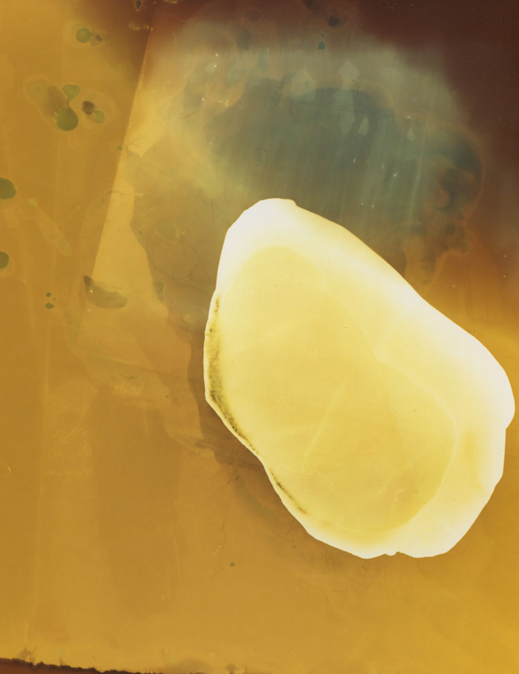
It was her work documenting scarred and ruined architecture in Kosovo that ultimately led to her abandonment of conventional photography. Yet there is an uncanny continuity between these initial photographic essays and her most recent work, which are nothing less than photogram constructions of ruins. While nothing might seem more distanced from the implied cumulative marking, decay, and (conceivably) violence of a ruin, than photograms of melting ice, it might be recalled that the inspiration for Karapetian’s 2012 “Accessory to Protest” show was nothing more than a brochure that advised protesters of the “Eight Items of Necessary Clothing and Accessories” they might need in Cairo’s Tahrir Square.
Karapetian has always been preoccupied with the formal challenges involved in transposing the impact of a documented actuality to the viewer’s visual and physical encounter, as well as the transparency of her own process. There are also, latently, issues of instrumentality and indexicality. Making reference to a large installation photogram (“Riot Police” (2011) from her 2012 Roberts & Tilton show, “Representation3”), Karapetian commented, “[if you] stand in front of these riot police, you understand them physically.”
Melting ice takes the kinds of elisions between pictorial and sculptural space extensively explored in her prior work to still further levels of abstraction and ambiguity— a sculptural negative that might transition dimensionally from solid to gas, leaving almost infinitely varied random markings. But Karapetian emphasizes above all the temporal dimension. “It’s about time and how we remember things…” Addressing the abstraction of the OCMA “ruin,” “Rock, Paper, Scissors,” she observed, “There’s a built-in distance between the referent and the image. It’s supposed to look like a rock, but it’s ice. It’s not a photograph of a rock, but it’s acting like it is; but it’s also built like a puzzle”
There is a tension here between the randomness of the markings made by the melting ice in the photograms and the kinds of environmental, atmospheric and human markings they evoke, and the deliberation with which the 900 individual amber/gold photogram “rocks” are built up around an aperture in the OCMA galleries through which the viewers pass. It’s as if they were a recapitulation of a ruin yet to be discovered—or yet to come. Here, the architectural aspect of her work elides still further into the domain of performance; and the viewer is placed in the position of acting out a memory s/he can only begin to apprehend.
-

Iva Gueorguieva
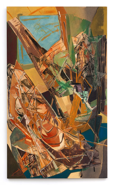
The title of Iva Gueorguieva’s show “Spill/Frame” seemed almost a naked admission of its strategies and ambition with a concomitant risk of crashing, careening failure. In almost all of the works on view there was both a willful, self-imposed notion of the edge or, especially as elaborated in the relief-constructions, the frame, the box, the armature, machinery, as well as the sense of a flow, falling away or threatened breach of that frame or edge.
In the context of this expansive show, the constructions (three in all) seemed compressed vessels of the exploded array of objects, incidents and machinery—”real life” referents—”framed” by the collage-paintings (six, including one from 2011, the largest on linen or canvas, with one on paper). What in its totality might appear a galvanic fury of lines, notional designs or geometric configurations, revealed a precise choreography of separately painted collaged segments of canvas or linen, slotted into the “machinery.” There should be no confusing it with gestural abstraction. This is really a revival of Cubist (or even Futurist) conventions by other means to other ends—those ends having less to do with illusionistic space than with illusionistic time.
A subject like Man Hunt (2013) might be expected to spill out of its frame—the painting is by far the largest (110 x 180 inches) of the works in the show; but in fact, it’s as controlled as the smallest, Shadow Blister (2013), the most “Cubist” in its neutral palette, which has an almost poetic elegance—a Cornell “slot machine” construction filtered through Braque. In Man Hunt, as elsewhere in the show, Gueorguieva’s dynamic palette energizes the triptych; its modulation between a slightly acid yellow-green “zone” through a dense varicolored mid-section to a darker, steel-blue dominated section almost demarcate its segments. But the “machinery” of the painting is far more complex. Instead, structural elements, screens, cabling and circuitry—industrial flotsam—eddy and arc around a black vortex well off-center.
The title of Seated Woman: 1974 (2013) itself underscored the sense of reaching back in time. The entire composition is a kind of reversal (again Gueorguieva’s palette is expressive)—with a “window” of blue in the upper left framing brown extensions (architectural or anatomical?) that descend obliquely into a larger cascade. The energy of the composition comes in downward thrusts—oblique strokes in collaged acrylic and oil-stick, a shower of brown lines, two-by-fours, jagged boxy elements in orange and putty or burnt brown and sienna amphorae—all collapsing into a blue void—an abstracted defenestration or a private sea—as if to penetrate the “mechanics” of time and movement.
Shelter (2012) was the most “totemic” of the constructions. On a rectangular cubic construction (like the frame of an old electric sign), the artist mounted pieces of steel industrial venting (or possibly an old Jeep grille) cut like wings, amid lithographed and printed fabric that abstractly suggested architectural elements—girders, crossbars, cranes, balusters and rigging. Panels of lozenged blue fabric curled toward the rear on parabolic tubing—wing-like extensions into a dubiously sheltering sky.
-

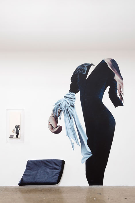
Bettina Hubby
Fragmented and contorted bodies in motion span the gallery as if onstage in Bettina Hubby’s exhibition “Pretty Limber.” Large-scale figures made of vinyl decals float across the space, wrapping around corners and emerging from the floor. Composited from numerous photographic sources, the entire installation feels as if one has entered a John Baldessari image. But instead of a background with the people removed, in Hubby’s work the figures are powerfully present though confined by the white walls around them, which become charged negative spaces.
Each piece is presented in two sizes; one large, shown as cutouts that project slightly from or are adhered directly to the wall, and the other in small original collages sandwiched between two pieces of plexiglas. The “who” or the “what” (including where her source materials came from) is less important than the formal relationships between the figures and the space they occupy, be it wall or paper. The large wall-mounted works overshadow the small collages, which feel like obvious referents. The collages are most successful as pages in the book Uniforms, created in conjunction with the exhibition.
Culled from myriad printed sources, Hubby combines fragments of body parts, fabric, clothing and animals to create figures whose heads, in the Dada/Surrealist tradition, are often substituted by something incongruous or missing entirely. In Load Bearing (2013) a headless male figure in a dress shirt, tie and slacks arches to the right, holding the shoes of another similarly dressed man whose body defies gravity and extends horizontally across the wall into a corner. His face is also absent, though suggested, framed by a giant woman’s red wig and a black cowboy boot. The arms of the second figure, protruding from the corner onto the next wall, meld into those of a third man who is even more drastically fragmented.
The larger-than-life size woman in She can bring home the bacon (2013) rises from the floor. Dressed in a black V-neck gown, it is unclear whether she is a superhero or a corporate executive, as her boxing glove-clad arm is relaxed rather than active. Ready at rest (2013) depicts the rear of an ambiguously gendered figure leaning forward as if part of a football huddle, hands resting on his/her buttocks. As Hubby’s montaged figures float and tumble across the wall, male and female body parts fuse to become simultaneously aggressive, standoffish and suggestive. In the back room of the gallery, she has created a boudoir and transferred her imagery onto pillows and a bedspread, emphasizing rather than masking their sexual content.
If the disembodied men and women seem complacent in, rather than critical of their situations, it speaks to the proliferation of mash-ups and remixing in contemporary culture. Hubby’s imagery appears to come from fashion magazines while her strategy takes its cues from art history. She has created an immersive installation that is captivating because of her use of the entire gallery space, yet the individual pieces (both small and large) offer little more than formal exploration of the coupling of disparate parts.
-

Alex Slade
Through a process of intellectual, historical and geographic research, Alex Slade makes evident, and critiques thereby, the social forces that shape the American landscape. Landscape-oriented American photographers have been preoccupied with this issue since the 1970s, but have manifested the message poetically and metaphorically, as in most work associated with the New Topographics. Slade, by contrast, takes on a didactic air in his latest exhibition “What City Pattern?”—without subordinating aesthetic considerations to social ones.
Slade seeks to eschew as much romantic response as he can in his photographs, and certainly by including documents and sculpture-like elements in his exhibitions he presents evidence of ideals betrayed, sidelined, or co-opted. Slade does so with a deadpan worthy of New Topographics photographers such as Lewis Baltz or Stephen Shore, but also with a critical eye that clearly takes up the deconstructive outlook of a neo-social photographer like the late Allan Sekula. As much as these predecessors, Slade transcends the self-effacing, reportorial offhandedness and pretense at objectivity that make a virtual cliché of photo-journalism. He relies instead on the opposite cliché, making sure to make art of his imagery. This sets the realities of his land- and cityscapes, brimming with social implication, into starker contrast.
Slade’s landscapes, whether Midwest farmland or California desert, are gloriously bleak vistas, vast expanses visually distinguished as much by manmade as by natural structures. In these, Slade shows his New Topographic roots, but consciously admits the fact that he’s at least a generation behind: whereas the topographies of a Robert Adams anticipate a taming and degradation of nature, Slade’s show that the process has been pretty much completed. The results are neutralized, bland, rural non-sites much more akin to early Robert Smithson than to latter-day Edmund Bortynsky. Slade’s urban/suburban views conjure Smithson even more emphatically, brimming as they are with city centers compromised by outsize postwar buildings, which now have slipped into disuse and decay. Not a few of these buildings are themselves architecturally notable, for better or worse; and when he gets close to them, at least, Slade cherishes their details and their design aspects, à la Julius Shulman. Even there, however, Slade reveals corrosive forces at work—at work against each other, that is, architectural pretense coming up against the ravages of climate and vandalism.
In defining what Slade does, any number of older photographers can be cited, not to rely on them simply as stylistic tropes, but to place Slade squarely in a North American tradition of landscape photography, one that (as frequently done by Smithson) encompasses conceptual and land-art investigation. By including in his exhibition objects that exemplify the techniques of mid-century design and periodicals that promulgated these techniques and the (post-Bauhaus) attitudes behind them, Slade further conflates issues and practices relevant to the social landscape of postwar America. He thus underscores the Ozymandian tone of his photographs, articulating the prime postmodern plaint against modernism: no matter how well designed, the road to hell is paved with good intentions.
-

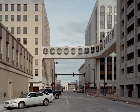
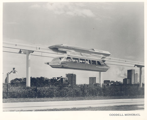
Never Built Los Angeles
The “Never Built” exhibition at the Architecture and Design (A+D) Museum on Wilshire unearths gems from Southern California’s architectural history. The idea originated in 2009, and its extensive research and carefully curated selection by Greg Goldin and Sam Lubell show a Los Angeles of grand gestures in public spaces, landscapes and landmarks. The accompanying publication further documents these projects and many others unable to fit on the walls.
This exhibition is attractive because it shows well-known California architects like Frank Lloyd Wright, Rudolph Schindler, Lloyd Wright, and John Lautner who have been applauded for their built residential work; here we see how they envisioned civic space and commercial buildings. Schindler’s unbuilt gas stations (1933) are a zeitgeist example of modernism—in other words, that once you were designing gas stations, you had “made it” as a modern architect. (FLLW and Mies Van der Rohe, for example, have both built stations.) Archival drawings of Lloyd Wright’s civic center master plan with proposed monolithic structures, transportation scheme and pedestrian corridors were animated in a fly-by video. Lautner’s Griffith Park Nature Center (1972-74) with winged rooflines reach out to soar, yet, budget cuts caused a bland building to be constructed in its place.
Why many of the projects weren’t built is explained with each placard next to the models and renderings. From the Green Blade Tower (2008) by Paris architect Jean Nouvel, where developers paid too much for the land and had to declare bankruptcy, to the simplest, but most vexing of reasons—the design was rejected, as in the case with FLLW’s Doheny Ranch. “Never Built” also tells the story of Rem Koolhaas’ Office for Metropolitan Architecture (OMA) and its design for LACMA in 2001. OMA proposed tearing down the old and rebuilding with an extensive translucent roof built to connect new spaces. Plans were set in motion but they couldn’t get the support of private backers. This provided a clear learning lesson to the institution, which is now trying to raise funds and support for another connective scheme designed by Swiss architect Peter Zumthor.
This exhibit complements the current increased interest both politically and publicly to demand “altruistic” public amenities and rethink the city’s corridors, buildings and civic spaces. There is a need for architectural solutions that merge the history of iconographic architecture with civic excellence. LA’s legacy may be the mastering of movement and the car, but the impact of its designers lay in their visionary ideas.
The “Never Built” exhibition reminds us that this is still a city of visionaries who are continually thinking of the human experience. While there is no direction to what should or shouldn’t have been built (every person is of their own opinion), it is a welcome exhibit of an impressive selection of projects previously hidden. It also exposes, perhaps, a flaw in the system. In Los Angeles there is no lack of ideas, but a scarcity of funding and influence to make these projects happen. Dreams are what made this city, and Angelenos have the power to demand them to be built.
-

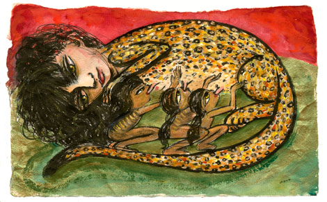
Irene Hardwicke Olivieri
In Irene Hardwicke Olivieri’s Subterranean Family (2013), a large woman crouches, her body sinking into the earth, weighed down by a patchwork of introspective self-images. One curls in a sphinx-like pose, her feline tail circling behind her back, as she clutches a stack of mail to her side. Below her, another doppelganger huddles, fetal, her body striped and furred, as miniature figures suckle at her chest. A tall, striding woman boasts long legs in explorer boots, and a red suitcase labeled “Misterios de Familia” (family mysteries) in her left hand. A fourth woman puts her arm around an owl and teaches it to read. Skeletons rummage through a closet. And in the lower right-hand corner, a nude figure reaches down to outline roots with her paintbrush. A tree rises from her mark, winding above the horizon to shelter the larger crouching woman.
A casual viewer might think the drawings, paintings and bone constructions resemble fairy tale illustrations, but Olivieri is not dealing with any ordinary fairy tales. Girls suckle from the teats of large wild cats, and in turn offer their breasts to lion cubs. The god of nature is a male giant whose torso is tightly enmeshed in verdant foliage. Little girls carry the entire imaginings of a society in their Rapunzel-like hair. The loss of species is mourned, and the discovery of new ones celebrated. A woman whose face, hair and body are composed of tiny bird bones kneels on a rusted dustpan and holds up the sky.
Indeed, Olivieri’s depiction of the female-nature connection resonates in intriguing transgressive ways. Women and animals are both on the bottom of historic hierarchies (men/women, human/animal)—which means they both occupy the territory of the Bataille abject. And yet both are needed desperately if we are to save this planet from total degradation.
In the intriguingly surreal content, the autobiographical focus (all of these dark-haired beauties resemble the artist herself), and the fine, precise drawing, Olivieri’s work recalls the work of Spanish Surrealist Remedios Varo (1908-1963). There are specific parallels: Olivieri’s image of a woman painting a tree into existence evokes Varo’s Creation of the Birds from 1957; Olivieri’s repeated use of feline imagery echoes Varo’s, especially in paintings like Paraiso de los gatos from 1955. But beyond that, Olivieri—like Varo—celebrates woman’s creativity, woman’s oneness with nature, and the ever-valuable strategy of knowing and imagining the world by knowing and imagining the self.
Olivieri’s Retreat (2013) depicts a woman standing in a cage of bound branches. She is nude except for a tool belt crammed not with hammers or wrenches but with drawing implements. More paint brushes and pencils, these wildly oversized, crowd around her, similarly imprisoned in the leaf-dense enclosure. The intense green of the sky promises fertility rather than threat. Is she trapped by nature? By her creative efforts?
-

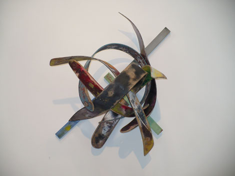
Duane Paul
“Speaking Tongues (The material of communication)” introduces Duane Paul’s considerable talent and ability in the artist’s first solo exhibition. The show’s 12 works (all 2013) are divided into three sections or “dialect clusters:” six works on paper, two free-standing sculptures and four wall reliefs. The dynamic exchange of visual dialogue among and between clusters is both provocative and revealing, centering on issues of texture, shape, size, color, line and volume.
Perhaps the works on paper could have been larger so that one might better appreciate their dense and richly worked surface textures. Their success is owed in part to 2-ply construction, revealing pockets of translucency that act as metaphors for unresolved fragments of childhood memories, juxtaposed with adult reflections, lessons and experiences. Paul introduces amoeba-like forms to these compositions, as visual anchors, focal points and enigmatic presences. The issues are of both a formal and personal nature.
Repetition signifies process, rhythm and progress. In Paul’s hands repetition and rhythm also become the tools for gathering a network of unresolved personal themes and challenges, offered up for resolution and/or transformation as revealed in the artist’s statement.
By repeatedly building up his sculpture’s surfaces, he employs a culture of “making and doing,” where the construction of the piece is as important as the final work itself. The repetitive process yields a form that physically resembles a thin, narrow seedpod, a rattle or elongated tongue. Their curvature is configured into a modified boomerang, and their layered construction mode is designed to expose layers of material information—levels of consciousness (similar to Mark Bradford’s “layered cutaways”), which eventually become visually unfamiliar and obscure. This is particularly so in Paul’s totemic piece; one example is a broken saddle in Humpty Dumpty’s Saddle Broke, which coincidently resembles an African headrest.
The mixed media wall reliefs exhibit Paul’s greatest strength as a painter and sculptor. Quite Rebellious, Stares Intently and Daddy Blows Smoke are two examples. Each piece offers a woven structure that allows for open-ended readings, of either coming into being as constructed (woven) or deconstructed (unwoven). Together the works balance motion and stillness in the most eloquent terms. They share the rhythmic turns and leaps found in Al Loving’s later works incorporating french curves and spirals. The reliefs’ impeccable workmanship recall the structured weavings of Martin Puryear’s craftsmen minimalist sculptures, with more painterly surface treatments, offering forms that are intentionally left ambiguous to the eye. As one observer noted, their polychromed surfaces echo the palette of Sam Gilliam’s early draped paintings. Tom Holland’s fiberglass 3-D paintings with physical strips attached to the painting’s surface also come to mind as a reference for Paul’s work. The tension created by the curvature in slats (made from a combination of various laminated materials, following the artist’s personal formulas) rivals the level of tension/drama found in Loren Madsen’s early “bend” pieces, created and fashioned from redwood slat and/or board back in the ’70s.
Paul’s exhibit is the result of the artist’s thinking-out-loud, in a much broader historical context that goes beyond generations, creating the profound conversation between the works engaged in “Speaking Tongues.”