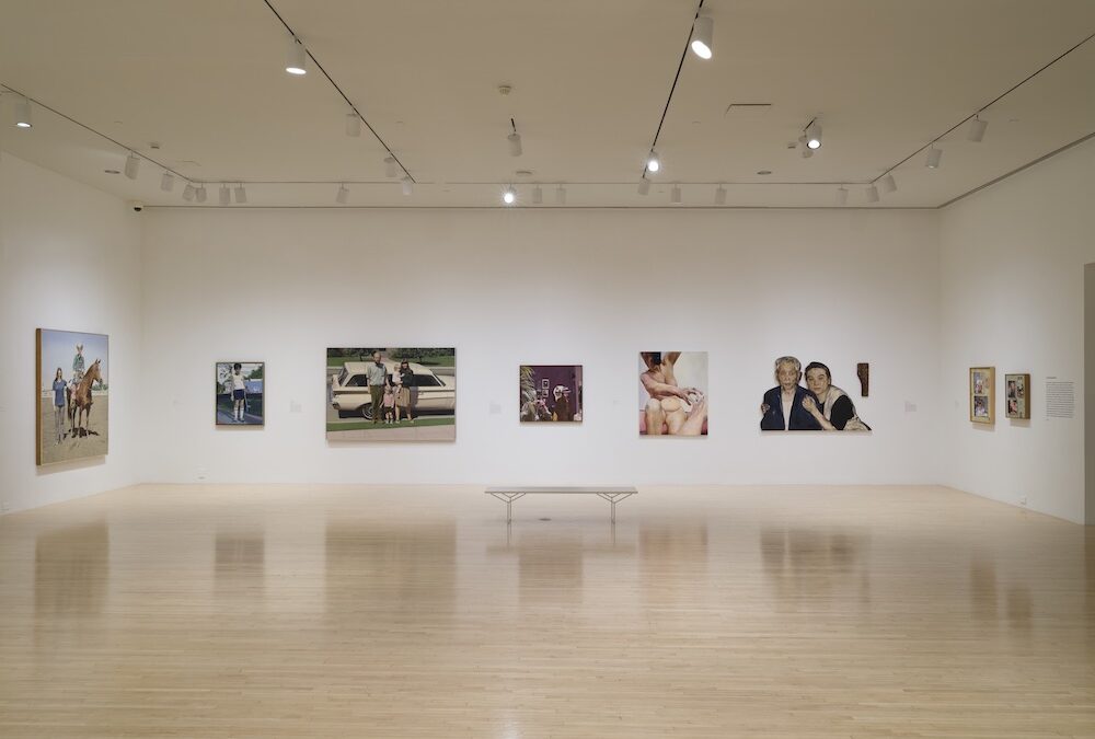
Your cart is currently empty!
Tag: MOCA
-
MOCA takes a dump, bigly
There’s a new smell in town, and the best way to find the source is by following your nose down Grand Avenue to MOCA. Yeah, I thought it was coming from the room of stale, day-old Rothkos too, but it doesn’t take long to figure out that the odor comes from the R.M. Quaytman exhibition down the hall; don’t stop at the toilets, you may want some relief while in front of one of the “paintings”. Or one of the 22 panels that make up the 100-ft. long show stopper, “Morning, 4.545%, Chapter 30”.
Morning, 4.545%, Chapter 30 To me, this piece has no reason to exist, and it’s possible that Quaytman felt the same way since she resorts to the usual trick that “idea-lite” artists employ to give their work the semblance of inspiration. Buried in this almost unending Post-Modernist filigree of 90º angles is a copy of work by, you guessed it, another artist. Sneaky, right? Well, not entirely, since Quaytman gives credit where credit is due, far across the room in a vitrine. There one finds a copy, or maybe it’s the real thing, who cares really, of a Mark Antonio Raimondi engraving called The Dream of Raphael, from 1507. Whoa, talk about a work in the public domain! How about we keep this useless conglomeration of nothingness as far as possible from the public domain and put it in storage someplace? Out of sight, out of her mind… Gee, wouldn’t that be nice? But there’s still a few horrors up the old studio assistant’s sleeve. For reasons I couldn’t be bothered to determine, there is a scaled-up version of a small article in the 1939-1940 New York World’s Fair newspaper, the World’s Fair Daily. Yes, this tiny article has been reproduced in oil, silkscreen ink and gesso, and, per the provided list of artworks, it took R.H. a minimum of two years to make it, from 2001 to 2003.
The Sun But wait! Super bitchen! There’s art in the next room that took only one year to make, the epic 2011 piece, “I Modi, Chapter 22”! Which is really cool because it makes you think what MOCA would look like if it was just one big ass, expensive thrift store. Yes, the main component is leaning against a piece of Ikea inspired furniture, has a smaller piece of art next to it and some glittery, beige-y panels haphazardly placed on top of the whole, waddaya call this, assemblage? Installation component? Sculpture? I watched people’s reactions to whatever it is and only one person stopped to look closer, which made me so excited that I went over to breathe in the air of an art experience only to see that they were texting a distant galaxy on their phone.
I Modi, Chapter 22 Well, Joseph Goebbels famously said, “If you tell a lie big enough… people will eventually come to believe it.” So, when you consider whether the massive “Morning, 4.545%, Chapter 30” is art or not, just think about who’s being lied to, bigly…
-
‘Are the stars out tonight?’ Harmonic convergence for a new art season
The beginning of another arts and culture season also marks a point where we really start to feel the impact of everything we’ve been experiencing over the preceding orbital/calendar year and start to take its measure. Events move swiftly; you can feel as if you’re stepping onto a speeding train just leaving your apartment; and to miss an event in one’s agenda, or just a day’s news can make you feel as if you’ve missed a station. Our connection to the everyday realities can seem so fragile, so contingent; yet that connection, those realities are themselves being continuously redefined and renegotiated. We need to make course adjustments, reorient the compass, re-navigate. We’re looking forward to the new – thrilled by the possibility of fresh ideas, sensations, beauties (and maybe a little desperate?); taking charge of the negotiations; but it helps to make sense of where we’ve been. (Then again – do we ever really know?)
This year, the best of the first major fall museum exhibitions and gallery solo shows collide, converge, fuse and spark to give us a hint of resonance, new direction, fresh looks at things we might have missed or overlooked, as well as those elements of course correction and perspective that always need to be refreshed.
We get more than a hint of resonance with Doug Aitken’s mid-career retrospective, Electric Earth, which (with MOCA Director, Philippe Vergne’s unstinting and hands-on commitment) practically makes MOCA’s Geffen Contemporary over into a resonant vessel of sight and sound. For Aitken’s show, the Geffen – which has never looked better – is splayed out into an open maze of almost 20 years of Aitken’s architectural/sculptural/experiential multi-screen installations, along with various photographs, lightboxes, collages, sculptures or other objects that offer a kind of emblematic road map to Aitken’s process, a connective tissue that invite the viewer to ‘walk this way.’ Vergne has reconfigured and plotted out the space to parallel Aitken’s process, with its infinite expansion or compression of the moment, convergence of microcosm and macrocosm, and sense of harmonic decay.
I thought the passage in Vergne’s catalogue commentary, expanding on Aitken’s [film] editorial process, summed up both his own installation strategy and Aitken’s fundamental approach: “ … a visual and temporal space conceived to suggest the expectation of narrative order, a tension toward ‘what comes next,’ a dynamic that is endlessly pointing forward giving rise to an open form – improvised and interfaced with thematic relations between sounds and images that strategically dissolve and reconstitute a visual, time-based, and harmonic landscape. This sense of pacing, of interrupted moments, of shifting and floating is simultaneously a summary of a narrative and the negation of that narrative.”
This is the museum exhibition as immersive experience; and the viewer floats away from it ready for pretty much anything that follows. Assuming you’re not spent from the experience (and pace yourself – you may need more than one), you might segue over to Hauser, Wirth & Schimmel for a museum-level exhibition of the work of the Austrian artist, Maria Lassnig, surveying in 31 paintings almost the entire span of her long and diverse career – a kind of prismatic kernel of the major retrospective of her work that appeared at the Tate Liverpool this summer and will soon travel.
Maria Lassnig is quite simply the greatest painter you’ve never heard of – except you actually may have, in recent years anyway, only to … well, … push her off the radar again. Lassnig finally began to achieve the recognition she deserved in the last quarter of her career; but her growing audience had really only the barest clue of her daunting scope. The Tate curators – and here in L.A., Lassnig Foundation Chairman, Peter Pakesch and our own Paul Schimmel – have done us all the favor of seizing upon the breadth of this extraordinary career and unfolding its varied objectives and mechanisms of inquiry, its approaches to media, its psychology and overall consciousness, sheer mystery and abundant humanity, into a kind of compact narrative of the artist’s life that, spread out through only five beautiful galleries, is quietly breathtaking.
Grounded in a figurative tradition informed by expressionism, Lassnig veered early into abstraction of varying degrees of painterliness and coolness, but always true to herself and her own artistic investigative spirit. The bodily, performative aspect of her gestural style turned her toward a more distinctly psychological, introspective and body-conscious approach, and her work in the 1960s and 1970s took on a more self-conscious, even surreal cast. Her later work, though cooler in palette and approach, partook of even more intimate, diaristic detail. Her subject is, above all else, consciousness itself – and she is true to it to the end.
Helen Frankenthaler, “Brother Angel” (1983), acrylic on canvas, courtesy Gagosian Gallery Across town, there are two other museum quality surveys – and no less breathtaking. The Gagosian Gallery’s 25 year survey of Helen Frankenthaler’s painting, Line Into Color, Color Into Line, clarifies (with some curatorial help from Yale art historian Carol Armstrong and the eminent writer and curator, John Elderfield) the complex genesis and structural sophistication of work that is occasionally viewed through an over-simplistic ‘color field’ prism. The 18 canvases that span the years 1962 to 1987 demonstrate a complex and evolving dialogue, not merely of drawing/line/design and color in the classic sense, but formal conundrums of the line in two-dimensional color-zoned space; line and/or color and edge; mark, subject and (colored) ground; and depiction and mark-making generally. They’re also, quite simply, gorgeous paintings; and if you’re heading to Gagosian to ‘educate the eye,’ be assured that your eyes will also be satiated with pleasure.
John Altoon, from the Ocean Park series You may experience a sensation of time warp or displacement at the Kohn Gallery’s exhibition of painting and drawing by John Altoon (but then, hey – after the Aitken show, you’re ready for it, right?). ‘Didn’t I just…?’ Sort of – especially if you were at the Altoon retrospective at LACMA in 2014. But rest assured, you’re at Kohn – it’s just that good. Just about everything you would want from an Altoon survey is here, from the more densely abstract paintings (some from the 1950s, some from the 1960s); the commercial pastiches of the early 1960s; the slightly surreal and brilliant color abstractions of the 1960s; the Ocean Park series; those tussles between the abstract and figural that occur throughout; to (finally!) the virtuoso erotic and quasi-sexual farces and fabliaux executed well into the late 1960s. It’s all here – so just go crazy and try not to spend all your money. It’s a commercial gallery, not LACMA, goddamnit!
Okay – so naturally, you’re now thinking of heading to LACMA – and why not? It’s not too far and there two more superb shows that demand your attention: The Serial Impulse at Gemini G.E.L., a 50th anniversary survey, an elegant and compact survey of the classic best of Gemini’s groundbreaking editions; and an absolutely sublime show of 17th century Chinese landscape painting, Alternative Dreams: 17th –Century Chinese Paintings from the Tsao Family Collection.
And now this ‘brief list’ is getting out of hand, so before I break off (to pick up again before the week-end), let me just give you a quick list of the remaining essential shows so far:
Henry Taylor, Blum & Poe, Culver City
Tom Knechtel: Astrolabe, Marc Selwyn Fine Art, Beverly Hills
Tom Knechtel “The Reader of His Own Self” (do you get the impression we might be going somewhere with this? See, Artillery’s “Pick of the Week” for this week) – with
Mira Schor: “Power” Frieze and War Frieze (1991-94), CB1 Gallery, downtown Los Angeles
Edith Beaucage, Luis de Jesus, Culver City
Ry Rocklen, Honor Fraser, Culver City
Rodney McMillian, Susanne Vielmetter Los Angeles Projects, Culver City
Jun Kaneko: Mirage, Edward Cella Art & Architecture, Culver City
And we haven’t even talked about music or theatre (or opera) or movies – or fashion. But we will. Before I go, here’s one thing that’s definitively out of fashion: the Peter Zumthor ‘Gumby’ blob that wants to eat Wilshire Boulevard. Do we have to resurrect Godzilla and Mothra to dispatch this thing? Calling Roger Corman….
Tom Knechtel, “Avery (2)” (2015), ink on paper, courtesy Marc Selwyn Fine Art -
Mélancolie to Exhilaration from Studio to Street
There was astonishing buzz around Philippe Quesne’s La Mélancolie des Dragons at REDCAT last Wednesday night; and as a sucker for avant-garde theatre, I simply had to be there, heat or no heat. I felt cooler just looking at the stage set, which resembled a forest clearing under the first snow of winter. As the audience took its seats, you could glimpse four of the actors already in place in a cramped four-seater later identified a VW Rabbit parked to one side of the clearing. When the lights finally went down, the situation became clear – at least to those of us who lived through the 1970s and have some memory of those drug-hazy days that would continue for some of us into the 1980s. Four retro-rocking dudes (think metal, hair bands, etc.) roll into a wood, stoned out of their minds, almost unaware that their car has died beneath them. They drink beers and pass around bags of chips while listening to vintage 1980s rock until the fog starts to lift. As they emerge from the car and we see them in their hair-band glory, we also see that what at first looks like a flat screen in the middle of the stage is actually a trailer hitched to the car. As they finally begin to take stock of their predicament (sobriety will do that to you), a woman in a purple down jacket seemingly stumbles onto this scene, though eventually greeted by the hair-and-metal guys like a lost relative or old friend.
With their angel’s arrival (she’s a mechanic, too … sort of…), tricks and hi-jinks ensue – plumes of smoke (from beneath the car hood), disappearing and reappearing bodies, bubble machines, lit-up screen/trailer (with big-hair wigs), and—oh yes—inflatables (the dragons?). The inflatables eventually multiply to fill the stage; and maybe that’s a good thing, because nothing else does. Quesne’s background is in set design, from which he went on to found the theatre/performance company, Vivarium Studio, which produced the thing. It might be said he brought the studio to the stage at REDCAT; what he seemed to have left behind was the actual theatre and performance. The gimmickery—deliberately lame—was beside the point. There was no magic here. Not that I’m necessarily expecting drama, suspense, pathos, catharsis, comedy, satire, or even wit (or fill-in-the-blanks); but we should be able to expect something to happen: an event, a transformation, a change, a transaction beyond the ticket-tear at the turnstile. There’s more dramatic tension in John Cage’s 4’33”.
I liked that the Los Angeles Times’ theatre critic, Charles McNulty got the intended ‘amusement park’ aspect of the staging; but otherwise I had to wonder if we had even seen the same show. Frankly I think he was snowed. Artaud references? Give me a break – it merely underscored the pretentiousness of the whole business. “The courtesy depicted in La Mélancolie des Dragons makes it awkward to complain of dullness…,” he demurs. I have no such compunction. Dullness belongs on no stage whatsoever.
“The play’s the thing,” as Shakespeare (among others) put it; but it doesn’t have to be a ‘big’ thing. It doesn’t even require a stage. It can happen in the blink of an eye; it can happen on the street. You can stumble over or past it. It either registers or it doesn’t; but if it does, the action begins. The rest of the line is important, too: “ … [w]herein I’ll catch the conscience of the king.” On the street it operates at both levels: the state and its anonymous citizens, the passers-by. It’s an incitement to action, or simply a statement, but implicitly political either way. I’m talking about street art here – something that’s been with us forever, but taken on new importance since Haring and Basquiat transitioned from streets and subways to fine art main stages. In recent decades, its legitimation has expanded (not unlike fashion design) from private collectors and galleries into the divergent (but occasionally overlapping) domains of commerce and high culture (e.g., skateboard gear; museum shows like MOCA’s own Art in the Streets a few years ago). Many of these artists have extensive studio practices; the most successful are major enterprises; a few of them are art stars in their own right.
A few of those stars will be on view this evening at Julien’s in Beverly Hills – where they are being auctioned in two sessions scheduled for this evening and tomorrow morning. They include original work taken from actual street installations, as well as studio replications and multiples produced in studio and commercial lithography rarities. The best of them remind us (not unlike some of the highlights from MOCA’s 2011 show) how great some of this work is; also of its immense subversive power.
The largest and most significant of these installations are by Banksy. His 2010 installation at an old Packard factory in Detroit, I Remember When All This Was Trees, is here, complete with cinderblocks and broken two-by-fours from the original site. Another work, Donkey Documents, originally mounted in Bethlehem on the concrete barrier dividing the Palestinian West Bank from Israel, in which an armed Israeli soldier inspects a donkey’s passport, will be auctioned from London. (From its original siting, the Church of the Nativity could be seen in the distance, triggering the predictable associations.) But Banksy is not the only star represented here. L.A.’s own legendary Chaz Bojorquez is here (a beautiful layered, calligraphic work on paper); Shark Toof; and some truly outstanding works—both original installation panels and serigraphs—by Shepard Fairey. (I’m not exactly a huge fan of Fairey’s—and the ‘giant’ André’s charms are lost on me; but some of these pieces (e.g., “M16 vs. AK 47,” are wonderful—the best work of his I’ve ever seen.) The French are well represented here, too, by way of such artists as Ludo, the sui generis Space Invader (who practically transcends the category), JR (whose Women Are Heroes series of photographic prints mounted on tarps is already justifiably the stuff of legend), and Fairey’s famous French compatriot, Blek Le Rat. But even these scarcely graze the scope and depth of this rich selection. The vision of these artists is witty and wry; also bleak. Yet we emerge from these encounters not with mélancolie, but exhilaration.
-
Flea Circus of Books: Printed Matter’s L.A. Art Book Fair
There may have been a ‘great thing’ or two (literally) amongst the millions of pages on display at the Geffen; but good luck finding them. I shouldn’t have to be telling this to Printed Matter (a fabulous art book store that’s a must whenever I’m in Chelsea)—but when it comes to art books (or magazines or zines, pamphlets, broadsides, comic books—or should I say, ‘comix’?), or even the posters, prints, photographs or other visual art itself, the same rules apply: re-write, re-write, re-write, and edit, edit, and EDIT (goddamnit!—and then proofread).
I was actually looking forward to this fair; and I have to wonder whether I gave it enough time. I was only there for two and a half hours; and I probably needed a full afternoon to do justice to all of the booths and zine tables that almost entirely filled the Geffen’s exhibition space. I should have invested in a catalogue—you almost needed one to negotiate your way through the goods (sic). But a full afternoon of this would have been exhausting and, had I hit the right string of loser-zines, would have probably triggered a massive migraine. Let’s bear in mind that there are only so many ways you can display books (including artbooks), catalogues or magazines and published artwork. I love bookstores and libraries—they offer space to browse and focus even amid the distraction of thousands of titles, to pause and reflect, to breathe. Here—even more so than at other fairs or conventions—the imperative was to keep moving. In fairness, I did manage to pause and see (even purchase) a few things; even mustered a personal connection or two. But I felt weighed down by the poverty of the offerings. Do I really need to add another half-dozen slender volumes, pamphlets or zines to my growing warehouse of art world ephemera? Yeah–there just might be two or three things that end up in some gallery or museum–no doubt enclosed and untouchable in some vitrine. But odds are half this stuff is going to end up over the next few years in someone’s garage or spread over the lawn at a garage sale.
If you were looking for any kind of quality/editorial control, you found it in the predictable places: Steidl, Mousse, Ridinghouse, MACK, REDCAT, Insane Dialectical Posse, etc. But it was hard for a newer imprint to make a significant impression amid the aisles of blight. And then there’s the other matter I discussed in my last post about the Art Los Angeles Contemporary fair: it’s not enough to be new; it should have something new to say, an original point to make; and it should be fabulous.
So again: do we really need this fair? Certainly we do not need this fair. Nor, would I argue, do we need more than one or two incarnations of a few other prominent art fairs (I’m thinking about the Art Basel Hong Kong announcement I just got in this morning’s e-mail). More specifically regarding book fairs: we could use a fair that placed some emphasis on local literary (as well as visual) culture and afforded opportunities for exposure (and expanding audience, dialogue) for local presses and authors. It is as important to identify the local ‘voice’ or voices as it is to ‘blend’ (and maybe lose) them amid the global polyglot. There are quite a few local presses (and writers and graphic artists) who could use our support. A fair should be more than just another occasion for the eco-catastrophic tourism of the .1 percent.
Quick disclaimer: this is not to be read as an aspersion on local book/magazine retailer, Circus of Books, which is a treasure. I only wish the L.A. Art Book Fair had come within a few light years of Circus’s retailing standards. As a repository of printed porn—which I sometimes fear is an endangered species—it has my enduring respect and affection.