Your cart is currently empty!
Tag: Kim McCarty
-

Refuge from the Inferno: L.A.’s Best Summer Group Shows
‘What is it with dudes and trees?’ I wonder for a second as I’m about to put this up on-line—thinking more about Shakespeare’s pastoral romantic comedy than the cool oasis of a summer group show René-Julien Praz has curated at Praz-Delavallade’s L.A. premises. (Though I suppose I could ask Paul McCarthy, who produced a somewhat notorious rendition along these lines for Paul Schimmel’s landmark Helter Skelter exhibition for MOCA in 1992.) But then I’m a bit of a tree-hugger myself, though it would never occur to me to abuse them with romantic sentiments of any kind. (Nor political for that matter.)
Shakespeare’s As You Like It creaks a bit (for the Bard) a few decades after the first encounter; but there’s no getting around its pastoral charm. I was about to say ‘melancholy charms’, which makes no sense—except actually it does a bit. (Consider Jaques: Shakespeare wrote his own songs for the show; but consider the possibilities of a 20th century update. You don’t suppose Noel Coward wrote “World Weary” for him, do you?) I mean how could I not like something so deeply trans? That had to come across on some subconscious level. Of course the Duke has to exile Rosalind. The less-than-perfectly court-adapted Orlando is scarcely aware of the extent to which he has overthrown the ‘natural order’. Rosalind consciously defies it.

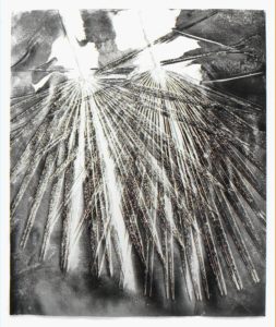
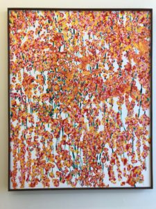
Klea McKenna, “Palms #2,” 2017 Human relations with trees are a bit strained lately. Having thinned out their ‘herd’ with our demands for paper, building materials and their many attractive by-products, we’ve failed to reciprocate by thinning out our own predatory hordes and checking our continuous stream of toxic emissions into the environment we share, thereby threatening our mutual survival. Who can say how Shakespeare would have updated his settings? He would scarcely recognize his drought-stricken Albion this summer. Amazingly, Arden (the Ardennes?) might still bear some resemblance to its ancient majesty, notwithstanding Belgian and French development and the trail of destruction the Germans left between Belgium and France 75 or so years ago. But Jaques’ line would probably be something along the lines of ‘I told you so.’
Summer is a time for group shows everywhere, and not just in L.A.; but they are particularly rich this summer in L.A. and offer brief escape—not necessarily to Arden or Arcadia (though come to think of it, Los Angeles County has its own Arboretum in the County’s own ‘Arcadia’), but nevertheless to an air-conditioned space, which this particular summer might actually be life-saving.
 Sometime this year, Tarrah von Lintel realized that her gallery was entering its 25th year—half a world away from its origin point (Munich), but having nurtured rich associations with many artists along its trajectory through New York to Los Angeles. Parallel to her collectors, von Lintel’s relationships with the artists and their works have amounted to an on-going dialogue with their processes, ideas and obsessions—and a larger dialogue with the art and culture for which the work is a focal point. These include many of the artists for whom von Lintel has assumed representation here in L.A., including Farrah Karapetian, Canan Tolon, Christopher Russell, Carolyn Marks Blackwood, Christiane Feser, and Floris Neusüss; but also artists who von Lintel has long represented, including Joseph Stashkevitch, Antonio Murado, and Roland Fischer. A few of these have yet to mount solo shows with the gallery in Los Angeles, including Tokyo-based Izima Kaoru, who followed a long career in fashion photography with several iterations of Landscapes With A Corpse (a number of which bear uncanny parallels to Melanie Pullen’s High Fashion Crime Scenes), and more recently a high-concept follow-the-sun series of acutely refracted photographs of the sun abstracted to a line or curve.
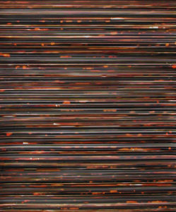
A conceptual blur parallel to the willful confusion and commingling of media (especially photography and painting – or work that resembles one or the other) is a through-line that runs through much of this work, including that of artists no longer represented by von Lintel. In addition to a first in-person encounter with Kaoru’s abstracted Tokyo winter solstice, it was interesting to revisit ‘zero-degree’ work by both Sarah Charlesworth (a faintly limned Book diffused in a pool of white light from 1999) and the aggressively etched chromatic striations of Marco Breuer (from 2003 – Pan (C-245))—a kind of drawing-by-extraction (that makes for an interesting transition to the work of, say, Edward Burtynsky, whose principal subject is the scarrified earth that is one of the most visible and dramatic legacies of the anthropocene). The contrasts in mood and medium are both refreshing and startling. Compare the near-stridency of the Breuer with Klea McKenna’s more recent gentle rubbing on gelatin silver paper in Palms #2 (2017).

Von Lintel was en route to France by the time I visited the show, but she may be back in L.A. before the show closes (August 18th); and she’s serious about engaging the gallery’s audience in an on-going dialogue about the work and the artists. With this notion of a gracious engagement with the gallery’s visitors in mind, the rear gallery has been staged as a kind of salon—replete with classic 20th century furniture and accessories—designed by Carole Decombe; and I can’t imagine a more delightful refuge on the kinds of blistering days we’ve been having in Los Angeles. Von Lintel may continue her ‘salon’ into the fall—but this is a show worth seeing regardless.

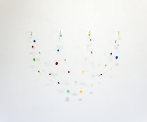
Patrick Nickell, “Ideals of strength and beauty,” 2016 As is pretty clear from some of the (mostly photographic) work just referenced, there is considerable continuity between medium and concept in the execution of any work of art. However idea-driven the work may be, no small amount of thought and effort are invested in its visualization and execution. In the contemporary post-conceptual landscape, artists increasingly feel free to articulate and enlarge upon ideas and concepts through engagement with the materials themselves and processes that are continuously improvised, modulated, and reinvented. There was never anything remotely oxymoronic about Carl Berg’s Conceptual Craft exhibition at Denk Gallery last year; and that remains true in this year’s far more diverse and expansive iteration. You could even find parallels to the artists’ treatment of materials between some of the work in the Von Lintel show and this show. Consider the drama of the iridescent chromatics in Tim Ebner’s seemingly folded, pleated and corrugated squares of powder-coated forged steel; or George Stoll’s ethereal parabolas and catenary curves of colored disks and glass beads. Stoll’s work often plays ironically upon notions of celebration and festivity—a zero-degree abstraction of human vanity, so to speak. (Or the inverted vanitas, where the commonplace and utilitarian is invested with a transitory illumination.) The ephemeral is given a notional permanence or duration, the intangible given material mass.

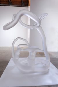
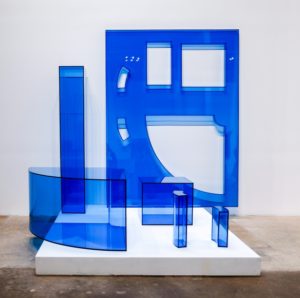
Patrick Nickell’s glass sculptures go directly to that domain of the ideal and/or idealized—the paradox of giving concrete form to, as one of the work’s titles express it, “something that can’t be found.” Or what if it can be found—albeit under an electron microscope. Or a loom? Or beneath a pattern-cutter’s paper or muslin? Or rendered, as Rachel Lachowicz has done here with C Lycra Knit (2018), in a kind of cyan-blue plexiglas—though conceivably I’m reading too much into Lachowicz’s choice of color. (Lachowicz has used monochromatic ‘signatures’ before, however—e.g., most notably in her 2017 tour de force crimson installation, Lay Back and Enjoy It.)

This is a very refined sort of craft—something that can conceivably be held in the hand as well as the mind’s eye—yet something that, as Lachowicz’s work indicates, can be infinitely extended in any conceivable direction under a variety of pre-set conditions. There are few if any limits (certainly not in our post-conceptual domain); and the furthest extremes of this range can be pretty expansive indeed. Consider Gjoj de Marco’s Replica of A Confessional Central Section – Cinema Prop F1-1808 A (2018), looking pretty much like what it must have once been in goddess only knows what movie or movies. These sorts of properties get reused and recycled quite a bit. (I mean that’s why studios have art departments and property masters.)
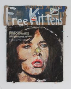
 But here’s the thing: what might be held in the hand (or two), its shape, texture, physical dimension and tactilely registered detail, is capable of its own free-form and unpredictable extension into other worlds or dimensions that emerge exclusively from the artist’s imagination—or that imagination in its random encounter with all phenomena and signifiers in its orbit. Kristen Morgin turns a random audiotape cassette—picked up at a garage sale from the looks of it, now stained and battered (though apparently with most if not all of the song titles spelled out—not an insignificant detail here)—into a trapdoor into the universe. The source object is an old country music hit, but Morgin’s There Goes My Everything (2018) transforms it into a cosmic explosion. Before you spiral off into the Milky Way, there’s more. If one object throws you down an astral chute, consider a juxtaposition of two, say Death Wish and Pierre Who Didn’t Care (referencing both the Brian Garfield thriller-turned Charles Bronson movie and the Sendak classic), or a Pretty Mick Jagger and Free Kittens (the cover of the Performance soundtrack with its stylized portrait of Jagger, with a random yard sale sign).
 A number of works invoke this sense of infinite expansion more specifically (e.g., Ross Rudel’s subtle chromatic intervention on a zig-zag pleated ‘infinite column’, Blue Stripe (2016); or Tom LaDuke’s full-fathom talismanic Oceans (2015) with its delicately filigreed pewter head planted atop a water-washed stone). It was equally bracing to see work that unpacked the ‘concept’ of craft (or technique) itself (e.g., Sean Duffy’s Sfumato, 2018).
Denk is one of the most beautiful spaces downtown to view art, and there is nothing in this show that does not richly plumb the pleasures of both concept and craft.
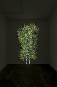
 My favorite among these shows, though, might be the aforementioned Praz-Delavallade show (but then, as I said, I’m quite mad about trees). I’m also a lover of great painting—and there’s a lot of it here, alongside painterly work in other media, including video (e.g., Jim Shaw). René-Julien Praz hasn’t made the gallery over into an Arden (or I suppose Ardennes would be equally apt for this particular gallery’s directors), although he sets the mood as we’re ushered towards the ‘birch grove’ wallpapered rear of the gallery, with Jennifer Steinkamp’s gently undulating poplars whispering alongside from their darkness in the midst of this otherwise immaculately white space. But that’s a clue, too. There are dark, or certainly shadowed moments in the midst of this sunlit space. Praz’s ‘Ardennes’ is a series of moments that take our measure of nature, our perception of, and variously willful and passive projections upon it, our fraught co-existence with it, and our yearning to reclaim or recapture its variously fearsome and fragile beauty.
 Further into the gallery, we continue to sort out the terms of our approach – our ‘to see and not see’ (to paraphrase Oliver Sacks) ‘forest-for-the-trees’ relationship to reality—as for example in Catherine Opie’s soft focus, barely limned grove of trees (mounted here against the birch-papered wall), Untitled #2 (2012), which I always associate with dark winter evenings. (Some works in this series were, I believe, photographed in such conditions, but not all; and not this one.) Then Kerry Tribe’s installation with video (Forest for the Trees, 2015) spells out the dilemma explicitly. That tentative, conditional approach contrasts starkly with the “radical” and ambiguous space Francesca Gabbiani shows us in a palette pitched some distance from nature. Amber and terra cotta are found in nature, but Gabbiani effectively denatures them against a backdrop of black and deep purple with a neon glow. A ragged frond of fern and few tufts of grass are the last earth-bound remnants of this “destruction.” Then there are the remnants of the human-built environment here – joists or louvers, lumber planks or trim that give evidence of a structure on this site. It’s as if that amber volume rising to the upper edge of the canvas were a kind residual aura of what was once “radical.”
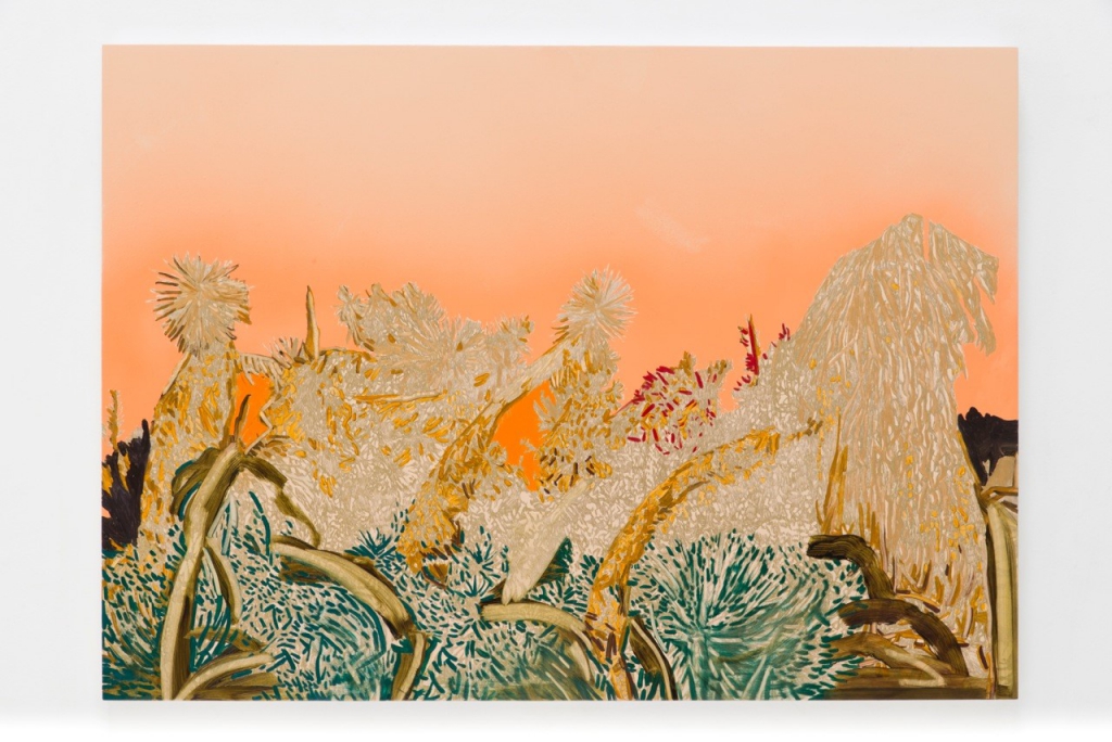
There are no apparent roots to return to here. Nature’s tenuous hold seems to melt away – like those ‘purple mountains majesties’ of what was once a beautiful continent (and planet). On the wall opposite, James Welling exploits a similar palette in a kind of deliberate reversal—foliage rendered on Kodak Metallic Endura paper (this is all we’re told) through what I’m assuming are Photoshop manipulations of what looks like a photo-negative image, or possibly two layered images (007, 2017). There’s also a vague hint of flame here, reminding us of the flames consuming so much foliage around us. Welling foregrounds purple leaves or blossoms against a bright yellow background in a companion image (001). It’s all a bit too bright, which can only bring on dark thoughts; and it’s as if Kim McCarty is offering our eyes an oasis of calm in her two spare watercolors—her signature minimalist brush trace here rendered almost ghostly, what might be a trace of lavender pressed from the flower (of a marijuana plant) dissolving into the white paper as if into the light itself.
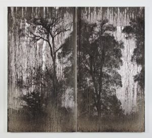
Disappearance is a subsidiary theme here. (Not sure if that has anything to do with Shakespeare—exile was more or less the thing there.) Certainly we’re not likely to see ‘sea-changes’, much less ‘coral’, which we’ve mostly killed off (but then that’s a different play). Cole Sternberg addresses this erasure more or less directly (a wooded sky being erased, 2017) with its hillside treeline sinking beneath a mottled pink sky. But there is that moment we cling to for its melancholy beauty (like Jaques?)—Matthew Brandt distilling that melting-away to the sublime in silver on silver gelatin (AgXBD752A, 2018) in a moment that seems to simultaneously pull us 200 years back even as we see our likely terminus 200 (okay 20) years forward.

The sublime will bury us (as Charles Gaines documents chillingly in Absent Figures: Rainier, Version 2, Marine Transport Files, 2000); but we leave our trace, variously brutal and poetic. There are many instances here, from Sternberg, to Adrien Missika’s Botanical Frottages, to Kirsten Everberg and Matthew Chambers, whose gorgeous foliage studies evoke both joy and an autumnal melancholy (which may seem pretty joyful in the dog days of summer).

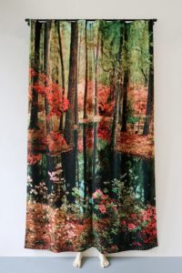
No forest offers refuge here; but as Pierre Ardouvin might put it, [t]he night is not over (2018)—which might be the universal GPS. (Two molded white resin feet peek from beneath a velvet curtain printed with a woodland scene, replete with pond and flowering trees.) We’ll all be hiding there soon enough.
The souvenirs we take from a show like this are as dark as they are sunlit—the monsters as abundant as the golden moments. Whitney Bedford’s gorgeous painting, The Time Inbetween (2015), summed up a then-now-forever moment, poised between that ‘fear of hope’ and ‘knowledge of fear.’ We’re still here for the beauty—and there’s quite a lot to be had in this beautiful show.
Talk to Me runs through August 11th at Von Lintel Gallery, 2683 La Cienega Blvd., Los Angeles 90034. Conceptual Craft II runs through August 18th at Denk Gallery, 749 E. Temple St., Los Angeles 90012. As You Like It or C’est Comme Vous Voulez runs through August 18th at Praz-Delavallade, 6150 Wilshire Blvd., Los Angeles 90048.
-

The Cats Are Alright – Cat Art Show 3
I love most animals, in fact pretty much all animals, including some species especially hostile to human life (maybe those most of all). But I’m not one to fetishize them – or many other things, either (I think). However, whether it’s because of social media or just word on the street getting around (I guess that pretty much means social media nowadays), a lot of people – not just my close friends – know I always have a cat or two (or more?) around my household. It has nothing to do with them being cats, per se. I mean it could be a dog or a horse (Shetland pony?), or a turtle (or other reptile), or a squirrel or ferret, or whoever else (non-human) drops in for dinner and overstays their welcome.
Anyway, whether I go get them, or they come get me, they usually stick around and at some point become integral to the way my household functions. (That’s a laugh line for my pals and a warning to anyone else.) I’ve written stories about my various relationships with my feline children & feline/canine/equine/reptile, avian and aquatic nieces and nephews because they’ve been some of my closest and most vivid, and have made for some of my best experiences outside of Disney and Carnegie Halls and the city of Paris.
If the choice is between an art show and live music, my choice is almost always music. Art shows are usually up for at least a few days, while the live performance can never be duplicated. If the art show has an overtly commercial concept or the work/themes threaten to veer into toxically cute, my decision is that much easier.
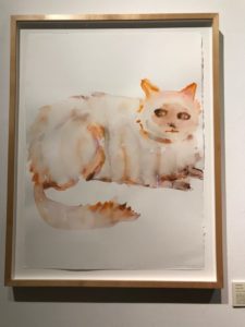
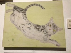
Kim McCarty, “Fat Cat” (2018) So the show on tap was the third biennial edition of curator Susan Michals’ Cat Art Show. I missed the first couple, so for all I knew I could be walking into a Siegfried and Roy revue gone way off the track. (Not necessarily a bad thing right there. Siegfried and Roy were and are truly great artists.) The bill across town (an art space by the way – LAXArt) was Kim Gordon – who rarely disappoints. But Susan Michals is a smart curator and two or three of my favorite people had charmed me into promising to drop by for a minute or two with the promise of libations and … well, … cats.
Everyone remembers the famous Goya portrait of Don Manuel (Zuniga? – I forget the rest) from the Met. And who could be bothered remembering the name when you have that tabby all but stealing the show from that elegantly attired lad? It’s the joke that makes the picture work so charmingly (or maybe alarmingly) – the boy thinks he’s running the show, while the cat has his eyes lasered onto that magpie Don Manuel has apparently let out of its cage for a constitutional. Poor frustrated cat! Poor threatened bird!

Midori Furuhashi, “Green Breeze” 2013 (Mineral pigment on wood panel) Though that’s the thing about cats – they’re never drama queens. They linger at the margins (sometimes literally – you can occasionally see feline figures in the marginalia of medieval illuminated manuscripts). They amuse themselves; they distract themselves with games (sometimes involving smaller prey). Sometimes they’re not even awake, napping in baskets or curled at the feet of some once-great personage (or simply wandering in from the background). Yes, once great and never to be heard from again – sic transit gloria mundi. But the cat lingers on … with its ‘pale blue (or green, yellow, amber, etc.) eyes’. Our eyes always find a way to them – as if they hold the secret to this pictorial alchemy. But if they do, they hold it close, yielding nothing without due recompense, and not even then – making us draw an occult inference from their gaze, their parsimonious vocal expressions, their purring, the flick of their tails. We want them more than they need us. It’s no wonder we once worshipped them. They were the original bodhisattva; they were definitely the original muse.
We may be moving back in that direction (and goddess only knows we might have seen that coming – except for the Baroque architecture they once inspired, human-inspired deities have been pretty much a continuous disaster, culminating in our current eco-catastrophe). We’ve always observed (and exploited) the animal world for the reflections of our imprint on the physical environment and our imagined, reconceived or invented, or virtual recreations of it; and cats have always been a sketchbook staple, the subject of every variety of graphic art. But in recent decades, artists have given rein to cats – their own, their imaginary or idealized feline muses, or more abstracted feline inspirations – to wander in from the wings and take center stage. I’m not sure if this began with Warhol’s ‘25 cats name Sam, and One Blue Pussy.’ The nature of our relations with cats (which has also changed subtly over the last half-century) has made them the vehicle of unspoken (and occasionally unspeakable) thoughts, fears, apprehensions, desires and aspirations.

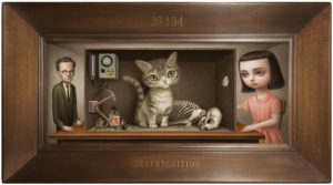
What amazed me most about The Cat Art Show 3 was that most (if not quite all) of the artists on view rose to the challenge of mining those observations and inspirations with considerable originality, verve, virtuosity, and even brilliance. There were some 140 works on view and one was drawn in for a close look at almost all of them. This is not something to be expected, even in a museum show. My initial expectation was that I’d be walking into a few gems amid a sea of quasi-pop/commercial ‘low-brow’ art. (I don’t like the term ‘low-brow’, and I think it’s occasionally misapplied; but I think readers will know what I’m talking about.) In this particular instance, even what might be shoved into that category managed to be pretty brilliant. Mark Ryden’s rendition of the famous “Schrödinger’s Cat” quantum mechanical ‘thought’ experiment, Superposition, managed to brilliantly sum up the spirit of the entire show and perhaps the entire scope of human endeavour as it is tenuously connected to the feline world. It also connected with the moment we’re living through (which on that particular evening seemed especially dark to me). Which is to say that the best work in the show captured those simultaneous moments, those dual (or multiple) universes contained within the special domain we share with cats or evoked by them.
A number of artists are conscious of the extent to which their cat subjects are really a kind of anthropomorphic or even self portraiture. Michael Caines’ work falls into this category, but also reminds of the way we see feline character articulating itself in the course of our relationships with them, as well as the way we see ourselves in our cats; or still more generally the way we can project specifically feline character or characteristics upon human subjects. This subject happened to be Clarence (pen and India ink on paper, 2015) – whether a cat with human eyes or human with a cat face, we can’t be sure – but I think I’ve seen him in an old movie. But as I’m sure (whether cat or human) he’s trying to remind us: never try to second-guess a cat.The exhibition was superbly indexed and documented and the texts bore out much of what I read into some of the subjects. Travis Louie works in a similar and no less deadpan vein as Caines, but far more fantastically, almost hermetically. His acrylic painting on board was presented in a traditional oval dark wood frame, with convex glass and you felt that was exactly where it belonged. What it looked like was a wry, sober, slightly ironic (if still gamine) version of a familiar character – the Dr. Seuss “Cat In the Hat.” The grisaille – not a bit of color – set the mood; and the title set us straight: Dreams of a Moss Covered Three Handled Family Gredunza. I can’t add anything to this description, which I thought was perfect:“Travis Louie … has created his own imaginary world that is grounded in Victorian and Edwardian times. It is inhabited by human oddities, mythical beings, and otherworldly characters who appear to have had their formal portraits taken to mark their existence and place in society. The underlying thread that connects all these characters is the unusual circumstances that shape who they were and how they lived…. [H]e has created portraits from an alternative universe that seemingly may or may not have existed.”
And you thought you knew The Cat In the Hat?
I sometimes wonder if I’m guilty of ethnic/cultural stereotyping given what I view as a particularly Japanese affinity for the harmony of the natural world. (Their natural environment has certainly been no less turbulent; but their art seems to achieve a resolution, even serenity that Western art rarely approaches.) But Japanese artists have a special gift for eliciting the natural magic cats are capable of radiating in almost any situation. It can range from the most quotidian domestic observation to something that approaches transfiguration. Katsunori Miyagi understands how to deliver that moment seemingly transfigured beneath the (literal) wash of our gaze. His cats, with dramatically highlighted markings, sit, stand or hang beneath undulant Rothko-esque watercolor washes in slightly opalescent tones that reminded me as much of some of Eva Hesse’s latex constructions as Rothko’s paintings – the chromatic subtlety in every way stands up to their masterly draughtsmanship. I could easily revisit the show just for these paintings.I never actually saw the (untitled) Raymond Pettibon that was on view, subtitled In the catbird… (2017), but I thought Gosha Levochkin caught something of Pettibon’s spirit and animus (perhaps with a dollop of Paul McCarthy at his most acidulous) in his 2018, PUSSY. In a way, this seemed something of a departure for Levochkin, whose eclectic, graphic, superflat work lends itself almost perfectly to animation – but gives a sense of his capacity for acute, satiric observation.
Like Miyagi, Ravi Zupa also draws on long tradition of animal and natural imagery, which though conceivably centered in India’s Mughal legacies, has ranged far afield into a global spectrum of graphic art, from (according to the legend/index card) German Renaissance printmaking to Japanese woodblock, Pre-Columbian art and agit-prop. The text may have strayed a bit far from Zupa’s intention for this particular and more-than-a-little-ironic drawing, Playtime (India ink on paper, 2018). What Michals, et al. clearly intended to underscore was the global-minded Zupa’s much broader disdain for puerile attempts at ‘ironic’ cultural appropriation. Thiago Goms’ ‘cats’ – definitely of the anthropomorphic variety, really humans with cat heads – hearken back to the graphic work of German post-expressionist and Weimar ‘new objective’ graphic artists. Here his cat-men seemingly tremble amid the concrete jungle of abstracted cityscapes no doubt inspired by the São Paulo of Goms’ childhood.Can we even wonder whether cats sense our own anxieties about our worlds – nature, or more precisely our loss of it, the intrusion of technology into our everyday actuality, our uncertainty about our purchase on it all? Kathy Taslitz’s Pussy Anxiety (2018) speaks to these issues directly and articulately. (While Michael Lindsay-Hogg (Jaded Cat, 2018) reminds us how sick of us they must occasionally get.)It’s almost impossible not to notice our cats’ sensitivity, their sixth sense about our movements and habits, our troubles, plans and schemes. And – especially if they move between the domestic space and their neighborhoods – we know they have a sense of the environment probably no less informed than our own. I could go on ad nauseam about so much of the brilliant work in this show by artists including, in no particular order, Anita Wong, Lauren Benrimon, Yael Hoenig, Kim McCarty, Tasya Van Ree, Lisa Lebofsky, Paul Koudounaris, Laura Keenados, Perrin Lam, Scott Hove, Midori Furuhashi, Adipocere, Kelly Berg, Mari Shimizu, and Charlie Becker. But I think we all get how lucky artists (and the rest of us) are that cats wandered in from the cold or the heat and into our still-precarious earth-bound encampments. I’m just cat-damaged enough to hope they can persuade us to keep it going. The Cat Art Show 3 runs through this week-end at Think Tank Gallery downtown – and Cat fanciers may gather for an early closing party tonight. Your cats will excuse you if you leave them at home alone for one evening. They always do.
 Sometime this year, Tarrah von Lintel realized that her gallery was entering its 25th year—half a world away from its origin point (Munich), but having nurtured rich associations with many artists along its trajectory through New York to Los Angeles. Parallel to her collectors, von Lintel’s relationships with the artists and their works have amounted to an on-going dialogue with their processes, ideas and obsessions—and a larger dialogue with the art and culture for which the work is a focal point. These include many of the artists for whom von Lintel has assumed representation here in L.A., including Farrah Karapetian, Canan Tolon, Christopher Russell, Carolyn Marks Blackwood, Christiane Feser, and Floris Neusüss; but also artists who von Lintel has long represented, including Joseph Stashkevitch, Antonio Murado, and Roland Fischer. A few of these have yet to mount solo shows with the gallery in Los Angeles, including Tokyo-based Izima Kaoru, who followed a long career in fashion photography with several iterations of Landscapes With A Corpse (a number of which bear uncanny parallels to Melanie Pullen’s High Fashion Crime Scenes), and more recently a high-concept follow-the-sun series of acutely refracted photographs of the sun abstracted to a line or curve.
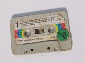 But here’s the thing: what might be held in the hand (or two), its shape, texture, physical dimension and tactilely registered detail, is capable of its own free-form and unpredictable extension into other worlds or dimensions that emerge exclusively from the artist’s imagination—or that imagination in its random encounter with all phenomena and signifiers in its orbit. Kristen Morgin turns a random audiotape cassette—picked up at a garage sale from the looks of it, now stained and battered (though apparently with most if not all of the song titles spelled out—not an insignificant detail here)—into a trapdoor into the universe. The source object is an old country music hit, but Morgin’s There Goes My Everything (2018) transforms it into a cosmic explosion. Before you spiral off into the Milky Way, there’s more. If one object throws you down an astral chute, consider a juxtaposition of two, say Death Wish and Pierre Who Didn’t Care (referencing both the Brian Garfield thriller-turned Charles Bronson movie and the Sendak classic), or a Pretty Mick Jagger and Free Kittens (the cover of the Performance soundtrack with its stylized portrait of Jagger, with a random yard sale sign).
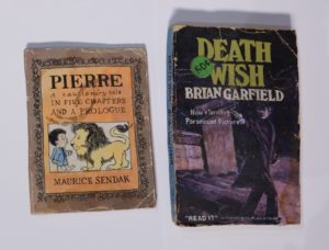
 A number of works invoke this sense of infinite expansion more specifically (e.g., Ross Rudel’s subtle chromatic intervention on a zig-zag pleated ‘infinite column’, Blue Stripe (2016); or Tom LaDuke’s full-fathom talismanic Oceans (2015) with its delicately filigreed pewter head planted atop a water-washed stone). It was equally bracing to see work that unpacked the ‘concept’ of craft (or technique) itself (e.g., Sean Duffy’s Sfumato, 2018).
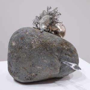
 My favorite among these shows, though, might be the aforementioned Praz-Delavallade show (but then, as I said, I’m quite mad about trees). I’m also a lover of great painting—and there’s a lot of it here, alongside painterly work in other media, including video (e.g., Jim Shaw). René-Julien Praz hasn’t made the gallery over into an Arden (or I suppose Ardennes would be equally apt for this particular gallery’s directors), although he sets the mood as we’re ushered towards the ‘birch grove’ wallpapered rear of the gallery, with Jennifer Steinkamp’s gently undulating poplars whispering alongside from their darkness in the midst of this otherwise immaculately white space. But that’s a clue, too. There are dark, or certainly shadowed moments in the midst of this sunlit space. Praz’s ‘Ardennes’ is a series of moments that take our measure of nature, our perception of, and variously willful and passive projections upon it, our fraught co-existence with it, and our yearning to reclaim or recapture its variously fearsome and fragile beauty.
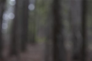 Further into the gallery, we continue to sort out the terms of our approach – our ‘to see and not see’ (to paraphrase Oliver Sacks) ‘forest-for-the-trees’ relationship to reality—as for example in Catherine Opie’s soft focus, barely limned grove of trees (mounted here against the birch-papered wall), Untitled #2 (2012), which I always associate with dark winter evenings. (Some works in this series were, I believe, photographed in such conditions, but not all; and not this one.) Then Kerry Tribe’s installation with video (Forest for the Trees, 2015) spells out the dilemma explicitly. That tentative, conditional approach contrasts starkly with the “radical” and ambiguous space Francesca Gabbiani shows us in a palette pitched some distance from nature. Amber and terra cotta are found in nature, but Gabbiani effectively denatures them against a backdrop of black and deep purple with a neon glow. A ragged frond of fern and few tufts of grass are the last earth-bound remnants of this “destruction.” Then there are the remnants of the human-built environment here – joists or louvers, lumber planks or trim that give evidence of a structure on this site. It’s as if that amber volume rising to the upper edge of the canvas were a kind residual aura of what was once “radical.”
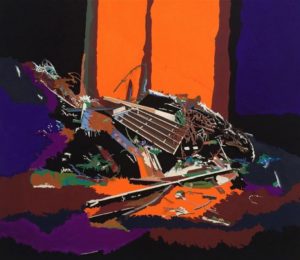
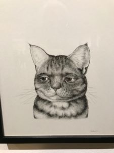 A number of artists are conscious of the extent to which their cat subjects are really a kind of anthropomorphic or even self portraiture. Michael Caines’ work falls into this category, but also reminds of the way we see feline character articulating itself in the course of our relationships with them, as well as the way we see ourselves in our cats; or still more generally the way we can project specifically feline character or characteristics upon human subjects. This subject happened to be Clarence (pen and India ink on paper, 2015) – whether a cat with human eyes or human with a cat face, we can’t be sure – but I think I’ve seen him in an old movie. But as I’m sure (whether cat or human) he’s trying to remind us: never try to second-guess a cat.
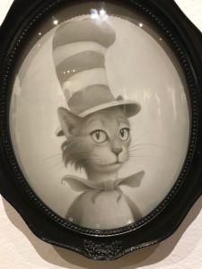 The exhibition was superbly indexed and documented and the texts bore out much of what I read into some of the subjects. Travis Louie works in a similar and no less deadpan vein as Caines, but far more fantastically, almost hermetically. His acrylic painting on board was presented in a traditional oval dark wood frame, with convex glass and you felt that was exactly where it belonged. What it looked like was a wry, sober, slightly ironic (if still gamine) version of a familiar character – the Dr. Seuss “Cat In the Hat.” The grisaille – not a bit of color – set the mood; and the title set us straight: Dreams of a Moss Covered Three Handled Family Gredunza. I can’t add anything to this description, which I thought was perfect:
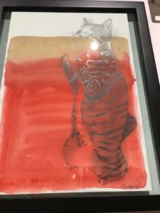 I sometimes wonder if I’m guilty of ethnic/cultural stereotyping given what I view as a particularly Japanese affinity for the harmony of the natural world. (Their natural environment has certainly been no less turbulent; but their art seems to achieve a resolution, even serenity that Western art rarely approaches.) But Japanese artists have a special gift for eliciting the natural magic cats are capable of radiating in almost any situation. It can range from the most quotidian domestic observation to something that approaches transfiguration. Katsunori Miyagi understands how to deliver that moment seemingly transfigured beneath the (literal) wash of our gaze. His cats, with dramatically highlighted markings, sit, stand or hang beneath undulant Rothko-esque watercolor washes in slightly opalescent tones that reminded me as much of some of Eva Hesse’s latex constructions as Rothko’s paintings – the chromatic subtlety in every way stands up to their masterly draughtsmanship. I could easily revisit the show just for these paintings.
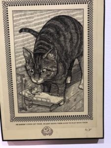 Like Miyagi, Ravi Zupa also draws on long tradition of animal and natural imagery, which though conceivably centered in India’s Mughal legacies, has ranged far afield into a global spectrum of graphic art, from (according to the legend/index card) German Renaissance printmaking to Japanese woodblock, Pre-Columbian art and agit-prop. The text may have strayed a bit far from Zupa’s intention for this particular and more-than-a-little-ironic drawing, Playtime (India ink on paper, 2018). What Michals, et al. clearly intended to underscore was the global-minded Zupa’s much broader disdain for puerile attempts at ‘ironic’ cultural appropriation.
  Thiago Goms’ ‘cats’ – definitely of the anthropomorphic variety, really humans with cat heads – hearken back to the graphic work of German post-expressionist and Weimar ‘new objective’ graphic artists. Here his cat-men seemingly tremble amid the concrete jungle of abstracted cityscapes no doubt inspired by the São Paulo of Goms’ childhood.
 Can we even wonder whether cats sense our own anxieties about our worlds – nature, or more precisely our loss of it, the intrusion of technology into our everyday actuality, our uncertainty about our purchase on it all? Kathy Taslitz’s Pussy Anxiety (2018) speaks to these issues directly and articulately. (While Michael Lindsay-Hogg (Jaded Cat, 2018) reminds us how sick of us they must occasionally get.)
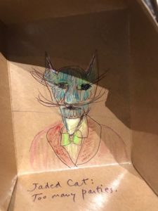 It’s almost impossible not to notice our cats’ sensitivity, their sixth sense about our movements and habits, our troubles, plans and schemes. And – especially if they move between the domestic space and their neighborhoods – we know they have a sense of the environment probably no less informed than our own. I could go on ad nauseam about so much of the brilliant work in this show by artists including, in no particular order, Anita Wong, Lauren Benrimon, Yael Hoenig, Kim McCarty, Tasya Van Ree, Lisa Lebofsky, Paul Koudounaris, Laura Keenados, Perrin Lam, Scott Hove, Midori Furuhashi, Adipocere, Kelly Berg, Mari Shimizu, and Charlie Becker. But I think we all get how lucky artists (and the rest of us) are that cats wandered in from the cold or the heat and into our still-precarious earth-bound encampments. I’m just cat-damaged enough to hope they can persuade us to keep it going.