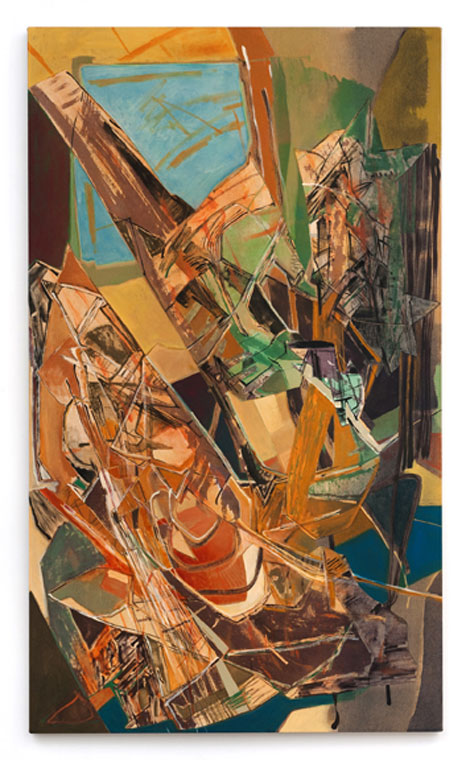
Edward Burtynsky’s principal subject over the last decade or so has been the industrial landscape, or more specifically, large-scale, frequently aerial views of major industrial operations, grids, excavations, or industrial waste sites. The photographs in his current...
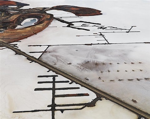
Edward Burtynsky – Industrial Abstract
read more