Your cart is currently empty!
Tag: contemporary
-
Pick of the Week: Andy Moses
William Turner GalleryNature has been the font from which many artists have taken their inspirational sacrament. And it is a pleasure to see an artist who takes that inspiration and so masterfully manifests the power and majesty of our natural world into something entirely new, which is what you will find at Andy Moses’ solo show of recent works at the William Turner Gallery.
Andy Moses is not new on the scene. He has worked as part of the cadre of post-modern greats for most of his career, and has maintained his unique aesthetic sensibility and only ever refined it further. While previous works appear other-worldly, Moses’ collection on display now is far more grounded.
The first works of note are the collection of honeycombed smaller canvases that sit in the back left. They harmonize wonderfully with one another, and offer a natural starting point to the rest of the show. The paint churns and spins, rebounding off one another and appearing like brilliant geodes or St. Elmo’s Fire. These are the groundwork, so to speak, and from here the canvases get larger and take on lives of their own.
The large hexagonal and circular paintings really illustrate Moses’ desired swirling and spiraling effects, drawing the viewer into the whirlpool of brilliantly vibrant color. The gold in particular appears to leap off the canvas like a great whip of light. Here, the lines ebb into and around one another, colliding and crashing like lava flows and ocean waves.
But finally, the true gems of the show are the landscapes. The curved canvases create a panoramic effect, as if looking over a misty marsh or rainbows dancing lightly over rivers. The colors are hypnotic, and the lines which stack and flow one on top of another give the works both height and breadth.
Many words describe the paintings on display at William Turner Gallery: iridescent, geodetic, entrancing, to say just a few. But no words do Andy Moses’ works true justice, as just like in nature, to truly appreciate their beauty you must immerse yourself in them.
-
Pick of the Week: Hosai Matsubayashi & Trevor Shimizu
Nonaka-HillThere is a natural tension drawn between old and new, conservative and progressive. Often times, it can feel that between those two positions there can be no resolution. Even in art, it can be difficult to fit the opposing ideals together; though when it happens, the results are mystifying. One such confluence of tradition and modernity is the group painting and ceramics show of Hosai Matsubayashi XVI and Trevor Shimizu, on view at Nonaka-Hill.
For those who haven’t seen a roman numeral that large since the French Revolution, our era’s Hosai Matsubayashi is the sixteenth in his family to run their kiln in Uji, Kyoto. Since the year 1600, the Matsubayashi family has produced some of the finest ceramics in all of Japan, most notable for their tea ceremony sets – and every ounce of the centuries of creative ability and technical mastery is on display in dozens of precious objects, from waved vases to earthen tea kettles.
Trevor Shimizu, by contrast, does not stand on a mountain of history but rather at the forefront of contemporary art. A painter and video artist based out of New York, Shimizu is known primarily for his sardonic and comedic works, like his exhibition of fart paintings in 2015. His work is deeply expressive, drawing on modernist influences to paint rapidly and with decisive brushstrokes.
Here in Nonaka-Hill, they have been brought together. Matsubayashi’s ceramics (which draw on a wide variety of traditional Japanese technique, most prominently wabi sabi and blue-washes) sit peacefully on low tables, as if they were set out for use in a tea ceremony. And while still in his abstract style, Shimizu’s large landscape paintings take on a new life when hanging alongside the historic ceramics. One begins to notice the influences of calligraphic styles in Shimizu’s work, and an allowance of negative space not unlike that of ink painting. Likewise, Shimizu’s expressive paintings lend their sense of freedom to the pottery, in turn lifting and re-contextualizing this tradition.
Together, Shimizu and Matsubayashi breathe new meaning into one another’s works, creating an entirely unique experience out of their individual brilliances.
Nonaka-Hill
720 N. Highland Ave.
Los Angeles, CA, 90038
Appointment Only -
Pick of the Week: The Lights of Los Angeles
Los AngelesBeauty is all around us. This thought feels simplistic, and given the past year, even wrong. Stuck in our homes, away from family and friends, a city as large and vibrant as Los Angeles becomes terribly claustrophobic. And even for those fortunate enough not to be directly affected by the pandemic (we are all affected in some way), it’s normal to become disaffected from your environment. Spend enough time anywhere, you’ll forget why you’re there in the first place.
The best way I’ve found to re-encounter beauty is to return to that most basic of artistic principles: light. I’ve found that very little warms the soul more than good lighting. Be it blinking and bright neon, soft daylight streaming through waving branches, or twinkling pin-pricks scattered amidst inky darkness, light is beautiful across all of its forms. And there’s hardly a better city, nor time of year, to find good lighting.
The sunsets are earlier and more brilliantly colored. Holiday lights of every hue adorn store-fronts, slanted eaves, and tree trunks. Streets are emptier and night is longer. This last Pick of the Week for 2020 can’t be found in any gallery. No, this week, I recommend getting in your car, putting on some lively music, and driving until you find that special lighting that makes everything stop.
From the thick veneer of shimmering lights that extends all the way to the horizon, visible from up high in the hills, to the dazzling street displays on Rodeo Drive and Santa Monica Boulevard. From the tall, shifting columns of light on skyscrapers downtown, to the festive and demure lights found all over every neighborhood. There isn’t a wrong answer, and no matter which lights you like, you’ll be happy you found them.
Three tips to finding good lighting:
- Trust your instincts. If you left feels good, turn left; if you want to go right, turn right. Mix it up. Drive in circles. In squares. Hell, drive in triangles. All roads lead somewhere.
- Just keep moving. Try not to get bogged down in traffic or stuck on highways, and unless a place really strikes you (which is what we’re looking to happen anyways). No need to get out and gawk either; the magic of light hunting is in the moment of discovery.
- Look at the city with fresh eyes. Act like you’ve never been here before. Hit the big name streets and tourist havens. You’ll surprise yourself with how wonderful our city can be without all the cynicism.
-
Pick of the Week: Shiyuan Liu
Tanya Bonakdar GalleryArt, at its most essential level, attempts to fix in space the experiences that pass like sand in an hourglass. On the whole, reality is almost always more complex than can be accurately represented, and meaning is missed in the variety of expression. But Shiyuan Liu doesn’t want to miss a thing.
Of all the ways to describe “For Jord,” at the Tanya Bonakdar Gallery, detailed rises to the forefront almost immediately. In any medium, Shiyuan extracts the most meaning she can out of each material and image. “For Jord” is about the ways in which we define things, and how those definitions change through time or culture.
In her video work, For the Photos I Didn’t Take, For the Stories I Didn’t Read, Shiyuan re-contextualizes the Hans Christian Anderson story “The Little Match Seller,” using images found on the internet to represent each word in the story, displayed over wintery, holiday imagery and gentle music. She is expansive in representing the language of the story, using girls from a wide variety of socio-economic background and culture to represent “SHE” or “HER,” for example. In this way, Shiyuan is challenging the viewers own biases and automatic associations with certain words, images, or concepts.
Her photo series as well, entitled For Jord and Almost Like Rebar, again encourage a broadening of perspective, illustrating the complex cultural programming that everyone has when it comes to theoretically universal imagery. The tessellated photographs and video stills of animals, plants, pianos, diced onions, etc. culminate in an overwhelming sensation not only that you alone could never hold all the answers, but that even the most basic definitions and associations can vary.
This challenge extends even further with the most abstracted of Shiyuan’s work, her Cross Away series. These grids of pigments, kaleidoscopic and variegated yet masterful in their command over color theory and balance, close the conceptual loop of the show. While life may be infinitely complex and ever changing, in each moment we have the ability to stop, to look, and – if we’re lucky – to find something beautiful in the chaos.
Tanya Bonakdar Gallery
1010 N. Highland Ave
Los Angeles, CA, 90038
Appointment Only -
Pick of the Week: Cosmo Whyte
Anat EbgiNothing is just one thing. This is a sentiment that many of us here in the United States, particularly those of us with privilege, are coming to terms with in an entirely new way. From recognizing that many workers who previously went unseen are in fact essential, to understanding that police officers do not always serve and protect, 2020 has taught us that multiplicities abound in this life. This lesson is reinforced in Cosmo Whyte’s show “When They Aren’t Looking We Gather by the River,” on view at Anat Ebgi.
Cosmo Whyte’s work is primarily focused on Black experience, centered on the ongoing Black Lives Matter and related civil rights’ movements happening across the United States. As a Jamaican artist, Whyte is particularly interested in the complexities of Black identity and the Black diaspora.
The first work you encounter hangs in the entrance to the viewing room as a beaded curtain. Entitled Wading in the Wake, a monochromatic image of men running into water and collapsing into its surf is printed upon the beads. At first glance, the image appears playful, but the reality is far from that initial impression. The image was lifted from a 1964 civil rights protest, in which Black activists swam illegally in white-only beaches and were subsequently attacked by violent segregationists.
The works beyond the beaded curtain again contain multitudes. Mixing images of Jamaican Carnival and riotous protests, Whyte conflates celebration and struggle, indicating that despite pain and oppression, joy persists.
The work which conflates the two most subtly is entitled Breadfruit, which shows a Black woman standing and smiling on a busy street, her face and body partially obscured by tropical branches – those of a Breadfruit tree. The breadfruit is an incredibly popular fruit in Jamaica, though it is not indigenous. Like 92% of Jamaica today, the ancestors of the contemporary breadfruit trees were brought over by European colonialists, uprooted from native soil and deposited into a foreign land. Nevertheless, these trees survived and thrived, created a rich cultural and culinary heritage, and serve as a powerful allegory in Whyte’s talented hands.
Anat Ebgi
2660 S La Cienegas Blvd.
Los Angeles, CA, 90034
Appointment Only -
Pick of the Week: Joni Sternbach
Von Lintel GalleryIn 1839, the very first portrait photograph was captured of (and by) Robert Cornelius. It must have been a difficult – albeit likely humorous – process, as Cornelius set up his camera before hurriedly running to sit motionless in front of it, arms crossed and hair tousled. To go to such an effort demonstrates the essential connection between portraiture and photography. They’ve been attached to one another from the beginning. Moreover, portrait photography is more important and accessible to the public in ways Cornelius could never have imagined. But in Joni Sternbach’s new exhibition “Surfboard” at Von Lintel Gallery, we see the oldest techniques of photography implemented in the capturing of a different kind of portrait.
As the title of the show suggests, “Surfboard” continues Sternbach’s ongoing “Surfland” series by capturing surfing culture through the use of tintype and silver-gelatin photographs. However, unlike her previous works, there are no actual surfers in the show at all. Instead, Sternbach photographs a wide array of boards, from weathered and beaten Hobies to modern fiberglass boards. The boards act as canvases themselves, showing not only the scars of their use but also elaborately painted designs like those in #2 Lightning Bolt and #5 Skeleton.
While a surfboard in the abstract is a utilitarian item of sport and leisure, under Sternbach’s careful eye and expert photographic skills, the boards take on an entirely new quality. Sternbach refers to this quality as “totemic,” and they do inspire a certain reverence. Especially when clustered together on the beach, they become an altar to the ocean.
And by giving these boards the dignity that such a laborious process as tin-type prints require, Sternbach glorifies the craft itself. One can take a moment to appreciate the gently sloping curves and precise symmetry of the boards, as well as the varied decorative elements. The care and talent with which these boards were created shines through in Sternbach’s work. It’s fitting that the only bit of an actual human being captured in Sternbach’s many portraits are two hands, clutching a board to hold it upright, as if to say “These crafted this.”
Von Lintel Gallery
1206 Maple Ave. #212
Los Angeles, CA, 90015
Appointment Only -
Pick of the Week: Sculptures
Kayne Griffin CorcoranSculpture is a medium of art with infinite possibilities. Unbounded by canvas or wall, a sculpture is only defined by the space itself. Yet despite the limitless potential definitions, there is only ever one realized in the moment that the iron is cast, the glass blown, or the stone hewn. This decisive moment is what allows for a narrative to form, one which in masterful hands reflects the society that surrounds it. “Sculptures,” a group show currently running at Kayne Griffin Corcoran, illustrates this narrative by expertly linking works created over the last sixty years in beautiful conversation.
To begin this decades-long story, “Sculptures” presents the artists who dove head-first into the literal material of their works. Nowhere in the show is this more clear than with Tatsuo Kawaguchi’s Iron of Iron and/or Tools; Plier (1975), where a pair of pliers are firmly embedded into an iron plate. Kawaguchi is highlighting the material from which tools are derived, and in doing so, questions the very conceptions of origin. In many ways, the artists collected in this show of his era – from the Arp-esque Ken Price to the minimalist Mary Corse – are all primarily concerned with the minor subversion of the expectations we place on material.
But there is a far greater subversion explored in “Sculptures,” a task handled by the sculptors to come in the 21st century. With these artists, the questions brought about have far more to do with the actual conceptual definition of the objects they represent rather than the materials. Is a gate still a gate if it leads nowhere? Is a boat still a boat if you cover it in copper shingles? And when is a bench simply a bench (or a lamp simply a lamp), and not a piece of art?
These works engender a distrustfulness not uncommon in contemporary society, an unwillingness to take anything presented earnestly at face value. The later works are pessimistic counterparts to the sincere explorations of material with which they are paired. And it is vital to keep these two seemingly disparate ideas in mind at the same moment. We must be equally dedicated in our investigation of our origins as we are concerned with subverting the expectations set by them. To forget where we came from is to forget why we must be distrustful.
Kayne Griffin Corcoran
1201 SOUTH LA BREA AVENUE
Los Angeles, CA, 90019
Appointment Only -
Pick of the Week: Maren Karlson
In LieuIt’s hard to pin down joyfulness. It’s a transient emotion that is readily batted away by the complexities and pains of everyday life. One can almost forget what it feels like. Luckily, one of the crucial functions of art is to remind us all that joy does exist. This is not to say that all art is joyful; in fact, most art is decidedly not. For one reason or another, we as a society have deemed it necessary for art to make a statement if it is to be taken seriously. Fine art – a term I use unwillingly – must do away with joyfulness if it is ever to do away with earnestness, which is the antithesis of contemporary art. And yet, Maren Karlson defies this golden rule in her new show, “Petal’s Path,” on view at In Lieu.
Karlson’s works are incredibly passionate. They are ethereal landscapes and still-lifes which take the natural world and transpose it onto small canvases. Viriditas, one of the larger pieces, catches the eye with its sharp bisection of blue and white halves and its swirling, intersecting areas of earthy green. Within the small, often frame-within-frame drawings, Karlson summons magical realms of vibrant color and natural themes.
Many of Karlson’s works abstractedly draw on the forms of moths and butterflies, such as Pupa’s Path, relying on their native symmetry to engage with the viewer. One is drawn into their flowing wings and nebulous bodies, circling around and around the abstracted portraits of the delicate creatures. They are simplistic at first glance – almost childlike – but the subtle gradations of color and careful mirroring underscore Karlson’s capable exhibition of joy.
Even the materials which Karlson uses emphasize this innocent, earnest aesthetic. The colored pencil lines, bumpy and tactile on the rough canvas, evoke a simpler time in one’s own life. It’s a body of work that doesn’t have ulterior motives or hidden messages, and simultaneously proves great art doesn’t need them. “Petal’s Path” shows us intimate glimpses of an uncomplicated, unironic, and unserious world of soft, verdant planes of green and swirling eddies of blue and violet.
In Lieu
5426 Monte Vista St.
Los Angeles, CA, 90042
Appointment Only -
Pick of the Week: Peter Alexander
Cirrus GalleryIt’s not that difficult to be contemporary. Be it through art, or writing, or simply conversation, we’re almost always discussing what’s right in front of us. It’s another thing all together to create something which takes on an entirely new meaning decades after fabrication. This is the power of Peter Alexander’s exhibition “Light in Place,” on view now at the Cirrus Gallery.
This survey of Alexander’s works – mostly lithographs and paintings, created in the 1970s, 80s, and 90s – illustrates some of the finer physical qualities of light. Alexander uses a wide variety of materials like velvet, glitter, and Kromekote paper to transform not only the light within the painting but the light of the space itself into a tactile experience. His older paintings, such as The Other One and Huh?, are especially engaged with this physicalizing work.
From the 1980s onwards, Alexander’s work becomes almost entirely lithographic as his pursuit of understanding and capturing light becomes more direct. Alexander himself is quoted as being inspired by the nature of Los Angeles and Southern California in particular. There are a wide variety of subjects: stunning bursts of light and color, monochromatic storm clouds breaking over the ocean, and cityscapes viewed from high above.
But what exists throughout all of Alexander’s works is a deep sense of unease. The vibrant sunsets appear as violent and chaotic explosions. The tilted cityscapes feel unbalanced and restless. The storm clouds, though breaking, are dark and threatening. Overall, Alexander’s vision of the beautiful vistas which inspired him are frightening, almost dystopic.
I wondered in my unease whether this feeling was coming from the art or from our current era. The sunsets reminded me of the images of the wildfires that were blanketing California in smoke. The lights of a city at night reminded me of the on-going protests for human rights and justice in Los Angeles. The work was pertinent to right now, and while that pertinence disquieted me, it is a testament to Alexander’s ability as an artist to be strike that mark from thirty years in the past.
Cirrus Gallery
2011 S. Santa Fe Ave
Los Angeles, CA 90021
Show runs through Nov. 14th
Appointment Only—No Walk-Ins -
Pick of the Week: Wanda Koop & Michelle Rawlings
Night GalleryThe two shows currently on view at the Night Gallery – Wanda Koop’s “Heartbeat Bots” and Michelle Rawlings’ “In the Garden” – represent opposite ends of the spectrum of contemporary art.
The larger show, “Heartbeat Bots,” introduces us to a fantastically vibrant and massive vision of the future. There are sweeping neon landscapes with a verticality heightened by the her trademark drips (or tears, as she calls them.) And in her portraits, Koop interrogates a basic understanding of humanity by confronting the viewer with deeply emotional robots. There is an uncanniness in viewing a painting of a cyborg which looks surprised or smug, bored or content. But the emotional quality of Koop’s work is, in the end, undeniable. Koop shows to us a potential vision of the future, rich in abstract emotional depth and vibrant color.
By contrast, Rawlings’ paintings do not have monumental scale, vibrant colors, or even a shred of abstraction. Rawlings uses an impressionistic style to render models lifted from photos from Virginia Viard’s Spring 2020 show in Paris as though they were hanging in the Salons of late 19th century Paris. Rawlings work is intimately small, with some of the accompanying instillation details no bigger than a postage stamp.
And since her work is so small, it draws the viewer in close to parse through the many fine details. I found myself going over every expertly rendered thread of the high-fashion clothing and trying (without success) to place an emotion – any emotion – onto the faces of the models themselves. The more I looked, the further away I was from elucidating any concrete sensation from the works.
But of course, that’s exactly the point of models on runways; they are paid to showcase the fashion, not emotion. They are the proverbial canvas upon which designers exhibit their work. And how are we to analyze a canvas upon a canvas? We don’t. All we can do then is just appreciate the work for what it is, and it is beautiful. It’s a pleasure to simply exist in the space that Rawlings’ works inhabit and to uncover the many treasures within.
Night Gallery
2276 E. 16th Street
Los Angeles, CA 90021
Show runs through Nov. 14th
Appointment Only—No Walk-Ins -
Pick of the Week: Amir H. Fallah
Shulamit NazarianThere are many stories that we have told ourselves in order to make our world make sense. These modern myths range from Columbus’ “discovery” of this continent to the very idea of the American Dream. These stories are taught to us from birth, intrinsically attached to the way we teach and learn our history—and are some of our greatest cultural exports. And it’s these lessons that are explored in Amir H. Fallah’s “Remember My Child…”.
Fallah, who has previously worked in veiled portraiture, tosses aside the model and instead creates a series of patchwork paintings, featuring everything from figures taken straight out of Islamic miniatures to images lifted from historical records and anatomy books. There is Christopher Columbus meeting Native Americans and being crushed by a globe, diagrams of the nervous system, and maps of the solar system. We see a chaotic confluence of patterns, designs, signs and symbols; Persian rugs, Art Deco icons and comic characters all adorn the paneled paintings.
In fact, Fallah drew much of his inspiration from his own childhood viewing America from afar while living in Iran, his formative years spent here in the U.S., as well as his son’s view of the world and interests. The hodgepodge of imagery showcases the mixing of two cultures, two identities. Fallah presents this duality in his work as it exists within himself as an individual between worlds.
And while many of his works reside in the allegorical—and can be picked apart as metaphors for immigrant life in the western world or for the ways in which identities can be muddled and unclear—his paintings are at their core understandable. There are few unfamiliar symbols, and the paintings are readable and clear. The unifying thread between all his works is the use of textual elements to form moralistic lessons; my personal favorite is one that strikes me as a lesson for our times: “Sentiment without action, is the ruin of the soul.”
Shulamit Nazarian
616 N La Brea Avenue
Los Angeles, CA 90036
Show runs through Oct 31st
Appointment Only—No Walk-Ins -
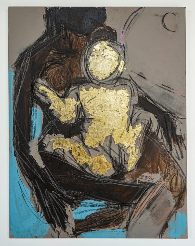
Pick of the Week: Ferrari Sheppard
Wilding Cran GalleryI’ve always had a deep love for art that dripped with symbolism. Art that encodes stories within their frame or form, all while being aesthetically appealing, draws you into a dialogue with the artist and your fellow viewer. It’s a bit like an inside joke; if you know, you know—and it certainly feels good to know.
Ferrari Sheppard’s new show “Heroines of Innocence” at Wilding Cran draws you into a world steeped in reverential references. With a style that floats somewhere between Jean-Michel Basquiat and Willem de Kooning (perhaps with a bit of Cy Twombly thrown in), Sheppard creates work that are entirely his own. His pieces possess a certain freedom in their unhemmed, charcoal lines that compose the anonymized Black women and girls.
But unlike other anonymized subjects, such as Ramiro Gomez’s essential workers, their anonymity is not to generalize them, but to guard them. The figures in Sheppard’s paintings are kept apart from this world through their anonymity. Kept apart from this world which has systematically oppressed people of color—Black women in particular. Moreover, by omitting any recognizable features, Sheppard invites us to inspect the figures simply as they exist.
Bond (2020), an intimate portrait of a mother embracing her child, is particularly eye-catching. The mother, a rough confluence of charcoal and acrylic, is almost entirely obscured by the golden child sitting on her lap. This piece has a strong religious overtone, with the use of gold leaf to highlight the “Radiant Child” metaphor. But with its back turned to us, it’s shown that the baby is a precious gem that does not belong to us and, moreover, is unconcerned with our presence.
Gold leaf is used in the show to fantastic ends, adding a religious iconographical effect throughout many of the pieces. Scribes (Study II) (2020), for example, used a large sheet of unbroken gold leaf to frame the two central children sharing a book, accentuating them and catching the light brilliantly.
Heroines of Innocence is available to be revered at Wilding Cran Gallery until October 31st.
Wilding Cran Gallery
1700 S Santa Fe Ave #460
Los Angeles, CA 90021
Show runs through Oct 31st
Appointment Only — No Walk-Ins -
Pick of the Week: Heather Day
Diane Rosenstein GalleryYou never really know which exhibition is going to make you cry. I certainly didn’t expect it to happen at Heather Day’s “Ricochet” at the Diane Rosenstein Gallery. None of the work was particularly sad and I actually had low expectations based on what I saw online. I remember I had even bemoaned to my editor; would this show just be another contemporary artist pining after AbEx?
Yet from The Persistence of Memory to Fever Dream, I could tell that Day was not pining after anything. Instead, she had cracked open the very center of her mind and laid it out on canvas for us all to see. Her works are free and expressive, with large fields of flooded pigment acting as the backdrop for floating ribbons of paint. They are chaotic and improvisational reflections of her inner world—her “mind maps,” as Day calls them.
And like any good map, they are also well-planned. Every stroke of paint falls just so, every flood of pigment only extends so far. These discrete elements work in harmony like dancers in perfect choreography; responding to one another, forming and disintegrating, flowing around each and every line.
These two poles of Day’s work—deliberate planning and improvisational chaos—do not necessarily explain my strong emotional reaction to her work. I’ve had a lot of difficulty putting my reaction into words, but I can share these few connections I forged in the hope that you’ll forge them too.
Day’s paintings show the entire spectrum of universal experience. They are fetuses forming in the womb; stars collapsing in on themselves. They are embryonic, and they are nebulous. I cried while walking through “Ricochet” because I was looking at art which so strongly reminded me of the beautiful, mystical and sometimes terrifying knowledge that I am alive.
I can’t promise you’ll have the same experience as me, nor can I promise that you won’t cry, but I can promise you that “Ricochet” will still be rebounding in your mind for days and days.
Diane Rosenstein Gallery
831 N. Highland Avenue
Los Angeles, CA 90038
Show runs through Oct 24th
Appointment Only — No Walk-Ins -
Pick of the Week: Duke Riley
Charlie James GalleryIt is easier than it has ever been to feel distant, from one another and from the world at large. I was seeking to traverse that distance when I visited the Charlie James Gallery, and I found the path through Duke Riley’s new works in “Far Away.”
In Riley’s glittering seashell mosaics and delicate inked prints, the artist constructs the artifacts of a world distantly removed from our dystopic surroundings. His tattoo-style ink drawings depict fighting cocks, carrier pigeons, and fantastical ocean scenes, complete with crashing waves, teetering towers and finely-detailed, lithographic hedonism.
The most impactful pieces were the two mosaics, Far Away and I’ve Been Using the Same Razor Since 1947. The former, a shell mosaic depicting a bottle lost in the surf, works in tandem with the latter, a rat adrift in a tin can, to create a synchronous feeling throughout the space. Combined with the choice of mosaic as a medium, the show is more a historical review of imagined, crumbling islands than a contemporary art exhibition. This is not to say that Riley’s works lack perspective, as they are littered with the symbols of our present moment – some more obvious than others. In the large painting Everybody Knows, one can find Laika, the Soviet space dog, flying alongside a bald eagle clutching an ICBM, soaring high above McDonalds bags, nuclear waste, and skulls wearing MAGA caps floating below.
Accompanying Riley’s collection is a group show of Californian artists Sadie Barnette, Shizu Saldamando, and Ramiro Gomez. Saldamando summons fascinating, finely-rendered portraits onto large wood panels, while Barnette has blown up archival prints of peaceful, domestic life for Black Americans onto monumental scale. Gomez, a highlight in the group show, showcases in acrylic on cardboard the anonymized lives of Los Angeles’ under-appreciated laborers. The work of the group show is timely and prescient, as this year continues to emphasize the importance of essential workers, representation of the Black American experience and forging meaningful, thoughtful connections.
Charlie James Gallery
969 Chung King Rd
Los Angeles, CA 90012
Show runs through Oct 17th
Appointment Only — No Walk-Ins -
Pick of the Week: Brian Atchley
Matter Studio GalleryExiting the 110 degree heat at the end of a brutal Los Angeles summer and entering into Matter Studio Gallery to view Brian Atchley’s Being Matter, one name immediately jumped to mind: Robert Mapplethorpe. And for those who visit this show who are familiar with Mapplethorpe, I’m sure he’ll come to mind as well. The immediate comparison between Atchley and Mapplethorpe is an easy step to take, and is a comparison that Atchley welcomed – to my surprise. While I have neither the authority nor desire to attempt to unpack the complex history of Mapplethorpe’s work, it’s suffice to say that he is controversial across the board. Conservatives found him offensively explicit, and many others were quick to point out the fetishization of Black men as deeply problematic (See: Notes on the Margin of the Black Book by Glenn Ligon for a far more informed investigation.)
But there is a critical difference between Mapplethorpe and Atchley: Atchley is a painter, and a very good one. The ultra-realistic portraits do not objectify or overly-sexualize their subjects like Mapplethorpe’s portraits; in fact, the sheer amount of care and attention paid to the tiniest detail of these paintings demonstrates an overwhelmingly empathetic eye, as opposed to Mapplethorpe’s depersonalized photography. And while the black-and-white compositions with their large range of values and emphasis on light evoke Mapplethorpe, the emphasis is more on Atchley’s technical ability than the subject matter. Atchley wants us to focus on the light itself, not whatever the light is hitting.
Though the monochrome portraits are technically brilliant, my favorite works were his “Suspension” series, which is his most recent series of works. Here, we see a departure from the grounded, Mapplethorpe-esque portraiture. These three works – Jackson, Celena, and Diego – represent an evolution for Atchley. He is no longer singularly focused on light, but also explores color, movement, tension – all while preserving the fine detail and focus on musculature that can be found throughout his work.
Matter Studio Gallery
5080 W Pico Blvd
Los Angeles, CA 90019
Show runs through Oct 11th
Appointment Only — No Walk-Ins -
Jeff Koons
Jeff Koons consumes five floors for the Whitney’s last show on Madison Avenue, and no wonder. Surely the artist who installed a giant floral poodle twice in Rockefeller Center can fill every nook and cranny. No one else takes such pains to rub in the obvious, to shock, and to please.
Andy Warhol played the innocent in a disaster area, the scene of car crashes and electric chairs. Koons is the sophisticate in the candy store, ready with whatever it takes to keep a basketball submerged in a fishtank. He is also a brand name. As sponsor for the retrospective, H&M announced a new Fifth Avenue store and a limited-edition Balloon Dog (Yellow) handbag. Yet in Koons’ body there is not an ironic bone. People write him off as a cynic, and they are wrong. He wants everyone to laugh along with him, even when things get nasty. And he wants ever so much to please, which starts with pleasing himself.
Koons had his breakthrough at the New Museum in 1980 with his series of upright vacuum cleaners in transparent display cases, “The New.” As readymades, they have little subtext. What can one expect from a vacuum-cleaner salesman? At the same time, a vacuum with its switch off seems airless. And nearby these in the Whitney show lie a snorkel and an aqualung, in bronze.
Koons gained more attention in the East Village in 1985, with his “Equilibrium Tank” basketballs floating just below the surface. They are still unsettling in their simplicity. Then he abandoned readymades for polychromed wood and porcelain in the late ’80s. The “Banality” series includes Buster Keaton on an ass, angels leading a pig, and Michael Jackson in that awful gold suit, cuddling a pet chimp, Bubbles. Jackson may derive from a Pietà, but a dead Jesus never sat so upright.
For “Made in Heaven” in 1994, Koons posed with Italian porn star Ilona Staller, whom he married. Here photorealism loses its detachment and its virtuosity, for who knows what the artist contributed, beyond the toned body and the sex?
Jeff Koons, Tulips, 1995–98. ©Jeff Koons He must have enjoyed more the idea of being married to a porn star than the actuality, for the marriage soon ran its course. So for the most part had his art. He throws down his “Hulk Elvis” paintings as if to infantilize Warhol once and for all, and classical sculpture interrupted by suburban lawn ornaments, but little more.
A sculpture completed this year, Play-Doh (1994–2014), required removing the museum’s doors to get it inside. It follows Claes Oldenburg by representing the everyday while alluding to tradition—here the loose volumes of early Modernism. And yet those volumes are crumbling into a gross-out.
The curators could have opened in the Meatpacking District with Koons, using the museum atrium for his puppy. Instead, they will devote the new building to the collection, followed by an African-American artist, Archibald Motley, and a living classic, Frank Stella. They are still turning their back on great architecture, but there is no happy way to say goodbye.