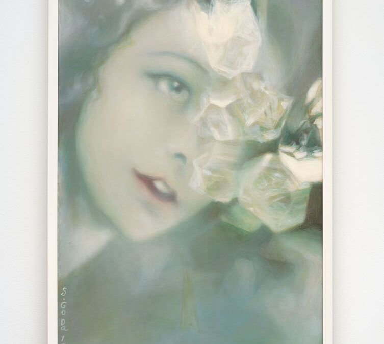
Those of us who have dreamed—which I pray is everyone reading this—know how it goes: A cacophony of vignettes rattle through your unconscious, some a single flash, some endless, though in reality, they’re all only a few seconds in duration. No matter their...
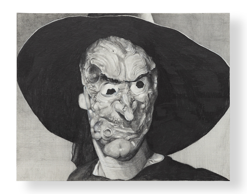
DL ALVAREZ at Guerrero Gallery
read more