Your cart is currently empty!
Tag: Art Mag
-
Shoptalk
LA Museum Update, Digital Art Happenings, In Memory: Simone GadDigital Art Happening
In April there was a moment when Yours Truly realized we were finally, at long last, emerging from the pandemic that has shut us in for over a year. It was Saturday night, and we were lured downtown by “LUMINEX: Dialogues of Light,” a one-night art happening of digital art projected onto building walls in DTLA. During COVID-time I’ve driven through these streets on various missions, and they were so empty it was apocalyptic. But tonight, lower Broadway was percolating with barhoppers and diners and, as darkness fell, art fans and those who had been pent up too long.
Sarah Rara, Perfect Touch, 2021, photo by Scarlet Cheng We started our rounds a little before the 7:30 official time—first stop was Sarah Rara’s “Perfect Touch 2021.” In a parking lot at 11th and South Olive, there was towering projection equipment and a handful of people, including guards and tech who were running the show. It was dusk, and we were told there was another half of the piece on the “other” side of the building—that is on the other side of the block. By the time we returned to look at the first piece again, it was dark, and there was now a crowd enjoying the sight of gigantic hands playing cat’s cradle—the string burning with light—and a voice reading a poem so aptly addressed to this strange, strange year: “The year of distance, the year of loss, the lost year,” the woman intoned, “The year of acknowledging fragility, interconnectedness.”
I think we will soon be seeing more work about what we’ve been through. It’s been a traumatic time, our shared annus horribilis—and we need to work it out through art: all forms of art, including writing and performance. And it was not only disease that captured us, but also a megalomaniac in power and his minions, bent on destroying the fabric of our civil life.
That night in DTLA we saw mesmerizing op-arty work by Nancy Baker Cahill and cascading images by Carole Kim, and a couple others. By 9 PM there were throngs of people on the sidewalks moving from site to site—mostly young and mostly elated to be out and about. Around us, new buildings were sprouting on nearly every block, some finished, others almost finished. What’s so surprising is that many are residential, housing for the new DTLA Urbanites. For some, the evening had just begun.
Installation photograph, Yoshitomo Nara, Los Angeles County Museum of Art, 2020, art ©Yoshitomo Nara, photo ©Museum Associates/LACMA. LA Museums (Finally) Reopen!
Museums also began to announce their reopenings in April, hooray! LACMA had a long list of exhibitions scheduled to open last spring and summer but, alas, did not. The biggest and probably most popular is the Yoshitomo Nara retrospective—he of the big-eyed girls holding little knives. To this day I never know what to make of his work—which has strong cartoony kitsch elements that play on its own commercial success. Yes, he is one of the most successful Asian artists today—in 2019, his painting Knife Behind Back sold for $24.9 million at Sotheby’s. I did enjoy looking at Nara’s early work, as he searches for his central themes. There is a reconstructed studio filled with drawings and small collectibles, which we peer into through windows. Then, as his canvasses grow in size and his brush becomes more impressionistic—as he turns away from his roots in line and drawing—he starts to lose me.
The Getty Villa has just reopened, with the exhibition “Mesopotamia: Civilization Begins.” I found the smaller show down on the main level, “Assyria: Palace Art of Ancient Iraq,” far more memorable. The subject matter is more focused (bas-reliefs from Assyrian palaces of the 9th to 7th centuries BC) and the images are so vivid, even brutal, in their storytelling: men hunting lions, soldiers storming battlements, kings lording it over everyone. These are on loan from the British Museum.
Also open are the Hammer (“Made in LA”), the Huntington (“Made in LA’s” second venue), California African American Museum (Sula Bermúdez-Silverman and Nikita Gale), and Forest Lawn Museum at Forest Lawn Glendale. Yes, the cemetery has a museum, and it’s currently featuring a terrific survey of work from noted stained-glass maker Judson Studios, based in Highland Park.
Simone Gad, photo by Lynda Burdick. OBITUARY
Saved by Simone Gad (1947–2021)
Simone Gad understood the tenuousness of appearances, their material possession and assertion. Her work as an artist was a conscious, deliberated and obsessive retrace of those assertions, an insistence upon their value and significance long after the fade-to-black, whether material or psychological (or for that matter cinematic—Hollywood actor and performer that she remained to the end). Among contemporary LA artists, she was a poète maudite, her work poised on a razor’s edge between redemption and remembrance; and she embraced it in full, transmuting loss and desperation into affirmation, affection, joy, mercy and defiance.
—Ezrha Jean Black
Please visit www.artillerymag.com/saved-by-simone-gad-and-other-souvenirs/ for a full read on the remembrance of Simone Gad.
Comings and Goings
Frieze LA is cancelled, finally. It’s been reported that they had planned to have galleries showing art in various available spaces around town—Paramount Studios, its usual haunt, was already booked to the gills with productions trying to play catch-up after COVID delays. This meant lots of driving for Angelenos (who already drive too much). The wonky logistics of all this apparently collapsed a scheme which would have been pretty challenging, even in the best of times. They’ll be coming back in February 2022 though, in a tent next to the Beverly Hills Hilton.
It was just a matter of time before New York mega-gallerist David Zwirner realized he had to open an outpost in Los Angeles—and Artnet reports he’s found a space near Deitch Projects in the West Hollywood area. LA galleries are making a move too—lots of well-located retail space is open around the city (the unfortunate fallout of COVID and the crippled economy). Moran Moran is moving to Western and Melrose. Luis De Jesus is leaving Culver City for DTLA and Lowell Ryan is moving from West Adams to West Washington Boulevard, in a building with a roomy courtyard. It’s always good to have outdoor space in LA, and of course so very useful for receptions and gatherings.
MENTAL HEALTH
May is Mental Health Awareness Month, and the Los Angeles County Department of Mental Health is sponsoring a month-long series of free programs and events highlighting the healing powers of art and connection. In its fourth year, WE RISE includes Art Rise with 21 art projects, Community Pop-Ups with over 50 local activities, and a Digital Experience, which can be enjoyed the usual way—virtually.
At this point, I’m especially keen on the RL experiences. Grand Park in DTLA, for example, will be home to “Grand Park’s Celebration Spectrum“ by dublab, in collaboration with Tanya Aguiñiga and curator Mark “Frosty” McNeill. Art installations and programming will “create space for all the missed celebrations in Los Angeles during the last year,” says the press release. Check out the festivities at www.werise.la.
-
The Wende Museum
Valuing the ValuelessIn the midst of the Revolution of 1917, fiery Bolshevik Leon Trotsky warned members of the Menshevik party that their moderate methods in the revolutionary world would relegate them to history’s “dustbin.” In an ironic appropriation six decades later, Ronald Reagan declared that Marxism and Leninism were destined for the “ash heap” of history. These two historical figures were, of course, speaking metaphorically about what happens to outdated ideology; they weren’t necessarily referencing the physical junk that collects with time. But ideology isn’t far removed from the everyday stuff it creates, the things it leaves behind. It’s in the places where these things are disposed of, neglected and hidden away, that history rests most authentically. And if you make the hour drive from The Ronald Reagan Library in Simi Valley to The Wende Museum of The Cold War in Culver City, you can see that while The Gipper was correct about the end of 20th-century Marxist Leninism as he knew it, there’s a lot of inspirational potential in history’s dustbin waiting to upset rigid systems of belief that linger with us today.
Courtesy of the Wende Museum, photo by Daniel Dilanian. The seeds of The Wende Museum began in the 1990s, when its founder Justinian Jampol began scouring basements and flea markets in Eastern Europe, seeking Soviet-era relics, particularly from the German Democratic Republic (GDR), essentially rescuing material culture from landfills. As people east of the Iron Curtain prepared for an uncertain future, many were quick to dispose of the state-sanctioned art, party memorabilia, outdated appliances and recorded remembrances that made up their previous lives. Everyone had their own reasons for the purge. Most simply wanted to make room, supercharged by promises of freedom, democracy and worldwide commerce. For oligarchs-in-the-making, the documented past was potential kompromat, evidence of the socialist safety nets that free-market crony capitalism wouldn’t supply. As the shiny hope of a ration-free future dissolved into authoritarian kleptocracy in countries like Russia and Hungary, proofs of the not-too-distant past threatened to become resonant reminders of what state-sponsored repression could—and often would—come to look like in the 21st century.
Now The Wende Museum houses the most extensive collection of Soviet-era art and artifacts outside of Europe. With over 100,000 objects in its collection, this unique institution, whose name derives from a German term referring to the change that occurred up to and following the fall of the Berlin Wall, stands as an invaluable resource for historians around the world, and an innovative educational destination for younger visitors who only know a post–Cold War life. As an art venue, The Wende hosts rotating exhibitions from its collections and works made by artists inspired by its archive. It’s a uniquely confounding and informative place, empowered by contrasts and contradictions that would probably piss off Ronald Reagan and his Evil Empire label-making progeny.
Justinian Jampol. I met Jampol and Joes Segal, the Wende’s Chief Curator and Director of Programming for a private, socially-distanced, masked-up tour of the museum and its current exhibition, “Transformations: Living Room->Flea Market->Museum->Art,” which re-articulates the journey objects undertake as they enter the institution’s archives. It’s unlike any exhibit I’ve seen before: Guiding the visitor through the very process that makes the museum, the exhibition employs a vulnerable transparency and a self-criticality that has come to mark many of its public offerings.
Visitors start in a domestic space, a small apartment decorated with period wallpaper and framed artworks, a dining room table surrounded by sleek modern chairs with kangaroo-like legs, and various toys scattered about on the floor. As I peered through the suspended windows modeled on Cold War housing, I found myself thinking about the value attributed to mid-century modern design today, transmitted through the lens of tastemaker enterprises like Dwell Magazine and HGTV. While “form following function” reads more like a cliché sales pitch these days—a salve for conspicuous consumption—the Wende’s exhibit makes clear that many of the things on display look the way they do because they were designed to make the most of the materials and technologies available at the time. The chairs, for example, are plastic because other raw materials were in short supply.
Joes Segal. Staring at all these objects activated in me a desire for things made to last, and I was reminded of one their many online talks The Wende has hosted since the COVID pandemic, particularly one about Private Space during the Cold War. During the talk Prof. Susan E. Reid, historian of material culture and everyday life in the USSR, noted that after the ’50s, during a state-sponsored turn to modernized noncommunal apartment housing, there were debates about where people would put all the new consumer products that would furnish their living spaces, with, “some architects and designers arguing that people shouldn’t have cupboards because they just shouldn’t have all this stuff …to put away,” so as not to encourage “accumulating things just for the love of things.” As the Wende exhibition makes clear, there was no shortage of things or people willing to buy them.
From the exhibition’s Home section, visitors move to the Flea Market, a facsimile including folding tables filled with objects like radios, textiles and teddy bears, walls displaying flags and surveillance equipment, and a clothing rack lined with military uniforms. As we pause and flip through a fascinating scrapbook of photos, postcards and written memories made by a cooperative of workers, Jampol notes, “If we (The Wende) weren’t here, a lot of these things would have disappeared …it’s endangered material.”
Courtesy of the Wende Museum, photo by Daniel Dilanian. Jampol and Segal point out that the museum actively collects things perceived to have little to no market value; once a certain kind of Cold War collectible becomes popular, they tend to move on to pursuing something else. The two men, bouncing ideas and observations back and forth with ease, tell me they actually get disappointed when the monetary valuations of things in the collection rise because “insurance costs and security costs go up.” Segal notes that developing their collection as a search for unearthed historical value is like a “secret sauce” that enables the museum to grow in a way that might be impossible for other institutions. It’s quite an accomplishment how they model the value in valuing the valueless.
We then move into the exhibition’s Museum section, a simulacrum of museological space with Soviet realist paintings and sculptures of proud workers and model comrades accompanied by official-looking wall text, velvet ropes separating viewers from art, and even a fake colonnade attached to the wall. These particular formalized elements look conspicuously designed to make the viewer aware of how the things surrounding a work of art create auras of authority. It echoes The Wende’s 2016 exhibition, “Questionable History,” which discussed art and artifacts through conflicting didactic labels stating interpretive positions in opposition to one another. For example, a pink bust of Lenin could be both pro and anti-socialist, a spontaneous reaction to the falling Berlin Wall and/or a nostalgic joke made in the last decade or so. In the end, the viewer is left to live in the uncomfortable space of uncertain “truths.”
Courtesy of the Wende Museum, photo by Daniel Dilanian. From there, the exhibit transitions through a mix of scientific machines on loan from The Getty with the word “ART” placed hilariously on the wall above them. These instruments, which measure material characteristics like tensile strength, sit as transitional objects—devices used to authenticate and stabilize artifacts as they make the journey from personal to public, ephemeral use into historical preservation. But things don’t end there: The exhibition then gives way to a selection of freshly made contemporary art inspired by items in the collection, the implication being that things in the archive start new journeys as catalysts for creative production after they find a home in the museum’s vaults. The inspirational potential is clear, for example, in Ken Gonzales-Day’s large photo mural composed of a collage of statues of leaders like Lenin and Stalin, recontextualized to reflect contemporary debates about what to do with monuments to the Confederacy in America today.
Courtesy of the Wende Museum, photo by Daniel Dilanian. Warmed by a fire pit in the museum’s sculpture garden, next to what will soon be a new community center, Joes and Jampol indulge my obligatory questions about how the museum positions itself within America’s politically polarized climate. Joes notes that some people get upset that the museum doesn’t demonize the GDR enough, while others want the opposite: “Other museums have the problem of getting people to care; ours is that often people care too much.”
The museum responds to these demands to take sides with critical neutrality, which itself acts as a looking glass, a reflection of the biases—latent or not—in its visitors. It’s a tricky balancing act that deftly challenges dualistic thinking. “Complexity can scare people off,” Jampol admits. “But it’s a worthwhile endeavor.” Joes adds, “If someone says ‘I get it,’ we’ve lost. Our success is in the confusion.”
-
GALLERY ROUNDS: Stanley Whitney
Matthew Marks GalleryStanley Whitney’s first major solo exhibition in Los Angeles, “How Black is That Blue,” reads like poetry. Utilizing his consistent style of painting “top to bottom,” Whitney’s colorful square works reveal several paintings within each piece. Favoring the asymmetrical, polyrhythmic shapes that he cites in Gee’s Bend quilting, Whitney’s stacked colored rectangles are not neatly packaged. Instead they bleed, drip and scrape, squishing their neighbors and shrinking in size. It is in this sense that his 11 new paintings on view read like poetry, their lines and gestures functioning as punctuation and line breaks, each scrape or nick of exposed white canvas abundant in unspoken meaning.
Stanley Whitney, Sun Moon, 2020 While the paintings are restrained and visibly specific (they feel decidedly finished, in a way I’m not sure I am used to seeing), there is a meditative quality to them. In making these works, Whitney remarks, “When you face the canvas and you’re painting, you have to bring everything to it. […] What comes out of my growing up? What comes out of my Blackness, my maleness, just being a human being? When you’re facing a blank canvas, you need all of these things to make it something.” The result is none of these things, and yet all of them at once accumulating to posit something new, something that looks like this exhibition, where each painting feels like a meditation on being and being in the exhibition is overwhelmingly meditative.
Stanley Whitney, Memory Garden, 2020 Entering the gallery is breathtaking. Each room presents one singular painting — large and mighty in stature — on its own wall. Given ample room these paintings seem to breathe, conversing with one another, each composed of the same parts and yet strikingly different. Whitney is a master of color, evident in his bold usage. Though the paintings are made up of blues, pinks, greens, reds and everything in between, I can be sure to tell you which the “green painting” (Twenty twenty), “yellow painting” (Sun Moon) or “pink painting” (Memory Garden) is.
Though they are boldly multi-hued, as well as significantly sized, they do not appear “colorful” or oppressive but rather muted and pensive. This speaks both to Whitney’s expertise of color and also his understanding of harmony and proportion.
Stanley Whitney, “How Black is That Blue” at Matthew Marks Gallery, 2021 This genre-spanning exhibition takes its influence from many forms — Gee’s Bend quilters as previously mentioned, architecture (look closely and the paintings will start to look like buildings, smartly constructed which, when placed in the context of this exhibition exist as landscapes or cityscapes), and jazz music. The off-beat, whip-smart irregularities of jazz are mimicked in Whitney’s obscure rectangles which have most in common with Beat poets and stream of consciousness method of writing. This exhibition, which can be best described as transcendent, reconciles form and meaning and, alike poetry, surpasses language and the words that construct them.
Stanley Whitney: How Black is That Blue
February 13 – May 8 2021
Images ©Stanley Whitney, Courtesy Matthew Marks Gallery
-
GALLERY ROUNDS: Hana Ward
Ochi ProjectsOchi Projects’ current exhibition, “an exit from this room and others like it,” features the latest painting and ceramic work of artist Hana Ward. In this show (all works 2021) both objects and paintings reflect on themes of time and isolation; feelings we are all too familiar with this past year. However, Ward takes these somewhat somber sentiments, and through luscious colors, illustrative marks and whimsical compositions, depicts scenes of power and potential.
Hana Ward, that drinking-wine-kind-of-thinking, oil on canvas, 2021 The show is made up mainly of paintings of Black female figures existing alone in wistful, reflective states. Rather than seeming to abide existentially in limbo though, Ward’s figures appear purposeful, even hopeful. Most of the paintings the women are in domestic settings as in that drinking-wine-kind-of-thinking, where a woman sits alone with a glass of wine at a dining room table. The illuminated figure appears in contemplation and the window behind her reveals an ethereal moonlit landscape. Although she exists alone in the confines of the dining room, the glow of the moon hints at the beauty and mystical world just beyond the window. In an exit from this room and others like it, a woman stands in the foreground of a room with a red painted floor extending behind her. The focal point leads to an open door, emitting a warm yellow glow that she looks toward hopefully.
Hana Ward, ima koso (now is the time), ceramic, glaze, clock, 2021 Themes of domesticity and time are further explored through the handcrafted ceramic wall pieces that are also a strong component of Ward’s practice. Clocks and vessels of sculpted faces are inter-dispersed throughout the other paintings, directly referencing concepts of time and space with titles such as ima koso (now is the time) where hands of a clock extend from the forehead of the woman they rest on—portraying how time is on the forefront of the mind.
In a year seeming to have no measure, Ward encapsulates this concept in reflection and celebration and looks towards the future. An exit from this room and others like it, reminds us that this moment will hold its mark for each of us, yet progression is in constant forward motion.
Hana Ward: an exit from this room and others like it
at Ochi Projects
March 27 – May 8, 2021Images courtesy of Ochi Projects.
-
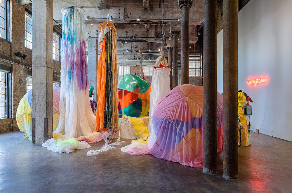
OUTSIDE LA: Katya Grokhovsky
Smack Mellon, New YorkKatya Grokhovsky is an artist and curator who explores the expectations of the American dream and the lived experiences of immigration to the US. Originally from Ukraine, Grokhovsky founded The Immigrant Artist Biennial, which launched last year despite many pandemic-related setbacks. In her current show at the New York-based nonprofit and exhibition space Smack Mellon, Grokhovsky created a wild installation of colors, textures and shapes called FANTASYLAND. Playing off of the themes of happiness, high hopes and naïve joy associated with Disneyland, Grokhovsky confronts the slow deflation of dreams as the shiny façade of living in America starts to deteriorate.
Grokhovsky uses a variety of mediums to make large assemblages with colorful objects such as giant plush toys, inflatable beach balls, parachutes and neon signs. FANTASYLAND is a site-specific installation for Smack Mellon that resembles a playground that at first feels like an exciting, welcoming amusement park, but upon closer inspection reveals darkness and decay. The exhibition is at once inviting, yet off-putting, bewitching and grotesque. The artist subtly chips away at the cheer and joy and leaves you with a sense of having missed out on something that was once beautiful.
Katya Grokhovsky, FANTASYLAND, 2021. Addressing American society’s culture of excess and consumerism, the large, colorful assemblages are made of repurposed materials like shopping bags and pieces of textile, adding to this sense of arriving at something that has seen better days. The materials are worn, slightly decaying and sun-bleached, with evidence of their past lives buried in layers below. Much like immigrants themselves, the installation appears to have a history, one that is being constantly reworked and added to rather than cleansed or erased. The works bear stories that the viewer can never fully know. A nod to the journey of immigrating and the idea of past lives and past homes, there is a strong sense of impermanence. The materials themselves are not archival, and the arrangement of the objects would inevitably vary if it were ever replicated.
Expanding on this sense of impermanence are the giant beach balls scattered around the installation. The balls, all in different stages of deflation, seem symbolic of the American dream, as if the idea of America is slowly deflated as the experience is lived. Deflation in general is a common thread throughout the exhibition. Deflated, lifeless parachutes hang from the industrial beams of the building and are draped around the beach balls. The balls inherently continue to lose air as the exhibition progresses, mirroring the constant evolution of life.
Katya Grokhovsky, FANTASYLAND, 2021. Grokhovsky’s works say so much about the experience of immigration: the hopeful expectations, the disappointment, the arduous, endless work, and the feeling of being sold on a dream that exist as a shell of its past. Powerful and poignant, she delivers her message wrapped in a shiny, colorful package that is as welcoming and foreboding as the story of immigration.
Photos by Etienne Frossard, courtesy of Smack Mellon.
-
GALLERY ROUNDS: Ishi Glinsky
Chris Sharp GalleryIshi Glinsky’s exhibition explores monuments of survival that honor the sacred practices of his tribe, the Tohono O’odham Nation, native to the Sonoran Desert in Arizona. Upon entering Chris Sharp Gallery I am instantly subsumed by Glinsky’s monolithically scaled leather jacket that levitates in the middle of the room. Coral vs. King Snake Jacket (2019) is colossally sublime, towering just over 10 feet tall. I feel an immediate desire to get close to the sculpture. I imagine crawling into the pocket of the worn-in jacket to discover an old receipt or a matchbox. The teeth of the zipper form interlocking arrowheads. Each crease in the leather recalls a story, a gesture, a history; each stud a piercing act of violence. As I look over each intricate detail, I notice that the jacket is adorned with an assortment of patches and pins, as leather jackets often are. Some are insignias for bands like Public Enemy and the Dead Kennedys, while others signify Native American activist groups, such as AIM (The American Indian Movement), and MMIW, stitched in black and red beads to represent missing and murdered Indigenous women. The sleeve of the jacket reads “YOSEMITE MEANS THOSE WHO KILL.” While the leather jacket’s hard exterior is a cultural symbol for rebellion, it also offers warmth and protection. Glinsky’s work embodies Indigenous history, resistance and survival.
Coral vs. King Snake Jacket, 2019 The radically oversized scale of Glinsky’s sculpture pays homage to Indigenous practices and native land that has historically been exploited and unrecognized. Western-hegemonic art history recalls monumental art by minimalist giants and land artists like Donald Judd and James Turrell, who have historically exploited stolen land, using it as a backdrop for their work. Art history works to reinforce violent colonialist narratives. We need new monuments and new storytellers. Glinsky’s sculpture acts as a counter monument that acknowledges and celebrates Indigenous people and their survival. While minimalism offers ahistorical universal ideals, Glinsky’s monument denounces dominance and claims resistance.
Coral vs. King Snake Jacket (detail), 2019 Indigenous scholar and activist Gerald Vizenor characterizes “survivance” as an active sense of native presence over absence, nihility, and victimry. Survivance carries forward Indigenous stories through collective memories and embodied practices.[1] Glinsky’s monument announces and honors Indigenous survival, demanding space for remembrance and existence.
Installation view: Friend ore Foe, 2021; Blue Rider, 2019 Chris Sharp Gallery
runs thru April 24, 2021 -
OUTSIDE LA: Izzy Barber
James Fuentes, New YorkIzzy Barber’s exhibition, “Maspeth Moon,” at James Fuentes brings together new plein air paintings that capture daily life in New York. Petite in size (the smallest 4” x 4” and others around 10” x 9”) Barber’s paintings are snapshots of quiet scenes that are at once private and familiar. From Little Italy to Midtown to Maspeth in Brooklyn, Barber paints the shared spaces and collective experiences that connect New Yorkers on a personal level.
Juniper Valley, 2021 Some paintings are identified by location, while others are left unnamed, but feel no less familiar. Barber often paints places and feelings she has encountered on a walk. “It can be a group of people, a structure, or a combination of colors that makes me stop and look again,” she explained in an email exchange after I inquired with the gallery staff. “Half the time I make a small sketch before I return another day with a canvas. Other times it’s a certain city block or neighborhood that I know has a feeling that I want to paint.”
Ridgewood Roof, 2020 One such feeling is captured in Ridgewood Roof (2020), in which the roof became both the studio and the subject. Painted in rich brown hues, neighboring roofs with glowing windows and a distant, sparkling city skyline unfold before the viewer. With so little outdoor space, rooftops have become a huge part of New Yorkers’ lives, especially over the last year. Far from luxurious, the city’s roofs are typically unfinished and dirty. A true representation of the resiliency of New Yorkers, rooftops became symbolic of how any outdoor space can be turned into something useful and possibly even beautiful.
Barber’s use of color captures the changing light as the days and seasons evolve. In Mott Street Market (2020), vibrant blue umbrellas and quaint food stands recall the Amalfi Coast or the Island of Capri. This same rich, mesmerizing blue is seen throughout the exhibition. The artist spends at least a day in her studio mixing paint to prepare for her outdoor excursions.
Weekend Gamblers, 2020 Barber’s paintings are truly done en plein air, often in periods of a few hours. “There is no rule, but the majority of the works in this show were done in one session. They are all painted on location. I bring the paintings back to my studio to look at them and if they don’t feel right I return to the same spot and keep working. If [the subject] is a fleeting moment, it’s going to be a quick painting. In the winter, I’ll stop when my hands or feet get numb; I can lose track of time easily when painting.”
It’s hard not to imagine the artist sitting in the snow painting the colorful blurs of sledders in Juniper Valley (2021) or swiftly working to capture the movement of the figures playing games in Weekend Gamblers (2020). Barber transports the viewer to these special moments, leaving a renewed sense of curiosity for the places and feelings emblematic of New York.
Izzy Barber: “Maspeth Moon”
James Fuentes, New York
April 8–May 9, 2021
All images courtesy of James Fuentes.
-
GALLERY ROUNDS: Brenna Youngblood, “The LIGHT and the DARK”
Roberts ProjectsHow we balance our individual experiences within the larger scope of our lives in many ways determines who we are, and how we understand and relate to the world around us. Reflecting on the dense and often traumatic events of the past year, which included a global pandemic and a re-awakening to racial injustice, Brenna Youngblood, in her inaugural exhibition at Roberts Projects, mediates her personal associations to these very public events as all of the works in the exhibition comprise a space for both reflection and determined response.
Brenna Youngblood, INCARCERATION, 2020, Mixed media on canvas, 69.75 x 40 in; Courtesy of the artist and Roberts Projects, Los Angeles, California; Photo Alan Shaffer Blurring the boundaries between figuration and abstraction, and speaking directly to the title of the exhibition as a whole “The LIGHT and the DARK,” i.e., the balance between light and dark, works like INCARCERATION (2020), imply human culpability through the empty hull of a black-and-white striped sweater, the pattern of which is reminiscent of prison uniforms that date back to the 1820s. In this system, prisoners had to remain silent, walk in “lock step” and wore the distinguishing black-and-white stripes, which were meant to suggest the prison bars they lived behind. In Youngblood’s rendition of mixed media, the sweater appears to be trapped within its own incessantly theatricalized and poignant gestural sweep across the canvas, and yet it also appears strangely frozen in space, which further suggests the idea of opposites, of balancing the light with the dark, the good with the bad, the pain with the rapture. The fact the price tag dangles from the bottom left of the frame in a gesture reminiscent of Rauschenberg’s dirty pillow in his seminal work Canyon (1959), further aligns the idea of prejudice and injustice with commerce.
Brenna Youngblood, Hourglass, 2021, Mixed media on canvas, 72 x 60 x 1.5 in (182.9 x 152.4 x 3.8 cm); Courtesy of the artist and Roberts Projects, Los Angeles, California; Photo Alan Shaffer Youngblood’s use of everyday materials including a pair of her own worn out shoes and an assortment of colorful buttons constitute a grouping of assembled collage works that allow her to imagine a new-fangled topographical facade which she then enhances through a variety of processes including thick impastos, transparent washes and variously loose and smooth brushstrokes. Hourglass (2021) employs hundreds of black buttons pushed to the very top of the picture plane like small circular creatures, jostling each other to and fro and desperately trying to come up for air. Metaphorically, this work specifically speaks to notions of disparity, prejudice and social inequality, and one has the sense that these buttons would rather be anywhere else than variously collected in this tightly claustrophobic mélange of darkness. A strange and hapless cloud floats beneath them, and one can’t be sure if the buttons are trying to escape it or seeking reentry.
Brenna Youngblood: The LIGHT and the DARK
March 20-May 15
Roberts Projects -
Lynette Yiadom-Boakye at Tate Britain
“Fly in League with The Night” at Tate BritainA man sits center frame, drowned within an interior sea of red hues, arms spread as he pensively gazes against our direction into the distance of the frame. A woman laughs cross-legged on a stool, mouth wide open as if paused mid-speech or laughter, as a grinning fox resting on the checkered floor between her legs mimics her expression. Nearby, two young girls explore a white-stricken landscape as they inquisitively play with what is left of the scattered land which surrounds them.
Mystic Edifice (2020) The unique allure of Ghanaian-British artist Lynette Yiadom-Boakye’s paintings rests in her enigmatic ability to mold past, present, and future; creating timeless landscapes that explore the relationships between living organisms, including humans, and their physical environments. Such elements are not usually deemed extraordinary, but since—like Yiadom-Boakye herself—all of her subjects are black, it feels radical. Smiling, smoking, lounging on beaches, and dancing; these autonomous subjects compel you to look, allowing black figures to become the protagonists of their own stories at last.
“Fly in League with The Night” seamlessly transitions itself from large-scale to mid-size works, from singular portraits to group images. Some works are paired to operate in dialogue with an other, such as Wrist Action (2010) and Bound Over to Keep the Faith (2012) where two androgynous figures are presented side-by-side, mysteriously grinning in the direction of the viewer. One rests their head upon their fist, whilst the other flashes a peach glove as if teasing us with what we are able and unable to identify. Straddling the line of what it means to be hyper-visible, seen, and simultaneously unseen; their gesture only amplifies their expression. Walking away from the exhibition, your mind remains marked by the tiny details of the faces you have just seen, with each figure slipping and merging into the other, much like I imagine Yiadom-Boakye intended.
To Improvise a Mountain (2018) Yiadom-Boakye executes a masterful approach to painting. Every brush stroke appears thick and distinct, yet complimentary of every shaded hue which appears. It is as if one can hear moments from each mark. In every brushstroke there is a laugh, a giggle, or a sigh, and with each of the endless black and maroon marks, or little burst of carnival yellow or rose pink, there is a moment of life. Black skin tones are rendered before us to echo the sentiment that no matter where they are placed, these characters will always find the light, whether it be through an expression, a gaze, or a gesture. Yes, these subjects are black, but Yiadom-Boakye redirects our thought and forces the viewer to question: why does such a thing actually matter?
Condor the Mole (2011) Fly in League of The Night brings together over 80 works crafted over a 17-year period. A timely and provocative mid-career retrospective, these works will haunt you far and beyond your initial viewing. Perhaps there are some studies featured which have lesser impact against the monotonous default white walls of Tate Britain. However, this is nowhere near distracting enough to fault the show. Yiadom-Boakye truly does fly away with her imagination, forging a realm far beyond what we are taught the Western Canon of painted portraiture should look like, and allowing black figures to exist in a timeless space where they are able to simply be at rest and at play, with room to finally take a breath.
-
Sherrie Levine: Sherrie Levine, Sherrie Levine
Exhibition at Xavier Hufkens, BrusselsSelf-portrait, Courtesy the Artist and Xavier Hufkens, Brussels Part I: Lana Del Rey
Some claimed that Lana Del Rey’s 2017 song “Get Free” was a rip-off of Radiohead’s iconic and self-masturbatory indie ballad “Creep,” which led to a rather unhinged and masculinist lawsuit. It seems that for women artists, homage or deconstruction or enjoyment or critique can all slide seamlessly and without conversation into fraudulence or a sort of frivolous game. This is to say nothing of still ongoing quests for (female, queer, POC) genius that are both necessary and regressive in their modernist preciousness. Of course, anything be similar and/or dissimilar to anything: bodies, one evocative wilderness or another, chord progressions, rainbows, discourses, bronze, women (largely) artists working at a certain place and in a certain time and in certain academically verified modes, photographs as such, lives, instances of falling in love. I will quote “Get Free” pretentiously “at length”:
There’s no more chasing rainbows
And hoping for an end to them
Their arches are illusions
Solid at first glance
But then you try to touch them (Touch, touch)
There’s nothing to hold on to (Hold, hold)
The colors used to lure you in (Shut up, shut up)
And put you in a trance (Ah, ah, ah, yeah)I don’t know the outcome of the man-child Radiohead outcry, but I do know that if they won the battle, they did not win the war, for Lana already exposed the trance and all of its iterations, thus rendering the archetypal idea of a copy archetypally unnecessary.
There is a freedom and pleasure in living inauthentically and without originality. In the chorus of “Get Free,” just after her appeal to rainbows, Lana pleads, moving from one archetype to another:
Sometimes it feels like I’ve got a war in my mind
I want to get off, but I keep ridin’ the ride
I never really noticed that I had to decide
To play someone’s game or live my own life
And now I do
I wanna move
Out of the black (Out of the black)
Into the blue (Into the blue)So, the movement toward optimism might be regimented, like the rainbow-turned-solid, or in the process of chalky decomposition. In any case, irrespective of the game she plays, she is still stuck within the colors of a bruise, and she and we love it.
Part II: Kermit the Frog
Kermit the Frog, like Lana Del Rey, knew that rainbows are the ultimate cliché, something that reproduces itself infinitely in ways that are life-giving and saccharine. They are a luxury (feminine, queer, hysterical, over-the-top, frilly, wasteful) but they are necessary. Despite their erotic curvature, rainbows are, in this way, akin to grids, bars, and the constraining heft of critique and deconstruction. On YouTube, you can find a “Rainbow Connection” duet sung by Kermit the Frog and Debbie Harry. Its wholesome and nostalgic spectacle is just that and nothing more and that has to be OK. In that moment, Debbie Harry was the Debbie Harry of Hairspray and not the Debbie Harry of the New Wave. But pretentiousness about genre is the worst kind. The fact that it is Debbie Harry of Hairspray with Kermit the Frog has to be OK in order for us to cope with the fact that the rainbow connection cannot be fulfilled
All of us under its spell
We know that it’s probably magic
And indeed, it must be magic, for it is being sung to us by a Muppet, whose only skull or trace is the puppeteer’s hand, and when the hand is retracted, there is nothing: only gauzy belief. But the magic lies in the fact that gauze cannot bruise, and that is solace enough. Debbie Harry has a skull though, but she does not offer it to Kermit or to us, and that is OK too.
Part III: Karen Carpenter
Gay men love Karen Carpenter, who did a beautiful cover of “Rainbow Connection” that was release posthumously in 1998, because all gay men (at least those, oftentimes, but not exclusively, of a certain age who were educated in the Judy Garland School) carry with them, inside, where the gauze is, a forced embrace of death, which is the ultimate form of unoriginality. And unoriginality is a form of wasting away, as is the evaporation of a rainbow in the indifferent sun or in the eyes of a cruel lover. And no one can be remarkable in wasting away, since we all do it—some more quickly and intentionally than others. But we hope nevertheless to waste away remarkably and create a legacy. Why are there so many songs about rainbows, and why are there so many narratives of death, which is another name for the master narrative of History? It is because the most reliable form of emotional nourishment is repetition, and it is the deepest form.
Allegedly, The Carpenters’ cover of “Rainbow Connection” was never meant to be released. Richard Carpenter joked, “If I ever released it, Karen would come down and get me!” This statement turns Karen Carpenter, feathered and wispy-to-death, into the Father and the Law, which seems flippant at best and cruel at worst. If Monet and Flaubert and Barthes were that thin, would we fear them? Would we disregard their wishes and listen blithely to and love their kitsch-adjacent recordings that they never wanted to see the light of day? It is irrelevant in some ways because no one regulates a man’s thinness, the space he takes up. Maybe if they were thinner like the immaterial bands of a rainbow, they and we might evade the pleasures and dangers of influence and history and death. Karen and Kermit and Lana and Sherrie know that in disappearing we can finally get free. They also know that a desire to reappear is not an indictment of our freedom.
Sherrie LevineSherrie Levine Sherrie Levine11 March—10 April 2021107 rue St-Georges | St-JorisstraatWilliam J. Simmons is a writer and curator based in LA and NYC. His first book Queer Formalism: The Return was published this month by Floating Opera Press. -
Pick of the Week: Hosai Matsubayashi & Trevor Shimizu
Nonaka-HillThere is a natural tension drawn between old and new, conservative and progressive. Often times, it can feel that between those two positions there can be no resolution. Even in art, it can be difficult to fit the opposing ideals together; though when it happens, the results are mystifying. One such confluence of tradition and modernity is the group painting and ceramics show of Hosai Matsubayashi XVI and Trevor Shimizu, on view at Nonaka-Hill.
For those who haven’t seen a roman numeral that large since the French Revolution, our era’s Hosai Matsubayashi is the sixteenth in his family to run their kiln in Uji, Kyoto. Since the year 1600, the Matsubayashi family has produced some of the finest ceramics in all of Japan, most notable for their tea ceremony sets – and every ounce of the centuries of creative ability and technical mastery is on display in dozens of precious objects, from waved vases to earthen tea kettles.
Trevor Shimizu, by contrast, does not stand on a mountain of history but rather at the forefront of contemporary art. A painter and video artist based out of New York, Shimizu is known primarily for his sardonic and comedic works, like his exhibition of fart paintings in 2015. His work is deeply expressive, drawing on modernist influences to paint rapidly and with decisive brushstrokes.
Here in Nonaka-Hill, they have been brought together. Matsubayashi’s ceramics (which draw on a wide variety of traditional Japanese technique, most prominently wabi sabi and blue-washes) sit peacefully on low tables, as if they were set out for use in a tea ceremony. And while still in his abstract style, Shimizu’s large landscape paintings take on a new life when hanging alongside the historic ceramics. One begins to notice the influences of calligraphic styles in Shimizu’s work, and an allowance of negative space not unlike that of ink painting. Likewise, Shimizu’s expressive paintings lend their sense of freedom to the pottery, in turn lifting and re-contextualizing this tradition.
Together, Shimizu and Matsubayashi breathe new meaning into one another’s works, creating an entirely unique experience out of their individual brilliances.
Nonaka-Hill
720 N. Highland Ave.
Los Angeles, CA, 90038
Appointment Only -
Pick of the Week: The Lights of Los Angeles
Los AngelesBeauty is all around us. This thought feels simplistic, and given the past year, even wrong. Stuck in our homes, away from family and friends, a city as large and vibrant as Los Angeles becomes terribly claustrophobic. And even for those fortunate enough not to be directly affected by the pandemic (we are all affected in some way), it’s normal to become disaffected from your environment. Spend enough time anywhere, you’ll forget why you’re there in the first place.
The best way I’ve found to re-encounter beauty is to return to that most basic of artistic principles: light. I’ve found that very little warms the soul more than good lighting. Be it blinking and bright neon, soft daylight streaming through waving branches, or twinkling pin-pricks scattered amidst inky darkness, light is beautiful across all of its forms. And there’s hardly a better city, nor time of year, to find good lighting.
The sunsets are earlier and more brilliantly colored. Holiday lights of every hue adorn store-fronts, slanted eaves, and tree trunks. Streets are emptier and night is longer. This last Pick of the Week for 2020 can’t be found in any gallery. No, this week, I recommend getting in your car, putting on some lively music, and driving until you find that special lighting that makes everything stop.
From the thick veneer of shimmering lights that extends all the way to the horizon, visible from up high in the hills, to the dazzling street displays on Rodeo Drive and Santa Monica Boulevard. From the tall, shifting columns of light on skyscrapers downtown, to the festive and demure lights found all over every neighborhood. There isn’t a wrong answer, and no matter which lights you like, you’ll be happy you found them.
Three tips to finding good lighting:
- Trust your instincts. If you left feels good, turn left; if you want to go right, turn right. Mix it up. Drive in circles. In squares. Hell, drive in triangles. All roads lead somewhere.
- Just keep moving. Try not to get bogged down in traffic or stuck on highways, and unless a place really strikes you (which is what we’re looking to happen anyways). No need to get out and gawk either; the magic of light hunting is in the moment of discovery.
- Look at the city with fresh eyes. Act like you’ve never been here before. Hit the big name streets and tourist havens. You’ll surprise yourself with how wonderful our city can be without all the cynicism.
-
Pick of the Week: Shiyuan Liu
Tanya Bonakdar GalleryArt, at its most essential level, attempts to fix in space the experiences that pass like sand in an hourglass. On the whole, reality is almost always more complex than can be accurately represented, and meaning is missed in the variety of expression. But Shiyuan Liu doesn’t want to miss a thing.
Of all the ways to describe “For Jord,” at the Tanya Bonakdar Gallery, detailed rises to the forefront almost immediately. In any medium, Shiyuan extracts the most meaning she can out of each material and image. “For Jord” is about the ways in which we define things, and how those definitions change through time or culture.
In her video work, For the Photos I Didn’t Take, For the Stories I Didn’t Read, Shiyuan re-contextualizes the Hans Christian Anderson story “The Little Match Seller,” using images found on the internet to represent each word in the story, displayed over wintery, holiday imagery and gentle music. She is expansive in representing the language of the story, using girls from a wide variety of socio-economic background and culture to represent “SHE” or “HER,” for example. In this way, Shiyuan is challenging the viewers own biases and automatic associations with certain words, images, or concepts.
Her photo series as well, entitled For Jord and Almost Like Rebar, again encourage a broadening of perspective, illustrating the complex cultural programming that everyone has when it comes to theoretically universal imagery. The tessellated photographs and video stills of animals, plants, pianos, diced onions, etc. culminate in an overwhelming sensation not only that you alone could never hold all the answers, but that even the most basic definitions and associations can vary.
This challenge extends even further with the most abstracted of Shiyuan’s work, her Cross Away series. These grids of pigments, kaleidoscopic and variegated yet masterful in their command over color theory and balance, close the conceptual loop of the show. While life may be infinitely complex and ever changing, in each moment we have the ability to stop, to look, and – if we’re lucky – to find something beautiful in the chaos.
Tanya Bonakdar Gallery
1010 N. Highland Ave
Los Angeles, CA, 90038
Appointment Only -
Pick of the Week: Cosmo Whyte
Anat EbgiNothing is just one thing. This is a sentiment that many of us here in the United States, particularly those of us with privilege, are coming to terms with in an entirely new way. From recognizing that many workers who previously went unseen are in fact essential, to understanding that police officers do not always serve and protect, 2020 has taught us that multiplicities abound in this life. This lesson is reinforced in Cosmo Whyte’s show “When They Aren’t Looking We Gather by the River,” on view at Anat Ebgi.
Cosmo Whyte’s work is primarily focused on Black experience, centered on the ongoing Black Lives Matter and related civil rights’ movements happening across the United States. As a Jamaican artist, Whyte is particularly interested in the complexities of Black identity and the Black diaspora.
The first work you encounter hangs in the entrance to the viewing room as a beaded curtain. Entitled Wading in the Wake, a monochromatic image of men running into water and collapsing into its surf is printed upon the beads. At first glance, the image appears playful, but the reality is far from that initial impression. The image was lifted from a 1964 civil rights protest, in which Black activists swam illegally in white-only beaches and were subsequently attacked by violent segregationists.
The works beyond the beaded curtain again contain multitudes. Mixing images of Jamaican Carnival and riotous protests, Whyte conflates celebration and struggle, indicating that despite pain and oppression, joy persists.
The work which conflates the two most subtly is entitled Breadfruit, which shows a Black woman standing and smiling on a busy street, her face and body partially obscured by tropical branches – those of a Breadfruit tree. The breadfruit is an incredibly popular fruit in Jamaica, though it is not indigenous. Like 92% of Jamaica today, the ancestors of the contemporary breadfruit trees were brought over by European colonialists, uprooted from native soil and deposited into a foreign land. Nevertheless, these trees survived and thrived, created a rich cultural and culinary heritage, and serve as a powerful allegory in Whyte’s talented hands.
Anat Ebgi
2660 S La Cienegas Blvd.
Los Angeles, CA, 90034
Appointment Only -
Pick of the Week: Joni Sternbach
Von Lintel GalleryIn 1839, the very first portrait photograph was captured of (and by) Robert Cornelius. It must have been a difficult – albeit likely humorous – process, as Cornelius set up his camera before hurriedly running to sit motionless in front of it, arms crossed and hair tousled. To go to such an effort demonstrates the essential connection between portraiture and photography. They’ve been attached to one another from the beginning. Moreover, portrait photography is more important and accessible to the public in ways Cornelius could never have imagined. But in Joni Sternbach’s new exhibition “Surfboard” at Von Lintel Gallery, we see the oldest techniques of photography implemented in the capturing of a different kind of portrait.
As the title of the show suggests, “Surfboard” continues Sternbach’s ongoing “Surfland” series by capturing surfing culture through the use of tintype and silver-gelatin photographs. However, unlike her previous works, there are no actual surfers in the show at all. Instead, Sternbach photographs a wide array of boards, from weathered and beaten Hobies to modern fiberglass boards. The boards act as canvases themselves, showing not only the scars of their use but also elaborately painted designs like those in #2 Lightning Bolt and #5 Skeleton.
While a surfboard in the abstract is a utilitarian item of sport and leisure, under Sternbach’s careful eye and expert photographic skills, the boards take on an entirely new quality. Sternbach refers to this quality as “totemic,” and they do inspire a certain reverence. Especially when clustered together on the beach, they become an altar to the ocean.
And by giving these boards the dignity that such a laborious process as tin-type prints require, Sternbach glorifies the craft itself. One can take a moment to appreciate the gently sloping curves and precise symmetry of the boards, as well as the varied decorative elements. The care and talent with which these boards were created shines through in Sternbach’s work. It’s fitting that the only bit of an actual human being captured in Sternbach’s many portraits are two hands, clutching a board to hold it upright, as if to say “These crafted this.”
Von Lintel Gallery
1206 Maple Ave. #212
Los Angeles, CA, 90015
Appointment Only -
Pick of the Week: Sculptures
Kayne Griffin CorcoranSculpture is a medium of art with infinite possibilities. Unbounded by canvas or wall, a sculpture is only defined by the space itself. Yet despite the limitless potential definitions, there is only ever one realized in the moment that the iron is cast, the glass blown, or the stone hewn. This decisive moment is what allows for a narrative to form, one which in masterful hands reflects the society that surrounds it. “Sculptures,” a group show currently running at Kayne Griffin Corcoran, illustrates this narrative by expertly linking works created over the last sixty years in beautiful conversation.
To begin this decades-long story, “Sculptures” presents the artists who dove head-first into the literal material of their works. Nowhere in the show is this more clear than with Tatsuo Kawaguchi’s Iron of Iron and/or Tools; Plier (1975), where a pair of pliers are firmly embedded into an iron plate. Kawaguchi is highlighting the material from which tools are derived, and in doing so, questions the very conceptions of origin. In many ways, the artists collected in this show of his era – from the Arp-esque Ken Price to the minimalist Mary Corse – are all primarily concerned with the minor subversion of the expectations we place on material.
But there is a far greater subversion explored in “Sculptures,” a task handled by the sculptors to come in the 21st century. With these artists, the questions brought about have far more to do with the actual conceptual definition of the objects they represent rather than the materials. Is a gate still a gate if it leads nowhere? Is a boat still a boat if you cover it in copper shingles? And when is a bench simply a bench (or a lamp simply a lamp), and not a piece of art?
These works engender a distrustfulness not uncommon in contemporary society, an unwillingness to take anything presented earnestly at face value. The later works are pessimistic counterparts to the sincere explorations of material with which they are paired. And it is vital to keep these two seemingly disparate ideas in mind at the same moment. We must be equally dedicated in our investigation of our origins as we are concerned with subverting the expectations set by them. To forget where we came from is to forget why we must be distrustful.
Kayne Griffin Corcoran
1201 SOUTH LA BREA AVENUE
Los Angeles, CA, 90019
Appointment Only