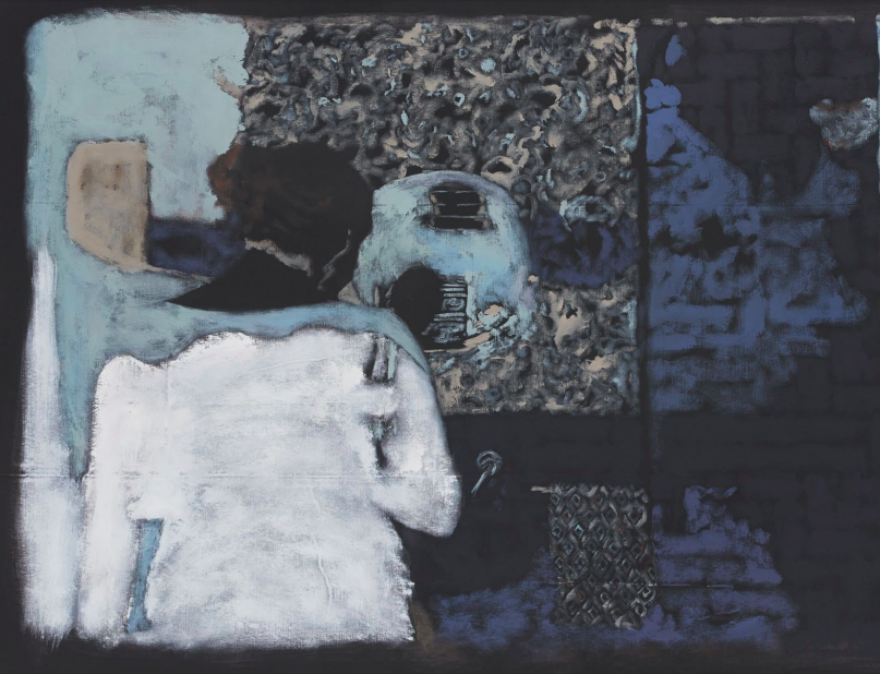
Silke Otto-Knapp’s paintings of cascading, roaming bodies feel as if they washed up on the shores of my mind like sedimentary particles— suspended and unsettled bits of matter that float and sink. Memories behave like mollusks, secreting trails of life, fading traces...
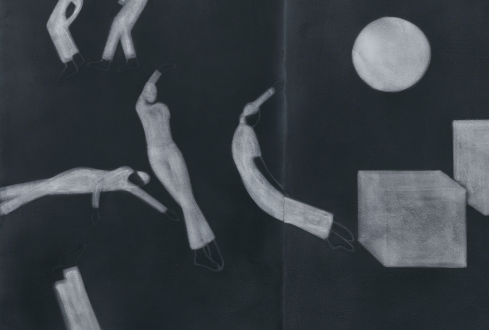
PICK OF THE WEEK: Silke Otto-Knapp Regen Projects
read more