


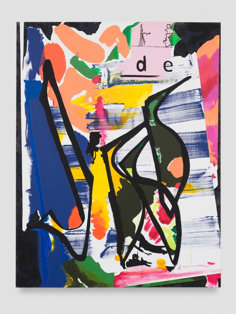
abstract art
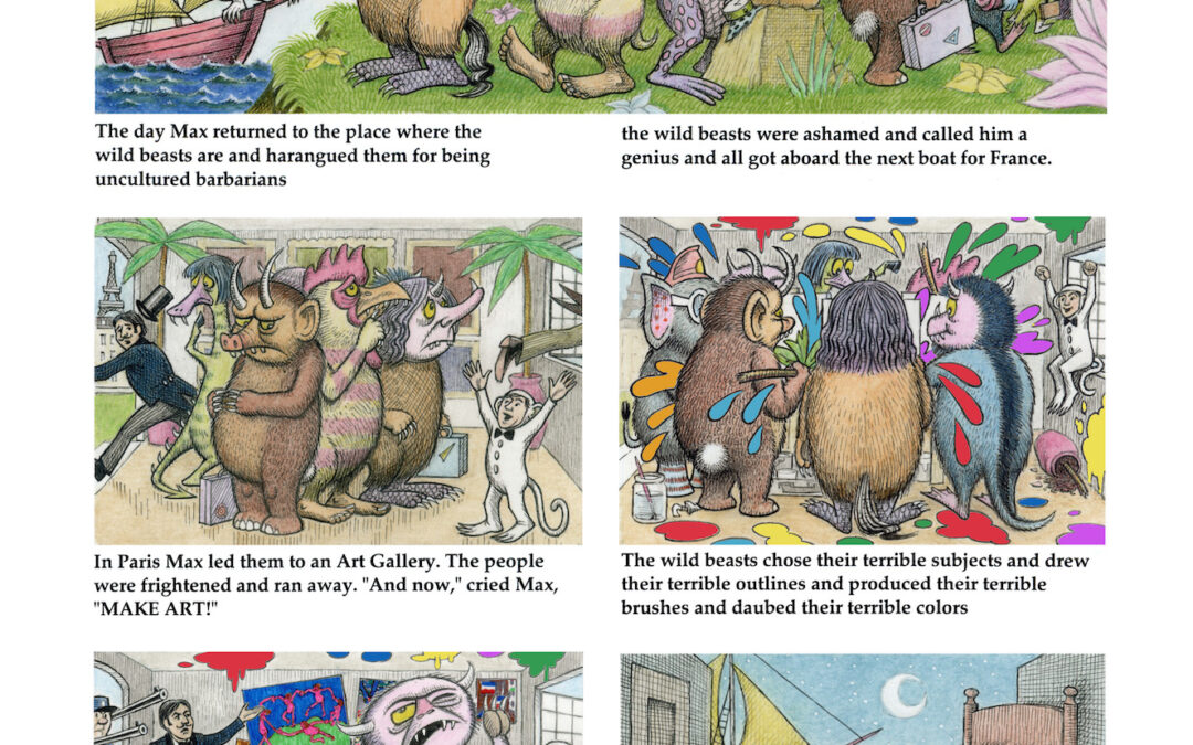
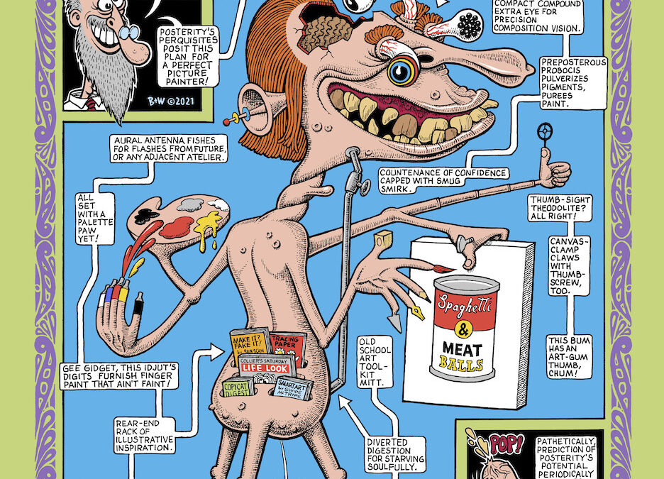
COMICS
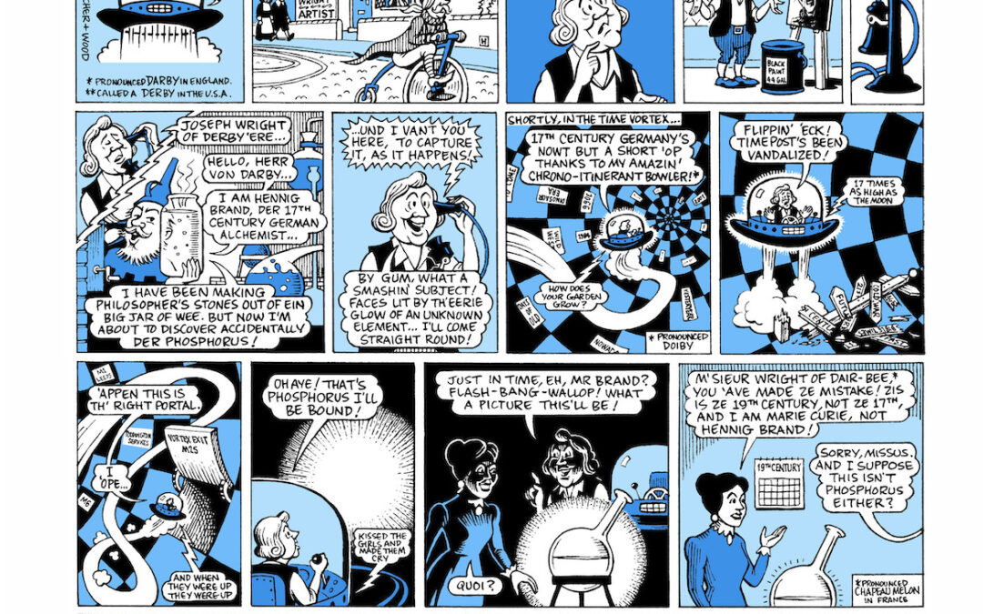
COMICS Joseph Wright of Derby
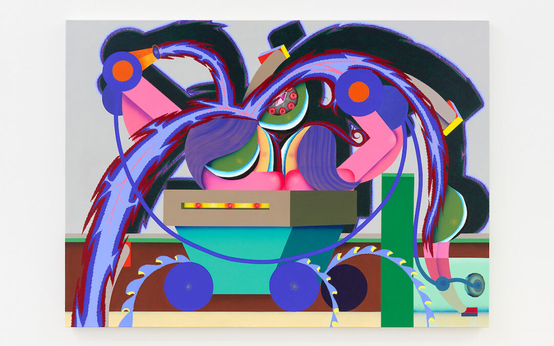
OUTSIDE LA: Gosha Levochkin The Hole, New York
Kicking off 2022, New York’s The Hole has debuted a solo show from Gosha Levochkin, the gallery’s first with the Russian American artist. Wild, vibrant and interminably buzzing, Last Element is rife with bright constructivist shapes, cartoonish figures and references...
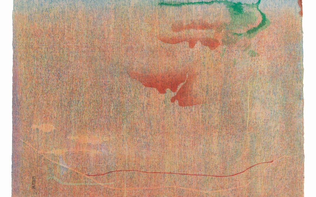
OUTSIDE LA: Helen Frankenthaler Dulwich Picture Gallery, London
The woodblock prints by American painter, Frankenthaler (b. 1928) that form "Radical Beauty" at Dulwich Picture Gallery in London, follow the wave of recent retrospectives highlighting overlooked 20th-century female artists such as Hilma Af Klimt and Agnes Pelton....
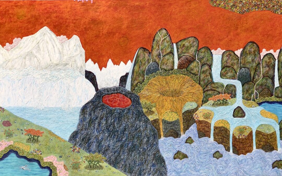
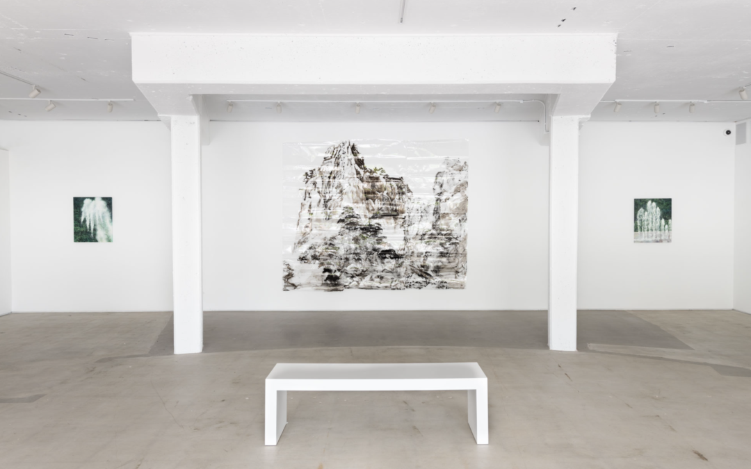
The Spiritualized Landscapes of Hung Viet Nguyen DEVOTED TO NATURE
“Art is a universal language,” Hung Viet Nguyen says. “And when I came here as an immigrant, my English language was not that great. My strength was in painting. I slowly convinced people that my art is my language.” Nguyen came to the US from Vietnam in 1982, with a...
Shoptalk: LA Art News Art Fairs, Breakout Artists, and More.
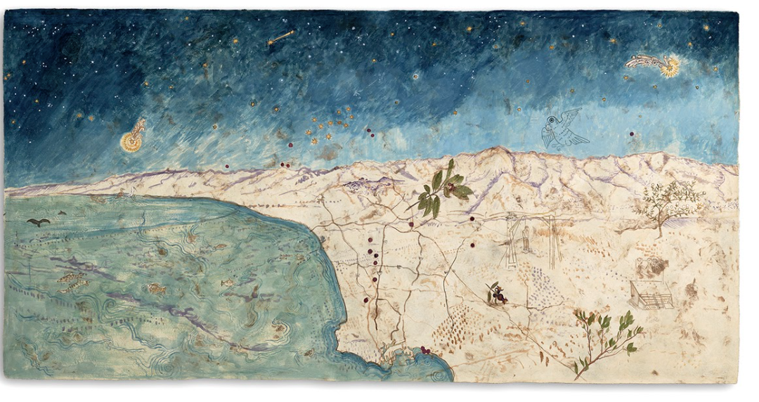
On a Roll LA artist Sandy Rodriguez is having a very good year—her work is currently in a solo show, “Sandy Rodriguez in Isolation” (through April 17), at the Amon Carter Museum of American Art in Fort Worth, TX, plus she’s part of two major exhibitions in the LA...
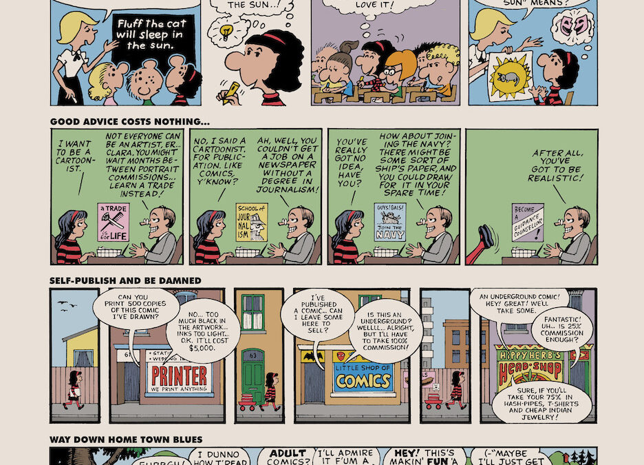
COMICS A Bunch of Sour Grapes
Pick of the Week: Lindsay August-Salazar Lowell Ryan Projects
Few grasp the power of language to be visually enthralling while expanding our consciousnesses as well as Lindsay August-Salazar, whose solo show at Lowell Ryan Projects, “There’s No Place Like No Place” brings these questions to the forefront. Employing vibrant color...
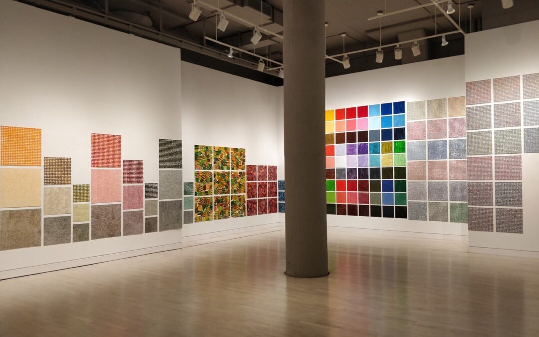
OUTSIDE LA: Jennifer Bartlett Locks Gallery, Philadelphia, PA
Various sizes of square panels mostly covered with dots with groups of parallel lines and occasional fields of paint line the gallery walls of Locks Gallery in Jennifer Bartlett's installation "Recitative"—its title derived from a rhythmic free form vocal style of...
Remarks on Color: Timid White and Bruised Sand: A Conversation Remarks on Color
Considering the world today, it’s no wonder you’ve begun to peel, to pull away from your respective homes, to hide from the tremors, quakes and quick-sands of the living world. We are all guilty of something. We have all fallen under at some time or other, curling in...
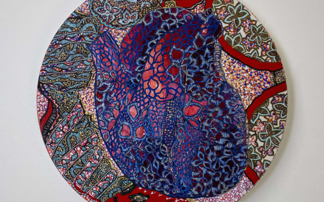
GALLERY ROUNDS: Leigh Salgado Launch Gallery
“As the World Turns” is an apt title for Leigh Salgado’s fourth solo exhibition at Launch Gallery. Many of the graceful works are circular, globe-like. A lush world of beauty that also evokes ideas of the circular nature of life: our annual passage around the sun, and...
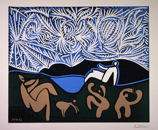
Pick of the Week: Unseen Picasso Norton Simon Museum
My first review for Artillery Magazine – almost two years ago now – was for my favorite museum in southern California, The Norton Simon. I recently went back and reread that article, and I found that my own writing was, to be kind, academic. Dry as a bone, really....
COMICS Future Features for Creative Creatures
Pick of the Week: Amoako Boafo Roberts Projects
In his essay on photography entitled “The Decisive Moment,” Henri Cartier Bresson describes the intricacies of portraiture and the subject. He writes that the ideal portrait is a “true reflection of a person’s world – which is as much outside him as inside him.” We...
Pick of the Week: Humming to the Sound of Fear Helen J. Gallery
The Korean Peninsula is a region rooted in duality. It is a land both literally and ideologically split down the middle, a lasting result of Cold War-era proxy wars, Western imperialist action, and an on-going brutal dictatorship. And even before the interventions...
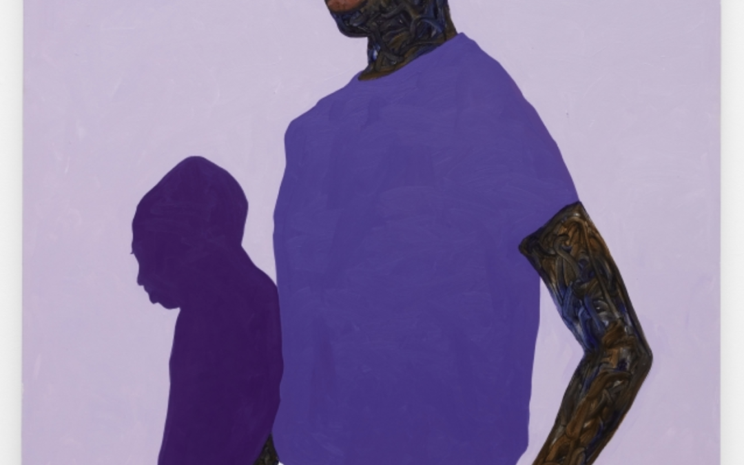
Pick of the Week: Devin B. Johnson Nicodim
Grief comes in countless forms. There are as many ways to feel the peculiar sensation of loss as there are things to lose. One can lose another, something external, and just the same – or just as differently –one can lose oneself. With bereavement, there is no wrong...
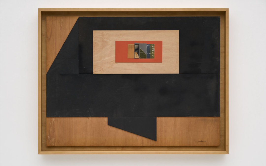
GALLERY ROUNDS: Louise Nevelson Kayne Griffin
Fragments of paper, cardboard, wire and foil have all been carefully orchestrated into a space that seems to float seamlessly and coalesce into a compelling quasi-geometric composition in “Collages 1957–1982” by Louise Nevelson. On closer inspection, it becomes clear...
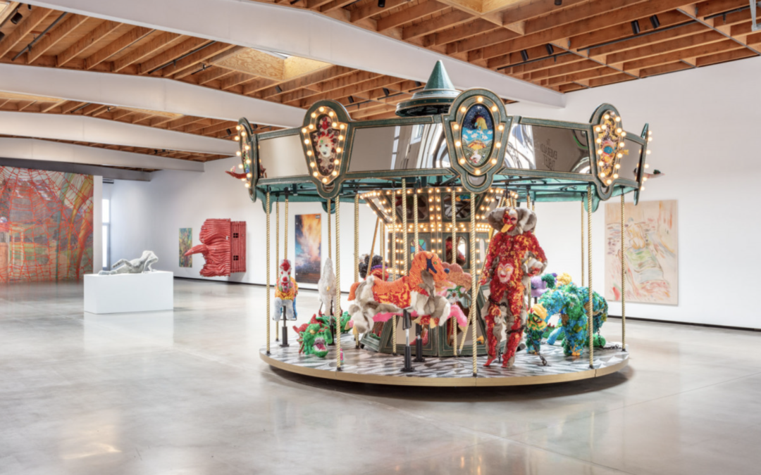
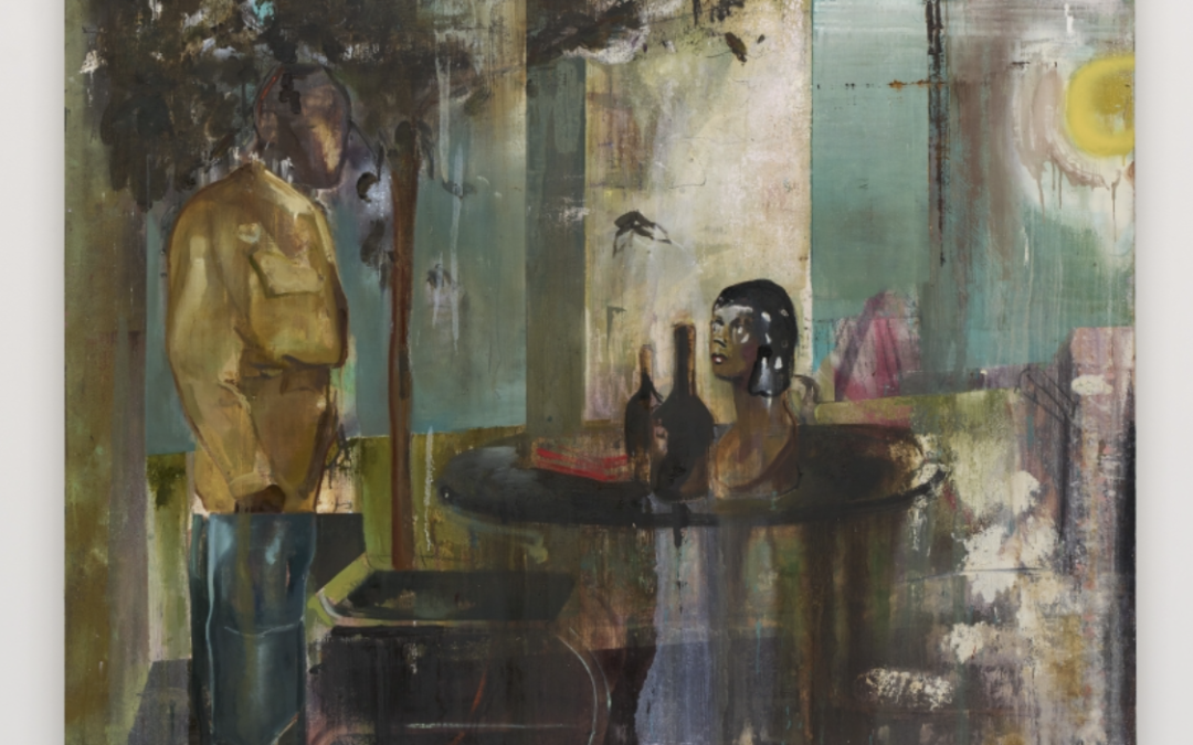
Pick of the Week: Ariana Papademetropoulos Jeffrey Deitch
Fairytales operate in a special place of human consciousness. They offer the building blocks of moralism and societal standards, for better or worse. Though folk stories, myths and fairytales are found throughout every culture, there are many common elements: simple...
