Your cart is currently empty!
Tag: Abstract
-
RICHMOND, VA: Diego Sanchez
VISUAL INFORMATION
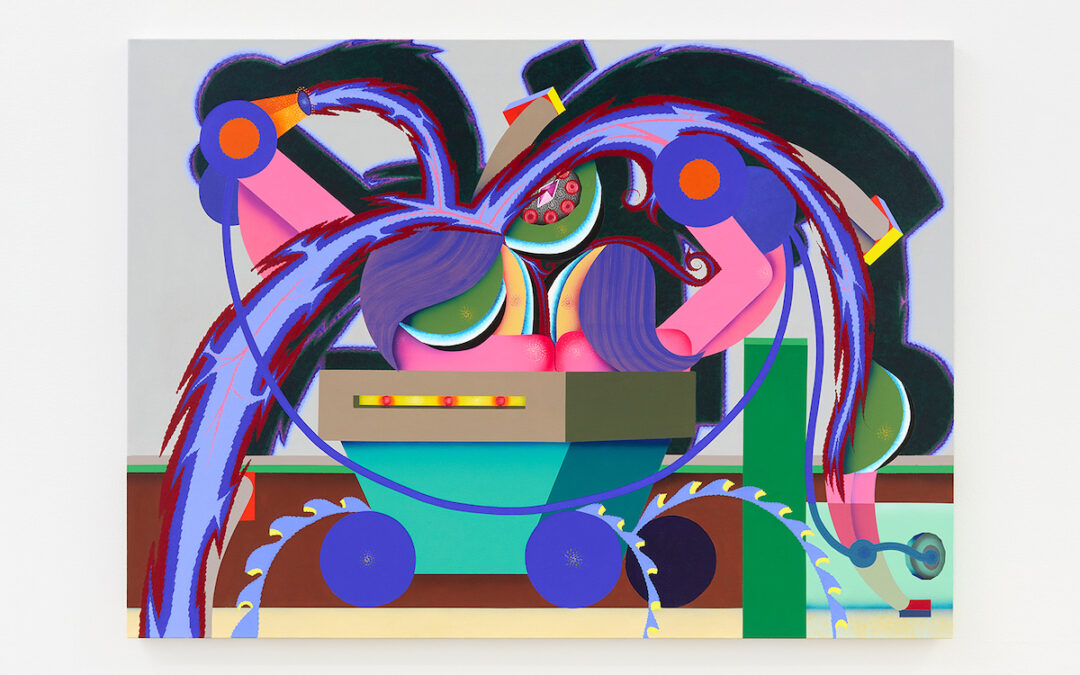
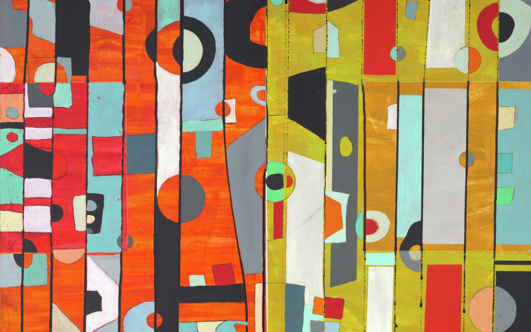
“One of the things I teach my kids is to be playful in their approach,” says painter and teacher Diego Sanchez. This freedom to experiment takes the pressure off and opens up the work in unexpected directions. It’s an attitude that has served Sanchez well in his own practice.
Sanchez lives and works around Richmond, Virginia, a city with a vibrant art scene. His story is not just about becoming a successful artist, it’s also an inspiring account of an immigrant starting with nothing and rising up through the ranks of his profession. Born in Bogotá, Colombia, Sanchez came to the US in 1980 at the age of 15. His father, a judge, had refused to cave to pressure from drug cartels. Fleeing for their lives, the family ended up in Northern Virginia. Sanchez, who had opted to study French at school in Colombia, spoke no English. It was an art class that changed everything, providing a means of communication. “I realized with art, you didn’t need English or French, anyone could get it,” he says.
Composition #6, 9×12 inches, mixed media on paper, 2021 After graduating from high school, with no money for college, Sanchez enlisted in the army. On completion of his military service and college degree, he attended Virginia Commonwealth University School of Arts, one of the best art schools in the country, where he received his MFA.
In the years following, Sanchez cobbled together a career with teaching gigs at various places around Richmond. His first full-time position was at Virginia Union University (one of the oldest historically Black institutions in Virginia), where he taught for five years. Eventually, he was offered a position at St. Catherine’s School (a distinguished private girls’ school), where he has been teaching for over 20 years. During the summer, he leads art classes at the Virginia Museum of Fine Arts (VFMA) and at Richmond’s Visual Art Center.
current work in progress, 48×36 inches, mixed media on panel, 2022 One of the first things you notice about Sanchez’ work is the surfaces. He uses a water base to develop them, coming back with layers of oil and cold wax. He also uses unorthodox materials—coffee to stain and soap mixed with pigment to create bubbles of paint that burst and leave behind nebulous rings of color. He likes playing with visual information. Sometimes he starts by creating realistic space and then paints something flat on it or adds patterns or text. “To me, a painting is a record of whatever is happening at the time. For instance, sometimes when I’m working in my studio, my wife will say, “Hey, can you pick up some milk?” So, I’ll jot down, pick up milk, on the work. I may cover it up later, but little glimpses of my life remain, becoming part of the painting.”
To center and relax during the stressful months of the pandemic, Sanchez started putting lines on paper. “I used this wonderful walnut ink. I love the earthy color, the opacity, the way it handles. I first created a simple structure of lines and then came back with the grid. I did a whole bunch of them, combining some with cold wax. It was like making a structure out of chaos.”
Composition #124, 32×40 inches, mixed media on panel, 2021 His work was changing, and with an upcoming show on the horizon, he set himself the challenge of doing 100 small pieces on paper. These gave him ideas on how to move forward, shifting from the handsome arrangements of geometric shapes to looser compositions that incorporate amorphous forms and interesting color pairings. In these works, texture and pattern possess an enhanced earthiness that imparts soul.
According to Dr. Michael R. Taylor, chief curator and deputy director for art and education of the VMFA, “Diego Sanchez is one of the most exciting and respected artists working in Richmond today, the museum loves his work, and we were proud to acquire Composition #76 for the collection in 2018.” Certainly, the measure of success is the acquisition of your work by a major museum, but Sanchez, like many famous artists before him, has the added coup of having his own merch available in the museum shop, which carries a puzzle and socks based on the acquired painting. Not bad for a kid who, at 15, had to start all over again from square one.
-
OUTSIDE LA: Gosha Levochkin
The Hole, New YorkKicking off 2022, New York’s The Hole has debuted a solo show from Gosha Levochkin, the gallery’s first with the Russian American artist. Wild, vibrant and interminably buzzing, Last Element is rife with bright constructivist shapes, cartoonish figures and references to graffiti, comic books and Japanese animation. Levochkin’s paintings are far from narrative, yet the shapes and figures come together in dreamy scenes that invite the viewer on a trippy, electrified journey.
Welcoming the viewer are two aptly titled paintings, Up and Down (2021), that depict jumbled figures blending into and climbing on top of one another. Their brightly colored noodle arms pull thin ropes in apparently endless motion. In Up, the figures appear to be on a ladder, perhaps on a playground. Down imparts a similar feeling of play with a paper boat floating calmly in light blue water. However, despite this element of play, there is something slightly sinister about the overlapping bodies. Are they forever stuck in motion, climbing, tumbling and pulling like Sisyphus? Is the rope being dipped into the water in Down really a rope, or is it an electrical wire? This subtle tension and hint at discomfort continues throughout the show, lending every work an air of excitement, as if the scenes unfolding are about to burst into motion.
Gosha Levochkin, Down, 2021 The people in these first two paintings seem to be on a wild journey. As the show continues, they jump into environments with unidentifiable shapes and architectural elements that melt into one another. In Hybrid Power (2021), a cart carries purple-haired figures. A cord plugged into the wall is attached to a device that emits frenetic, jagged bursts of energy bouncing in various directions. Architectural features like columns are sucked into the central jumble from some unknown source. Perhaps this is another image of a figure at play, or perhaps they are hard at work with their arms frantically completing a task.
Gosha Levochkin, Found Nothing Splash, 2021 A similarly buzzing scene unfolds in Found Nothing Splash (2021), in which space and logic are fully abandoned. A large figure stands on the right and looks out onto the swirling tornado of colors and jagged lines. Additional figures appear in fragmented, confused postures, as if being sucked through the swirl. Tiny people jump around the whole composition, springing from place to place.
Installation view of Last Element, 2021 Contributing to this sense of movement and play is an audiovisual animation installed directly into the gallery wall that Levochkin made with motion graphic artist Jonny Lee. Like stepping into the virtual realm of a video game, the work features an animation of water cascading out of a large red pipe and into a bright blue current. The constant flow points to the interconnectivity of humanity, a fact that has become increasingly true with our reliance on all things digital over the last two years. Adding to the virtual feel is the audio score created by Jay Rothman, a composer and sound designer with a background in early video game music.
Whether at work or at play, the figures that weave in and out of Levochkin’s energized scenes are hard not to love. With bright colors, wild scenes and jagged lines bursting with energy, Last Element is refreshing, exciting and a welcome invitation to embrace the chaos.
Last Element is on view through February 27th, 2022 at The Hole NYC, 312 Bowery, New York 10012
-
OUTSIDE LA: Helen Frankenthaler
Dulwich Picture Gallery, LondonThe woodblock prints by American painter, Frankenthaler (b. 1928) that form “Radical Beauty” at Dulwich Picture Gallery in London, follow the wave of recent retrospectives highlighting overlooked 20th-century female artists such as Hilma Af Klimt and Agnes Pelton. This exhibition, much like Matisse’s The Cut-Outs, centers on a medium the artist was lesser known for but may come to be their standout and most memorable work—as I believe for Frankenthaler it should be.
The exhibition features prints created from many layers of woodblock prints, allowing for depth in the colors from the layering prints and wood textures. The color palettes resemble night skies, sunsets, how clouds look out of an airplane window. That is to say they are vast. The feeling I get throughout this exhibit is similar to being in nature with awe-striking landscapes: I tingle, get teary, and feel a little aroused.
Freefall, 1993 by Helen Frankenthaler. Photograph: © 2021 Helen Frankenthaler Foundation, Inc/ ARS, NY and DACS, London/ Tyler Graphic Ltd, Mount Kisco, NY Against the back wall in the first gallery is Freefall (1993). This large print of ocean-blue tones moves into darker hues as the piece spreads. In the lower portion of the piece, the green, peach, and yellow shapes see faint darting vertical lines emerge, making the paper look like wood. The works in this first room set the precedent for experiencing how Frankenthaler’s colors move. Guzzying, a delightful word coined by Frankenthaler to describe the technique where she sandpapers and drills into worked surfaces to achieve different effects, allows the colors to continue spreading, and add additional depth.
Madame Butterfly, 2000 by Helen Frankenthaler. Photograph: © 2021 Helen Frankenthaler Foundation Some works feature the soak-stain technique commonly used in Frankenthaler’s painting to thin out paints making them more translucent and abstract. Japanese Maple (2005) sees juicy rich pinks and reds, offset with a full-moon-like blob of electric blue. A triptych composition, Madame Butterfly (2000) made in collaboration with Kenneth Tyler and Yasuyuki Shibata, is a 1 x 2m work where 102 color woodcuts have been made from 46 woodblocks. Frankenthaler cites her prints as being about ambiguity, speaking to these works not imposing an image or experience, but allowing the colors to ignite nondetermined feelings.
Installation Shot, 2021. Photograph: © 2021 Alice Cotterill for Dulwich Picture Gallery One corridor shows the development stages of prints that formed Essence Mulberry (1977). In this room are some highlights with orange and amber horizontal blocks that are reminiscent of the desert. Frankenthaler says of her woodcut prints: “they’re repeated but they’re different.” The stages of printmaking displayed—along with a video of Frankenthaler at work in her studio—provide insight into the woodblock print process without lengthy curatorial statements distracting the viewer. You are only pulled out of the works with the unavoidable reflection that comes from glass-protected wall pieces being lit up in gallery spaces.
Outside the exhibition sits Frankenthaler’s painting Feather (1979), an iridescent-toned painting contrasted with rich ambers. Shown next to Monet’s Water Lilies and Agapanthus (1923), to highlight both artists’ depictions of the transience of nature through paint, it also remarks on Frankenthaler’s overlooked body of work. “Radical Beauty” is a pleasure for those that don’t perhaps have synesthesia, but want to hear colors and feel colors.
Helen Frankenthaler: Radical Beauty
Until 18 April 2022
-
Pick of the Week: Lindsay August-Salazar
Lowell Ryan ProjectsFew grasp the power of language to be visually enthralling while expanding our consciousnesses as well as Lindsay August-Salazar, whose solo show at Lowell Ryan Projects, “There’s No Place Like No Place” brings these questions to the forefront. Employing vibrant color schemes punctuated by a symbolic lexicon of the artist’s own invention, August-Salazar challenges us to recall a poetic past and make our own meaning in the face of our ever-changing mediascape.
The exhibition opens with six large-scale, burlap-grounded paintings that showcase August-Salazar’s fearless command of color and energetic brushwork. In her animated compositions that appear to levitate off the canvas, every rhythmic swath, gesture, and shape are as cohesive and captivating as recorded choreography — vestiges of her background as a hip-hop dancer.
The paintings also feel distinctly collage-like in their amalgamation of symbols and use of cutouts that tease fragments of coarse burlap beneath the glib acrylic. In referencing collage, August-Salazar reiterates the sheer multitude of histories, meanings, and interpretations that characterize her exploration.
Up in the sun-soaked loft, August-Salazar displays a suite of 47 unframed works on paper that echo the vibrancy and linguistic themes of her paintings, furthering them through repetition. I felt like I was entering a secret playroom or ancillary studio space brimming with insights to her creative process or possibly long-awaited clues for translation. Hanging gracefully off the wall, these delicate works introduce an element of levity and evoke a sense of childish whimsy and wonder to complement the palpable intensity of the paintings below.
At every turn, certain symbols of August-Salazar’s visual vocabulary (which she fittingly titles Abstract Character Copy) jump out — a smattering of English letters, a trio of hieroglyphics, a half-crown, an arc of yellow reminiscent of a Warhol banana. Each individual element of her wide array of visual signs felt vaguely familiar yet entirely unprecedented, like faces I’d seen in a dream that I yearned to recognize.
Through the eccentricity and indefinability of her visual vocabulary, August-Salazar conceals more than she reveals and offers little more than a sparing understanding of a hidden message only she knows. She thereby creates the uncanny feeling of walking through her own personal utopia — one that I was overjoyed to have been invited into even though I didn’t speak the language.
Lowell Ryan Projects
4619 W. Washington Blvd
Los Angeles, CA 90016
Thru Dec. 11th, 2021 -
OUTSIDE LA: Jennifer Bartlett
Locks Gallery, Philadelphia, PAVarious sizes of square panels mostly covered with dots with groups of parallel lines and occasional fields of paint line the gallery walls of Locks Gallery in Jennifer Bartlett’s installation “Recitative”—its title derived from a rhythmic free form vocal style of 16th-century Florence.Vertical groups of threes begin the left-to-right read and as the gaze traverses the arrangement, resonances build. The characteristic viscosity of enamel paint allows for different thicknesses and therefore different hues of blues, reds, yellows, greens—even as the palette expands. There is a rhythmic build as the eye tracks back and forth throughout the pattern overall, with single panels that emerge causing a momentary stoppage. The mix of making a process-based sequence that follows a rule-based pattern is highly satisfying to the eye and the mind. Bartlett utilizes this trope to create this monumental work that projects simplicity in everything except its reverberations.
Dot matrices are delineated in grids with only the variation of paint to distinguish one from the other. Elsewhere dots are placed within dots complicating the pattern and becoming targets. Dots move and in doing so become lines that create tangles that seem to be without preplanning. Finally, in one last explosion, the dots become a thick black line that marks off a very irregular squiggle drawn out across 24 overlapping plates. Clearly both the musical inspiration and the reductivist conceptual patterning lean into something other than just a process.
Installation view, 2021 Bartlett’s work with steel plates has for many years followed a specific practice. The plates are painted in enamel and then silkscreened with the grid onto which the artist deposits paint. Much of that work is done by trusting that the irregularities of enamel will create differences in tonality and even drips. The grid is light but visible and the variances from the perpendicularity are the point of this technique. Difference emerges ineluctably and watching the smaller and larger square plates as they move up and down from a single horizon acts like a graph bar moving up and down but suddenly in the left or right progression there is a clot of colored plates all adamantly disobeying the previous arrangements.
The pleasure of this work has always been the interplay between expectation and perception. There is a prelude to the development overall but soon as a viewer traverses the sections, all of the minute differences rush to the fore obscuring the predictability of the pattern. It overpowers believability just like some types of music in which a single note builds overtones and undertones simply because it’s being played over such an extended time.
Jennifer Bartlett: Recitative
Locks Gallery
October 8 – November 27, 2021
-
Pick of the Week: Unseen Picasso
Norton Simon MuseumMy first review for Artillery Magazine – almost two years ago now – was for my favorite museum in southern California, The Norton Simon. I recently went back and reread that article, and I found that my own writing was, to be kind, academic. Dry as a bone, really. There’s a strong voice, but one that is far more interested in saying something than showing something. It reduces the art to a history lesson instead of elevating it to the contemporary moment. But that’s what first steps are all about, making a place to look back and see how we’ve grown. Artillery Magazine has awarded me with that opportunity, and so for my fiftieth (and final) Pick of the Week, we’re revisiting The Norton Simon Museum and their new exhibition, “Unseen Picasso.”
I don’t love Picasso. I have a hard time liking the work of artists who I feel I would’ve disliked personally. It’s why I prefer Cézanne to Gaugin, or Caillebotte to Degas. But with Picasso, it extended further than the personal; I found his work, particularly later works, to be uninspiring and disconnected. In short, I’m a Georges Braque die-hard.
But it’s time to put old biases aside and welcome a new side to Picasso – an unseen side, if you will. Through this exhibition’s collection of lesser known lithographs, prints, and linocuts, I saw the threads of Picasso’s creativity and genius manifesting around me. In Dove (1949), for example, the bird, jutting out in sharp relief from the swirling gradations of black lithographic ink, is masterful and subtly detailed. It’s gentle gaze echoes its status as a symbol of peace.
What’s special about the prints in the exhibition is not only the technical wizardry and expert use of vibrant color (as in Bacchanal with Goats and Spectator (1959)), but the nods to Picasso’s creative process. The small inscriptions, the notes to the printers, the Roman numeral dating – these signs of the artists method in the work are personal in a way that is refreshing in a Picasso. They elevate the work as they ground it, making clear the labors of creation. In this room at the Norton Simon, Picasso is no longer a titan of Modern Art, but a craftsman, one who iterates ideas and claims perfection with a decisive “bon à tirer” – ready to print.
“Unseen Picasso,” and Picasso himself, conveys that we can all as artists and people strive for nothing but growth. I am immensely grateful for my time growing as a columnist with Artillery, and I look forward to continuing to grow and forge works that I too will proudly stamp, bon à tirer.
The Norton Simon Museum
411 W. Colorado Blvd.
Pasadena, California 90232
Thru Nov. 6th, 2021 -
Pick of the Week: Amoako Boafo
Roberts ProjectsIn his essay on photography entitled “The Decisive Moment,” Henri Cartier Bresson describes the intricacies of portraiture and the subject. He writes that the ideal portrait is a “true reflection of a person’s world – which is as much outside him as inside him.” We are just as much individuals as we are part of the larger whole. And while Bresson writes about photography, this lesson applies well to painting, where the artist can make far more deliberate choices as to what is reflected in the subject. The portraits of Ghanaian artist Amoako Boafo in exhibition at Roberts Projects, “Singular Duality: Me Can Make We,” express complexities both internal and external in a vibrant celebration of Blackness.
Black portraiture – which has been routinely excluded from the western art historical canon – is a subject that has been by some of the greatest contemporary artists, the likes of Kehinde Wiley and Amy Sherald. But what sets Boafo apart is the personal and impressionistic style of his subjects. The textured brushstrokes of the skin, mixing tan, blue, and black to create a complex color gradient, point to the intense care that Boafo wields. These direct signs of the artist illustrate the time and thought with which Boafo approaches his craft.
Contrasted with these apparent brush strokes are the striking fields of color that act as garb and backdrop for the subjects. The backdrops in particular are intentionally plain, with near shadows which cause the sitters to pop off the canvas and into the room. Combined with their larger than life stature, there is an immediacy to their presence – they exude an effortless confidence and ease, and above all comfortable with their self-expression.
But there is more than ease in these subjects. In Yellow Throw Pillow (2021), we see a seated figure resting their head on their folded hands, staring past the artist in a moment of reflection. The plaintive, wistful air surrounding the work is in contrast to the joy of Red Collar (2021) or the decisiveness of Purple Shadow (2021), demonstrating Boafo’s interest in capturing the wide-range of emotion, particularly for Black Americans in this past year.
Amoako Boafo’s work is simultaneously deeply personal, reflected in the care with which he paints his subjects, and illustrative of the wide range of human experience. Boafo offers ledgers of Black experience both inside and out, the individual and the whole.
Roberts Projects
5801 Washington Blvd.
Los Angeles, California 90232
Thru Nov. 6th, 2021 -
Pick of the Week: Humming to the Sound of Fear
Helen J. GalleryThe Korean Peninsula is a region rooted in duality. It is a land both literally and ideologically split down the middle, a lasting result of Cold War-era proxy wars, Western imperialist action, and an on-going brutal dictatorship. And even before the interventions that created the north and south, the peninsula has long been a place of dueling characteristics. The Korean identity has been hard-fought, being constantly re-defined and altered through centuries of alternately Chinese and Japanese colonialist action. This dualistic identity is explored in Helen J Gallery’s current group exhibition of four Korean and Korean-American artists, “Humming to the Sound of Fear.”
The most immediate work upon entering the gallery is the soundscape created by YoungEun Kim. Inspired by the loudspeakers which constantly blare information across the de-militarized zone between North and South Korea, Kim creates her own speaker system. Using only the highest frequencies of famous South Korean love songs, Kim organizes a fragmented and chirping melody, reminiscent of bird calls. This creates an ambient juxtaposition between the natural and man-made, carried through in the works of the other artists.
Two in particular who carry this theme are Jae Hwan Lim and Song Sumin, painters exhibiting a wide body of work in the exhibition. Sumin’s works of acrylic on canvas capture the mountainous ranges of Korea, blanketed in thick canopies, yet streaked across in billowing clouds of smoke. In white stain (2017), we see the smoke stretch across two canvases, first appearing as benign fog until it crashes cataclysmically into the earth, revealing itself to be a missile strike. This conflation of nature and war, violence and serenity, lies at the core of many of Sumin’s works.
Lim’s examination of duality, on the other hand, lies in a simultaneously traditional and radical use of medium, as he applies traditional ink painting techniques to large sheets of plastic. The painted mountain scenes, all inspired from Mt. Kumgang, a mountain which famously acted as a reconciliatory bridge between North and South Korea until 2008. The ink paintings create a familiar mixing of natural and manmade, of new and old, and are striking reminders of the immortality not only of artistic forms but of the plastic we use every day.
Finally, we arrive at the work of Kyle Tata’s photo collage series Lookout Mountain Lab Production Notes. Diving into the archives of the US military backed film producer, Lookout Mountain Lab, Tata examines the far-reaching tendrils of war during the 20th century and the ways in which conflict and propaganda can color every aspect of life.
Across the four artists in “Humming to the Sound of Fear,” we find the myriad of ways that we interact with conflict, nature, and borders both real and psychological.
Helen J. Gallery
929 Cole Ave.
Los Angeles, California 90038
Thru Nov. 6th, 2021 -
Pick of the Week: Devin B. Johnson
NicodimGrief comes in countless forms. There are as many ways to feel the peculiar sensation of loss as there are things to lose. One can lose another, something external, and just the same – or just as differently –one can lose oneself. With bereavement, there is no wrong way and there is no manual; it is intensely personal and yet universal, one of the few things that we are all assured to feel regardless of how long we live. And one a time like the present, so deeply entwined with grief, we should confront it head-on. In Nicodim’s current exhibition, “My Heart Cries, I Set Out an Offering for You,” we see how loss and grief can manifest through paintings and sculptures from stellar young artist Devin B. Johnson
What we find in Johnson’s abstracted and ethereal paintings is not loss, but the echoes of loss. We witness the people who are still here and must meet that loss. Those who lay lilies at street corners. Those who come home to empty apartments or huddled families. Those who are haunted, as we all are, by one ghost or another. These representations of loss are more striking than others because they illustrate the subtle and quiet moments that come in its wake.
The paintings utilize a sepia-toned palette, reflecting the somber emotional state induced by his paintings. They are highly textured paintings evoke sensations of rust and ash, forms of loss in their own right. Johnson’s use of mixed-media paints for his more abstracted work, along with the understated gridlines and swaths of color, pay homage to some of the great Black abstract artist whom inspire him like Torkwase Dyson and Cullen Washington Jr.
Coming off of an unintentionally extended residency at Kehinde Wiley’s Black Rock, Senegal and responding to the on-going battle for civil rights occurring in the United States, Johnson’s interest in loss, grief, and memory are deeply rooted to the current moment. An unexpected word is quietly repeated through his paintings: GLORY. It’s an odd word to be associated with loss, and reminds me of a statue that recently captivated me at the Met: Antonin Mercié’s Gloria Victis, glory to the vanquished. The work, depicting the winged goddess Pheme carrying a dying French soldier, reminds one that even in the most tragic moments of loss one can find uplifting strength. Johnson’s work reminds us that only by fighting through these darkest hours can we possibly find our destined glory.
Nicodim
1700 S. Santa Fe, #160
Los Angeles, California 90021
Thru Oct. 16th, 2021 -
Pick of the Week: Ariana Papademetropoulos
Jeffrey DeitchFairytales operate in a special place of human consciousness. They offer the building blocks of moralism and societal standards, for better or worse. Though folk stories, myths and fairytales are found throughout every culture, there are many common elements: simple language, universal symbology, repeated characters and motifs – essentially, they are created to be easily accessible. This may seem at ends with fine art, for which inaccessibility has been a hallmark for the better part of the last century. But the pick of the week (and perhaps the best show in Los Angeles) works to unite the two; with original works and a curated group show, “The Emerald Tablet” from Ariana Papademetropoulos at Jeffrey Deitch is a must see.
We’ll start with the originals. The large scale paintings offer a good introduction to the tone and rhythm of the show as a whole. They feature Papademetropoulos’ spectacular painting ability and weave a miraculous worlds of impossible proportions. Be it ghosts, unicorns, alien landscapes or wicker furniture, Papademetropoulos’ works entice the viewer into her occult dimension and prepare them for the magic which awaits them in the subsequent galleries.
The group show is a confluence of some of the greatest contemporary artists that Los Angeles has to offer. From up-and-comers like Lucy Bull to past powerhouses like Mike Kelley, Papademetropoulos gathers works which build off her own foundation and carry the ideas of occult happenings to new heights. The most striking works in the main room are the carousel from Raúl de Nieves and the witch-faced cottage from Jordan Wolfson, but the magic really begins in the final room. With the walls painted a deep, emerald green, rock monoliths pierce into the space, creating a feeling of sanctuary and ritual. In the center, a fantastic city under glass from the aforementioned Kelley evokes the emerald city imagined by Frank L. Baum in his timeless work, “The Wizard of Oz.”
But that quick comparison is not the base from which Papademetropoulos operates, though that is what first comes to mind. The show itself, “The Emerald Tablet,” is named for the Emerald Tablet of Hermes, an Arabic text that was foundational to the history of western occultism. This layering of meaning, hiding deeper, secret knowledge under the guise of something recognizable and mundane, is the core of occult working, and the core of Papademetropoulos efforts, both personal and curatorial.
Jeffrey Deitch
925 N. Orange Drive
Los Angeles, California 90038
Thru Oct. 23rd, 2021 -
Pick of the Week: Jason Mason
Bill Brady GalleryI’ve written a lot about Los Angeles and how it’s mistakenly known as an “ugly city.” And while before I’ve been willing to blame that mistake on biased reporting, I’m starting to believe that the call is coming from inside the house. Truthfully, we have only ourselves to blame for our city’s image problem. And it’s more than just the labels we self-ascribe. It’s the images and impressions that have become iconic to Los Angeles. The palm trees and deserts, the waves and sunsets – we supplant the city that we built with the nature that we conquered. These natural icons act as the subjects for the incisive paintings from Jason Mason in his show, “California Rhythm,” on view at Bill Brady Gallery.
I was first struck by Mason’s work when I immersed myself in the details. Mason possesses an immense technical ability; from the gentle gradations of color in waves of water or sand, to the hyper- realistic palm tree on a millennial pink backdrop, he shows himself to be an outstanding painter. He renders the symbols of southern California with an exacting and fine eye.
But the power of his works is not built on technical mastery alone, nor on a sentimental awareness of our cities iconography. Rather, Mason injects into his natural images telltale signs of humanity: like trash floating in the sea or construction equipment. Mason goads the viewer into recognizing the identity of their city not only in the natural beauty but also in our human intervention. These suggestions of humanity highlight the dichotomy of a city like Los Angeles, and the difficulty of aligning a city with natural symbols.
These ideas come to the forefront with the works which introduce textual elements. Cloak and Dagger (2021), for example, takes the classic palm tree vignettes and flips them by transforming them into cell towers. The text (“Cloak and Dagger” written across the canvas) illustrates the thin veneer of Los Angeles’ identity. We want to put forward this front of splendor and iconic nature, but at our core we are a city of wires and towers.
The “California Rhythm” is a syncopated one; it upends our traditional understanding of our city and its iconography, but still ends up with a beautiful melody.
Bill Brady Gallery
603 N. La Brea Ave.
Los Angeles, California 90036
Thru Oct. 16th, 2021 -
Pick of the Week: Camille Rose Garcia
KP ProjectsAs an omnipresent symbol across the history of humanity, the ocean assumes many roles. It is a healing force, and is immensely destructive; it is divine and earthly. The ocean encompasses the myriad of natural and mystical forces which have captivated our imagination as a species ad infinitum, inspiring visions of deities and monsters alike. “Obsidian Butterfly,” the newest show from Camille Rose Garcia on view at KP Projects, encapsulates the depths of the ocean and our connection to it.
For the past year, Garcia’s work has centered on the ocean as the Pacific became a refuge for her after being evacuated from Northern California during the wildfires. Across twelve works on panels (often adorned with driftwood) and fourteen smaller works on paper, Garcia draws on this experience to explore the shamanic and healing properties of the ocean. In her brightly colored paintings, Garcia often personifies the ocean as a healer/goddess figure, adorned with shells and sea stars.
In the titular work, Obsidian Butterfly (2021), we see one such goddess archetype articulated in Garcia’s signature style. The macabre, black-teared woman evokes the dualistic symbolism that the ocean itself evokes. While herself appearing as a kind of witch, gesturing out a spell with a wave of her hand, the warm, almost neon, palette is inviting and enticing – a sirens call. This sunburst scene is encircled by a vignette ocean floors and jungle vines, as if peering through a portal to another world.
One of the most striking works, Serpents of the Abyss (2021), again utilizes the sea-witch figures, this time in accompanying roles. They pick up instruments constructed of sea shells to announce your arrival to yet another realm, this one far ominous. A cave – or perhaps a maw – shrouds a spiny conch shell, which in turn has its own secrets. The entrance, however, is guarded by four identical serpent heads – the hydra. Smoke billows from their eyes and creates a psychedelic haze, one where the line between enchantment and peril is inexorably blurred.
Above all else, “Obsidian Butterfly” – and in fact, the entire oeuvre of Garcia’s career – is as aesthetically appealing as it is deeply rooted in the collective history of the symbols of our world, both natural and supernatural.
KP Projects
633 N. La Brea Ave.
Los Angeles, California 90036
Thru Oct. 9th, 2021