


File this under ‘better too late than never’ (i.e., of a piece with the story of my life). You have only two days to see this show; but if you’re in the Beverly Hills vicinity, I encourage you to run to it. This is a fabulous, albeit extremely compact, show in the same league with last year’s great Calder show (at LACMA) – or at least a small section of it. You don’t have to follow or write about developments in contemporary art to occasionally feel a bit overwhelmed, but it helps. This is where the museums usually come into play, offering us fresh historical reference points or just letting us get lost in a random browse of one collection or another. Then there are the fresh perspectives afforded by music, movies, dance; or the distractions of fashion and pop culture. The right show, book, music, etc. can function like a palate cleanser, refreshing us and priming us for the next course. Every once in a while a gallery will itself offer an opportunity to refresh the cultural screen; and such is the case right now – but only for the next two days – at the Gagosian Gallery in Beverly Hills. Anthony Caro – Works from the 1960s.
 Caro’s work made important linkages between the movements that comprise modernism’s arc throughout the 20th century and into the 21st. But his work also inaugurated them, usually with work that became central and almost iconic to the times in which it was made, though remaining sui generis, bearing his unmistakeable signature, however they might ‘relate’ to contemporary work. Such is the case with his work of the 1960s, which not only reached discreetly back to his biomorphic phases (he famously apprenticed with Henry Moore), but to the Cubist and Constructivist legacies of early modernism, while at the same time opening the door to a way of seeing and encountering sculpture that was entirely new. To see these sculptures, whether for the first or sixty-first time, is to be struck by that freshness anew. Caro became famous for a kind of sculpture that veered into the domain of what might be termed architectural, but what is really simply intrinsic to the syntax of the work. The work claims the space it requires to complete its statement, expression, gesture – nothing more, nothing less. The work urges us forward into its space – not to dance with it exactly (it occurs to me how much that expression would have horrified Michael Fried, who himself famously applauded Caro’s work), but to position and shift our bodies and viewpoints in tandem with its articulation.
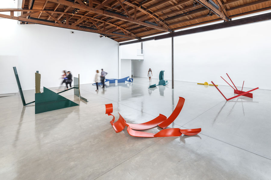
Without necessarily abandoning the raw unfinished or neutrally painted steel elements that characterized much of his immediately preceding and later work, Caro, very much in tune with his times, fastened onto color – in primaries and bold secondaries – as a means to heighten this articulation, to make it emphatic. It all but pops in Gagosian’s airy and softly lit space. Consider the simplicity of First National’s (1964) deconstructed cube (really a kind of homage to Cubism) with its obliquely pitched inverted zig-zag central element in bright (almost taxicab) yellow positioned between two I-beams in bright green, with the elements spatially coordinated by thin yellow axes lightly hovering above and behind the principal ‘figures.’ (And yes – there is ‘figuration’ here without being at all figurative.)
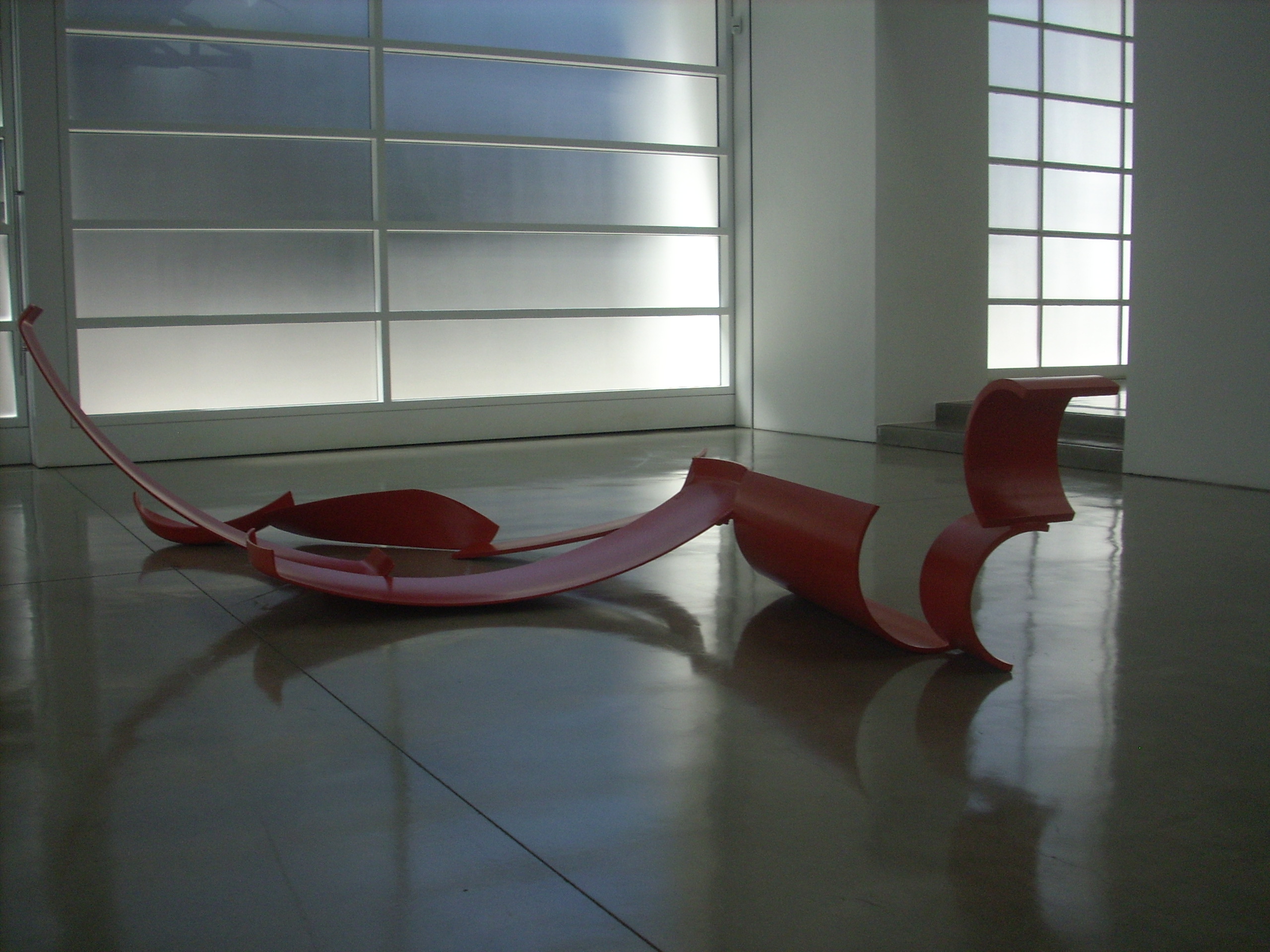 As if to underscore that secondary point, consider another gorgeous geometric deconstruction (in a slightly burnt orange) that beckons us into the second gallery, Purling’s conic dis-sections that unfold in an almost teasingly rational manner that nevertheless evokes Julio Gonzalez or even (dare I say it?) a swimmer. Then – as if returning to that linear rigor – we’re pulled back towards the clean gesture of Wide (1964) in bright red, with its splayed 100 degree V pitched forward over a thin, perfectly flat-standing short horizontal, with the slightly shorter upward extension forming a kind of check mark figure under three projecting rays. Caro again plays with an array of thin planes, trapezoids and quasi-Cubistic concavities (e.g., the abstracted leaf; the eye) in Drift (1970), drawing us around and over with its folds – a dancer’s turn in bright blue.
Subtle narratives unfold, entirely abstractly (albeit in vivid color) in industrial and shaped pieces in, e.g., The Window (1966-67) and Month of May (1963 – you were thinking 1968, maybe?), but also in smaller pedestal pieces that can be viewed in the upstairs gallery. I only wish you had more time to do so. Run to it if you can.
