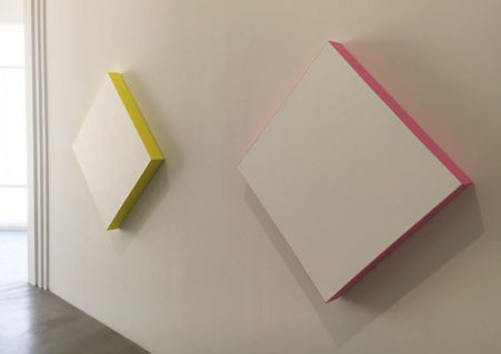
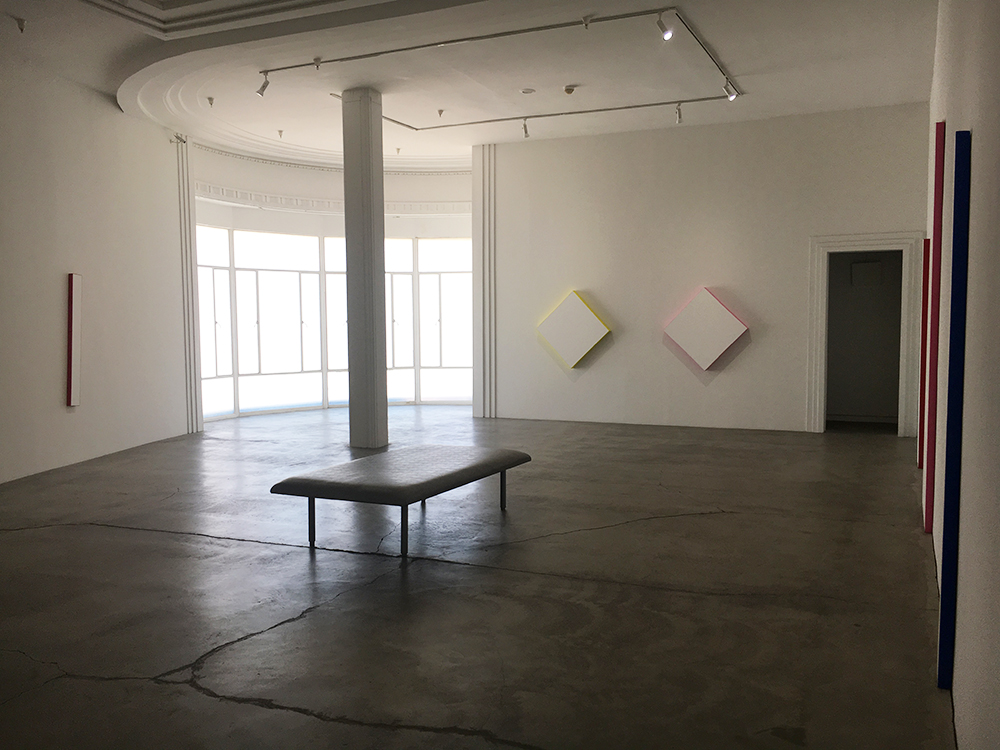
If an artist’s style is a visual representation of their technical abilities, then the painter Deborah Salt should have no problem applying her Minimalist talents to house painting. I mean that sincerely and without sarcasm or irony, for after all, paint itself has no volition; how it is used becomes an unarguable manifestation of the artist’s skills. Consequently, Salt’s solo exhibition at the Ace Gallery not only reveals her prodigious aptitude at flawlessly laying down color in the grand tradition of both wall and Color Field painting, but also her unique place in such schools of the mundane. Her impressive individualism lies not in how she evidences her achievement, but where she chooses to do so: the edges of the canvas, not the frontal plane where the most important visual information of a painting is usually presented.
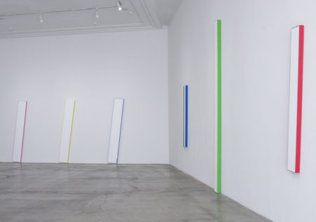
Still, the path of least painterly resistance on which Salt finds herself leads only to aesthetic nothingness. Even the Ace Gallery’s contradictory statement that her paintings are “minimal (yet) expand definitions of painting” fails to dispel the emptiness of the endeavor; after all, minimalism implies reduction, not expansion. And even though she “arrived at this engaging body of work through a distillation of artistic concerns over decades”, it’s hard to believe that getting to this point required years of thought. But then again, intuition’s a bitch, and maybe cultivating such an art methodology really does require decades of rigorous counterintuitive mental deconstruction. Yet, even with Salt’s fanatical approach to theory and use of materials, the paint still manages to assert itself with a narrow 1/8th inch band of color skirting the perimeter of each painting’s front. This is probably for technical reasons, practical matters trump theoretical concerns after all, but it sort of ruins Salt’s abnegation of the painting’s façade; unfortunately, even though they are the most interesting graphic intersections of these paintings, any fraction of nothing is still nothing.
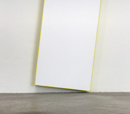
Fortunately for the thrill seekers in the audience, most of the vertical works are installed at acute angles, “the absence of a right-angle paradigm giving an off kilter effect further enhanced by long, narrow proportions”. So, there’s the explanation if you were wondering why your boredom had turned to nausea; nothing like rejecting the tyranny of the 90º angle to alter your equilibrium. Which also makes it difficult to determine if the other pieces on the wall are similarly tilted squares, or lozenge shapes in their own right; it’s a shame, but such inconsequential speculation is the mental highpoint of the show. Still, don’t get me wrong; the failure of this show lies not with Salt, who is certainly allowed and encouraged to make art as she sees fit, but with a gallery system that continues to exhibit artwork that carries no cultural resonance outside the white walls of its own confines.
