


Monet’s haystacks, Baldessari’s discs, Warhol’s everything—there are a number of artists who have worked in series specifically plotted as “the same picture in different colors” throughout art history, for diverse reasons—phenomenological comparison, critique of aesthetic fungibility, fascination with mechanical reproduction. For Meg Cranston, working in that way has to do with those aspects, but also with unpacking classic modalities of color theory, in the vein of conceptual atelier work where the complex influence of color on perception of form is endlessly chronicled, and abstract contents favored over narrative ones, so as not to distract from the task. It’s as much a thought experiment as an optical one. It’s actually pretty funny.
Using only four base colors (plus black and white), Cranston riffs on a single composition: a Le Corbusier painting from about 1962. First she reproduced it, then she made five versions of it wherein only the palette is altered. Of the suite of six, three were shown to acclaim at ALAC art fair earlier this year; the gallery is showing the remaining three, all from 2017, along with the precious and lively six-panel preparatory sketch on paper reflecting the full group, 6 Paintings, Same Composition, 4 Hues, Different Titles, After Corbusier (2016). Each 60 x 45 inch acrylic-and-oil stick on canvas painting is titled with the shorthand for a year; here indicating 1974, 1997 and 2015. This conceit references Cranston’s ongoing interest in the cultural impact of color-branding by paint company Pantone, specifically its “color of the year” campaign. In that spirit, each work’s palette contains a miniature zeitgeist, and the eras as portrayed in these “color stories” track with a reductive art history of style.
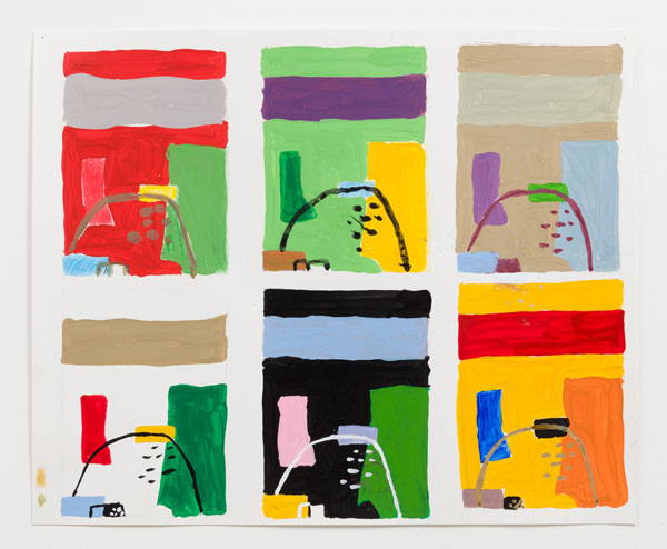
Meg Cranston, 6 Paintings, Same Composition, 4 Hues, Different Titles, After Corbusier, 2016, courtesy Meliksetian Briggs
Le Corbusier is of course known as an architect, which shows in his penchant for an abstract language of rough geometric shapes, and a knack for collapsing vertical and receding spatial planes into cartographic schematics. All the iterations share the same elements in the same relational arrangements as his template, so that in addition to each encapsulating a set of tastes, seeing them in proximity to each other emphasizes the degree to which color possesses power over the perception of space.
The original’s white background, limestone banner, green monolith, yellow support of a thin black arch, light blue, and bent crimson mass not only convey the jaunty Mod end of Modernism, but settles into itself in a way that seems derived from landscape. In ‘15 the switch to a field of grass-green surprisingly does not at all reinforce the landscape quality, with a larger yellow presence pulling the eyes to the side, and quieter colors on the smaller shapes receding from rather than engaging the whole. The balance is recalibrated, gravity works differently, and the familiar becomes elusive. In ‘74 the taupe, pale mint, periwinkle, violet, and red array is the most edificial, inorganic in a postmodern way that circles back to man-made environmental flow. And ‘97 offers a bright red background that is extravagant and operatic in a way that seems almost emotional and looks only like what it is—a painting. Sometimes the more things stay the same, the more they change.
