Your cart is currently empty!
Category: **SEPT-OCT 2023
-
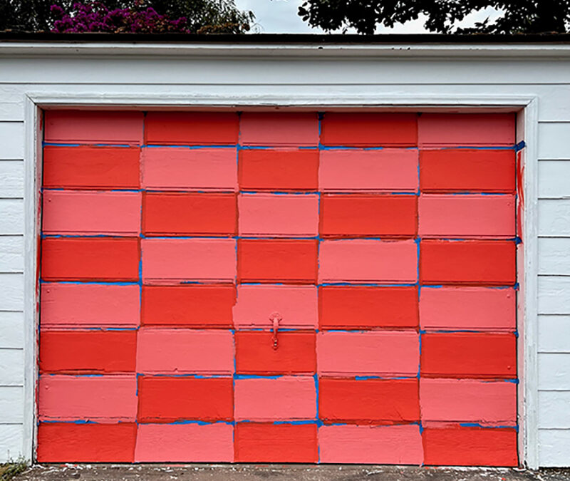
CODE ORANGE
September-October 2023 Winner & FinalistsCongratulations to our winner Seth Kaufman and our finalists, Kaufman’s photo is seen above and first in our photo gallery in the September/October2023 online edition Artillery. The following photographs are the finalists. Please see the info below on how to enter for our November/December 2023 online-only photography column Code Orange.
Seth Kaufman, Painting In The Wild…Alley, Los Angeles, California; Digital Photograph Diane Cockerill, Hunger Can Be Hard to Recognize, 2022; DTLA Los Angeles, California; Digital Photograph Cecilia Arana, Through The Looking Glass, 2023, Huetamo, Mexico; Digital Photograph Robin Foldesy, Flood Recovery, 2023, Ludlow, Vermont; Digital Photograph Laurie Gwen Shapiro, Hands-up for SAG-AFTRA, NYC; Digital Photograph Svetlana Katz Gold Standard, 2023, NOMAD District/New York City; Digital Photograph Elizabeth Arana, The Holy Hour, 2023, Los Angeles; Digital Photograph Timothy Sassoon, Gymnasts 036, 2023, Santa Monica, California; Film Photograph, Patty Moose, Jump, 2017, Hollywood, California; Digital Photograph Morgan Carhart, Into The Abyss, 2023, Marin County, California; Digital Photograph CODE ORANGE is a web-based photography column and opportunity to have your work published in the magazine, curated by LA artist and photographer Laura London. Chosen entries will be published online in Artillery and finalists will appear online. CODE ORANGE is a documentary photography project and outlet for artists to express how they feel about the current state of the world.
Tumultuous times like ours have historically produced some of the most interesting, captivating, and timeless art; we hope to find and share similar works today. Images submitted should capture how our country and the world are affected by political, environmental change, social, personal, universal, identity issues. Photographs can be produced using a film or digital camera or smartphone. Black-and-white and or color images are accepted.
Ten photos are selected by London, one winner and nine finalists. The winner will receive a one-year subscription to Artillery. Their photo will appear on our homepage website for two months and winner and finalists will appear in our weekly Gallery Rounds newsletter, along with our Instagram post.
Good luck and we look forward to seeing your photographic submission!
DEADLINE for our NOV/DEC 2023 issue: October 20, 2023
Image Specifications for photo submissions:
• Only one photo per person
• FOR WEB: 72 dpi; 600 pixels wide. (hang onto your original large file in case you are selected for publication)
• Include: Artist Name, Title, Date, Place, and Medium (in that specific order)Label Image: First name, Last name,
Write the text for your image: First name, Last name, Title, Date, Location; Medium
• Email your photograph entry to lauralondon@artillerymag.com
-
Metro Art
THROUGH A GLASS LIGHTLYVisiting the three new Downtown LA Metro stations recently, I found myself intrigued with how artists commissioned by Metro Art use the transparency of glass to design artworks. The street level of the stations is enclosed by glass, both to allow natural light in and to show people outside what is inside, and vice versa. It creates a certain built-in welcome to pedestrians, both those planning to hop aboard a train as well as those who haven’t yet.
Clare Rojas’s, Harmony, Little Tokyo/Arts District Station – A/E Line. The new Little Tokyo/Arts District Station is a wonderful example of transforming something functional into something beautiful, even joyful. The glass panels enclosing the entry deck bear a whimsical design by Clare Rojas. The Bay-area artist is known for her colorful, graphic style, often in a story-telling vein but also in more abstract patterns, as at this station. Here she paired tall curved, sail-like shapes with rectangular blocks that suggest skyscrapers; along the top runs a series of circles which look like the waxing and waning of the moon. The work is called Harmony; a gentle reminder of how we live in the city, but also in time—a time counted out by heavenly spheres.
Meanwhile, at the next station, Historic Broadway, the noted LA artist Andrea Bowers uses letters in different sizes and colors to spell out two phrases, which appear both in English and Spanish. These are two phrases often heard in public rallies in the ’60s, “The people united will never be divided” (El pueblo unido jamás será vencido) and “By independence we mean the right to self-determination, self-government and freedom.” Bowers has said about this work, “I seek to reflect the diverse communities that regularly gather downtown to express their voices and their rights.”
The phrases run across several panels and are divided by brackets, so a passerby might randomly pick up a word or two like “freedom” or “libertad.” They would have to pause to read the whole phrase, which is what an artist hopes for, right?—a moment of concentrated attention and, hopefully, reflection on what the work might mean.
Ann Hamilton’s, under-over-under, at Grand Av Arts/Bunker Hill Station. Ann Hamilton is a well-known conceptual and performance artist based in Columbus, Ohio, and her appetite for public art was whetted when she did a mosaic for a subway station in New York City. After learning about the Metro Art program, and submitting her qualifications for consideration for public art opportunities in the LA transit system, she was selected for a commission at the new Grand Avenue Arts/Bunker Hill Station, specifically for the elevator banks. Six elevators go from the lower level to the street level of the station, which is sandwiched between a view of DTLA buildings and a plaza with The Broad museum and Otium restaurant—nearby is MOCA, as well as Disney Hall and the Music Center complex.
“For me the challenge was can we take something like vinyl and give it the fineness of something hand-drawn,” Hamilton said during a phone interview. Her project, under-over-under, put together ideas of urban intersections with weaving, and she began to draw by hand parallel lines that were like threads of cloth; she reminded me that in her early days she worked with textiles. The drawn lines were translated onto blue vinyl overlays, which were applied to the glass walls of the elevators and of the exteriors. “As the shaft of the elevator travels up and down, you’re literally weaving the pattern,” she added.
I mentioned that I felt a certain calming sensation as the lines crossed—maybe it was the lull of being in motion, maybe it was the blue. “That was partly was my intention,” Hamilton admitted. “How does it wrap you, you’re now inside the cloth. It’s like the feeling of that as much as the image.”
Many more infrastructure projects are on the horizon. To learn more about opportunities with Metro Art, visit metro.net/art and click on Art Opportunities.
-
From the Editor
September/October 2023; Volume 18, issue 1Dear Reader,
Seventeen years—that’s a long time. Most relationships don’t last that long. That number has now outlived all my other jobs; I’m referring to my relationship with Artillery. I started this magazine with my late husband in 2006, who warned me: Once you begin, you can’t go back. Boy, was he right about that. I can’t call in sick, never take a vacation or even a personal day during deadline. This is one of the most committed relationships in my life.
Even though it’s a huge responsibility, like any relationship, things can change throughout the years. Hopefully one improves with age, develops other new relationships, changes one’s look—maybe even get a facelift? (We are in Hollywood!) Well, it seemed like it was time for that makeover, and you’ve probably noticed right away that this editor’s letter looks different. Keep turning the pages (after you’ve read my letter!) and you’ll see our splendid new redesign throughout the entire magazine. Creative Director Bill Smith headed the new look and did a great job, along with designer Dave Shulman. They put in long hours in collaboration with Publisher Alex Garner and me. We’ve changed our body text, hopefully for more legibility, and added some new subtle bells and whistles. We’ve expanded our layouts to highlight more visuals—we are an art magazine, after all.
Besides the new look, we’ve added a new column, “Peer Review,” which looks at the practices of two artists. In each issue, a contributor will invite an artist whose work they admire to talk about the work of another artist, one of their peers, that they are drawn to. For this issue, Alex asked New York–based artist Fin Simonetti to participate, and she chose Ambera Wellmann, who recently had a show in Turin. Be sure to check out Simonetti’s impressive marble sculptures and stained-glass works in an upcoming show in Los Angeles this fall.
Our theme, Systems of Power, features artists whose works are politically and socially engaging, questioning and challenging the system. Can art change anything? This has been an ongoing discussion in Artillery since day one, and by now it has almost become a rhetorical question. New contributor Cat Kron talks with Martine Syms about her autobiographical films. Longtime contributor Christopher Michno writes about artists who deal with the environment, specifically climate change. East Coast reviewer Sarah Sargent gets her hands on the powerful book Redaction, co-authored by Titus Kaphar and Reginald Dwayne Betts, both of whom are prepared to take on the systemic racism in our penal system. And Bianca Collins talks with Indigenous artist Mercedes Dorame about her latest installation at the Getty Center.
We hope you’ll enjoy our September issue as we celebrate our 17th anniversary, with a new look and our stalwart regulars mixed in with new writers and reviewers. It seems hard to believe we’ve been around this long, but I guess some things never grow old.
-
ON TOP OF THE WORLD
Mercedes Dorame Reverses Power Structures With SpiritualityAt the Getty Center, Los Angeles’ world-famous “treasure box on the hill” bearing the name of oil tycoon J. Paul Getty, a monumental shift is underway. I chatted with Tongva artist Mercedes Dorame, whose art is at the center of it all.
“Mercedes Dorame: Woshaa’axre Yang’aro (Looking Back),” the inaugural installation for the Getty’s Rotunda Commission series, marks the museum’s first solo presentation by an Indigenous Californian from the Los Angeles basin and the southern Channel Islands, the ancestral land on which the Getty Center was erected in 1997.
Growing up in Tovaangar (Los Angeles), Dorame heard many times while up at the Getty, “On a clear day, you can see Catalina Island!” The invitation to create an installation inspired by the site got her thinking about the ways humans hierarchically place themselves above other beings and plants, and how she could encourage a reversal of that assumed power structure to privilege the information that other beings can teach us.
In “Looking Back,” high above visitors’ heads as they move through the threshold of the entrance hall, five sculptures of abalone shells as tall as 12 feet rotate slowly—like wise gentle giants swaying underwater in a slowly moving current. The ear-shaped shells’ iconic mother-of-pearl innermost layers catch sunlight streaming in from the rotunda’s tall, second-story windows, as filtered through bright pink iridescent material, adding dappled light to the underwater effect. A four-panel panorama view of the Tongva coastline looking back from Pimugna (Catalina Island)—painted from memory as it appears in Dorame’s mind’s eye after many research trips—encircles the top of the rotunda. A tranquil, peaceful energy fills the space as it is transformed by the monumental presence of these spiritual guides.
Mercedes Dorame. Dorame’s successful reversal of our external relationship to scale and power begs us to reconsider our loyalties to the social structures built by humans in an attempt to rule the world. When we look out from the Getty to Catalina Island, where abalone still live and thrive naturally, perhaps we should consider the returned gaze of the island, looking back at the museum, and the sacred knowledge that abalone have to teach us.
Perhaps only art can sweet-talk us into subverting our biases in such a way.
American museums, especially those like the Getty, the world’s wealthiest art institution, haven’t historically been representative and inclusive of the global majority when it comes to what art is collected and which audiences are cultivated. A culture of ignorance inevitably builds around communities least represented in public presentations and interpretations of beauty and history. This is understandably distressing to those of us from those communities.
For example, Dorame noted, “Abalone and white sage have lost their citation.” Consider their increasingly ubiquitous presence in spiritual shops, their mere presence glaringly out of accordance with the Indigenous tradition of gifting such sacred materials. A surge in popular demand for materials used in the pan-spiritual practice of smudging, or cleansing with the smoke of sacred herbs, is in part to blame for their over-harvesting. “That’s so devastating to us as people,” Dorame explained, because “there’s been so much erasure around who we are, and what our culture is—while, simultaneously, things [like sage and abalone] have been appropriated into mass culture.”
Installation views: “Woshaa’axre Yang’aro (Looking Back).” Courtesy of the Getty Museum. While the Getty has much more ground to cover if they aim to repair audiences’ underexposure to and misunderstanding of the communities that they historically ignored, “Looking Back” is a step in the right direction.
“I know a lot of people of color, in general, have a hard time feeling comfortable in big museum institutional spaces,” said Dorame. “How do you get people to come to a museum? Well,” she laughed, “you show people of color. From my experience, the intention was there to acknowledge that there hasn’t been [Tongva] representation in this institution prior to this.”
The Getty smartly invited Meztli Projects, artist and organizer Joel Garcia’s Indigenous-based arts and culture collaborative, to curate the opening celebration. Throngs of visitors in their most festive attire marked this seminal occasion by enjoying food prepared from the Chia Café Collective cookbook, flower arrangements featuring native plants and blessings offered by Dorame and her father—a powerful demonstration of how successful a global museum’s local community engagement can be when it leads with inclusion.
-
COMMITMENT TO SOCIAL ENGAGEMENT
“Redaction” by Reginald Dwayne Betts and Titus KapharA powerful indictment of the American legal system, “Redaction,” a collaboration between poet Reginald Dwayne Betts and visual artist Titus Kaphar, began its life as a 2019 exhibition at MoMA PS1 in New York. As a follow-up to the show, the artists, who are both Black, decided to produce a book version of the same name, published by W. W. Norton, to attain wider distribution, particularly among members of the poorer Black communities.
Redaction focuses on the way this demographic is victimized in both state and federal courts because they can’t afford bail, traffic tickets or court fees. If they don’t pay, they are thrown in jail even though they haven’t been tried or convicted of any crime—a flagrant violation of the Eighth Amendment, which states: “Excessive bail shall not be required, nor excessive fines imposed, nor cruel and unusual punishments inflicted.”
For Betts and Kaphar, this is personal. Kaphar’s father was often in prison during his childhood, and Betts spent more than eight years in jail, including 14 months in solitary confinement, for a carjacking he committed when he was 16. Books saved him, and when he got out, he went to college, graduate school and, in an amazing feat of transformation, received his Juris Doctor from Yale Law School, where he is currently pursuing a PhD. He has accomplished so much, climbing out of a very deep hole to reach the very heights of the legal profession. And yet, despite all his achievements, the shadow of those incarcerated years still looms over his life.
Kaphar’s ascent in the art world is almost as dramatic. This bona fide art star, with work in major museums and representation by Gagosian, used to help his family make extra cash by carting trash to the dump. The two men have rightfully been honored with a wealth of prestigious awards, including MacArthur fellowships.
Paired with Kaphar’s artwork in the book, Betts’ poetry uses the actual text from Civil Rights Corps lawsuits filed on behalf of jailed people whose constitutional rights have been violated as its basis. He employs the process of redaction to hide words and phrases, but he turns it on its head, revealing the most provocative and obscuring the rest, adroitly wresting poetry out of tedious legalese.
Kaphar is known for his galvanizing work (paintings, sculptures and installations) that reassesses history, taking figures from notable historical and art-historical paintings out of their idealized vacuum and exposing them to a contemporary retelling in both a visual and historically accurate manner.
Kaphar’s series of portraits of those unfairly jailed are simply beautiful. His delicate lines and spare compositions produce likenesses of great authenticity and power. Despite the sadness and frustration, all the subjects appear serene. Kaphar finds the dignity and nobility in them and amplifies it.
Stunning etchings in white ink on black paper combine Kaphar’s portraits with Betts’ poetry and lines of redacted text, overlaid with eye-catching gunmetal. The lines resemble prison bars; they also recall the bars on the US flag that represent the original 13 colonies—all of which benefited, directly or indirectly from slavery. In either case, the faces of the incarcerated individuals are separated from us (and their freedom) by those bars.
Reading Betts’ trenchant language is an experience that leaves no doubt in one’s mind that while the 13th Amendment may have abolished chattel slavery, it continues within the walls of our prisons where racist hierarchies are maintained and free labor is extracted.
Betts and Kaphar’s commitment to social engagement extends well beyond their creative practice, with each establishing important nonprofit organizations. Kaphar’s NXTHVN (nxthvn.com), founded with Jason Price and Jonathan Brand, is in New Haven’s historical African-American neighborhood of Dixwell. A vibrant arts incubator and fellowship program, NXTHVN supports individual artists and curators through education and access to a lively arts-centric community. NXTHVN helps further the careers of young artists, helping them navigate the art world and providing opportunities for professional artists, while enhancing the larger community of New Haven. Betts, meanwhile, is the founder and director of Freedom Reads (freedomreads.org), which places books into prisons via its Freedom Libraries—movable wood shelving units that hold 500 books—in the hopes of uplifting incarcerated individuals and maybe even helping them conceive a positive way forward. As of this writing, Freedom Reads has installed 172 prison libraries in 10 states.
In concert with the MoMA PS1 exhibition, Kaphar and Betts commissioned a typeface that could serve as an alternative to such fonts as Times New Roman, the norm for US legal documents, and New Century Schoolbook, which is used by SCOTUS. Now an ongoing statement, the use of the Redaction font, along with the book itself, protests the unconstitutional and racist practices of these institutions.
-
FUCKING WITH AUTOBIOGRAPHY
The Films of Martine SymsHow do we tell our stories? Martine Syms is rewriting the terms. In addition to sculptures, installations and text-based projects, the polymath Angeleno artist has made a string of ambitious films. Her work in FAV extends as far back as her solo show at MoMA in 2017, where the then 29-year-old artist debuted her first feature-length film, Incense Sweaters & Ice, as part of the exhibition “Projects 106.” The show was arranged so that the viewer navigated multimedia collages around the centrally placed three-channel film. Describing the experience of walking around “Projects 106,” New Yorker critic Doreen St. Félix observed, “I had the sensation that the artist had planted coded messages for me, and for other black female viewers—messages that others might walk right by.”
This granular specificity is a key feature of Syms’ practice—there is nothing general in her work, despite her penchant for ironized hyperbole (see The Mundane Afrofuturist Manifesto, published by Rhizome in 2013) and her abiding fascination with the broad, slapstick humor of Old Hollywood animation studios (which infuses everything she’s done). To write about Syms’ sprawling oeuvre entails a considerable amount of back-catalog research into her bibliography, and the works themselves are inundated with references to pop and literature. The effect is that of a challenge for the viewer to either bone up or miss it. In an early interview for the Baltimore zine Video On Paper in 2012, she explained, “I’m interested in storytelling, but I’m obsessed with how we share our stories” (emphasis mine). In a moment when every writer and content creator seems to be hastily revising their job descriptor as “storyteller,” her insistence on turning the camera back on the messenger resonates 12 years on from that first assertion.
Incense Sweaters & Ice follows 20-something Girl as she navigates a fits-and-starts romance with WB (White Boy) as well as the LA to Mississippi trajectory required of her in her job as a nurse, itself an inverted reference to the Great Migration made by Black Americans during the 20th century. Like all of Syms’ work, the film gives inanimate messengers equal billing with its cast. Much of the dialogue occurs in text threads between Girl and White Boy, which are superimposed on the film in real time. Also, like all of Syms’ work, it borrows from experience, here drawing on interviews with her mother, who worked in nursing.
Still from i am wise enough to die things go, 2023. © Martine Syms. Courtesy the artist and Sprüth Magers. Saddling an artist with the “autobiographic” descriptor is necessarily fraught, in that it presumes both a right and an ability to “know,” and that this knowledge is relevant to the work. When I asked her during our phone interview about how she thinks about autobiography, Syms responded, “I think self-reflexiveness is a bit more interesting to me. There are obviously things taken from my life, but it’s usually pretty constructed.” She qualified, “I like the idea of fucking with autobiography. In a recent piece I did, called My Life Story, I’m using stuff from Lil Nas X’s TikTok but I’m presenting it as my autobiography.” The protagonist of Incense Sweaters & Ice at one point tells White Boy, who is recording her, “I don’t really like posing, like this is so strange … Okay, I’ll pose I guess … If you’d stop that’d be great. Thanks.” It reads as a nod to the incessant surveillance and patrolling of Black women, often by white men, as well as the performativity expected of them.
Syms’ The African Desperate, released in theaters in 2022, is a study in affect and performance, lofty artistic ideals and the mundane tasks that fill studio days, even in the rarefied air of a pastoral summer MFA program. In it, Diamond Stingily, Syms’ longtime friend and collaborator, plays a masters candidate on the cusp of graduation. Stingily is a seasoned and virtuosic performer of Black female subjectivity, adept at subtly amplifying the visual cues that signal contemporary Black womanhood. Syms had already showcased Stingily in her 2015 video Notes on Gesture, in which the artist performs a looping string of finger wags and waves, palming the air in gestures copied from recordings of famous Black women. In The African Desperate, Stingily is seen simmering under the scrutiny of the almost entirely white program as she wrestles with the question of what she will and won’t do, whether she’ll play their game or refuse it.
Syms’ most recent video work, i am wise enough to die things go (2023), pays homage to the crucially personal reference of 20th-century animator Chuck Jones. From 1933 to 1962, Jones created now-canonical animated shorts for Warner Brothers, where he developed the iconic personae of, among others, Bugs Bunny, Porky Pig and Daffy Duck. Like Jones, Syms is a covert minimalist intent on conveying her characters’ interior worlds with as little extraneous detail as possible, adhering to predetermined rules (motivations) that drive them. The video is the centerpiece of her recent exhibition, “Loser Back Home” at Sprüth Magers, Los Angeles, and responds to a 1953 Jones animation, Duck Amuck, which is a notably meta (for the time) twist on the usual trials and tribulations of Daffy. The premise is that the cantankerous duck is plagued not by another toon but by the brush of the anonymous off-screen animator intent on messing with him—constantly switching out his backdrops and costumes, erasing all but his beak.
Still from Incense Sweaters & Ice, 2017. © Martine Syms. Courtesy of the artist and Bridget Donahue, NYC. I am wise enough to die things go copies Daffy’s travails gag for gag, with the notable difference that her actor, Leslie Bamou, is performing in live action. Bamou, who Syms met at an acting class, captures both the blustering Daffy and the affectations of a pretentious Hollywood star: “I always wanted to do a sea epic,” Daffy exclaims as the animator paints him in a (short-lived) sailor’s costume. Meanwhile Bamou enthuses, “I am a water creature. I think it’s because my north node is in Pisces.” It’s tempting to see the self-righteous outrage of Daffy Duck and that of the star of i am wise as at odds, to project onto the latter a commentary about the external constraints placed on Black female bodies. But the more relevant constraint here is that of translating an animated work to film. Rather than funny, the jarring quality suggests a displacement or fracturing of self. And yet the original is unsettling in its own right—one sympathizes with the duck’s frustration.
People want a lot from this work, and at a certain point Syms says no. Responding to my follow-up query to check her statement on My Life Story, she responded, “I think the question of autobiography is generally extremely boring, and I said as much during our interview.”
-
CLIMATE CONSCIOUS
Artists Advocate for Carbon ReductionsArt sector efforts to decarbonize have been highly visible over the past three years as galleries and artists have publicly pledged concerted action to reduce exhibition-related emissions: Nonprofit advocacy groups like Gallery Climate Coalition, Art + Climate Action and Julia’s Bicycle have launched campaigns and provided tools to support change in art sector practices. These developments are important steps for an industry driven by wealth and privilege that, according to carbon analyst and Gallery Climate Coalition advisor
Danny Chivers, generates disproportionately higher emissions than comparably scaled market sectors.Jenny Kendler, a founding member of Artists Commit, sees this as a critical moment. “What we need now, more than ever,” the Chicago-based artist says, “is to change culture.” The need for urgent measures is underscored by the Intergovernmental Panel on Climate Change’s (IPCC) most recent report, which notes that the window for meaningful action is rapidly closing. In the words of UN secretary-general António Guterres: “The climate time bomb is ticking.”
Kendler, who was the first Natural Resources Defense Council Artist-in-Residence, has long made climate action a cornerstone of her art practice and, more broadly, her engagement with the world. Long before COVID and the ubiquity of Zoom, she limited her air travel, agreeing to give artist talks only when Skype was an option. “This is a systemic issue,” she emphasizes, “We need each and every artist to be a part of the global climate movement, in whatever ways they have capacity to do so.”
To be a partner for change, she says, means “making choices that benefit life as a whole, rather than working toward personal or short-term gains, status or purely economic benefit.”
Jenny Kendler, “Dear Earth” (21 Jun. –3 Sep. 2023), installation view. Photo: Mark Blower. Courtesy of The Hayward Gallery. Kendler advocates considering an artwork’s lifecycle at its inception. While this can mean thinking about the type of materials that compose the work—Kendler prefers working with recycled or ephemeral materials—equally important, she notes, is how it’s “produced and transported, where it goes after it is exhibited, and how capital flows into and out of the project.” Her installation Birds Watching III, for example, which was on view this summer in the Hayward Gallery’s ecology-oriented exhibition “Dear Earth,” was fabricated entirely with recyclable materials. The work will travel to the London Zoo to raise awareness about the zoo’s conservation efforts with critically endangered birds. After that, she hopes to find a permanent home for it and plans to use the proceeds for climate and conservation work.
Debra Scacco, an artist, curator and organizing member of Artists Commit, believes that artists are ideally positioned to introduce climate-conscious practices when working with institutions. Gallery, museum and nonprofit staff may not feel empowered to address climate, she says, but “if we consistently present this as a serious concern and, where appropriate, a part of the work, host venues will generally sign on in some way.”
A transplant from London, Scacco moved to Los Angeles in 2012 and quickly focused her art practice on the ecology of the Los Angeles River. In 2017, she founded Air, a residency that allowed artists to pose questions about specific climate challenges and engage with “systems that require critical change.”
Air worked in collaboration with Los Angeles Cleantech Incubator (LACI), which hosted a series of residency exhibitions throughout 2021. Air’s culminating exhibition, “Song of the Cicada,” at Honor Fraser Gallery presented artists’ findings on research, ranging from wetlands habitats, toxic manufacturing byproducts and climate impacts on natural systems.
“In my own work, I aim to connect each exhibition or event with on-the-ground environmental justice work,” Scacco says. This past fall, she curated “Confluence,” an exhibition focused on the LA River, at Track 16 Gallery. Each artist was asked to share the work of an environmental organization supporting the LA River. Gestures like these, she says, invite viewers to engage with climate work through their engagement with the exhibition.
Installation view of “Debra Scacco: Confluence,” 2022. Courtesy of the artist. In October, Scacco and Joel Garcia, an Indigenous artist (Huichol) and organizer, will partner with Fulcrum Arts to present Procession, a large-scale performance and civic activation. The project reframes the history of the Los Angeles River and the violence enacted on its ecosystems through colonization. Culminating in processions along the river’s former floodplain in Los Angeles State Historic Park, Procession identifies the river by its Tongva name, Paayme Paxaayt and will gather “stories of how different cultures utilize the river and how channelization impacts culture and legacy.”
Collaborative efforts to decarbonize the art sector are promising. “It is the conversations and collaborations that are happening across the sector that give me the most hope,” says Chivers, citing discussions to rethink “often over-strict” storage standards that drive energy consumption, art fair expectations for travel and shipping, and how institutions can thrive while cutting emissions by at least half.
These issues however, can’t be separated from social justice questions. Scacco makes a point that “the art world is a space of outsized privilege and waste while artists and art workers often struggle to make a living wage,” which she says makes the current moment an opportunity to create a new paradigm.
Cultural organizations have the potential to exert outsized influence in discussions over climate solutions, but this relies on credibly addressing their own emissions. In a global context in which public pledges often supersede actions, establishing credibility will also require institutions to develop transparent, verifiable protocols.
-
MALKA GERMANIA
Yael Bartana’s Jungian Journey Into the Past and PresentIn an age when so much gratuitous violence pervades our screens, the three-channel film Malka Germania presents a gentle Jungian perspective on the effects of the Holocaust on today’s German citizens. The film alludes to collective trauma about war and subjugation, while transforming that trauma into manna.
Malka Germania (Queen Germania in Hebrew), created by Israeli native/Berlin resident Yael Bartana, features the elegantly androgynous Malka (Gala Moody) moving slowly through Berlin while attired in a long, hooded robe. She dominates the city—portrayed in the film as the locus of Germany’s draconian past—and observes people going about their lives, including soldiers in the Israel Defense Forces, Hitler Youth in training, beautiful female dancers and an organ grinder. The three-channel process provides a visceral look into the German people’s awareness of their collective history. As the channels segue onward, the film encourages Berlin residents—and us—to envision images of persecution and power.
Other players in the film include fair-haired beachgoers relaxing, playing and riding in boats, until the noise of helicopters disrupts their false sense of well-being. The awareness of a warmongering past is emphasized with sounds of marching soldiers, traffic noise, church bells and barking dogs.
Installation view of “Yael Bartana: Malka Germania” at Contemporary Arts Center Gallery, UC Irvine, 2022. Photo: Yubo Dong. A concluding scene features a computer-generated image of an imperial Nazi “Hall of the People” rising from a lake that evokes Albert Speer’s proposed design to celebrate Germany’s World War II victory. It also references the lost city of Atlantis, a fictional parable about the dire consequences of corruption and arrogance. The film closes as hordes of German citizens walk wearily along the railroad tracks, leaving Berlin, as Malka looks on approvingly from a separate channel.
While portraying the ambiguities of the contemporary German- Jewish experience, the film merges the past with the present. As a Jewish woman, my dreams, memories and current perspectives are often framed by an awareness of the persecutions and fears of my ancestors, who lived through life-threatening pogroms, the repercussions of which can be felt with my relatives today.
Malka Germania has compelled me to embark on a Jungian journey of examining my legacy as metaphor for and reflection of the larger world’s tendency toward war and domination—and to view that legacy as a stimulus and muse for creativity, as Bartana does in this important film.
-
The Complex Stuff is the Best
Keith Haring at The Broad“Children know something that most people have forgotten.”
—Keith Haring’s journal entry from July 7, 1986.In the spirit of Keith Haring’s retrospective, “Art Is For Everybody,” I decided to seek a child’s perspective on his work, enlisting my friend’s eight-year-old son, Oscar Forbes, to get his thoughts about the exhibition.
After setting up tickets for our visit, the museum’s PR team emailed me, warning that “the exhibition contains adult themes and sexual content that some parents may deem inappropriate for children.” When I shared this information with Oscar’s mother, she responded, “I don’t think there’s anything at the Broad that’s inappropriate for him—we just watched a Studio Ghibli movie where shapeshifting raccoons use their testicles as parachutes.”
Were the Broad’s warnings in reference to Haring’s collaged newspaper headlines with texts reading “POPE KILLED for FREED HOSTAGE”? Maybe it was his depiction of a crowd worshiping a disembodied phallus or his various hieroglyphic characters engaged in cartoonish coitus (which Oscar interpreted as people dancing). Or maybe the warning pertained to the most unsettling and profound piece in the show, Michael Stewart—USA for Africa, which Haring painted in 1985 as a tribute to Stewart, a young Black graffiti artist murdered by the NYPD.
I couldn’t help but see the museum’s multiple warnings as reflective of Haring’s timeless ability to shock the right people —and the issues he deeply cared about remain relevant today. While Oscar acknowledged that “some parts are more serious than other parts,” he didn’t seem surprised by the art.
Keith Haring, Untitled, 1984. Courtesy of The Broad Art Foundation, Los Angeles. Oscar was fairly quiet throughout most of the show, reluctantly answering my questions with descriptions instead of opinions. But in front of a vast canvas populated by robots, nuclear blasts and figures flying in the sky, Oscar, twisting his sun-bleached shoulder-length hair in deep concentration, turned to me and said, “Keith Haring was really paying attention to how he was drawing. He likes to draw one thing again and again, so people know what it is.” I couldn’t have said it better. The kid had summed up Haring’s practice in two perfect sentences.
After finishing our first complete tour of the show, and heading back in for another look, Oscar, notably patient after nearly an hour of tolerating my embarrassing enthusiasm, said, “The complex stuff is the best, the paintings that have a story and more than one image in them.” While unpacking this appraisal, we both agreed that works like Haring’s 1983 “Untitled (Totem)” series—towering sculptures adorned with carved line drawings of people piled atop one another—showcased his talent better than works featuring singular characters, like his neon, three-eyed, smiley face paintings from 1981.
Keith Haring, Humiliation Victim, 1980. Courtesy of the Keith Haring Foundation and The Broad Art Foundation, Los Angeles Haring’s more iconic images are best suited for reproduction on illuminated billboards or mass-produced objects. This was evident in a display highlighting a collection of merchandise he sold at the Pop Shop, a store he opened in 1986 in New York. While looking at the array of shoes, watches and skateboard decks, Oscar assessed, “It’s just as much art as anything else.” (Cue Haring and his Pop-art predecessors smiling down from heaven.)
Standing in front of an untitled, immense black-and-white mural that most viewers engaged with solely through their smartphone cameras, I asked my young friend what he thought about the differences between how kids and adults look at art. Oscar leaned back on his tie-dyed Crocs, paused briefly, and responded, “Adults don’t see all of the details.” He suggested that the best way to see the art was to “start at the bottom and slowly move your way up. The bottom is bigger than the top.” He was right: Starting at the bottom meant beginning with the gravitational pull of the artist’s lines and the way he let paint drip toward the floor, a sign of the non-mechanical nature of the work—or is this simply his literal point of view?
While I was satisfied with the retrospective’s overall exhibition design, Oscar believed there were missed opportunities. He suggested, “They could have put more things in other places, like the floor and the ceiling. It would fill up the room. People aren’t looking at the ceiling.” And he was right. It was the first time in any art experience I found myself noticing that no one was looking up. Future curators take note: Installing Haring’s work on the floor and ceiling, even as vinyl reproductions, would call back to how he painted the Pop Shop’s walls, floors and ceiling, and would reflect how he filled his works with a line that could go on and on forever. Were he still with us, I bet Haring would appreciate my companion’s suggestion to take advantage of all the space our eyes can roam—maybe something the adult curators have forgotten.
Untitled, 1981. From the Collection of Larry Walsh. Courtesy of The Broad Art Foundation, Los Angeles. -
BUNKER VISION
The Power of LustIf you are addressing power dynamics in your art, a good place to set scenarios in is a military context. There is a built-in component of control in every aspect of martial discipline. What one wears, eats and how one’s time is spent, is all carefully prescribed from the top down. It is a rigid system that is built to keep power in the intended hands. But as with all systems that rely on human nature, there are factors that can subvert any system of control. One of the most reliable of these is desire. No matter how rigidly an officer enforces the rules, their heart still wants what their heart wants.
Claire Denis doesn’t suffer fools. She spent her formative years in Africa where her father was a civil servant. He was more sympathetic to the local population than the colonial powers that placed him there, and made a point of changing his post every two years, so that his children would learn the geography of the continent. The lack of cinema in the places that Denis grew up in caused her to come to her craft later than most filmmakers. When asked why she chose cinema, she explained that she is unfit for anything else. She got her start as an assistant director to filmmakers Wim Wenders, Jim Jarmusch and Jacques Rivette. When an interviewer called her a protégée of these directors, she asked them if they’d use that word with a male assistant director.
Beau Travail is set in the French Foreign Legion outpost of Djibouti. It is loosely based on Herman Melville’s Billy Budd (Benjamin Britten’s opera of the same name appears in the soundtrack), in which a soldier becomes wildly beloved by his fellows, causing his superior officer to view this adoration as a threat to his authority.
Denis’ depictions of Legionnaire exercise regimes are based on observations of actual training. They might be described as the section of a Venn diagram where Vanessa Beecroft and Tom of Finland intersect. As Denis stated: “Cinema cannot exist except through eroticism. The position of the spectator is like a kind of amorous passivity and hence highly erotic.”
Aside from the officer’s suppressed lust, the film mostly depicts soldiers going about their drills, ironing their uniforms and generally killing time. The contrast between the urgency of the officer’s lust and the soldiers’ languid routines makes many of the power plays of the officer seem even more irrational and hysterical. The sum of its parts makes this film a perfect study of power dynamics.
-
ART BRIEF
Supreme Court Levels The Playing Field For ArtistsThe 2022–23 term has been a disaster for the US Supreme Court. Chief Justice John Roberts, Jr. disgraced himself by spurning demands from Congress and the public that the Court adopt a code of ethics similar to the one covering all other federal jurists. If such regulation had existed, it may have prevented the dishonorable conduct of Justice Clarence Thomas who was Pro Publica exposed as a bought-and-paid-for tool of a right-wing billionaire.
The court’s conservative supermajority flagrantly ignored the prerequisite of standing to sue in overturning President Biden’s student loan forgiveness program and in permitting a woman’s proposed marriage planning website to state that she would not accept business from same sex couples.
However, amidst all these controversies we should not lose sight of May’s major Supreme Court ruling on the fair use doctrine in copyright infringement cases. As predicted in my column a year earlier, the court upheld the Second Circuit Court’s ruling that the Andy Warhol Foundation infringed the copyright of rock photographer Lynn Goldsmith’s photograph of Prince. My forecast was based on the likelihood that, with the departures of Justices Ruth Bader Ginsburg and Stephen Breyer, the court’s experts on copyright law, SCOTUS would uphold and rely on the Second Circuit’s opinion, especially in view of that New York court’s history of issuing important copyright rulings.
The Second Circuit’s majority opinion was notable in emphatically stating that judges should avoid acting as art critics in determining whether a derivative artwork was sufficiently transformational of another artist’s underlying work of art to qualify for the fair use exception to copyright infringement.
SCOTUS, putting aside ideological lines, ruled 7 to 2 in Goldsmith’s favor, with liberal Justice Sonia Sotomayor writing for the majority. The dissent was penned by liberal Justice Elena Kagan and joined by conservative Chief Justice Roberts. The ruling was even more unusual for the overt sniping between Sotomayor and Kagan.
Vanity Fair 2016 cover. In 1984, Vanity Fair licensed Goldsmith’s photo of Prince for $400 for a single use to illustrate an article titled “Purple Fame.” Vanity Fair hired Warhol to produce his take on the Goldsmith photo and he created 16 silkscreens in a variety of colors—they went with a purple version. On Prince’s death in 2016, a special issue was printed and the Warhol Foundation was paid $10,250 for a license to use the orange image of Prince on its cover. This time Goldsmith received no compensation for the use of her photo.
Goldsmith sued the Foundation in federal court for infringement. In its defense, the Foundation’s lawyers argued that the fair use exception applied. Several elements must be proven for successful fair use determination. The two most important are that 1) the artwork must be “transformative” of the underlying work and 2) an assessment must be made of the of the derivative artwork’s impact on the on the original work’s commercial value in the marketplace.
The SCOTUS majority found that not only was the Warhol work not sufficiently transformative of the photo, but more importantly, that Goldsmith and the Warhol Foundation were competitors in the marketplace. Sotomayor wrote, “Such licenses, for photographs or derivatives of them, are how photographers like Goldsmith make a living. They provide an economic incentive to create original works, which is the goal of copyright.”
Sotomayor also rejected the Foundation’s argument that Warhol sufficiently transformed the Prince photograph by cropping, shading and coloring it.
The upshot of the majority opinion is to deemphasize the transformative element of fair use and focus more on the commercial impact the unlicensed usage had on the original work. The impact in this instance was glaring—Vanity Fair only paid Goldsmith for the earlier use of the Prince photo, and only paid the Foundation for the 2016 issue.
Justice Kagan in her sneering dissent wrote: “All of Warhol’s artistry and social commentary is negated by one thing: Warhol licensed his portrait to a magazine, and Goldsmith sometimes licensed her photos to magazines too. That is the sum and substance of the majority opinion.” Kagan added that the majority opinion reduces the editors of Vanity Fair to choosing between the Goldsmith and Warhol images with a flip of a coin without regard to artistic merit.
By my reading, Kagan’s dissent seems to exalt Warhol as an art god, while brushing aside Goldsmith as a mere mortal, but that is not fair to the myriad of artists who are copyright holders. Indeed, as the Supreme Court majority makes clear, artists are to be treated as equals under the law for purposes of copyright.
-
THE DIGITAL
Dream Big: Remember Where You Came FromMemory is a funny thing. Do you remember skinning your knee when you were a kid, or do you just look down at the scar and think of the stories you’ve heard? As you drive down the first street you lived on, do you remember the market on the corner where you would get ice cream on hot summer days? What is the difference between a memory and a story? Does one have more value than the other? Are either based in reality or does that even matter?
As I stood in a nearly empty room at the Japanese American National Museum and interacted with Aki’s Market (through oculus googles), I didn’t see someone’s quickly assembled CliffsNotes. I saw a rediscovered defining chapter in a family’s/nation’s history. It was a place torn somewhere between a dream and a memory, a place of value to Japanese- American history, to Southern California history, to East LA history. A once-forgotten corner store that now exists digitally again—thanks to its re-creator Glenn Akira Kaino.
The original Aki’s Market existed in both a time and locale within American history that some may wish to forget. Shaped by the experience and memories of an entire ethnic population imprisoned by the US government (including the future owners of Aki’s Market) and set in an East Los Angeles area better known at that time for homicidal gang activity rather than for members giving, building and uplifting the community, there existed Akira Shiraishi, “Aki.” By all accounts Aki (Kaino’s namesake—whom he never met) was a formidable man both in stature and heart, yet the stories were few and far between as Kaino grew up.
Glenn Kaino, stills from The Store, 2023, VR equipment, mixed-media installation, courtesy of the artist and Pace Gallery. In conversation with Kaino after viewing the exhibition, I began to understand that the show was not at all about the objects (whether physical or digital) but more about the conceptual nature of memories, both personal and communal. It was an exploration of family, community and the unknown stories you have been told. We often share the least with those the closest. We hold our fears, our mistakes and many of our triumphs from those we claim to love the most. What does it mean when we look deeper into what we are told? What trauma is found, what perseverance is exposed? If you look closely, if you ask the right people, if you search for the spirit that you’ve heard of—sometimes the facts are so much more inspiring than you could have dreamed.
What was manifested for the exhibition was simply an extension of the exploration of Kaino diving deeper into relationships with family, community members and historical documentation to learn more about Aki. To be clear—the art was great. It does exactly what it should. It takes you to that intrinsically special place only profound art can do. It doesn’t try to be more than it should. It doesn’t try to put you in a place of true VR, of interacting like some first-person video game. That’s not what Aki’s Market does. Rather, it puts you in the confusingly beautiful moment where you wake up from a dream and struggle with whether it was a memory or a dream.
With assembling communal memory, we think about what we have been told, by our moms, by our uncles. By someone that just passed through 25 years ago and had an opinion because everyone has an opinion: “That’s not how it was. I was there, It was like this. “The Donuts were over there. The Levis were here. The Coca-Cola display was there.”
In reality, there wasn’t any Coca-Cola. The store sold Pepsi. So, who remembered it correctly? More so, does it matter? It may matter to some—to me, it matters less and less. I am a writer; I love a well-told story. I remember bringing my daughter home for the first time. I remember skin-to-skin before leaving the hospital. I looked at that picture today. Do I remember bringing her home? No, I don’t. What I do remember is taking her out of the hospital and not knowing how to put the car seat in. Do I remember turning onto our old street in East LA and passing by Aki’s Market less than two minutes from unloading my precious cargo? I do not remember it, but now it is a part of the story I will tell moving forward
-
PEER REVIEW
Fin Simonetti on Ambera WellmannA stone sculptor and stained-glass artist (among many other things), Fin Simonetti approaches demanding classical mediums with cultural critique and tender ambiguity. The New York–based Canadian artist has become known for her stone carvings of canine body parts—such as muzzled busts, paws and jaws—as well as her stained-glass structures, which include bear traps and sanctuary-like miniature houses. Honoring her creativity and dedication to her painstaking craft, Simonetti shows something different with each of her exhibitions; her upcoming show at Matthew Brown Los Angeles, which will involve new materials, opens in October. In this first iteration of “Peer Review,” we invited Simonetti to talk about the work of any artist of her choice.
I was excited to see Ambera Wellmann’s recent exhibition “Antipoem” at Fondazione Sandretto Re Rebaudengo in Turin since the works remind me of one of my favorite genres of historical painting—Doom paintings. Medieval depictions of the Last Judgment, Dooms typically portray heaven and hell, packed with figures, demons, angels and animals—all collapsed into a dramatic, dense narrative. The paintings in “Antipoem” feel like they could be vignettes taken from one of these works, maybe Hans Memling’s 15th-century triptych The Last Judgment.
My favorite work in the show, For you beautiful ones my thought is not changeable (2023), has swirls of bright color in the background that I imagine as an incoming apocalypse, ready to swallow the arena of animal figures in the foreground. If the show were a sequence, this painting would be the first scene, as if a hellacious bomb has only just detonated, but not yet engulfed the landscape. While the other paintings are completely immersed in a hellworld, here you can see the chaos approaching—it’s only beginning to infringe on the space.
Ambera Wellmann, For you beautiful ones my thought is not changeable, 2023. Courtesy of Fondazione Sandretto Re Rebaudengo. I’ve always admired the way Wellmann handles paint. Somehow she is able to depict hard objects with soft blurry brushstrokes and capture narrative and melodrama without any specificity. I love that her works are rich with allusions to art history; the name “Antipoem,” along with work titles drawn from Sappho, imply a collage of art and literary references.
Like Wellmann, my work sometimes includes religion and animals as subjects. Seeing work that approaches these themes in ways that are materially and conceptually very different from mine allows me to experience my interests more like a consumer—that distance allows me to be more of a pure viewer, which is a treat.
—As told to Alex Garner
-
SHOPTALK: LA ART NEWS
Coachella and New YorkMelrose Hill or Bust
We now have critical culture-mass in the area of Western Avenue between Melrose Avenue and Beverly Boulevard: half a dozen galleries have settled in, to be joined by LAXART any time now (the latter was supposed to have opened last year). This area has been dubbed “Melrose Hill” in some announcements, although Melrose Hill is actually elsewhere. That aside, the biggest boy on the block is David Zwirner from New York, with two adjoining buildings and a third under construction. The inaugural show in the north building was strategic and well-timed—“Coming Back to See Through, Again,” Njideka Akunyili Crosby in her first show with Zwirner. She’s one of LA’s most gifted artists, and her large works on paper are wonderfully layered—both narratively and literally—with patches of photo transfer juxtaposed with painting.
“I’m Nigerian, I’m American; you can be both,” she said in a recent New York Times interview: “I think places are richer for having difference.” In one painting, Still You Bloom in the Land of No Gardens, a mother staring directly out from the picture plane lovingly holds her young daughter in a backyard, while beautiful green fronds and vines swirl up and around them. Another, New Haven (Enugu) in New Haven (CT), is an interior still life, the left half taken up by a closet full of colorful clothing, while our eye is drawn to a small table on the right with its teapot, plant and a framed photograph of a young girl in a white dress. These are portraits of intimacy and tenderness, while the interlaced photo-collages reference a wider world; they are taken from her own archives and from Nigerian magazines.
Jean-Michel Basquiat in LA, photo by Brad Branson. Grand Avenue’s Art Stars
Another hotbed of art is currently on Grand Avenue in DTLA—remember, you can now get there by the Metro and not worry about the exorbitantly priced parking. There’s the stunning Keith Haring show at the Broad, “Keith Haring: Art is For Everybody” (up through Oct. 8). There’s the very smart look at art in LA before the building of Museum of Contemporary Art (MoCA), “Mapping an Art World: Los Angeles in the 1970s–’80s” at MoCA Grand (up through March 10, 2024). Then there’s the “Jean-Michel Basquiat: King Pleasure” immersive (up through Oct. 15) in the building across from Disney Hall. For art aficionados the latter is quite worthwhile, as it includes around 200 drawings and paintings from Basquiat’s short but meteoric career. Some are displayed in replicated rooms including his studio, where his work covers the floor and walls. Another section recreates his childhood home, with the living room on one side and dining room on the other. It’s very ’60s middle-class Brooklyn. Basquiat was born into a well-off family, although he had to deal with his parents’ separation and his mother’s mental illness, and became a rebel, taking drugs and quitting school.
Much of the art is hung like a regular exhibition, according to chronology and themes in his art. These are accompanied by pithy, well-written text panels. This loving tribute to an artist who died far too young—it’s still shocking to think he died at 27—was curated by his two sisters, Lisane Basquiat and Jeanine Heriveaux. So naturally it feels personal—very different from what one usually sees at a museum.
These immersives are not cheap—admission prices for the Basquiat show range from $28 to $35. Museum prices have been creeping up too, but here in LA the trend has been toward free admission. That includes the Hammer, MoCA and The Broad (although the Keith Haring show requires a special ticket which costs $22 for adults). You can even get into LACMA for free on weekdays after 3 p.m. if you are an LA County resident—something I only found out this year.
Still from Barbie. Barbie vs. Oppie
At the cinema it’s been the summer of Barbenheimer, so it would be amiss not to opine on the two movies that opened the same weekend and have throngs streaming back into theaters. In case you have been living under a rock or in deep isolation, Barbie, directed and co-written by Greta Gerwig, is based on the ultra-skinny, femmy doll that girls have been playing with since the late 1950s. Oppenheimer, directed and written by Christopher Nolan, is about physicist Robert Oppenheimer who assumed a god-like aura when he became “father of the atomic bomb” in 1945, but was subsequently brought down during the Red Scare of the next decade.
Let me just say, Barbie is the winner. Not only because it’s a blockbuster hit, bringing in over a billion dollars, Barbie is also one of the funniest and most inventive films you will see this year—and the most political—playing on our notions of the Barbiedom (whether you love it or hate it), hyper-consumption and patriarchy.
Margot Robbie plays a pitch-perfect stereotypical Barbie in Barbieland, a confectionary fantasy with lots of pink and lots of feel-good. Until one day during a pool party, with 100 of her closest friends, she begins to have thoughts of death and the Real World. To repair the rift in the fantasy-reality continuum, she travels to the Real World—with Ken (Ryan Gosling) as a stowaway—where men look at her lustfully, as an object, while Ken finds himself admired just for being a white guy. Insert a visit to Mattel headquarters, an LA high school and Santa Monica Beach, and Barbie gets an education she brings back to Barbieland. So does Ken, who finds patriarchy very appealing indeed.
I just went to see Barbie again out in the burbs, and it was packed on a Tuesday night, despite running at what looks like three
theaters in the multiplex. There were lots of girls and women, of course, but there were also lots of men, who also laughed heartily at the jokes about patriarchy. We’ve learned something about toxic masculinity this past decade, and Barbie so very cleverly plays on how ridiculous, even crippling, our traditional definitions of male and female behavior can make us. -
ASK BABS
The Name GameDear Babs,
I’m a mid-career painter who’s carved out a decent professional career. I’m not famous, and frankly, I don’t want to be. My problem is that I have a unique name I thought would never be confused with another artist. Recently another, young painter with my exact first and last name has been getting attention in the art world. People are starting to mistake me for them. We don’t make similar paintings, but I’m concerned about what’s going to happen if people keep getting us confused. Should I change my name or should I wait it out?
—Pondering a Pseudonym in Philadelphia
Dear Pondering,
If only the art world operated with the same policies as the Screen Actors Guild, which tries hard to make sure all its members work under names that cannot easily be confused with one another. Perhaps then, this younger artist would be the one considering a name change.
Giving up your given name is not an easy decision. You’ve worked to establish yourself using your lifelong name, so changing it now would be like surrendering your public identity to someone else’s success.
Consider the practical aspects of your situation: Does the misidentification you’re experiencing impact your professional life, the sale and the reception of your work? Do you honestly think your online presence might suffer if the other artist becomes a supernova in the art world, making any hopes at search engine optimization futile? Does this appellative doppelganger have any risk of sullying your name? It would really suck to be an artist named Tom Sachs, right! Just to be sure, why not reach out to your same-named peer? Get to know them, if only so they know you exist.
Ultimately, you’re probably going to be fine. I suggest using this as an opportunity to live up to the unique name you and this other artist share. Who knows? In the future, people might mistake the other artist for you!
-
POEMS
“Cowsong” and “Yellow Touchings”Cowsong
Guide me into the depths,
where the lack of oxygen intercepts
the thing no human accepts.
Yet here I am, alive: a joke
the wind might contrive.
Underneath the beat of your blood,
feet in the stars, face in the mud.
I can hear your brains beat
and your heart thud.
I see your tendered legality,
your surrendered hospitality.
It leaves me lost yet calls to me.
The borders crossed,
thanks for the liberty.
I hold my heart in place.
Allow me to reveal it
to your face.—Max Ferguson
Yellow Touchings
Before you retire
from this realm of delight,
you bask for one last time
in the tenderness of the spotlight.
As you stare up at the stars,
where you came from, and back down
into the ocean of adoring sighs,
you wipe the pride and joy
from bloodshot eyes, soaking up
all the love and reflected glory
from the thousands who have lived
their own stories through you,
and the thousands more
who will relive it on pay-per-view.
Down through the years, your sorrow
and elation have been magnified
at every station. Fame is love,
but the price is steep,
and a well-spent life runs deep.—John Tottenham