


“Children know something that most people have forgotten.”
—Keith Haring’s journal entry from July 7, 1986.
In the spirit of Keith Haring’s retrospective, “Art Is For Everybody,” I decided to seek a child’s perspective on his work, enlisting my friend’s eight-year-old son, Oscar Forbes, to get his thoughts about the exhibition.
After setting up tickets for our visit, the museum’s PR team emailed me, warning that “the exhibition contains adult themes and sexual content that some parents may deem inappropriate for children.” When I shared this information with Oscar’s mother, she responded, “I don’t think there’s anything at the Broad that’s inappropriate for him—we just watched a Studio Ghibli movie where shapeshifting raccoons use their testicles as parachutes.”
Were the Broad’s warnings in reference to Haring’s collaged newspaper headlines with texts reading “POPE KILLED for FREED HOSTAGE”? Maybe it was his depiction of a crowd worshiping a disembodied phallus or his various hieroglyphic characters engaged in cartoonish coitus (which Oscar interpreted as people dancing). Or maybe the warning pertained to the most unsettling and profound piece in the show, Michael Stewart—USA for Africa, which Haring painted in 1985 as a tribute to Stewart, a young Black graffiti artist murdered by the NYPD.
I couldn’t help but see the museum’s multiple warnings as reflective of Haring’s timeless ability to shock the right people —and the issues he deeply cared about remain relevant today. While Oscar acknowledged that “some parts are more serious than other parts,” he didn’t seem surprised by the art.

Keith Haring, Untitled, 1984. Courtesy of The Broad Art Foundation, Los Angeles.
Oscar was fairly quiet throughout most of the show, reluctantly answering my questions with descriptions instead of opinions. But in front of a vast canvas populated by robots, nuclear blasts and figures flying in the sky, Oscar, twisting his sun-bleached shoulder-length hair in deep concentration, turned to me and said, “Keith Haring was really paying attention to how he was drawing. He likes to draw one thing again and again, so people know what it is.” I couldn’t have said it better. The kid had summed up Haring’s practice in two perfect sentences.
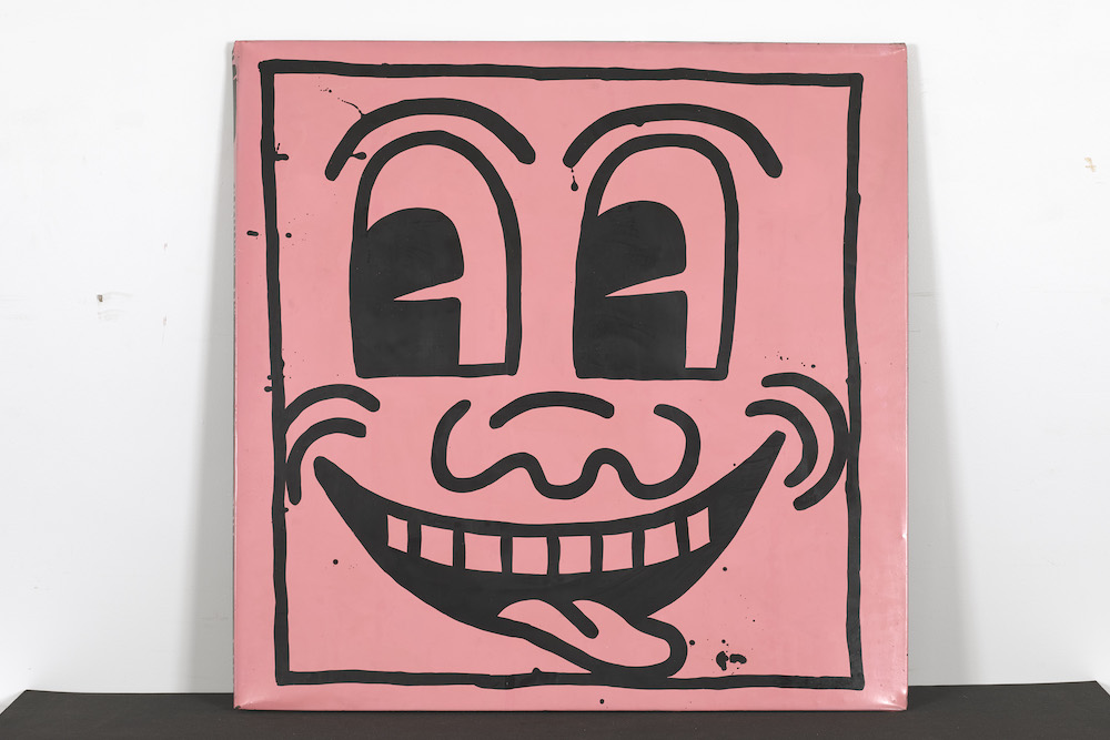
After finishing our first complete tour of the show, and heading back in for another look, Oscar, notably patient after nearly an hour of tolerating my embarrassing enthusiasm, said, “The complex stuff is the best, the paintings that have a story and more than one image in them.” While unpacking this appraisal, we both agreed that works like Haring’s 1983 “Untitled (Totem)” series—towering sculptures adorned with carved line drawings of people piled atop one another—showcased his talent better than works featuring singular characters, like his neon, three-eyed, smiley face paintings from 1981.
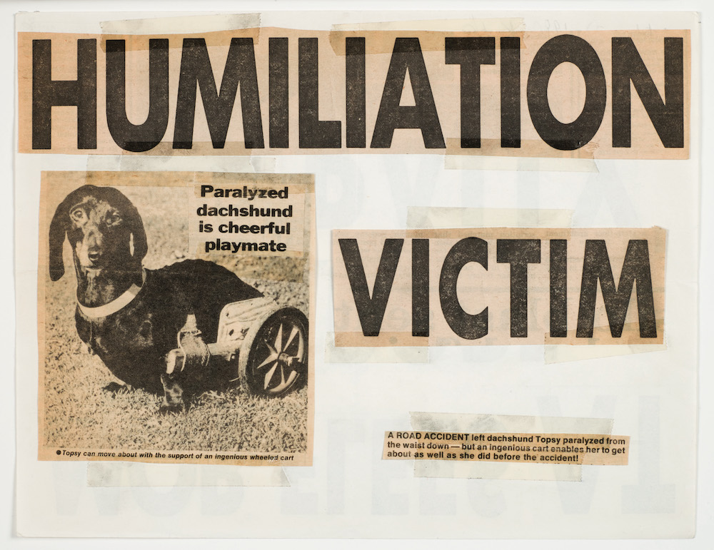
Keith Haring, Humiliation Victim, 1980. Courtesy of the Keith Haring Foundation and The Broad Art Foundation, Los Angeles
Haring’s more iconic images are best suited for reproduction on illuminated billboards or mass-produced objects. This was evident in a display highlighting a collection of merchandise he sold at the Pop Shop, a store he opened in 1986 in New York. While looking at the array of shoes, watches and skateboard decks, Oscar assessed, “It’s just as much art as anything else.” (Cue Haring and his Pop-art predecessors smiling down from heaven.)
Standing in front of an untitled, immense black-and-white mural that most viewers engaged with solely through their smartphone cameras, I asked my young friend what he thought about the differences between how kids and adults look at art. Oscar leaned back on his tie-dyed Crocs, paused briefly, and responded, “Adults don’t see all of the details.” He suggested that the best way to see the art was to “start at the bottom and slowly move your way up. The bottom is bigger than the top.” He was right: Starting at the bottom meant beginning with the gravitational pull of the artist’s lines and the way he let paint drip toward the floor, a sign of the non-mechanical nature of the work—or is this simply his literal point of view?
While I was satisfied with the retrospective’s overall exhibition design, Oscar believed there were missed opportunities. He suggested, “They could have put more things in other places, like the floor and the ceiling. It would fill up the room. People aren’t looking at the ceiling.” And he was right. It was the first time in any art experience I found myself noticing that no one was looking up. Future curators take note: Installing Haring’s work on the floor and ceiling, even as vinyl reproductions, would call back to how he painted the Pop Shop’s walls, floors and ceiling, and would reflect how he filled his works with a line that could go on and on forever. Were he still with us, I bet Haring would appreciate my companion’s suggestion to take advantage of all the space our eyes can roam—maybe something the adult curators have forgotten.
Untitled, 1981. From the Collection of Larry Walsh. Courtesy of The Broad Art Foundation, Los Angeles.
