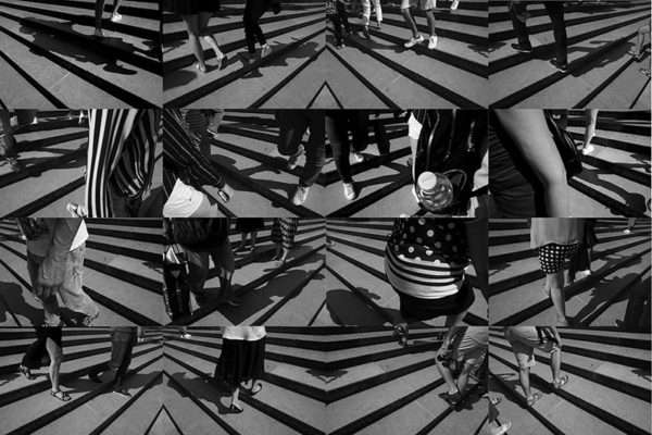
The repetitive quality of the overall patterns in the grids in Ave Pildas’ show at Tufenkian Fine Arts create an almost animated effect, a little like standing in one place over a long period of time and blinking slowly. The different figures traverse the space that is framed and look like stop-action films without fostering the sense that there is the continuity of one figure linking them all together. The off-kilter turning of architectural and landscape scenes makes the horizontal and vertical vectors that we normally orient ourselves with turn into a dynamic optical pattern in which it is hard not to feel a slight topsy-turviness.
Then there is the effect of how a viewer’s imagination shrinks down into the wonderful and often black-and-white world looking for telltale details. How that one’s head is turned this way or that, another one’s hand is raised this way or that: a single location is mined for a highly differentiated set of circumstances. The work both elicits a strong sense of fixity and place and an equally strong sense of how these places that are in fact momentarily occupied by people become extraordinarily active. The interactions span different geographical locations and move from ground level to aerial views. At times it appears as though the environment superimposes itself on the figures traversing it, at times the figures almost blot out the background place in front of which they are being frozen.

Ave Pildas, Carlos Slim, 2017
In the nine-part horizontal grid that constitutes Converse, 2013, the foreground consists of people walking along a street that in the background is a wall of printed images of people standing in various poses. The walkers are all single figures turned to the side and have been cropped so that you see most of their body but not their calves or feet. The people on the wall are all facing forward, legs akimbo, arms in various expressive poses and the superimposed feet of this human chain link underscores the advertisement by sharing the same shoe: from all different walks of life they converge on their footwear. Pildas proposes the opposite: not all those walking share the same path.
In the closely cropped images that make up the grade for Capital Stairs (2019) it is the geometry of the highly contrasting steps that take up most of the space. Images of feet and lower legs predominate although there are interspersed images of waists and thighs. Both images utilize the high contrast of black and white as an expressive coefficient and they both effectively express the strange, implicit contrast and compares that occurs to anyone who is standing still and watching a crowd flow by. Ave Pildas’ years of watching the world move through his lens brings us the highly refined sensibility of looking for compelling details of the ordinary.


