Allison Miller’s oeuvre is firmly and unequivocally rooted in the painting tradition, and yet is built upon a conviction, evident in her output over the past decade or so, to explore every inch of the possibilities, conditions and inherited clichés of painting. It operates more as a dynamic, undulating continuum than a machine on a trajectory. Equally adept at inventing strategies and systems as she is at destroying and subverting them, her work’s success largely depends on the interplay and balance of the two.
In Jaw (2016), for example, Miller plays on clichéd pictorial conventions as well as “doodling,” a form of “non art” art. A blue zigzag framing device resembling a caricature of an actual frame edges the painting, while symmetrical yet imperfect curlicues sit in the top corners, suggesting the rehashed tropes of pictorialism seen in children’s art. A horizon rests tacitly in the background as if to connote landscape. Bursting forth from these motifs comes an army of vertical stripes, which at times intermingle with the other elements but generally tear through the composition with a flattening effect. Miller often juxtaposes inherited tropes with unexpected elements that disrupt our conditioned visual modes.

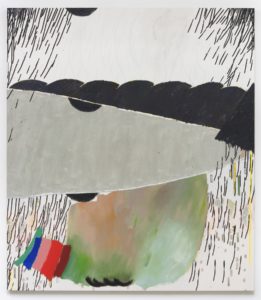
Allison Miller, Door, 2015, ©Allison Miller, courtesy of the Artist and The Pit Gallery, Los Angeles, photo by Jeff Mclane.
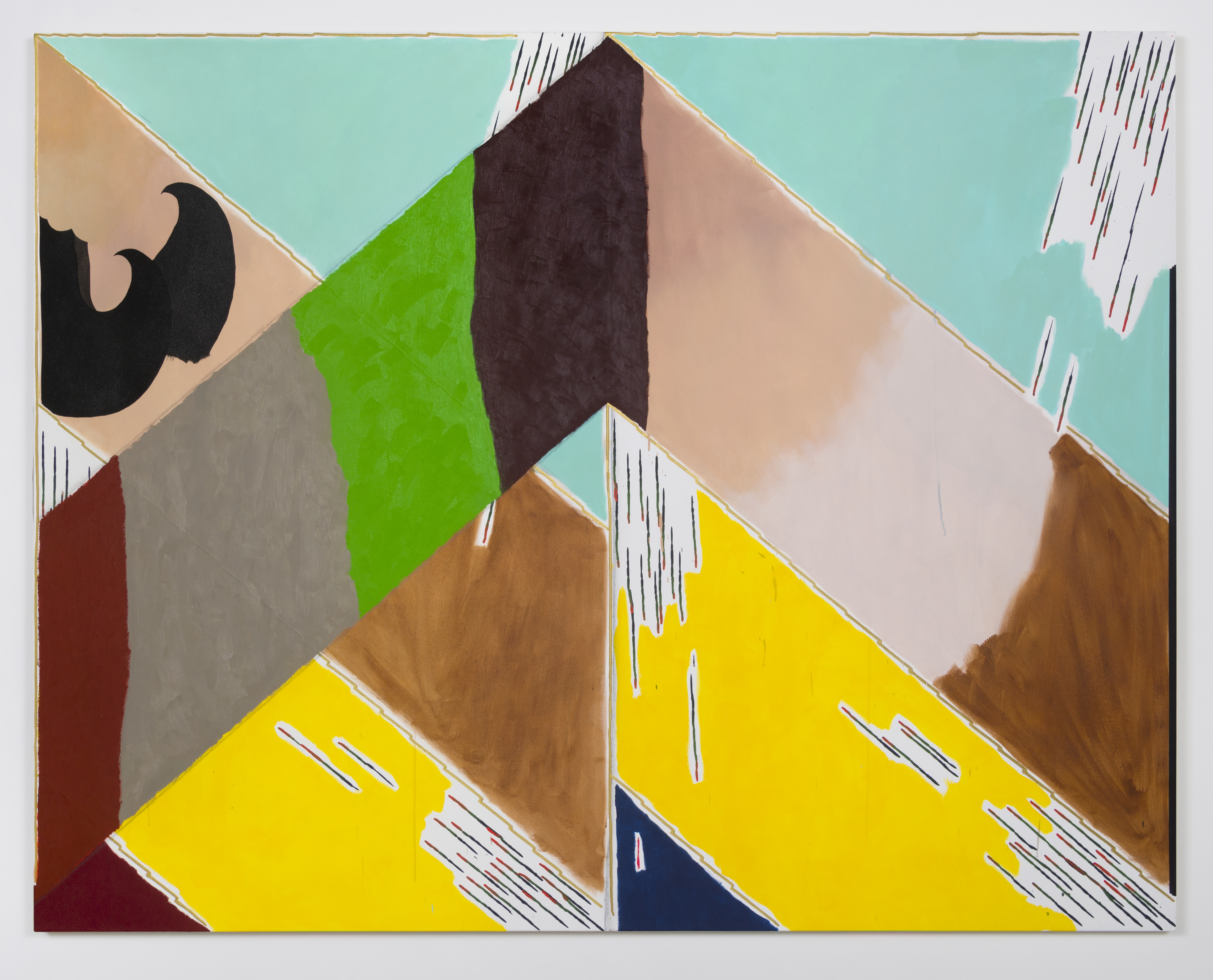
The title of her current exhibition, “Screen Jaw Door Arch Prism Corner Bed,” is a combination of the titles from all seven works in the show. Bed (2016), a diptych and her largest work to date, occupies the entirety of “The Pit II,” the smaller room adjoined to the main gallery. Like many of Miller’s works, its syntax consists of both purposeful structural marks and those that appear more haptic and improvised. Here, more than with the other works, is a clearer delineation of the succession of the acts that contributed to the creation of the work, and more negative space left around the marks. Perhaps the traces of how the artist created this work in time contributes to its relative lack of strength in comparison to the others.
Miller’s works seem to operate most successfully when the surfaces convey a certain visual democracy, achieved at least in part by the obscuring of chronology—something she does exceptionally well in Corner (2016). It’s quite difficult to say whether she began with the foreground or background of Corner, all parts feel simultaneous. Yet ironically, this simultaneity encourages a more extended temporal experience of the work. Flat areas of disharmonious colors butt up against scatterings of more tightly-controlled line motifs. The work is simple in its basic visual vocabulary and composition but seduces the viewer with its deliciously unconventional use of color. Another highlight of the show is Door (2015), a composition split crassly into thirds. Here, gorgeously rich blacks meet fractured lines—the color palette of the Fauvists—and soft, bloated shapes reminiscent of the work of Philip Guston. These works are underpinned by their ability to let viewers vicariously live in the simultaneous pleasure and provisional quality of their creation. One gets the sense that they are, in the end, as a much of a surprise to Miller as to the viewer.


