Your cart is currently empty!
Month: May 2015
-
“Alien She”
The Riot Grrrl movement, which emerged in reaction to the male-dominance and sexism that infused West Coast punk scenes in the 1990s, spawned a subcultural movement in art, publishing, and performance. Even in the resolutely anti-establishment punk rock scene, many male-fronted bands spouted homophobic lyrics and ideologies. Riot Grrrl musicians and artists stood against the widespread homophobia and conservatism in the punk scene and society as a whole.
“Alien She” at the Orange County Museum of Art focuses on seven artists who were influenced by the Riot Grrrl movement. This narrow survey immediately bombards viewers with a montage of roughly-printed punk rock zines. The visual magnitude of this archive, safely cached behind a layer of Plexiglas is overpowering, offering an initial impression of the breadth and intricacy of this subculture. One shelf holds a small sample of zines, allowing readers to peruse a few copies, but feelings of cacophony and hermeticism echo throughout the entire exhibit, which as a whole is visually and contextually disjointed.
Allyson Mitchell, “Ladies Sasquatch” series (2006-10) Tammy Rae Carland’s 2002 “Lesbian Beds” series provides an intimate view of the sexuality negatively targeted by the male-centered mainstream punk. Her serene studies of lesbian couples’ unmade beds serve as a counterpoint to the chaotic energy of the zine archives, but the discordant punk aesthetic is a continuous theme in “Alien She.” L.J. Roberts’ giant, bright pink crocheted “barbed wire” fence in the center of the exhibit—not actually barbed wire, but made of yarn, hand-woven wire, steel poles, and assorted hardware—“We Couldn’t Get In. We Couldn’t Get Out” (2006-7) is an abrasive and disarming visual presence. In her hands, this warped and messy structure that stretches diagonally across an entire gallery, splitting the space in two becomes a metaphor for the struggle of immigrants, queer and transgendered people.
Allyson Mitchell explores non-normative sexuality, positing a “queer utopian dream world” with giant female monsters from her “Ladies Sasquatch” series (2006–10) near the giant pink fence. These large, ferociously posed fuzzy creatures recalibrate ideas of beauty, desire and femininity.
Stephanie Syjuco’s “The Counterfeit Crochet Project (Critique of a Political Economy)” series (2006–present) of replicated designer handbags, belts, pouches and other consumer accessories invite dialogue about the elevated value of art, how the setting of an object changes its value, and whether material choice changes that value. In line with the Riot Grrrl movement’s collaborative and supportive tendencies, the series comes complete with free instruction manuals. Syjuco’s collaborative-based works offer an interesting dialogue about authorship, commodity, and the ongoing debate about art vs. craft.
The work of Miranda July, whose boundary-pushing is often compelling, loses out in this installation, which is sparse and heavy on text. With such strong video-based and interactive works, it is a pity the museum offered documentation of pieces and processes, rather than finding a creative way to exhibit some of her most interesting pieces. July’s video works on display here are small and of poor quality. While they draw on a kind of vintage aesthetic, they fall flat in this space.
One high point for the exhibit is the collection of photographs and video clips from filmmaker and artist Faythe Levine. Her Handmade Nation and Sign Painters films are fascinating and beautifully executed alternative art scene documentaries. However, the presence of these films in “Alien She” is confusing. While the curator notes that Levine is influenced by the activism of the Riot Grrrl movement, there is little resonance of Riot Grrrl motives in Levine’s work for this exhibit.
The exhibition seems afflicted with a mild case of schizophrenia, teetering back and forth between a larger cultural survey of the Riot Grrrl movement and a simple look at seven artists who were influenced by the underground Riot Grrrl movement in the 1990s. At times, the visual representation of the movement and artists is chaotic and overwhelming rather than illuminating. Based on an aggressive underground punk rock music scene that was formed as a reaction to sexism, racism and homophobia, a large number of women at that time became more active and aggressive in art, politics, music and activism, standing up for LGBT and women’s rights and experiences.
“Alien She,” which is part of a national tour, feels cramped in the OCMA galleries. The exhibition as a whole seems like it would make a fascinating book, but with the majority of the works being so based in documentary and social practice, the experience as a whole is educational, sometimes evocative, interesting but exhausting.
-
Eric Wesley
Eric Wesley loves to kid around and unbalance the viewer. In this survey or rearrangement and reworking of objects from his production dating back a decade, he checks in with a wide variety of works distributed in a clock pattern throughout the spacious warehouse floor of 356 S. Mission. He anchors the exhibition with I Beam U Channel (2015), a central monumental steel piece that transforms from I-beam on one end to U-beam on the other (a previous iteration of this work was made of camouflaged painted wood). This once trompe l’oeil beam that spins, ominously suspended on a single steel thread, mimics the trajectory of an invisible monster burrito—Inch-Alota (2015)—spanning the entire space and visible only in cross-sections exiting the building on each side as stained glass inserts.
Other disassembled series appear transformed throughout. A trio of overturned and variously positioned little forklift-like carts, D’Cart X,Y and Z (2010–15) mirror the Cartesian X, Y, and Z coordinates and are situated next to Entangled Pictures 1, 2 and 3 (2010–15): canvases splattered with primary colors and attached to larger unprimed canvases. The artist’s use of space and references to Cartesian mathematics serves to unite the series and suggests a meaning encoded in the physical placement of objects in space. It is as if he were looking for a site-specific definition where the space of his array in the larger world could be a crux. And then he upends any site specificity with the spatial equivalent of a shrug in his re-presentation of the “Spa” series.
Eric Wesley, New Realistic Figures (Sleeping): Plato, 2015. Photo courtesy the artist and 356 S. Mission Rd. Originally a single work, Spa-Versation, Spa-Brary, Spafice (Balzac Gigante) and Spa-Cial (all 2007–15) are presented as separate units. Each work with its light steel framework and white tile inlays seems a cross between spa equipment and a not always benign restraining device for office workers. Spa-Versation provides a seat for someone where they get blasted by a small but powerful flame gun. Spa-Cial is a tipped over dribbling fount to bathe or rinse in that isn’t working, destroyed (literally in NY by Hurricane Sandy) and reconstituted as ruins.
Miniature pedestal-mounted figures—New Realistic Figures (Sleeping) (2009–15)—cast in plastic and painted or with faux finishes are placed here and there. Wesley adds to his 2009 renditions of contemporary white philosophers like Jean Baudrillard and Michel Foucault, ancient figures such as Confucius and Plato, who are portrayed as dark-skinned. Some are missing sections of their arms, and all appear to be asleep. Could this be Goya’s “Sleep of Reason”? Maybe, but I suspect the artist prefers to let our imagination run rampant. His much ado about nothing and special effects of sound and fury add up to a Dadaist feat and are good fun, too. Perhaps he is asking “What is all the hubbub about,” as in the ungainly, quasi-industrial obelisk in the entrance of the gallery, which announces with its title: “WTF.”
-
Leigh Salgado
Our clothes are, as Virginia Woolf reminds us, more than “vain trifles” serving “to merely keep us warm.” Instead, as Woolf asserts, “They change our view of the world and the world’s view of us.” Art that turns our attention to our clothes illuminates how we see each other and how we are seen.
Leigh Salgado uses paper, paint and grommets to depict women’s clothes, especially lace-lined lingerie: bras, panties, corsets. Her cut-paper portrayals of women’s undergarments have roots in both the high art of the European avant-garde and the craft practice of papel picado.
In the late 1940s, Matisse began cutting shapes from painted paper and reassembling them, like puzzle pieces, into flat decorative images. In doing so, he turned away from oil painting—the privileged medium of high Modernism—to explore the previously devalued craft activity of cut paper. The merger of fine art and craft (also termed high and low art) was to become a fundamentally important strategy of Postmodernism.
Leigh Salgado, Good and Plenty, 2015. A Southern California native, Leigh Salgado grew up seeing papel picado images adorning the walls of Mexican restaurants and houses of her Latino neighbors, especially during the Day of the Dead celebrations, but she never thought to incorporate the craft tradition into her art practice. Then one day in 1990, she became frustrated by certain parts of a painting she was working on, and decided to excise the offending sections. She found she liked the cutouts and they have since become major components of her compositions. Today, the sheets of paper Salgado employs are riddled with piercings, recalling papel picado. The rhythmically cut holes also recall the eyelet lace that adorns dresses, blouses and lingerie.
One of Salgado’s recent works, Blissful Deflowering (2015) at first seems to be a globular vase filled with a dense bouquet of pointed-petal blossoms. On second glance, it becomes an orange-striped brassiere supporting flesh-toned flowers symbolic of female virginity.
Floral imagery also dominates Ballerina, (2015) a dance costume with hot pink petals that constitute a tutu. The torso is sprinkled with tiny brown flowers and topped by lacy green leaves. Above the torso is a scrambled ribbon that shimmers magenta and emerald. Ballerina asks viewers to consider the culture of performative display enacted by women on and off the stage.
Good and Plenty (2013) portrays thong panties in the signature colors of the licorice candy of that name. The fabric over the pubis is composed of pink and black striped blossoms; the tiny back section is openwork, like fishnet. The technical control Salgado exhibits is gasp-inducing, especially in the fishnet area. Like the licorice, the panties look good enough to eat… which of course brings up all manner of sexual innuendos.
In short, Salgado’s exquisitely wrought, visually seductive depictions of female attire address the objectification of women and how we co-create that objectification by seeing and dressing ourselves as objects. Lingerie, especially, contributes to what Simone de Beauvoir discusses as woman’s state of being seen (with man the viewer). Salgado insists we reconsider this process.
-
Mernet Larsen
Born in 1940, Florida based painter Mernet Larsen exhibits a body of older as well as recent paintings in her Los Angeles debut. These moderate-sized canvases feature geometrically distorted figures that populate skewed interior and exterior spaces. After teaching painting in Florida for over 35 years, Larsen had her first New York gallery show in 2012, where the works were applauded for their uniqueness, wit and charm. Larsen’s paintings have a purposeful naiveté, a quality that is also prevalent in the works of younger painters including Jonas Wood and Avery Singer, who are known for works that flatten space and figures.
The figures and the world they inhabit are somewhat reminiscent of Edwin Abbott’s novella Flatland, a story about cultural hierarchies and class, subjects that also inhabit Larsen’s paintings. To this end, the perspective in Larsen’s work is often intentionally wrong—forms and figures do not recede in a realistic fashion—making the depictions of natural, urban and domestic spaces unsettling and claustrophobic. Each figure is a quasi-robot comprised of interlocking rectangles styled to represent heads, hair, arms, legs and other body parts. The figures in Conductor (2012) and Skier (2013) emanate from the bottom of the paintings as vertical posts with long sinewy outstretched arms. The featureless skier faces away from the viewer, skis pointing down the slope in front of an abstracted chairlift and rows of snow-covered triangular trees. The conductor, also facing away from the viewer, directs a chorus singing for the audience in a vast yellow-toned hall.
Mernet Larsen, Aw, 2003. The works are humorous (though not cartoony), insightful and perceptive. Aw (2003), one of the earliest works in the show, features a diapered infant whose perpendicular legs and arms reach out to male and female figures whose angular bodies bend down but do not touch the child. The body language and expressions of the figures seated around an L-shaped table in Faculty Meeting (2008) exemplifies the sentiments of those who suffer through the tedium of these mandatory meetings. The speaker whose rounded face and hand borders the edge of the painting confronts eight expressionless male and female figures who seem to want to be anyplace but there. The Salad (2013) features a pointy-breasted woman wearing a purple dress who appears to have left her chair. She stands tall at the top of the painting behind a wooden table that gets smaller as it comes forward in space. Salad servers in hand, she is ready to serve the tiny figures in the foreground. The realistically painted table and wood floor depict an impossible space though not an uncommon occurrence—a woman serving her family.
Larsen’s paintings represent abstracted real-life situations and occurrences. She presents familiar places and activities—cafes, concert halls, ski slopes, gun shooting, sawing, walking, biking, handshaking—as if they had been sandwiched between two pieces of glass. This reduction or stripping away of details infuses the paintings with a new personality, one based on intuition rather than observation.
-
JESSICA RATH
“A Better Nectar” is a rare exhibition merging art with nature, while focusing on the daily activities of bees—those diligent flying insects that pollinate our planet. Among this show’s surprising pieces are several larger-than-life fiberglass sculptures that replicate the various objects of the bees’ attentions. These pieces, along with a light sculpture and the interpretive, “musical” sounds of foraging bees and of pollen being released, follow a multisensory journey, starting from the bees’ nests and concluding at their nurturing nectar collection.
The centerpiece of this exhibition is Resonant Nest (all works 2014)—19 honey-colored 36-inch-high fiberglass sculptures of hatched bee eggs. These sensuous, bell-shaped objects, gathered into three clusters and theatrically lit to emphasize their incandescent qualities are complemented by haunting music emanating from speakers installed within their organic shapes. The music, composed by Robert Hoehn, who is himself a bee keeper, calls up the diurnal activities of bumblebees as they move from nest to flower. The score, performed by the CSU Long Beach chamber choir, contains seven compositions including Languid Wander and Afternoon Forage. While the music was arranged to evoke the sounds of these tireless bees going about their workday activities, it is redolent of sacred, monophonic Gregorian chants.
Jessica Rath, Resonant Nest, 2014. Photo credit: Brian Forrest. In an adjacent gallery, “Staminal Evolution” features two polyester resin sculptures that allude to “buzz pollination,” a process in which worker bees vibrate at a specific frequency to release pollen from flowers and plants. The first of these sculptures, Tomato is a distinctly un-tomato-like 10-foot long representation of this nightshade plant’s tiny yellow stamen. Nearby, the 8-foot tall Manzanita Anthers depicts a Manzanita stamen, this plant’s phallic pollen-releasing organ. This magnificent ruby red sculpture resembles an abstract flower. Anthers also emanates sound—the aural equivalent as imagined by Rath of the release of pollen.
“Bee Purple” in a third gallery is named after the violet color that bees gravitate to while pollinating flowers. This immersive and color-shifting light installation evokes the light sculptures of James Turrell. As this projection screen depicts a bumblebee’s visual journey while pollinating different flowers, its colors shift from purple to yellow to aqua-green. A nearby video portrays a digital bee traveling along a cluster of flowers; and as the bee passes a particular color, this hue is flashed onto the screen. Rath complements these three primary installations with six supportive ones, the latter visually and didactically following her scientific/artistic journey to create this timely exploration.
Rath’s 2012-13 exhibition, “Take Me to the Apple Breeder,” was inspired by Cornell University’s apple-breeding program and combined photography with porcelain sculptural apples. In probing the interconnectedness of art and science and concomitantly offering a far too rare reverence for our ecological/agricultural world, “Apple Breeder” presaged Rath’s current work. Yet “A Better Nectar,” goes even further while demonstrating the artist’s creative evolution. The synergy of Rath’s sensual sculptures, lighting and devotional music forges the equivalent of sacred space in the secular.
-
Theodora Allen
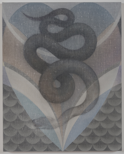
William Blake’s proverb “Eternity is in love with the productions of time” from The Marriage of Heaven and Hell is an apt lens through which to contemplate the paintings of Theodora Allen, both because her style and imagery suggest the visionary Romantic painter and poet, and because she is similarly concerned with temporality and mysticism.
Allen’s paintings initially appear understated. Many are very small; all are done in light, ethereal washes of pale greens, blues and grays. The paint itself is unobtrusive, for Allen applies thin layers of oil paint and then immediately wipes them off using a soft cloth; the pigment seeps deep into the canvas and is more of a memory of paint rather than the conspicuous presence of it. Her subject matter is mostly found in nature and depicted within architectural spaces. Plot, No. 3 (2014) features raggedy weeds, dandelions, and moths curved into an arch, while Snake, No. 2 (2014) places the titular creature amid symmetrical geometric lines and shapes. Occasionally man-made objects appear, as in Plot, No. 4 (2014) where a stringless guitar rests both in a field of flora and fauna and in an internal frame of interlocking rectangles, and in Calendar, No. 2 (2015) in which an hourglass, festooned with cobwebs and flowers, dominates the picture plane. The only human being present in this garden of ghostly delights is a woman, whose lightly-limned face in Flash, No. 2 (2015) is turned in profile and has the exquisite, soft beauty of a Pre-Raphaelite subject.
Theodora Allen, Calendar, No.2, 2015. Courtesy of the artist and Blum & Poe. Both the man-made and natural subject matter evoke the irreconcilable yet forever enmeshed notions of eternity and temporality. Moths are drawn toward fiery ends, flowers wilt, flames exhaust themselves, the grains of sand run out. Allen’s painting process itself evokes time, for each work had a beginning and an end, and the traces of each layer of paint and Allen’s erasure of them are visible on the surface. However, the artist seeks to move beyond fixed conceptions of time in her imagery and its evocations. The hourglass can be turned over infinitely, the guitar’s muteness will endure longer than any song, and Wildfire, No. 1’s curling flames are more ancient eternal fire than ephemeral blaze. The snake symbolizes rebirth and renewal in the shedding of its skin, and in its ouroboros form, infinity. The perfectly symmetrical architectural forms in which the creatures and objects reside allude to an inner vision, one that cannot be limited to or captured in temporal human experience.
Allen’s imagery and concerns are more similar to Blake than her contemporaries. Like Blake, Allen’s work insists on duality and opposition—we cannot contemplate eternity without the temporality of our existence, but can never fully grasp it. Allen’s paintings reveal an artist attempting to cleanse her own doors of perception to get as close as she can to the infinite.
-
AMIR H. FALLAH
Despite their welter of contrivances, and their aesthetic dependency on such elaboration, Amir Fallah’s paintings maintain a deep, charming and abiding sense of mystery. Like so much current painting that conflates figurative and abstract elements—and like so much painting that self-consciously crawls or explodes off the canvas onto the supporting walls —Fallah’s art makes an involved display of its manifold and heterogeneous elements. Unlike so many of his peers, however, Fallah makes such pictorial spectacle work, visually and theatrically—not simply through formal cohesion (which he is often willing to diminish or even risk foregoing), but through the image’s own visual drama. Fallah’s current work in effect embodies the “performance” itself, the stage sets, and the hall housing the audience.
Fallah is an aesthetic maximalist, filling his canvases—and the walls on which they hang—with busy patterns, bright colors and unobtrusive but persistent touches of trompe l’oeil. As restless as fireworks, they refuse to sit still long enough to behave as pictures; but pictures—or at least presences—constitute the conceptual as well as optical nucleus of Fallah’s entire approach. The images, after all, have been assembled conceptually even more than they have visually: the back stories to the installations overall as well as to their components reside in the process of assembly. The paintings in “From the Primitive to the Present” (all works 2015), Fallah’s Chinatown installation, were all devised as imaginary portrayals of members of a family whose belongings he had found and purchased (not by accident) at a North Hollywood estate sale. Everything from fabric patterns to old photographs to clothing to journals found their way (sometimes literally) into these paintings. “Perfect Strangers in Santa Monica” (all works 2014-15) also comprised a number of constructed “portraits,” although this time, since the painting-project was conducted in collaboration with local college and K-12 students, the paintings resulted from the active input of the subjects and their relatives and friends. The core of the installation was a platform-mounted, igloo-like enclosure inside which four eccentrically shaped, in fact rather heraldic paintings hung. The gallery’s own walls displayed montages of family photos and other personal ephemera, the kind(s) on which Fallah depends to “build” his presences, this time brought to him by his collaborators and given their own berth, and dignity, in the overall presentation.
Amir H. Fallah, Ancestors 2, 2015. Courtesy of the artist and Charlie James Gallery. A 3D display anchored the heart of “From the Primitive to the Present” as well, but here Fallah set out discrete objects cast in multiple from his estate-sale cart-away. Coffee cups, crucifixes, construction hats and other objects sat drenched in the same earthy grays, browns and yellows that predominated throughout the show. The color scheme for “Perfect Strangers” was darker and more enveloping, a soft nighttime to the downtown installation’s harsh day. Such a contrast hinted at a deliberate binary relationship between the two exhibitions. Resulting from different processes, they said different things, but spoke to each other from either end of town.
-
James O. Clark
The show’s title, “1993 to 2011,” gave some indication of the artist’s preoccupation with the relative ‘curve’ of time; but that was scarcely half of it. Clark took full advantage of the space-time manifold within the gallery’s rectangular ‘white cube’ space, not merely re-contextualizing his quasi-Minimal light sculpture, Tibia Plateau (1993–2011), but deconstructing and activating the entire space by way of light, shadows and reflections, and in turn their subtle alterations, dispersions and manipulations by way of readymade and additional elements (phosphorescent paint and motion sensors, in this instance), and the movement of the viewers themselves. A casual or first-time visitor might be excused for assuming the gallery was undergoing top-to-bottom structural-electrical repairs, or that a seismic temblor had shaken the fixtures from the ceiling. The gallery’s directors gave the artist full rein to alter the space as the work required; and Clark used the gallery’s own built-in fluorescent lights, suspending or entirely separating them from the ceiling.
Both initial and cumulative effects kept the viewer off- balance from start to finish. The viewer might conceivably enter an almost entirely darkened space, successively triggering the lights activated by motion detectors, casting variously white, pale pink and chartreuse lights around their immediately surrounding space. Depending upon the number of viewers in the space, there might be some corresponding, mirroring or re-balancing effect as lights triggered in another part of the gallery threw off another pool of light—and the configuration of the space as a whole: in effect, a spatial ‘curve’ in microcosm. As if to underscore the skewing of that three-dimensional axial geometry, three of the pieces (each using three fluorescent lighting elements) were simply titled A3, B3 and C3 (all 2015). Each mocked the notion of perpendicularity in a kind of suspended di Suvero- or Caro-esque fashion, with one element dangling from the ceiling as the other elements (one brushed with phosphorescent paint, as if to indicate another dimension) intersected or attached tangentially in their descent to the gallery floor.
James O. Clark, 3A, 2015, Photo courtesy of ltd los angeles and photographed by Jeff McLane. The “1993 to 2011” of the show’s title referred to the (presumably) various site-specific iterations of “Tibia Plateau”—which clearly became the template for all of these works as well as the show’s concept. Tibia Plateau, may come closest to the abscissa-ordinate relationship of conventional geometries, but only by specific reference to its analogue relationship to the body. The work refers to the knee joint in that the tibia plateau is where the upper-most prominence of the tibia meets the femur in the joint capsule. Presumably there would an analogous “radiance” if the joint were turned in the manner the light elements were presented here. But the larger point was the way discrete zones of light converged, bending our sensation of the space as much as the light. The other titled installation consisted of a single element placed in the painted alcove/gallery space in the gallery that was triggered as the viewer moved into it. The piece, titled “You’ve got me,” clearly referenced the viewer’s purchase on both surrounding space and actual perception of it—a soft-focus Klein-esque “void.” And not unlike that Klein, it successively encapsulated the viewer’s reception of this raw but elegant show.
-
Cornelia Schulz
Last fall Patricia Sweetow relocated to Oakland’s vibrant Uptown district, where Spun Smoke, her new venue, combines fine art with high-end, high-fire ceramics and a few skeins of her very own hand-spun, hand-dyed wool. Spun Smoke recently presented work by accomplished painter Cornelia Schulz.
In recent years Schulz has taken her sophisticated gestural abstractions down to a compact scale, and here followed an impulse to bring them off the wall entirely and into the realm of sculpture. Initial efforts were, apparently, unsuccessful, but persistence paid off; “Piece A Cake” offers the disingenuous suggestion that these small gems came easily. As well, their scale and shape could suggest an actual hunk of pastry—a deliberately disarming subterfuge.
Schulz presented nine works in oil on canvas on 3D wooden supports. The vertically-oriented, thickly-painted structures are all small in scale and rest upon—in fact, are bolted to—their bases. One of the most intriguing of this engaging and quirky bunch is Piece A Cake #5 (2015), sitting on a semi-circular hunk of vanilla-colored “pedestal.” It also resembles an animal—a sheep say, or a horse—the rounded edge of a black rectangular solid peeking out like a muzzle from a thick coating of white—edged with cerulean blue, black and a pale yellow ocher, and striped with a dizzying array of warm and cool hues and tones, cadmium red, orange, lime green. Thick overall, the paint is in some areas scraped down with a tool, leaving a pattern of shallow, regular grooves; in other areas, it is whipped into a frenzy, peaking and frothing into points like a stiff meringue.
References to Minimalism, strongly felt in the artist’s earlier shaped canvases that evoked groundbreaking works by Frank Stella and Elizabeth Murray, remain as a foil and grounding device, the firm and severe geometric structure undergirding the extravagant paint. If Stella achieved notoriety with an emphasis on flatness and his desire to draw our attention to the two-dimensionality of the picture plane, Schulz conversely wows us with the undeniable three-dimensionality of paint itself.
Cornelia Schulz, Piece A Cake #3, 2014, Courtesy Patricia Sweetow Gallery/Spun Smoke, photo credit: David Schmitz
Piece A Cake #3 (2014) sits atop a black teardrop shape. Drooping peaks of white trail onto the base, yet the opposite side of this “stroke” is black. Wavy forms alternate between suggesting water, frosting and tar. The profusion of complex, intricate brushwork like this belies any misconception one might initially have that these are “easy” works.This mimicry of other substances playfully nods to the trompe l’oeil sculptural tradition, particularly strong in the Bay Area ceramics world, where clay performs a convincing job of imitating wood, paper or other materials, and is found in the work of artists such as Richard Shaw or, in a funkier incarnation, Robert Arneson. With the ascendancy of hybrid media, Schulz’s skillful pairing of the concerns of painting and sculpture is visually stunning and quite contemporary in feel, almost daring us to dismiss these works as too beautiful at times, and then subtly revealing their remarkable sophistication—and good taste.
-
Araya Rasdjarmrearnsook
Thai artist Araya Rasdjarmrearnsook’s retrospective at SculptureCenter in Queens, New York, and her concurrent solo exhibition at the Tyler Rollins Gallery titled “Niranam” is the work of a profound humanist. Using videos as her primary medium, she tackles subjects such as death, cruelty to animals, and the underrepresented rural population of Thailand with unusual perspicacity. What might fleetingly appear to be the work of a sentimentalist is quickly transformed into deeply stirring presentations mediated by nuance and restraint.
While Rasdjarmrearnsook’s practice is deeply informed by Thai culture and Buddhist beliefs, her long established place as a feminist who uses the body to negotiate new pathways resonates with universal overtones. The artist is perhaps best known for her “Class” and “Conversation” video series, in which her dialogue with corpses on gurneys in make-believe classroom settings are chillingly dignifying. Although these series are often interpreted in the Buddhist tradition as gestures of longing for the departed, bringing the discomfort of death into daily discourse is unexpectedly gratifying. Through philosophical conversations tinged with humor and affection, Rasdjarmrearnsook half-coaxingly elicits their feelings about funeral music, people crowding their coffins, and the circumstances and gravity of their passing. By anthropomorphizing death through her classroom sessions, the artist transposes the status of the dead, as she elevates the position of women in her culture.
Similarly, in Rasdjarmrearnsook’s deeply biographical video Niranam (2008), which translates as nameless or anonymous, her body becomes an important tool of intervention. A gruesome surgery is performed on her back as she narrates the early loss of her mother and the tribulations of growing up, interspersed with vivid memories of a riverbank, flowers and church bells. This method of repeatedly juxtaposing contrasting views and images throughout her art prevents it from sliding into mawkish sentiment.
Araya Rasdjarmrearnsook, The Treachery of the Moon (2012), Courtesy of the artist and Tyler Rollins Fine Art. Infused by a deep sense of compassion for the vulnerable that is in keeping with Buddhist beliefs, Rasdjarmrearnsook honors the disenfranchised whether they are man or beast. The artist dedicates many of her works to stray dogs she rescues that otherwise are likely to be caught and killed. In The Treachery of the Moon (2012), these sentient creatures become Rasdjarmrearnsook’s companions. In the video, two dogs on a mattress in an empty room flank the artist as she watches an opulent soap opera. Bathed in exuberant waves of reds and oranges from the television, the room exudes a sense of rapture that seems to beatify the artist’s canine compatriots.
Rasdjarmrearnsook celebrates Thai villagers’ enthusiasm when a Buddhist monk elicits responses to paintings by Artemisia Gentileschi’s Judith Beheading Holfernes and Jeff Koons’ Untitled, of flamboyant bikini-clad women idolizing a man. By bringing her subjects to the forefront through a series of encounters with Western art, Rasdjarmrearnsook recognizes their presence.
Time and again, in an act of great reversal, the marginalized take center stage on a platform that brings them sensation and life. Placed in the hands of a gifted transformer, they remain etched in one’s memory forever.
-
John Currin
[fbalbum url=”https://www.facebook.com/media/set/?set=a.10152837072988870.1073741871.282227883869&type=3″] -
Between Distance, Denial and Disappearance
It’s a commonplace of the current cultural moment that we have trouble tearing ourselves away from our screens. (Some of us anyway; and for some of us that screen is basically an extension of our desk.) But actually I think it’s a bit more complicated than that. The problem is more about negotiating the space between screen and actuality – the distance implied and enabled by the screen; the denial we invoke and enter into on any number of levels in our address of actuality. Walk down a street – any street – with your eyes and fingers off your phone, and fully engage visually, aurally – I dare you. Your guard goes up in direct proportion to the neutralized visual/mental filters. It’s a mean world out there, mitigated only by aesthetics that go from surreal to ridiculous and back about every other second. There’s a lot of talk lately about the resurgence of comedy (which I don’t entirely buy); but you can see the possibilities just by walking down the street. It’s a laugh-fest or a choke-fest depending upon how visible or invisible, hungry or desperate you are.
If you were at the eastern end of Sunset Boulevard over the last few weeks, you might have noticed a multi-unit structure that seemed to be getting ready for the wrecking ball (which in fact I believe it is). It probably barely registered initially, but if you walked or drove past it often enough, especially in the last couple of weeks, you would have noticed it gradually being white-washed. At a certain point, you would have noticed that the entire structure and property – every nook and cranny, every outcropping, all devices and signage, landscaping and even the trees closest to the buiding – was covered in white paint. It’s been a shambles for the last five or six years, maybe a decade; so chances are this is the first time you have noticed it – which is part of the point.
This was the Sunset-Pacific Hotel, known informally to many of us in or around this neighborhood, as “Bates Motel” (after Bates Street, which faces one side of the hotel). Vincent Lamouroux had the idea of making this garish bit of local blight, which, in spite of its dimensions, had no more visual impact for most of us than a discarded gum wrapper, into an art installation. Goddess only knows the actual “Bates Motel” of Hitchcock’s Psycho would be considered an art installation by now (those Messager-like taxidermied birds against that Oldenburg-esque setting!), so why not? And he was onto something with this. It’s a kind of erasure that makes the thing visible; not a real absence or removal, but, as his title suggests, a locus for ‘Projection.’ At first, I wondered if some sound-and-light installation or film projection might be planned for the site; but when I went there to inspect it, I learned that this was not the case. In fact, it might simply be a promotion for a downtown design emporium, Please Do Not Enter (which itself is located in a building that will never be torn down – the Pacific Mutual building, a gorgeous Beaux-Arts structure). This is just a bit off-putting; but then, as I have myself pointed out, commercial/design, retail and fashion collaborations have also become quite common nowadays.
We’re starting to confront the fact of disappearance, of invisibility on many levels: the earth’s other species, the biosphere itself (which would ultimately mean the disappearance of our own species); for those of us of a certain age or in compromised health, our own disappearance; the obsolescence or simply impoverishment of a vast portion of the working world; the disappearance (or at the very least transition) of civilization itself.
-
A Guide to Paris Photo LA, 2015
An interview with Paris Photo LA’s new director, Florence Bourgeois, and the new artistic director, Christoph Wiesner, was the first thing on my agenda for the fair this year. I wanted to get from Bourgeois and Wiesner a sense of what changes or innovations they hope to bring to PPLA. Because this is the third year of the three-year commitment Paris Photo had made to be at Paramount Studio in LA, I also wanted to find out whether a decision had been made yet to renew the contract.
Ms. Bourgeois was very forthcoming about this last question. Yes, she said, the fair would definitely be back next year. “Paris Photo has to have iconic places,” she continued, “– the Gran Palais in Paris, and the Paramount Studio here. The fair works because the venue is fantastic. It’s an experience to come here radically different from that of any other fair in the world.” She was less certain about whether the new contract was also for three years or just one, but was definite that PPLA would be on-going.
Amir Zaki
Sliver 7, 2014
Framed Ultrachrome Archival Pigment Photograph with UV Coating
Artist and ACME., Los Angeles
Exhibitor : Acme
Mr. Wiesner responded to my original question about new initiatives, elaborating on two they have already taken. One is “Introducing! Young California Photographers Award,” which is an annual competition sponsored by Paris Photo LA sponsor J.P Morgan Bank. The other he mentioned is “California Unedited! The Archives of R. J. Arnold,” which is an exhibition of new prints from the restored negatives of a 19th-century portrait studio in Paso Robles. Bourgeois elaborated, saying, “: “We really wanted to enter into the American art scene and especially on West Coast. We don’t just want to have a French fair coming here. We want to have an American fair. We can see that the fair is settling more and more into America. The first year we had 29 American galleries, last year 35, and this year 39. So the fair is Americanizing more and more.”The two projects Wiesner highlighted are both welcome additions to the fair, though with somewhat mixed results this year. (The exclamation in each project’s title seemed to reflect some nervousness about the outcome.) “California Unedited!” wasn’t really an innovation, for it occupied the same “Power House” gallery in which another documentary project – an archive of LAPD photographs of crime scenes – was displayed last year. Still, this year’s archive is both fascinating and significant. It consists of new prints from 19th-century glass negatives recovered by photographer Anthony Lapore and painstakingly restored by volunteers at the El Paso de Robles Area Historical Society. My one regret is that Lepore didn’t go the whole nine yards by making prints that looked like those R. J. Arnold would have made himself, since digital technology makes it easy to duplicate today the appearance of 19th-century processes. Clearly labeled as reconstructions rather than originals, such prints would have been more effective at informing the lay public than the weak black and white prints that are on display.
Nadav Kander
Priozersk XIV (I was told she once held an oar), Kazakhstan, 2011
Chromogenic Print
Flowers Gallery
Exhibitor : Flowers Gallery
Aimed exclusively at MFA students in California art schools, “Introducing!” offered a $5,000 cash prize that attracted many entrants. Final selection was made by a panel of, in addition to Bourgeois and Wiesner, a collector and a curator who are each prominent in the LA photography scene along with two curators from elsewhere and the mandatory celebrity all LA events like this must include – in this case collector, photographer, actress Jamie Lee Curtis. The winner selected Thursday evening from among the six finalists whose work was on display is UCLA student C. J. Heyliger. His shaky, large-scale, monochrome print of a barren California landscape has a powerful presence – or rather, present – but a dubious future. It’s a trendy image but not as unsettling and genuinely new as another entrant’s, a diptych by CalArts student Arden Ellis Surdam.Another project that J. P. Morgan has at the fair, and that is more effective than the outcome of “Introducing!”, is an exhibition of photography from the J. P. Morgan Chase Art Collection. Selected by the bank’s able curator Lisa K. Erf, the work shown is a reminder that, in order to have genuine significance, a photograph which causes a sensation when first seen has to stick around until it becomes part of the history. Photographic pieces from the collection by Thomas Ruff and his teachers, Hilla and Bernd Becher, and by figures as diverse as Chuck Close, Richard Prince, Louise Lawler or Carrie Mae Weems – almost all from the 1970s and 80s – come as a melancholy but sweet shock not of the new, but of the fact that what’s new must last until it’s old.
Michal Macku
Glass gellage VI, 2006
gellage and carbon print on glass
Galleria Paci contemporary (Brescia, IT)
Exhibitor : Paci contemporary
The J. P. Morgan Collection show is relevant to this year’s fair in that the contemporary work in it is balanced by more vintage and historic photography than was seen last year. Both of J. P. Morgan’s installations – the contemporary student contest and the corporate collection show – are on Sound Stage 14, and other galleries there illuminate further how the history of photography morphs into the photography of history.AG Gallery, from Tehran, for instance, has recent protest photographs by Mohammad Ghazali that, instead of being in your face, are all the more profound for being oblique, subtle – aesthetic – in their effect. Some background information provided by the very articulate (in English) gallerist Simindokht Dehgani illuminates these quiet images.
Mohammad Ghazali
Tehran a Little to the Right, 2010-2013
Expired Polaroid Film
Ag Galerie and Mohammad Ghazali
Exhibitor : Ag Galerie
Nearby is the Black Eye Gallery’s exhibit of the “Facade” series by architectural photographer Tom Evalgelidis. Digital technology now makes possible architectural photographs so large that they render all the detail on a façade, so that you feel you’re standing in front of the building itself. The view of “Red Church, Saint Petersburg, 2005” is such an image here. But a view of the blank backside on the edges of which we glimpse an equally detailed façade in “North Hanoi, 2003” is equally suggestive.The power that the photography of history takes on in an archive like the one in “Unedited!” is felt still more acutely in a large set of vintage NASA photographs at Breese Little Gallery and a small group of look-alike portraits from 1967 made in the Sudan by Rashid Mahdi, at Clémentine de la Férronière Gallery. (By contrast, see at the same gallery the contemporary at-home portraits of French women by Badouin that look like fashion shoots. Everyone is his or her own celebrity in our postmodern age.)
As you come out of Stage 14 onto the “New York Backlot,” turn right up the Lower East Side street and go into Casemore Kirkeby to see work from the last few years by Todd Hido. All of it is printed to look as if done with the unstable photo technology of an earlier era and has tended to fade over time. Now, in place of the history of photography, we get photography as history – as a faked historical document, or just a reminder of an earlier time in the life of the medium, though not in the life of the photograph’s subject. The ability now to play with the medium’s history this way can be an aesthetic decision, a self-contradiction and self-displacement, a paradox of the sort of which all art is made.
Edward Sheriff Curtis
The Eagle Catcher, 1908
Small Format Copper Photogravure Plate
Bruce Kapson Gallery
Exhibitor : Bruce Kapson Gallery
Backtrack when leaving Casemore Kirkeby and take a sharp right up the angled street whose reverse geography leads from the Upper East Side to Greenwich Village and then Soho. Find your way to Document Art at the next corner on your left, and go in to see Zoé T. Vizcaíno’s bewitching photographs of rocks dropping into a pond or lake whose surface reflects a distant landscape and horizon. It’s as if God has poked a hole in the sky.The next major stop, after turning left on 12th St., is Stage 32. Though it has almost as many exhibitors as the other two Sound Stages, there is less to see here that is compelling. The two most interesting galleries cover quite a lot of the history of photography in two adjacent spaces. Jenkins Johnson has LA photographer Melanie Pullen’s series “High-Fashion Crime Scenes,” done in the last decade. These pictures make a film-noir conundrum out of our obsession with glamor, fast living and fame.
Next door, at Bruce Kapson, are vintage Edward Sheriff Curtis studies of Native Americans from the turn of the last century. The prints are stunning if familiar work. But also on view are the copper plates with which the prints were editioned. Curtis’ work is an authentic part of the history of both photography and his subject, though both aspects of that history have been questioned. Does his Pictorialist treatment of his subjects, sometimes tinged by soft focus with a melancholy sense of loss, sentimentalize the injustice and suffering that with which those subjects were afflicted? The copper plates as presented here are also powerful, but they, too, have been processed in order to enhance their appeal (and their considerable price). A collector I know who is knowledgeable about process questioned the way the plates were treated to make the image more visible.
Mohammad Ghazali
Tehran a Little to the Right, 2010-2013
Expired Polaroid Film
Ag Galerie and Mohammad Ghazali
Exhibitor : Ag Galerie
Stage 31 next door is closer to Stage 14 in the sense it summons of photography as both a contemporary art form and an historical medium. Just inside the entrance is Ingleby Gallery, from Edinburgh. The material on view is all about current experiments with process. These range from Ben Gauchi’s work in 19th-century types, including the ambrotype (a kind of daguerreotype on white glass) and the Civil-War era tintype, to the images of Garry Fabian Miller and Susan Durges, whose work is done to very different effect with what is called the “dye destruction print.” Adjacent to Ingleby is Paci, from Trieste, whose solo show is of Michal Macku’s 3-D work in “glass gellage.”At Flowers Gallery, a few Nadav Kander images of abandoned Soviet-era monuments in places like Kazakhstan resonate in their power with Evangelidis’ architectural studies seen earlier. Across the walkway, Riverside-based photographer Amir Zhaki has a very large photograph made at a very high speed of a crashing wave looking more like an ice-bound mountain or an Artic glacier beginning to melt. Next door, at Equinox, is recently re-printed color photography done by Fred Herzog in the 1950s. Whereas Todd Hido’s current work is evocative because it looks like faded work from the 70s, Hido’s even earlier work now has the lush color it would have when first printed, 50-plus years ago.
Liu Bolin
Hiding in the City, 2013
Exhibitor : Sun Klein
My last stop was to see Liu Bolin’s work at Sun Klein. The photo pieces by Liu seen here take us right back to our first stop at Ag Gallery from Tehran, for Liu began doing this type of work in 2005 as a political protest against the Beijing government for closing and destroying the Suo Jia Artist Village. In his photographs, live figures have been perfectly painted so that they disappear into the background. It’s a tour de force related to Calum Colvin’s work of 20-plus years ago, where he painted mythological scenes in real, three-dimensional rooms so that, from the camera’s point of view, the scene was flat . Thus does photography keep reinventing itself from one generation to the next generation.When I left Stage 31, I ran into a small group of LA collectors who were chatting after their day at the fair. I wasn’t surprised when they began playing down Paris Photo LA, speculating that it would close after this year. When I told them about the reassurances I’d gotten from Florence Bourgeois that the fair would be back next year right here, on the Paramount lot, where it’s been since 2013, they remained skeptical. The more they talked, though, the more I realized that because they and many of their LA friends go as a group to Paris Photo in Paris, they feel almost obliged to be blasé about – to downplay –Photo Paris LA. We’ll just have to hope European collectors find coming here equally exotic.