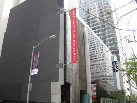
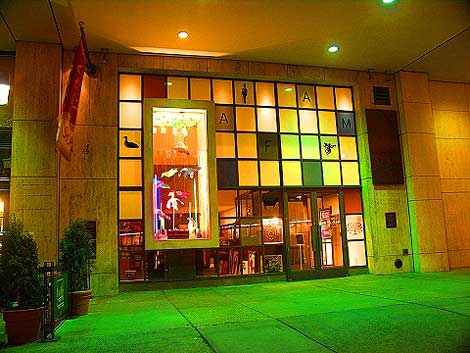
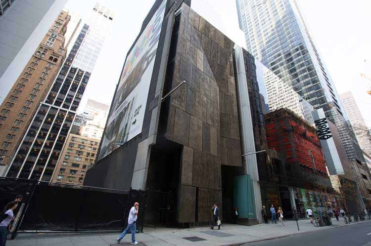
Well the axe has fallen once again on the magnificent American Folk Art building, designed by Tod Williams and Billie Tsien Architects. The structure is considered to be an architectural gem having won numerous awards including an American Institute of Architects National Honor Award (in 2003); the World Architecture Awards for Best Building in the World, Best Public/Cultural Building in the World, and Best North American Building, as well as the New York City American Institute of Architects Design Award (all in 2003); and the Municipal Art Society New York City Masterwork Award (in 2001).
Sheathed in bronze, the eight-level sliver of a building more than holds its own on this block of West 53rd Street with a human scale that offers welcome visual respite from the megaliths surrounding it. The building’s cliff-like surface, which is pockmarked and mottled and looks both ancient and modern, presents a dynamic pattern of intersecting planes. A clever use of recessing creates a strong line bisecting the façade that culminates in a dramatic slanted V at the top, which expresses upward and downward movement simultaneously. All this dynamism adds lightness to a material that has a pronounced brooding intensity. Strips of glass on either side provide interior light without compromising the sculptural integrity of the façade.
Built by an overly ambitious board at a reputed cost of $32 million, the 30,000-square-foot building, completed in 2001 spelled trouble for the American Folk Art Museum from the beginning. After years of struggle, the institution finally threw in the towel, unloading the building to its next-door neighbor, MoMA in 2011, and retreating to its former home at 2 Lincoln Square where it pays $1 a year in rent to the Church of Jesus Christ of Latter Day Saints. Talk about a comeuppance!
After its sale, the future of the building was unclear until April 2013 when MoMA announced plans to demolish it as part of its expansion. Following a huge public outcry, MoMA retreated, promising to reconsider the demolition. But then, just a few weeks ago, on January 9, MoMA announced that it is going forward with its original plan.
Having grown up in New York City, I am well aware of the many architectural treasures that have fallen victim to the wrecking ball: Pennsylvania Station, the original Madison Square Garden, the old Metropolitan Opera House, the spired red-brick fortress that was the School for the Deaf on Lexington and 68th, to name just a few. But these destructions were at the hands of zealous city planners or itchy-fingered developers. What makes the AFAM building’s fate so hard to take is that this time it is a museum of modern art with a prominent architectural and design department that’s swinging the ball.
Is this what a museum is supposed to look like? I thought they were charged with preserving treasures, not obliterating them in some misguided quest for “bigger and better.” It seems like just yesterday MoMA reopened after extensive renovations, which though certainly bigger, were never, ever better. Those of us who had been coming to the original museum all our lives had reveled in its intimate spaces where one could foster a cozy relationship with such treasures as Les Demoiselles d’Aignon. That sense of warmth was banished, replaced with a glitzy Yoshio Taniguchi design that resembles an upscale shopping mall in Dallas. Going up the escalator, I’m fully expecting to find Ladies’ Lingerie at the top instead of Gerhard Richter.
Granted, this airplane hangar-scale works for some things, but not everything. I remember when the museum was completed, Monet’s Nymphéas was moved from its perfect little sanctum sanctorum out to the central atrium. Swallowed up by the vast space, it became according to one critic a “dirty Band-Aid” on the wall.
I wonder what constitutes the makeup of the MoMA board of trustees. Captains of industry I am sure who are all about being bigger and badder than the next guy. One thing’s clear, they’re all about spectacle and social standing, monetizing and market share. None of which has anything to do with creativity.
Why can’t they keep the AFAM building constructing something around it if they must? Designed specifically to exhibit art and a seminal example of contemporary architecture to boot, it would make a most fitting repository for MoMA’s architecture and design collection and a delightful palate cleanser amid a sea of glass. The AFAM building’s reputation as a bad exhibition space is a myth fabricated by those who want it razed. It’s a perfectly fine exhibition space with clever indirect lighting and spaces that are both small in scale, like much of the Folk Art Museum’s collection, and bigger open areas used to display larger works. Personally, I like different types of spaces and buildings for my museums like the Isabella Stewart Gardiner, the Guggenheim, Venice’s Accademia.
But the boors of the board are about branding and conformity and marking their territory. This last holds true also for architects Diller Scofidio + Renfro who are willingly destroying something truly beautiful to replace it with something mundane. Or is it that they can’t bear to share the stage with such an architectural jewel as the Williams Tsien design, knowing it will put their own efforts to shame?
Sarah Sargent is our New York contributor, you can follow her blog: http://artnosh.blogspot.com/


