As part of her career-spanning 2022–23 survey, “Peripheral Vision” at the Getty, and in honor of the museum’s 20th anniversary, the German-American photographer Uta Barth presented an expansive commission entitled “…from dawn to dusk” (2022). Twice a month for a year,...
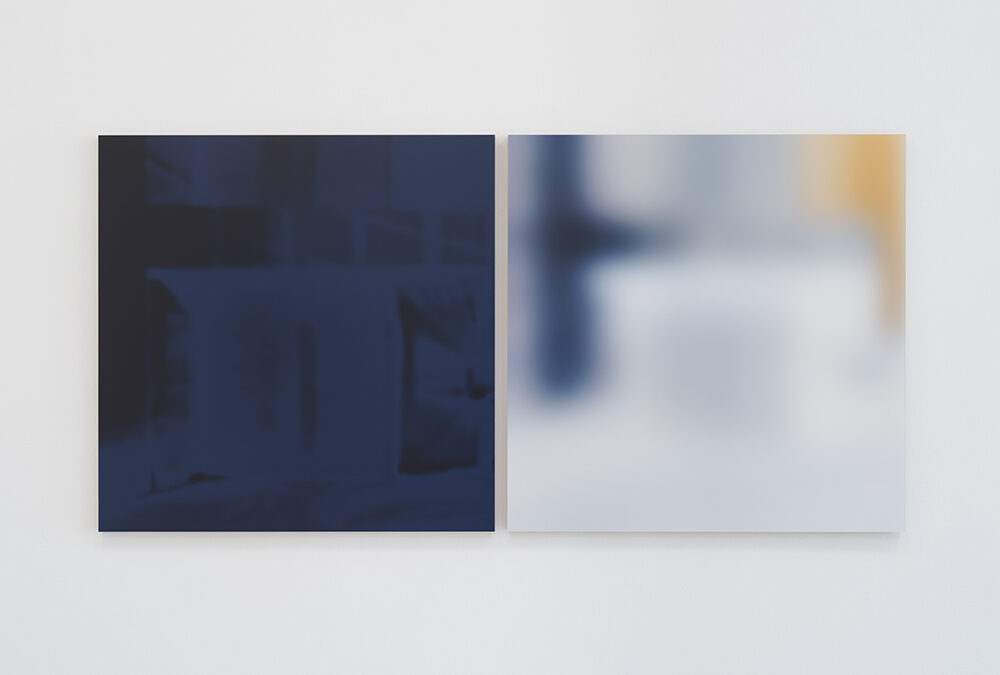
Uta Barth 1301PE
read more