Your cart is currently empty!
Byline: Christopher Michno
-

CÉcile B. Evans
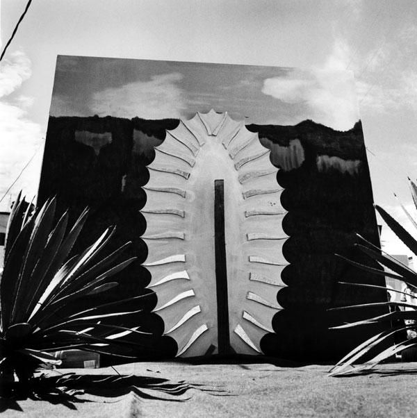
Cécile B. Evans’ stand alone installation, “Something Tactical is Coming,” generates a deliciously satisfying SciFi dystopian theatricality. The bulk of the installation at Chateau Shatto is comprised of a production set from the second episode of her three-part video series “Amos’ World.” Effectively divided into two spaces, the installation delivers the fictitious architectural office interior of Amos, the character for whom the series is named. On the obverse side of the structure, a frame of wood studs and unfinished hardboard, the episode is story-boarded with a loosely schematic narrative scrawled in Sharpie and a lattice of small video screens (without audio) broadcasting rushes; that is, extra scene footage not used in the final cut.
Evans’ projects typically explore the darker side of human systems and infrastructure, in which she extrapolates ideas to their logical ends—with a healthy dose of ironic wit. Here, and in “Amos’ World,” she takes on the Utopian aspirations of Modernist architecture. Amos could be modeled after any number of Modern architects articulating a grand vision for idealized urban life. The most prominent example would be Le Corbusier, the designer behind the L’unite D’habitation in Marseille—a building of modular housing units adhering to Le Corbusier’s notions of aesthetics, communal living and harmonious existence with nature.
Even without the complete video of episode 2, the installation, its title derived from a foreboding line in the story, takes on an absorbingly world-building aspect, echoing SciFi literature and film, and conversely, failed idealism. The loosely sketched narrative with its B-movie campiness and darkly Orwellian overtones offers the satisfaction of fright-film goose bumps and the familiar ring of a ghost story.

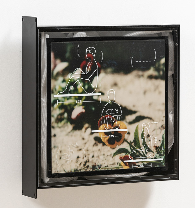
Cécile B. Evans, Forgiveness Isn’t Always The Best Thing To Ask For (Character Study), 2019, courtesy of the artist and Château Shatto, Los Angeles, photograph by Elon Schoenholz. Affixed to the gallery walls, two illustrations of human figures, which look as if they have been taken from an architectural standards book from the 1950s, indicate guidelines for designing to human scale. These drawings are attached to empty server housings—the computer infrastructure that digitizes, stores and serves up the virtual analog of human thoughts, memories and experience.
The artist asserts that the systems humans develop tend to shape humanity in turn, a theme that can also be evidenced in the installation’s video fragments, the rushes from “Amos’ World,” where puppeteers dressed in Chroma key blue manipulate Amos—Evans’ archetypal designer, personified as a puppet
The argument could be made that the reconstructed set from “Amos’ World” demystifies the video and dilutes its world-building, turning the project into an engineering problem and making precious the artifacts of the art-making process, to the detriment of the art itself. There is some merit to this view, yet Evans doesn’t appear to be interested in world-building so much as unraveling the logic of world-building—whether applied to a model of Utopian architectural as seen here, or as in many of her other projects, which comment on the alienating effects of technology. Her work is trenchant commentary, albeit with lots of cheek.
-

En Plein Error, Brian Kennon
The art collective En Plein Error, comprised of artists Jenny Gagalka, Beaux Mendes and William Wasserman, practices a kind of extemporaneous riffing to create their pastel on paper works, in a process that might be loosely compared to a session of exquisite corpse, except the trio makes their marks contemporaneously, with an orchestration and awareness of each other’s engagement with the paper/medium. The drawings in this exhibition take their cues from art historical works, signaling that there is more going on here than improvisation, and one can make inferences from the diverse influences, and at the same time deduce intention. The Opening (all works 2018), evokes Renior’s Luncheon of the Boating Party (1880-81), but tosses in a dose of German expressionism, with faces that range in color from a vaguely corpselike yellowish-green worthy of George Grosz, to a boldly lavender/crimson/orange reminiscent of Emil Nolde or Ernst Ludwig Kirchner.
The three artists arrange short residencies/retreats that are the working studio sessions in which the collective generates their drawings. These must be as intensive as one imagines they are giddy. Holed up in a hotel room for a 36-hour stint, the immersive nature of the experience geared toward breaking down individual preferences and finding a collective voice, yields results that on one hand are vital—witness the wisp of a stray asparagus spear on the hors d’oeuvres table—and on the other, carry a provisional, almost preparatory quality.

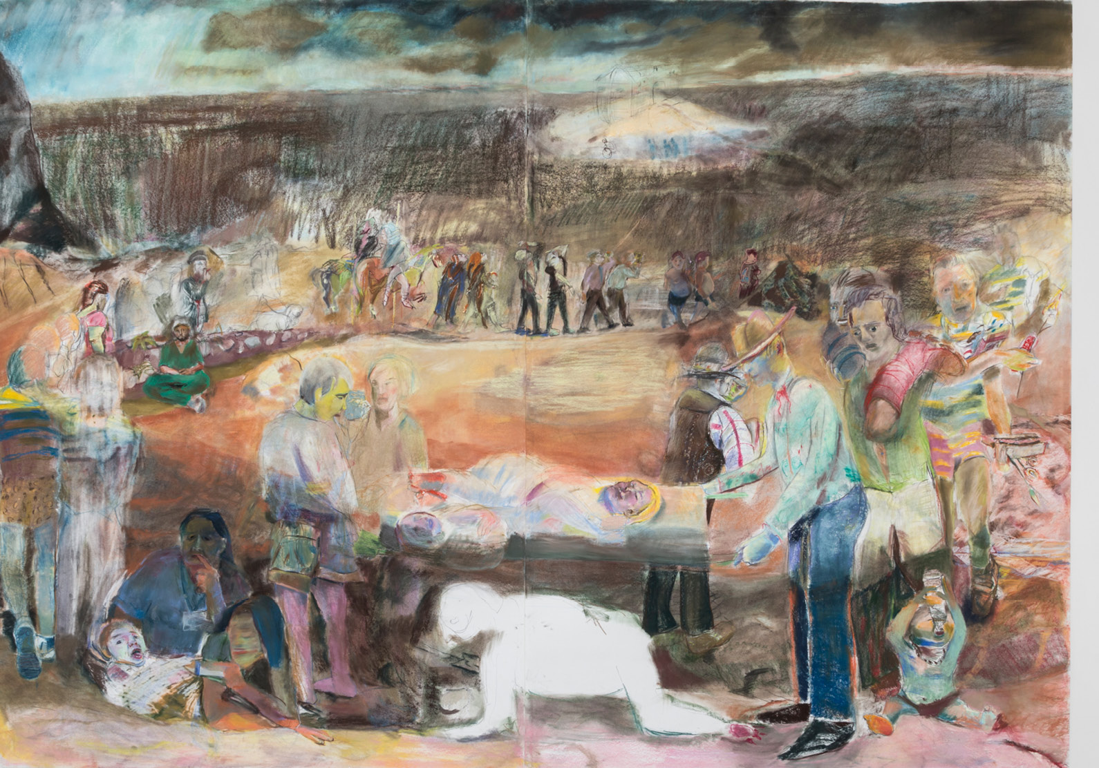
Jenny Gagalka, Beaux Mendes, William Wasserman, Dancers and Dog (2018), courtesy ltd los angeles. The ambitious Noah’s Ark conveys both the compositional strategies and the immediacy of their process, depicting a Boschian procession that winds from foreground through the middle and into the deep vista of the picture, where a skeletal ark is sketched in a luminescent circle that somehow escapes the gloom of darkly foreboding storm clouds. Figures are both unfinished and obscured creating tension between pictorial voids and a palimpsest-like sequence of rewriting.
Paired with En Plein Error’s unvarnished expressionism merged with a certain conceptual structural conceit, is Brian Kennon’s “Pages (Bonin, Buren, Benedict),” a collection of nine modest collages, in which he juxtaposes side by side images taken from art books. The sobriety with which Kennon goes about his work, and the material simplicity and restraint of the objects, plays in stark contrast to En Plein Error. Kennon’s work is generated through his research and mining of libraries, or the art historical archive. Each work in the exhibition is some combination of images of the work of artists Daniel Buren, Cosima von Bonin or Will Benedict. Much like an art history slide lecture, images are presented for examination and comparison. But their removal from the book and the library shifts the frame of reference. These concurrent exhibits reflect different modes of interacting with art historical knowledge, but in both Kennon’s work, and that of En Plein Error, ideas of authorship are reexamined and art historical references are detached from their original fields, allowing something new to emerge.
-

Regen Projects: : Tavares Strachan
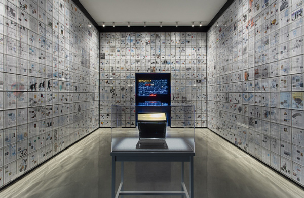
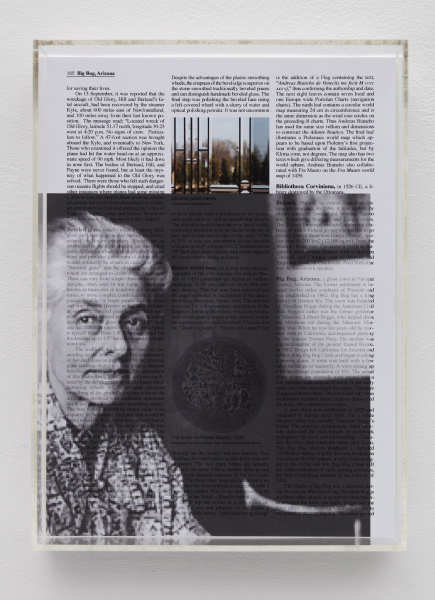
The entry into Tavares Strachan’s “Invisibles” exhibition is a kind of anteroom (Six Thousand Years, 2018) evoking something like a private library or even a Wunderkammer. It’s wall to wall, floor to ceiling array of acrylic vitrines, each the exact same size, holds reproductions of pages from the Encyclopedia. The exhibition’s print material references Britannica, evoking the never setting sun of the British Empire, and indeed, this display conjures the private Wunderkammers and libraries that were expressions of a vast imperial effort to capture the entire world in microcosm. It doubly references the Bahamas, where the artist was born, and which was a British colony until 1973.

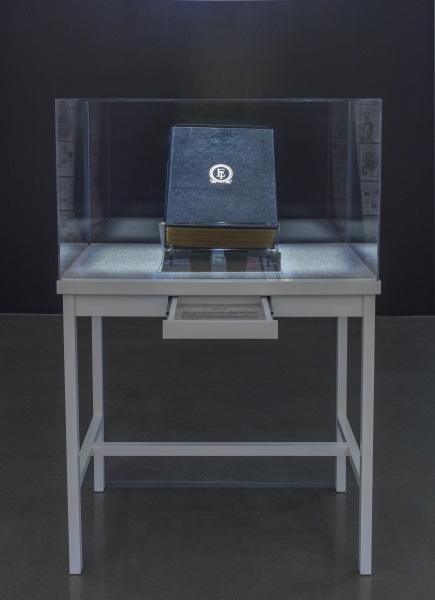
Tavares Strachan, Six Thousand Years (detail), 2018. Archival inkjet, pigment, enamel, vinyl, graphite, mylar, spray paint, collage, oil stick, acrylic mounted on sintra encased in acrylic. 826 units, each 11 x 8 x 2 inches. Courtesy of the artist and Regen Projects, Los Angeles. The focal point of this introduction to Strachan’s larger montage, neon, and sculptural multimedia works is The Encyclopedia of Invisibility (white) (2018), which sits encased in its own vitrine atop a small desk.
Tavares Strachan, The Encyclopedia of Invisibility (white) 2018. Leather, gilding, archival paper, white maple, felt, acrylic. Overall dimensions: 55 x 36 x 20 5/8 inches. Courtesy of the artist and Regen Projects, Los Angeles. The theme of invisibility pervades the exhibition, and here, “Invisibles” refers not just to the individuals, communities, achievements—the histories—that have been elided from the encyclopedia, a conceptual project that directly indexes an Imperial past, but also to the individuals who write the entries in the encyclopedia, or the editors who decide what makes it into this compendium that carries with it an authoritative air and draws the boundaries of knowledge.

Tavares Strachan, The Stranger (2018), mylar, matte paper, pigment, enamel, vinyl, graphite, mounted on acrylic, 36 x 36 x 2 inches. Courtesy of the artist and Regen Projects, Los Angeles. The individual pages in Strachan’s array of individual encyclopedia entries have been overwritten with collage elements. This act of rewriting continues through the larger montage-works in the exhibitions core, in which Strachan draws from the encyclopedia and foregrounds various pieces of information.

Tavares Strachan, Victorian I (2018), mylar, matte paper, pigment, spray paint, acrylic, oil stick, enamel, vinyl, graphite. Framed dimensions: 63 1/2 x 125 1/2 x 3 1/4 inches. Courtesy of the artist and Regen Projects, Los Angeles. 
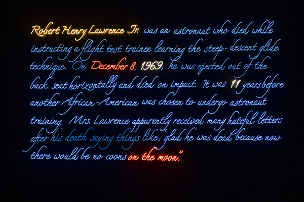
Tavares Strachan, Robert Henry Lawrence Jr. (2018), 4500k neon, blue neon, yellow neon, orange neon, tube supports, transformers, 80 x 120 x 2 inches. Courtesy of the artist and Regen Projects, Los Angeles. In this exhibition, the artist has returned to themes from previous bodies of work, for example, images of African American arctic explorer Matthew Henson, and Robert Henry Lawrence Jr., the first African American to be an astronaut. These examples along with the exhibition title broadly invoke Ralph Ellison. A trio of small glass, Pyrex and mineral oil sculptures—spectacles (Spectacles from the Invisibles, 2018) after Shirley Chisholm, Matthew Henson and Tenzing Norgay—are on display in the gallery’s lobby as both prelude and epilogue.

Tavares Strachan, Chisholm (Spectacles from The Invisibles) (detail), 2018, Glass, Pyrex, Mineral oil, lacquered MDF, 17 x 15 1/2 x 14 3/4 inches. Courtesy of the artist and Regen Projects, Los Angeles. Tavares Strachan, “Invisibles,” November 2 – December 22, 2018, at Regen Projects, 6750 Santa Monica Blvd., Los Angeles, CA 90038. www.regenprojects.com
-

EDITOR’S LETTER

Dear Reader,
The death of painting has been declared with either enthusiasm or dejection so many times, as has its corollary, the “improbable” resurrection of the medium, that the tandem seems now like a market gyration—either a panicked sell-off or a spate of giddy investors snapping up undervalued commodities. Apparently, the first doomsday prediction was uttered by Paul Delaroche, likely with a sinking feeling in the pit of his stomach, when he saw his first Daguerreotype sometime around 1839.
Delaroche was a historical scene painter, and his sense of dread upon envisioning the capacity of an emerging photographic technology to make his work obsolete is entirely comprehensible. He needn’t have worried—about painting, that is. But then we know this already. Artists have reinvented painting—and other art media—so relentlessly, that the thought of consigning one medium to a single type of expression is now entirely foreign to us.
And this is the point about painting—as with any other medium, it is as varied as the artists who practice it. In this issue of Artillery, we explore artists working in the medium of painting in diverse ways. Lane Barden examines the transition in Yunhee Min’s painting practice from the conceptual strategies she used in the early 2000s to her interest in contending directly with color and composition. In her “Wilde Paintings,” exhibited over the summer, he finds a phenomenologically-oriented intuitive approach that enters into conversation with previous generations of abstract painters and generates a kind of pure sensory experience.
Annabel Osberg talks with Ariana Papademetropoulos about her otherworldly paintings and immersive installations that in certain aspects function as mise en scène in a larger narrative thread that runs through her work. Yxta Maya Murray visits the studio of Pamela Smith Hudson, the Los Angeles painter who is so poetically reinvigorating encaustic. Hudson discusses her work in relation to her enduring interest in jazz. Shana Nys Dambrot turns her eye on Robert Yarber’s Freudian dreamscape paintings, which have just as much urgency now as they did in the Reagan era of trickle-down economics and cold war geopolitics. Eve Wood evaluates the tensions presented by the materiality of Lenz Geerk’s acrylic-on-wool paintings in relation to their depictions of psychological displacement. Meher McArthur follows Vera Arutyunyan’s painting practice as a means of expressing inner emotional states related to geographic dislocation. And David DiMichele writes on his appreciation for a favorite of his: Vincent Van Gogh’s Mulberry Tree.
The lie that painting isn’t up to addressing the contemporary experience never really held much sway. It is always and forever being reinvented. Even, at times, within a single practice. Think of Philip Guston’s remarkable late-career transition. Our reviews section is also littered with examples of contemporary painting addressing contemporary ideas. Corley Miller discusses, albeit indirectly, the propagandizing power of painting, citing David’s heroic portrayal of Napoleon’s crossing the Alps. Ironically, it was Delaroche who countered that iconic image with the real story: Napoleon rode a mule.
—Christopher Michno, Associate Editor
-

Michael Williams
“Fructis,” Michael Williams’ first exhibition with David Kordansky Gallery, presents the painter’s familiar wisecracking take on the ephemera of the everyday, as seen in his inkjet paintings, and his formally ambitious “Puzzle” paintings, which take a serious stab at circumventing the figuration/abstraction divide. It could be seen as a bifurcated practice—yet this is a paradoxical assertion; each of these veins informs the other. Like previous iterations, Williams’ seven inkjet paintings are developed with digital drawing tools—here, they are a combination of Photoshop and a drawing pad. Despite the high-tech, they retain a primitive quality, like a crisply designed but intentionally awkward zine, printed on art paper, married to Williams’ cartoony style of drawing. More importantly, they blur the distinction between the digital and gestural.
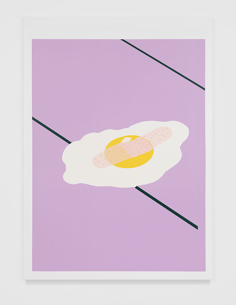
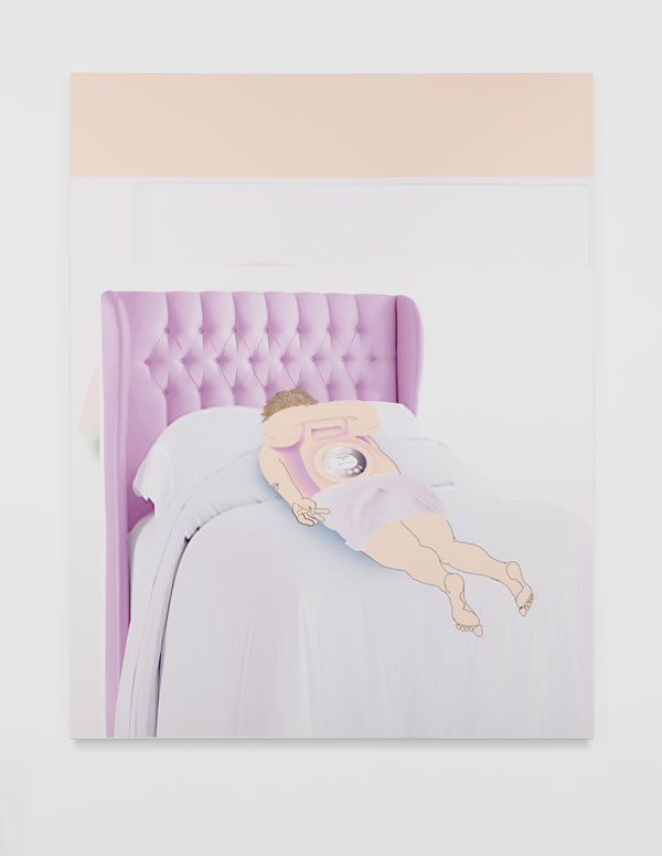
Williams’ inkjet paintings feel deliciously off-kilter, and the irreverence hits at varying levels, generating layers of ambiguity. Take, for example, JC (all inkjet paintings 2018)—a Christ crucified on a 45 mph road sign—and Descendant Egg, an egg fried sunny side up, band-aid stretched across the yolk as it appears to be slipping through cracks in lavender-colored flooring. With Middle Game 1 Williams uses a modified aspect-ratio photographic image of a bed. The lavender tones of its quilted headboard find echoes in the skin tones of the crudely drawn towel-draped figure that lies prone on the bed—and whose back morphs into an analog telephone. Mike, spatially organized around overlapping geometric fields (the subtle modulations of color between intersecting planes evoking Albers, but updated), is reminiscent of a joke where you meet yourself coming and going—only, Mike (a self-portrait?) is pissing into his own back pocket.
His oil-on-canvas “Puzzle” paintings—a series of disfigurements, if you will—flatten illusionistic space in favor of organic interlocking shapes and an inventive interplay of color and texture. The show’s title can be taken to mean enjoyment (as in the pleasures of painting, perhaps) or some variant of its Latin root; or possibly contemporary slang for “when things go horribly wrong”—a meaning consistent with the exhibition’s epigraph by Anders Sandberg, a research fellow at the Future of Humanity Institute at Oxford University.

Michael Williams, Middle Game 1, (2018), Photography: Lee Thompson. Courtesy of David Kordansky Gallery, Los Angeles. Sandberg’s quote brackets Williams’ work with a coolly analytical assessment of humanity’s transience over the long haul, in a universe that will ultimately wind down. He posits that the viability of the species can be extended by living as software—a not entirely comforting prospect. It forces recognition of the ways we live symbiotically with software—an evolution readily reflected in Williams’ painting practice.
Positioned adjunctly, an array of 10 enamel-on-linen paintings (10 HBOS, 2018), delivered à la Pollock, mimes HBO’s logo/branding. The predominately grisaille works, formally less convincing than their fellows, are presented as an animated sequence depicting the lead-in to the cable channel’s programming. They might be read as a clever joke on painting’s allure in the golden age of television, or better yet, the concept of seeing patterns in abstraction (pareidolia), which in turn comments on the artist’s puzzle paintings.
-
The Alien Worlds of Christopher Richmond
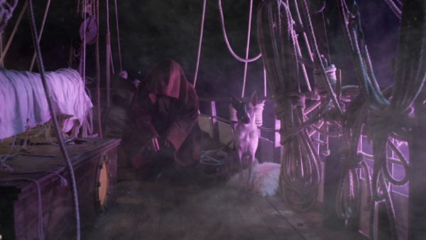
Film and video artist Christopher Richmond has been interested in science fiction for as long as he can remember. When he was a kid, he rented videos based solely on the cover art; his favorites were sci-fi. “Any sort of surrealist landscape, I was sold,” he tells me during a conversation at his studio near MacArthur Park on a hot summer-like day in February. He was also fascinated by comic books and “obsessed with notions of world-building,” he says, for which “science fiction is the inherent laboratory.”
The 32-year-old artist has been making film and video art that fits roughly into the science-fiction genre for nearly a decade. His newest project, Hyperway, a three-channel philosophical science-fiction-styled road trip film that comes in at nearly 100 minutes, opens at Moskowitz Bayse in November for his second solo exhibition at the gallery. The film might be about space travel to another world, or it might also just be a film about a trip into the Mojave Desert. The title reflects Richmond’s depiction of the freeway as an intergalactic roadway—a “Hyperway.” Shot entirely on Southern California freeways and locales without elaborate staging or effects, it derives its otherworldliness from costuming, monologues and the audience’s willing suspension of disbelief, and reprises Richmond’s favored elements: hand-made, cartoonish costumes; familiar locations beset with a sense of surreal displacement; a discontinuous narrative; philosophical discourse; a sense of foreboding; and for good measure, two different taxidermy coyotes.
Production stills from Hyperway, 2018, all images courtesy of artist and Moskowitz Bayse, Los Angeles. Tall and slender with a crown of unruly curls, Richmond is energetic and loquacious, often stopping mid-thought and starting over. I saw his films for the first time two years ago at his debut solo exhibition, “Double Fantasy,” at Moskowitz Bayse. Panthalassa (2015), a two-channel, 49-minute HD video, was a hallucinatory mind game in which Richmond played the main character. Stranded on a sailing vessel that is lost on an endless sea, he is hectored by a chimeric presence. Rendezvous (2016), a single-channel 41-minute HD video (and 16mm color film, VHS and sound transferred to HD) involves a mysterious event, an asteroid, a stranded alien and a character (Richmond) who seems to take the pulse of the solar system as he wanders around Los Angeles with a microphone aimed at the sky.

Christopher Richmond, Panthalassa, 2015 (still), courtesy of the artist and Moskowitz Bayse, Los Angeles. Richmond studied cinematography as an undergraduate at Chapman University, where he learned all he ever wanted to know about narrative and three-act structure. While satisfying liberal arts requirements, he was exposed to contemporary photography and conceptual art. Richmond quickly began to develop his own practice, which afforded him opportunities to explore ideas in ways that his film program did not.
He elected to pursue an MFA because he wasn’t interested in telling stories; rather, he “wanted to explore the fissure between story and discourse.” The willing suspension of disbelief was “just as curious as our desire to make order out of chaos,” he says. And a master’s degree at a film school wasn’t the place to do this. He wanted to study with other artists, especially those who weren’t working with film or video.
“My work didn’t really start off as science fiction,” he says, though as early as 2009 his films explore the genre. And as he neared the end of graduate school, he increasingly focused his practice on world-building. Comic books are a major influence. “I try to follow closely the storylines that grapple with comic book continuity,” he says; between crossovers, tie-ins and spin-offs, a changing roster of writers, and “simultaneous storylines about the same character, differentiated by nothing more than words like ‘spectacular,’ ‘uncanny’ and ‘amazing,’ it is unlike anything else. It’s no wonder every decade or so, the big comic book companies do spring cleaning and end the world or destroy reality. I love this about comic books.”

Production stills from Hyperway, 2018, all images courtesy of artist and Moskowitz Bayse, Los Angeles. Then there’s his fascination with theoretical physics, which presents possibilities of the multiverse, wormholes, and other speculative thought experiments. At an early age, he thought he would become an astrophysicist. His grandfather was a graduate of Caltech and a civil engineer. His uncle worked for NASA and gave him books on the Hubble telescope and Voyager. High-school science pared his interest in actually being a physicist, though, and he fell in with a group of older friends who introduced him to avant-garde cinema and European film.
Richmond worked on Hyperway, with a number of frequent (and new) collaborators. Even gallerist Adam Moskowitz appears in one scene, playing a Bach violin Partita in the space ship, which is Richmond’s Honda Civic. “It was pretty absurd to be in the back of a Honda Civic to play violin while a panel of brightly colored, flashing LEDs is blasting your eyeballs, and somebody is standing outside of the car and shaking it to emulate what the car would do when you’re in traffic,” Moskowitz says. “The result is actually quite wild—how close he can get to making you believe that the car is in motion.”
Richmond asked the critic Jan Tumlir, whom he met at USC while working on his MFA, to play one of the characters in Hyperway. “Jan plays a dramatized version of an academic. His character is based on my real experience of him,” Richmond says. There was no script, Tumlir recounts via email; Richmond gave him a character outline. “On reading this, it immediately occurred to me that Christopher wanted me to play myself. So I went back to what he knew of me from my lectures and the discussions we had during the class.” He prepared ahead of time, writing, and then it was a matter of “delivering those thoughts in an improvisational manner before the camera.”

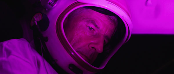
Production stills from Hyperway, 2018, all images courtesy of artist and Moskowitz Bayse, Los Angeles. Tumlir’s monologue is a poetic reflection on several things at once: Daniel Buren’s essay The Function of the Studio, the idea of how medieval churches and the communities they served were rooted in their environment, land art, crop circles, and Heidegger’s distinction between the World and Earth. His discussion undergirds the film, posing ontological questions of what an Earthling becomes after leaving Earth. But he delivers it costumed in a space suit, bundled into the back seat of Richmond’s Honda Civic. He looks off as he intones his lecture.
“Obviously, there is something absurd about bringing up Heidegger in the context of low budget sci-fi, but then this is an art project, so you can have it both ways, so to speak,” Tumlir says. “The film is sci-fi and also about sci-fi. Philosophical meditations drawn from Heidegger, who moves fluidly between questions of origin (The Origin of the Work of Art, 1950) and future (The Question Concerning Technology, 1954) are germane to the second, meta, context. Sci-fi is always about projecting forward in time as well as back.”
The film is a synthesis of ideas that Richmond has been thinking about for years, starting with the writers and filmmakers that have influenced him. His interest in manipulating our suspension of disbelief, exploring and calling attention to “the fissure between story and discourse” and making films that reflect on film’s apparatus—a Structuralist posture—is filtered through the informal approach of the French New Wave, and indeed, Richmond cites Godard as one of his favorite directors. Richmond’s film and video art is very self-aware, and in conversation, he demonstrates this same perspicacity as the discussion unfolds, almost as if his thought process mirrors his language and filmic work.
Halfway through our conversation, he says, “The sound of confusion is always something that’s interested me. I love the cadence of someone trying to make,” here, he interrupts himself and starts again: “The sound of me talking right now—trying to get to the point that I’m making has always been my favorite thing to listen to.”
In his films, that idea takes shape in any number of ways. “The idea of these characters trying to fuse ideas, trying to come to some sort of catharsis, but never getting there—because in many ways, I would argue, there’s no catharsis to be had,” he says.
Visually the film conveys this same kind of energy, like a storm of information exploding at the viewer in three channels broadcasting simultaneously. He deliberately mixes film and video media to perturb the seamless artifice. “I’m interested in the viewer slowly getting the harsh dichotomy between aesthetics. They begin to maybe—not completely—become aware of that sort of different viewing space that those different effects that 16, 8mm, VHS, Digital, HD have on them…in some way through the dichotomy of seeing it switched so prevalently between them, they begin to make connections,” he says.
But the question Richmond has been asked, over and over, is “Would you show this in a theater?” It’s one of the reasons he works in multiple channels—“It’s not even a question once you make something multichannel” he says, though he’s quick to point out that there are aesthetic reasons, too. The question leads to a more fundamental one: what is the difference between art and film, and more critically, which is Richmond’s? The answer, for Richmond, is complex. Foremost, he says, he makes his films for the gallery setting. More than that, he routinely incorporates some elements suited to viewing spaces that exist for experiential pleasure—for example, immersive Hollywood-style films—with others that require critical reflection, on the film, its apparatus, its contemporaneous discourse. In the end, his goal is something quite distinct from the standard Hollywood ending. His films, Richmond says, “employ all of the tactics of narrative story-telling, but they are not telling stories.” He likens them to lenticular images, in which one image is embedded within another, and the viewer switches seamlessly from one to the next.
Production stills from Hyperway, 2018, all images courtesy of artist and Moskowitz Bayse, Los Angeles. The science-fiction aspect allows the films to exploit viewers’ willing suspension of disbelief, which Richmond further manipulates with the phantasmagoria of his characters and the surrealism of his style.
He comes back to two more favorites: Andrei Tarkovsky and Stanisaw Lem, the Polish sci-fi writer and author of Solaris (1961), whose novel Tarkovsky brought to film. It tells a story very much up Richmond’s alley: set aboard a space station and built around the emotional breakdown of the crew, sent to investigate a strange occurrence on a distant planet, it poses probing questions about what it is be human. “As far as I’m concerned, they’re just philosophers in space. Only when you escape Earth, or only when you are living in this fictitious world can you really begin to explore things in the abstract.”
-

Reine Paradis: Surreal Chic
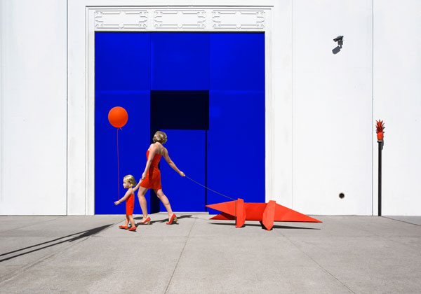
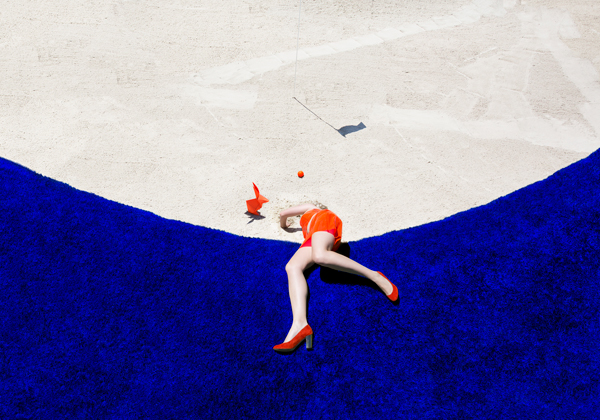
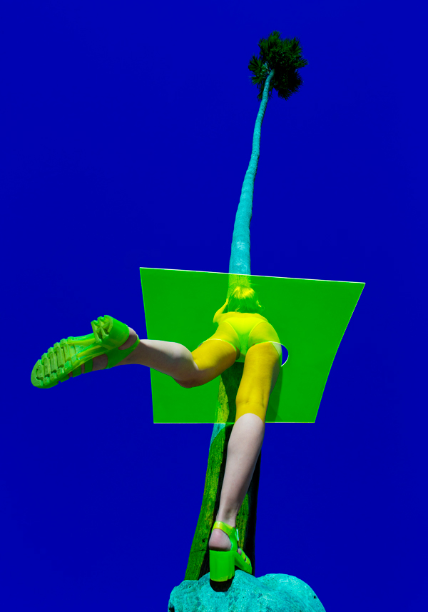
The photographic tableaux of Los Angeles–based Parisian transplant Reine Paradis evoke an ambiguity of place. The central focal point of each is a solo figure, played by Paradis, typically costumed in an A-line mini or similarly chic garment fashioned from transparent, tinted PVC; she is most often posed humorously or awkwardly—sometimes, heroically—in an iconic landscape, accompanied at times by sculptural origami animals that she holds on a leash (Elefanto, 2018), or an eerily childlike doll that appears to hold her hand (Crocodyle, 2016). Yet none of her works betray their locale; instead, they are stages for the whimsical fictions Paradis creates.
In L’envol (2016), she balances perilously along the cylindrical edge of a blindingly white water tower against an impossibly intense blue sky—a kind of ultramarine-phthalo-Prussian-blue mix that resembles International Yves Klein Blue—a detail that offers a perspective on Paradis as a feminist version of the dramaturgical modernist: think of Klein’s leap into the void. Instead of being dragged through pigment and bodily imprinted onto canvas, Paradis is the master of ceremonies, even when she is sprawled on a putting green (Moongolf, 2016).
Moongolf, 2016, archival pigment print, 60 x 42 inches (edition of 3), courtesy of Avenue des Arts. Her photographic tableaux begin as scenarios that come to her as “visions,” Paradis explains during a visit to the South LA studio she shares with her husband, filmmaker Carl Lindstrom. Paradis records these first as “maquettes”—rough drawings akin to storyboards. They are fully realized as photographic tableaux, complete with props that she builds herself, and costumes she makes, at times with help from the upholsterers and furniture makers in the studios adjacent to hers, and they originate in her memories of make-believe scenarios acted out with her sister during their childhood in rural Southwestern France.
In the late 1980s Paradis’ artist parents fell in love with the region and relocated from the Antibes to the remote hamlet of Bilhac. “It’s not even a village, it’s like a hameau. You have a church, a few houses, but you have to drive to get to the next village,” Paradis says.
She recently returned to Bilhac with Lindstrom to shoot footage for a documentary. “I recognize similarities with my images and this place where I grew up,” she says. “There are so many things…for example, the empty pool [evoked in Empty Pool (2016) in her “Jungle” series].” She and her sister would often play in an empty pool adjacent to their property. “I didn’t really think about those things when I was creating the images.”
Empty Pool (2016). Archival pigment print, 60 x 42 inches (edition of 3). Courtesy of Avenue des Arts. “My main inspiration is the location first,” she says. “And the light in LA is very different from the light I was used to in Europe… I shoot around midday. It’s always super-intense, very bright. I’m of course inspired by the colors that I use. They are one of the main focuses of my work. But everything is equally important,” she insists.
“Midnight,” her recent exhibition at Avenue des Arts in downtown LA, featured a new series of photo-tableaux that continues where previous series left off, along with excerpts from the documentary she and Lindstrom are working on, and an installation: a gold-painted pineapple, suspended on a filament, rotated slowly as it was videoed and simultaneously projected through a piece of lime-green Plexiglas cut into a graphic shape representing a pineapple. The image—a pineapple rotating over a rotating pineapple—was “rad,” according to one attendee overheard at the opening.

Palmsquare, 2018, archival pigment print, 90 x 63 in.; both editions of 3, courtesy of Avenue des Arts. Paradis’ works engage in a kind of myth-making in which Paradis is herself both the author and subject. Some time ago—it’s not entirely clear when—the artist abandoned her patronymic surname in favor of something more… idyllic. But another cultural signpost is layered within and behind the surreal landscapes in which Paradis is the sole protagonist. In some works, she engages in light-hearted physical humor, sprawling, legs outstretched (Palmsquare, 2018). These evoke moments from the French auteur Jacques Tati’s series of films featuring the slightly befuddled Monsieur Hulot. It’s a source that Paradis acknowledges: “It’s not my inspiration, but it’s true. I had a friend who told me this too.” But Paradis’ cool aesthete takes Tati’s mildly amused cultural critique in a different direction. The sleek lines, primary colors and chic costuming are signifiers of modern sophistication, but the images are fantasy worlds that hold the promise of escape.
-

Sredstvo Kool
With relations between Russia and Western liberal democracies strained to the point of rupture, the rise of nationalistic fervor and anti-democratic forces on all sides, and notions of dissent and finding a viable way forward taking on greater urgency with each successive day, “Sredstvo Kool (Medium Cool): Contemporary Video Work from Russia” at Young Projects comes at a crucial moment. The exhibition features video work by nine different artists and collectives, showcasing a chorus of dissenting voices within Russian culture that are critical not only of the surge of Russian nationalism but also, appropriately, of Capitalism’s failures.
Two videos by Chto Delat, a collective of philosophers and poets, stand out for their direct challenge to the tyranny of authoritarianism through devices derived from Brechtian theater. The single channel HD video Palace Square 100 years after. A Film—Lecture: “4 Seasons of Zombie” (2017) is an amusing reflection on the October Revolution on its 100th anniversary and of a capitalist ideology that makes zombies out of people.
Collective member and philosophy professor Oxana Timofeeva directly addresses the camera in a roving lecture delivered at the Palace Square in front of the Winter Palace (The Hermitage, St. Petersburg). The lecture is infused with a sense of historical irony as she stops briefly to get a photo with actors dressed as Peter the Great and Catherine the Great who are posing for photos with tourists. There are moments of brilliance when Timofeeva discusses the link between the Christian “hope of the resurrection” and the appeal of zombies in popular culture. She is accompanied by the collective’s ensemble zombie performance. Left unanswered are critical questions: what next in the struggle for justice?
AES +F, The Last Riot (2005 – 2007) 3 channel video installation, courtesy Young Projects. The other Chto Delat work, The Excluded. In a Moment of Danger (2014) is a much starker affair with a four channel flat screen presentation that primarily takes the form of actors addressing the camera to discuss sensitive issues in Russia that have led to personal and collective tragedy: anti-gay legislation, the shooting of protestors in Ukraine, etc. As the conversation continues, the video moves into a wider public space with implications for society at large.
Sasha Pirogova’s single channel video Motherland (2016) addresses heroic ideals embodied in the Mutter Heimat statue in Berlin’s Treptower Park, which commemorates Soviet soldiers who died in the Battle of Berlin. Pirogova futilely emulates the ossified posture of these ideals, his body betraying the struggle of holding the pose.
Other highlights include a massive 3 channel video installation, The Last Riot (2005–07) by AES +F. Part of their Liminal Space Trilogy, it resembles a post-apocalyptic video game with scenes of digitized, animated beautiful young models wielding implements of war, engaged in an Olympian struggle. It is full of art historical references and set to Wagner’s Die Valküre, but it’s an anodyne version of the apocalypse. Vika Begalska’s Army Boots Crave Tenderness (2015) is much more interesting—a recording of a performance by the Teresa troupe at the Luda Gallery in St. Petersburg, it’s a kind of sex farce of the “make love not war” variety, with rousing cheers to Aphrodite.
-

Pretty in Pink: Christopher Reynolds
Although Christopher Reynolds’ art is full of food imagery, few of his installations and performances traffic in actual foodstuffs. “It’s not really about the food, but the food referencing,” the Northern California-based artist says in a phone interview. There is at least one glaring exception—an opulent performance last year at a private supper club in Santa Monica, but that, too, pointed to his elaboration of food as an index—in that case, of luxury. At its core, Reynolds’ practice explores food as a signifier of class and social status, a lever of aspiration; his work is steeped in the rituals and immersed in the politics and social meanings of food, how we consume it—both gastronomically and culturally—and how we use it to “manipulate, control and communicate.”
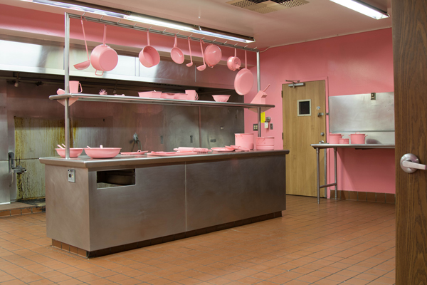
The Schauss Kitchen (2013–17), his most ambitious project to date, and Appetite Apparatus (2011), a related prelude to the encompassing Schauss Kitchen, explore appetite and denial. Reynolds produced a bevy of items for these projects entirely in a queasy Pepto-Bismol pink. They are both stand-alone sculptures and objects that are “implicated” in his performance—from the 1970s flip clock painted pink down to its rolodex-style split-flaps, to the pots and pans, cleaver and kitchen mallet, dish towels and food trays all in the same anti-acid pink. They appear as if they exude a tactile chalkiness that is reminiscent of the gritty texture of Kaopectate, as if, should you touch them, they might leave a light pink dusting on your fingertips.
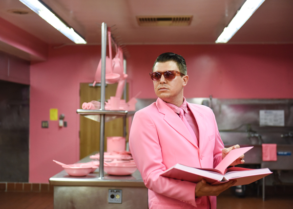
“The Schauss Kitchen,” installation. “I was obsessed with how food can manipulate, but also how color can manipulate,” Reynolds says. His research into the physiological effects of color led him to Schauss pink, better known as Baker-Miller pink—the description given by Dr. Alexander Schauss, the scientist who initiated a series of experiments in the late 1970s on colors’ effects on aggression. Schauss persuaded Baker and Miller, two naval officers at a correctional facility in Seattle, to paint the interior of a holding cell in the color he subsequently named after them. The studies demonstrated reduced aggression after 15 minutes of immersive exposure. In a later study overseen by Dr. Maria Simonson at The Johns Hopkins University Hospital, subjects also reported a suppressed appetite.
This rather unappetizing vision reached its zenith in Reynolds’ performance of The Schauss Kitchen two years ago at “Human Condition,” a sprawling exhibition in the former Los Angeles Metropolitan Medical Center in the West Adams district, where the work’s bewildering, alienating effect was compounded by the setting. All of the walls of the former Medical Center’s industrial kitchen were painted pink, and as he did in previous performances, Reynolds wore a matching pink suit and tie, Chuck Taylors, and rose colored glasses, and carried a thick pink tome of “recipes.” Cover-to-cover—all 800 pages—pink.

Christopher Reynolds performing in “The Schauss Kitchen” series, 2013–17. The 1970s vintage flip clock—a thrift-store find—“was actually broken on 15 minutes, which was weirdly serendipitous—it flips, literally, every 15 minutes,” he says. A company in Burbank formulated the spray paint to turn it Baker-Miller pink.
He bought the glasses from one of the many online color therapy vendors offering Baker-Miller pink glasses.
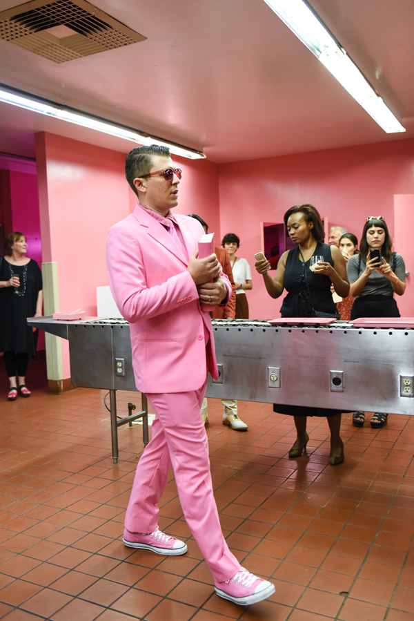
There’s an aspect of coercive manipulation that echoes the initial study’s setting in a correctional facility. In his performances—for a private event at the Marine Art Salon in Venice, a public performance at Grand Central Market downtown, and a Yelp event for influencers—Reynolds adopts a “stone-faced” persona. Wearing the Baker-Miller glasses and staring at his audience, he walks around and “reads” from the Cookbook—the 800-page Baker-Miller-pink tome. “The more you read it, the less hungry you’re going to be.”

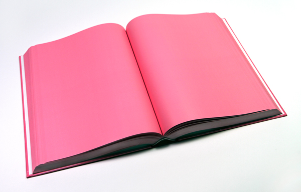
Cookbook, 2013, Baker-Miller Pink printed book (800 pages), edition of 3. “I need to be implicated in the process. So I’m not only performing for the public, but I’m performing on myself,” he says. It’s a “play on performance anxiety and the fact that these [glasses] are lowering my blood pressure and calming me down.” But ultimately, there’s no satisfaction. Cooking show videos tantalize in the background.
As if to illustrate the nexus of unconscious desires and conscious self-manipulation, some time after the performance, Kendall Jenner blogged about painting a wall in her house Baker-Miller pink. Friends of hers had just been to “Human Condition” and told her over dinner of the color’s correlation with calming and appetite suppression. “Somehow my project is making her lose weight,” Reynolds sighs, “makes me sick to my stomach, but also kind of amazing.”
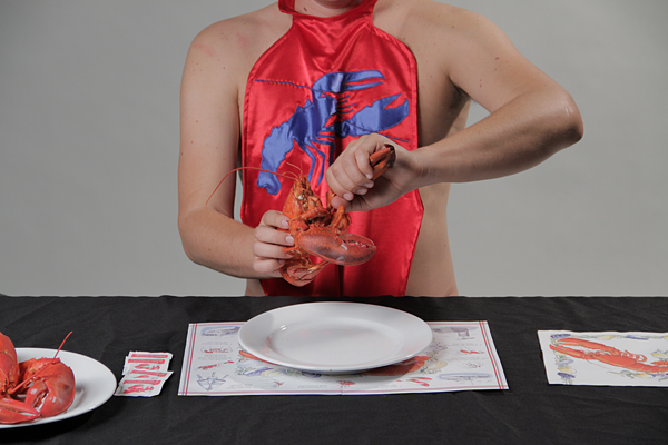
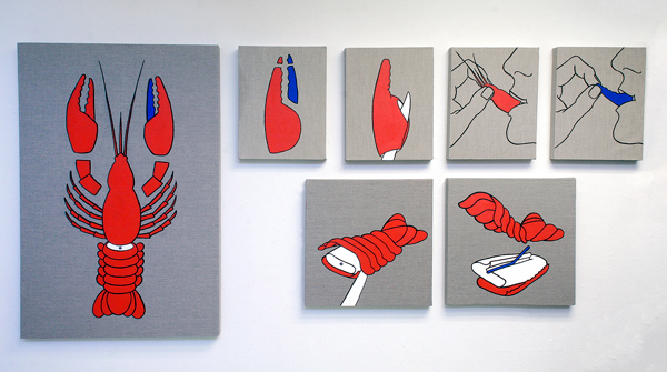
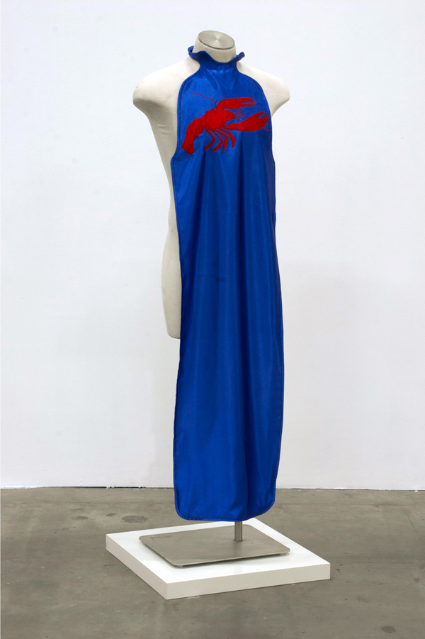
Reynolds’ fascination with food as an index of class mobility came sharply into focus in a gourmet event he produced in 2017—one of the few pieces he’s done with actual food—for the private Santa Monica supper club Stage and Table. The Claw and Cracker Club (2017) grew out of How to Eat Lobster (2011), a smaller-scale project that explores the ritual aspects of consuming.
How to Eat Lobster, 2011, (production still), video. “I was obsessed with the lobster because it is one of the few remaining foods that we select ourselves. We pick it out. We kill it—I’m not saying in a barbaric way. There’s a very specific, ritualistic way that we disassemble and consume it. There’s a protocol,” he says.
Ritual was very much a part of the Reynolds family holiday celebrations, which included a Puerto Nuevo–style lobster dinner ever since the artist’s childhood. The family frequently visited Puerto Nuevo in Baja California, where meals also had a pronounced sense of ritual, Reynolds says—the parade of servers showcasing lobsters of various sizes, the act of picking out individual lobsters, which he found “fascinating and disturbing.” And How to Eat Lobster incorporated some of those ritual aspects. “It involved paintings and silk robes, in a play on religion meets fraternity meets secret society,” he says.

How to Eat Lobster (Blue Claw), 2011, installation detail 
Lobster Bib (Blue), from “The Claw and Cracker Club” series, 2011. Photo courtesy Sean Flaherty and Christopher Reynolds.
-

John O’Reilly
The intimate scale of John O’Reilly’s photomontages belies the broadly ranging ambition and scope of his concerns. The 40-year survey of his work at Zevitas Marcus reveals a consistency of approach spanning the entirety of O’Reilly’s production. The artist, whose work was included in the 1995 Whitney Biennial, began making paper montages in the 1960s, almost entirely with a Polaroid 100 camera acquired in the mid-’80s. His meticulously constructed compositions seamlessly draw together disparate images from varied sources—art historical, printed material, pornography and studio Polaroids—into a nearly continuous pictorial space.
O’Reilly’s antecedents are John Heartfield, Raoul Hausmann, Hannah Hoch and other Dada artists—a number of whom claim to have invented photomontage; but his interest in the form is not in emulating the expressly political aims of Heartfield’s early works. Hausmann and Hoch are more closely related in that theirs were open forms, allowing for associative possibilities.
The juxtaposition of images that are clearly discontinuous is smoothed over by O’Reilly’s technical dexterity and intricate process (elaborated in detail in Francine Koslow Miller’s essay, Assemblies of Magic) to create works that initiate a dialogue between literary, art historical and more introspectively personal concerns.
Heartfield’s works contributed to an understanding of photographic media as manipulable, and within that framework, O’Reilly’s montages are examples of the pre-digital plasticity of the medium. Yet O’Reilly delivers his finely conjured fictions with a wink, alternately concealing and exposing the evidence of his interventions.

John O’Reilly, Leda (1981), courtesy Zevitas Marcus. His process of shooting and re-shooting studio tableau, and then cutting, gluing, sanding and smoothing edges introduces traces of the artist with painters, writers and other figures. A reproduction of Velasquez’ Las Meninas (A Paper Self, 1986) alongside a cutout of his own profile—literally, a trace—puts him in the company of another artist who put himself reflexively within the frame while commenting on the world around him.
Within the montages, he leaves evidence of the construction of his tableau—a Board propping up a picture (Of Cavafy—Swimmers, 2008), or a pair of thumb tacks (Worcester Street Series #2 County Road, 1992), and so on; in addition to the conversation being inflected with the artist’s body, his presence directly or indirectly felt, the works reference the artist’s hand, commenting on their own facture.
This leads to a push/pull between a purely interior and imaginary space created within his concoctions and an indexical relationship to the process, the studio and the self.
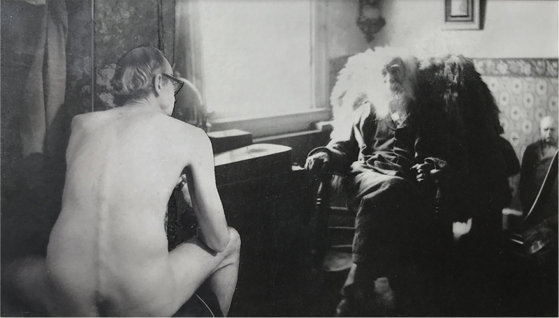
Of these interior spaces, none is more illusionistic than Talking with Whitman (1984), a fictitious portrait of the artist, seated nude on an ottoman, his back to the camera, in conversation with Walt Whitman, evoking the poet’s Song of Myself (1855). Nor is there any that exceed the technical sleight of hand he achieves in this piece, in which he seamlessly blends the space between himself and Whitman, as if traversing time and space, establishing a kinship.
The works here, a mere introduction to O’Reilly’s output, offer a window into the artist’s long conversation with art history and his endlessly engaging interior space.
-

KATHERINE SHERWOOD
Twenty-one years ago, Katherine Sherwood suffered a brain hemorrhage that left her without the use of her right hand. As described in a 2012 article she wrote for the journal Frontiers in Human Neuroscience, when she eventually returned to her studio, her practice shifted dramatically. Out of necessity, she learned to paint with her left hand. She also reported feeling less self-conscious and able to make more “urgent” connections; whether these changes resulted directly from the stroke (as posited by neuroscientists), the work that followed this life-altering event was infused with heightened lyricism, sensitivity and color.
Sherwood’s solo exhibition at Walter Maciel, “The Interior of the Yelling Clinic,” features works from her recent “Venuses” and “Brain Flowers” painting series, as well as an installation of 10 mixed-media figurative works from her 2010–12 series, “Healers.” Images of the brain appear throughout, and while the artist had been using brain imagery in the early 1990s before her stroke, here, they refer back to Sherwood.

Katherine Sherwood, Chrysanthemums (2017) photo by Aubrey Rubin, courtesy of Walter Maciel Gallery, Los Angeles The 10 mixed-media figures in “Healers”—constructed from abstract painting, clothing fabricated specifically for this series, painted neurological images based on the artist’s brain scans, and digital prints—function as portraits of a sort. They purvey an open narrative structure counterpoised with a tactile materiality. Sherwood’s handling of paint in these works is wonderfully fluid and sensuous. Shifts in texture from printed, painted and sartorial elements are reflected in the construction of each work. For example, a smooth, yet crack-suffused meniscus-like paint-pour overlaps the embroidered seal adorning the raw linen canvas in Angelo (2012). In Stevie (2011), quilted pants hang beneath the torso and face of an inquisitive-looking young man who wears a kind of top hat filled with what appear to be radiographic images of blood vessels.
In her “Venus” series, Sherwood complicates the treatment of the female figure in Western art, composing reclining nudes after iconic ones by Manet, Ingres, Giorgione and Goya; but Sherwood’s are painted as a critique of the sexualized ideal—the faces of her Venuses comprise her own brain scans and each is depicted with a physical disability that references her own experience of post-stroke paralysis. Olympia (2014) wears a leg brace, After Ingres (2014) a prosthetic arm. Blind Venus (for G) (2018) has a red-and-white cane, Maya (2014) a walking cane. Each of the paintings is made on the backs of several smaller canvases that are stitched together to form a larger whole. On the reverse side are art historical reproductions, once used as lecture illustrations, with unpainted areas of the Venuses still retaining reference numbers linked to master painting images.
In her mining of art historical references, and merging them with allusions to her own medical history, Sherwood asserts a critique of idealized beauty as propagated and reinforced by master paintings created by and for men. Instead, she posits new images of supremely confident women with the composure and power of Olympia, who have moved beyond the confinement of “the ideal.”
-

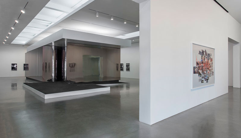
Catherine Opie
Both love letter and indictment, “The Modernist,” Catherine Opie’s new photographic installation and short film, blurrily overlays real places and occurrences with imagined events, creating an alternate near-term history of Los Angeles. Known as a portraitist and documenter of strictly factual people and communities, with this project the artist has ventured into the construction of a fiction that is loosely a portrait of the city she calls home. “The Modernist” is also broadly informed by the international and domestic political landscape, fueling a mounting sense of outrage.
As an homage to Chris Marker’s 1962 post-apocalyptic short film La Jetée, Opie’s film is neither as inventive nor as convincing as Marker’s psychologically harrowing tale of time travel and the sacrifice of the individual for the collective.

Installation view of Catherine Opie The Modernist at Regen Projects, Los Angeles, photo by Brian Forrest, courtesy Regen Projects, Los Angeles. Yet “The Modernist” strikes home on its own terms. Opie knows how to set a scene well, engaging with the interplay between iconic images and the underlying nuances that either belie or give rise to mythologies—a continuing motif in Opie’s work that handily lends itself to spinning a tale. The films share an ambience of dread, and although The Modernist reflects the economic and political malaise of our own era, La Jetée’s Cold War nuclear terror—tempered with pallid resignation—carries an existential threat that is hard to trump (conflation intended). But perhaps that is the point: The assault on social, economic and political institutions is just as dire. (Still, North Korea looms.)
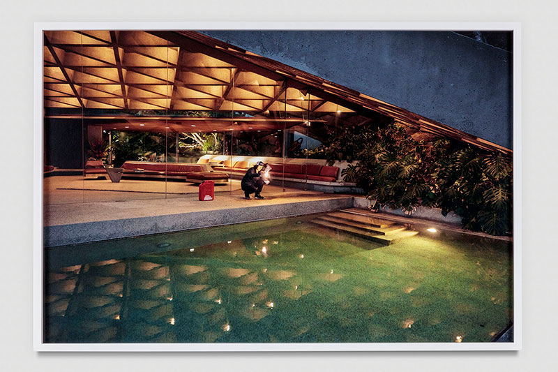
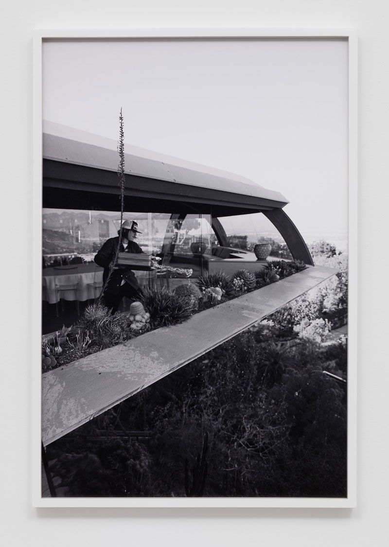
Stosh Fila, aka, Pig Pen, photographed by Opie in numerous series, inhabits the role of aspiring artist-turned-arsonist. A pristine copy of the coffee-table tome Case Study Homes sits on the protagonist’s coffee table. Using it as a kind of playbook, Pig Pen’s artist plots a campaign of destruction against the houses featured within its pages. These homes, once conceptualized as templates for affordable housing while embodying sleek Modernist design, are now emblems of luxury and privilege. Not many more than those that still exist today were built.
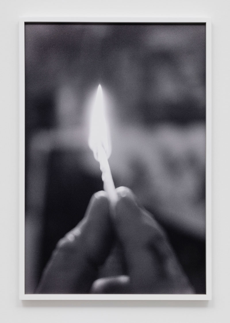
Sheats-Goldstein #4 (The Modernist) 2016 © Catherine Opie, courtesy Regen Projects, Los Angeles The arsonist’s own stunted economic mobility is spurred by a keen awareness of class stratification, signaled in Opie’s film by newspaper headlines declaring the plight of families of modest means burned out of their homes by runaway wildfires. We are meant to conclude that they are unlikely to have the resources to rebuild. Out of a sense of egalitarianism or class retribution, the artist emerges here as serial arsonist. Like so many cinematic killers, he creates an ever expanding collage of targets and trophies—presented in the gallery as an artifact of the film’s facture in the form of a collage authored by Pig Pen.

Chemosphere #3 (The Modernist) (2016) © Catherine Opie, courtesy Regen Projects, Los Angeles. 1Opie’s world-building is complete to the minutest detail. Headlines referencing real-life art stars and catastrophic losses of the architectural gems that made Los Angeles’ reputation as a locus for innovative design create a queasy sense of unreality—Opie’s film, and Marker’s too, introduces a hallucinatory motif. It’s difficult to tell which headlines are factual, and which, for the purposes of the project, are fabricated. One could be forgiven for frantically checking to see that any number of the homes seen on the arsonist’s trophy wall are still standing. Pig Pen’s collage embellishes images of Eames and Koenig homes with painted flames. John Lautner’s Chemosphere and Sheats-Goldstein Residence feature prominently as arson casualties and are photographed in situ. (Lautner hated Los Angeles, but it was his laboratory. He was remarkably responsive to client needs and budgets, and profoundly sensitive to site and the integration between structure and environment, as seen in the realization of the Sheats-Goldstein Residence’s indoor/outdoor aesthetic.)
The theater for Opie’s film, an elegant rectangular prism with rounded corners and reflective sheathing installed in the center of the gallery, was designed by architect Michael Maltzan, who also designed Regen Projects. It is a modernist temple meant to evoke facets of the structures seen in Opie’s photographs and film. The exterior skin distortedly reflects Opie’s photographs that hang in the gallery. In the far gallery, a vitrine displaying a luxe collector’s box with the film DVD
and a box of Swan Vestas (the brand of English matches so prominently featured in the hands of Pig Pen’s pyromaniac), compacts the experience into a market gesture.Match fire #4 (The Modernist) (2016) © Catherine Opie, courtesy Regen Projects, Los Angeles. “The Modernist” cumulatively adds up to a complex set of “truths” not unlike the way Opie’s portraits of real people and communities offer nuanced ways of perceiving their subjects, commenting on both the exigencies of art making and the failures of modern architecture’s utopian dreams. The failure of those dreams provides the undertow in Opie’s work.
-
Michael Lewis Miller
Care for a pickled egg? How about a mayonnaise sandwich? Or maybe you’d prefer apple butter? With these questions and a simple spread of food with which to ply visitors, Michael Lewis Miller gently draws his audiences into his performances, which arise almost surreptitiously out of the artist’s self-effacing nonchalance and Appalachian-bred hominess and hospitality—the fact is, the performance is ongoing from the moment Miller steps into the space and begins unpacking his provisions. Broadly addressing the notion of personal identity and of the individual within a community, Miller turns his art simultaneously inward and outward, coupling personal archaeology with an exploration of familial relationships; at the same time, he invites his audience to join him in these endeavors and implicates them in the family dynamics that eventually reveal themselves.
“Michael Lewis Miller: 1989 to Present, Survey Exhibition” gathers 28 years of the artist’s sculpture, hand-stitched costumes and cabinets filled with sets of nested drawers and collections of objects, all inextricably entwined with and activated through performance. The breaking of bread and Miller’s amiable disposition and unaffected directness surmount the barrier between artist and audience, performance and life. Miller’s meandering style of narrative, which has the informality of an afternoon visit for a chat and cup of coffee with a friend, disguises the performance so that the realization of its scope dawns with revelatory power. Shifting to more formal gestures, Miller’s interactions with his audience become more theatrical and performative as he interacts with the sculptures.
Visually, his hand-crafted cabinets bear some resemblance to H. C. Westermann, and his work is likewise autobiographical. He also calls to mind Michael McMillen’s evocative sprawling collections—though Miller is pristine by comparison. But Miller’s objects are really a stage for performance and facilitate an ongoing interplay with his audience. His work reflects complementary theatricality and vulnerability, while generating a lasting hook—an unexpected draw into the emotional entanglement of family dysfunction.

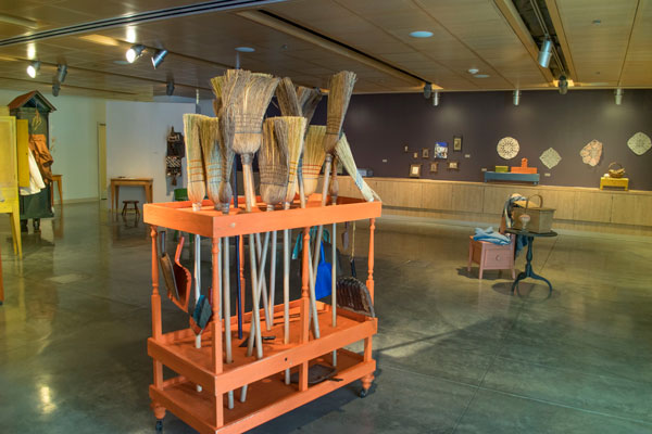
Michael Lewis Miller (1989–present), courtesy of the artist and Norco College. Sowing (all works, 1989—present) paired with Sweep offers an example of this unfolding dynamic. Donning tartan, apron, bonnet and seed spreader, (and asking an audience member to tie the apron strings at his back), Miller sings an Appalachian plaint as he sows wheat berries around the gallery with the spreader. Removing the costume, he then begins taking brooms from a cart (Sweep) and walking up to spectators. “Will you help me sweep?” he asks. “After all, I fed you.”
And here, the cumulative weight of Miller’s performance begins to dawn. Although all unhappy families may be unhappy in their own way, at the very least, their unhappiness stirs a glimmer of recognition. Miller’s work, however, does not contain recriminatory bitterness; instead it gently—and generously—acknowledges fragility and imperfections, including his own.
In Mary’s Prosthesis, he struggles into a “straight jacket” attached to a cabinet with small casters. Thus harnessing himself, he drags the burden of his own—and his mother’s—baggage around the gallery: the effort, arduous, the cabinet lurching. And, then, he coaxes someone else into the jacket to do the same.
-

Tectonic Shift at Nevada Museum of Art
Perhaps the best way to think about “Unsettled,” the ambitious fall exhibition at the Nevada Museum of Art, is from a planetary perspective. As a complement, a separate project concurrently on view suggests and reinforces that viewpoint. A one-to-one scale model of a small satellite tethering a large spherical Mylar balloon, Orbital Reflector (2017) by Trevor Paglen, is the first object that comes into view on entering the museum, and the last before leaving, bracketing the exhibit. The actual satellite—a joint project with the museum—will be sent into low earth orbit for several weeks in 2018 to deploy a slightly larger, diamond-shaped balloon.
Prototype for Trevor Paglen, Orbital Reflector, co-produced and presented by the Nevada Museum of Art, courtesy of Nevada Museum of Art. The project orients away from the parochialism of regions or even nations, to a planetary, a solar-system-and-beyond perspective on our globe. In orbit, the reflector will be visible to the naked eye, and can be tracked with an app. The ensemble that hangs in the museum’s four-story entry hall is a kind of sentinel and harbinger of what is to come. Though it ostensibly comments on Earth orbit as the staging ground for satellites or a junk yard of detritus, Orbital Reflector demarcates human migration, not just as witnessed in the planet’s past, but what seems, with increasing urgency, to be in our very near future, in a trajectory off the planet, the boundary of what may be the next great human migration (that is, after people living in the hottest parts of the planet begin the next migration, fleeing the effects of climate change).
But dreams of escaping a planet increasingly hostile due to the machinations of capital and carbon run amok, achievable or not (whether on a small scale for a select few or on a mass basis), are fundamentally unequal. The billions of the world’s poor who are now suffering the early effects of climate change will never, one expects, be in a position to make a new start in a space colony (if that ever happens, for anyone). As a reminder of our place on the planet or in the stars, Orbital Reflector begins to feel like an ominous gesture.
“Unsettled” installation view, courtesy Nevada Museum of Art The larger exhibit, “Unsettled,” orients to human migration on the terrestrial sphere, focusing geographically on the last parts of the globe to be infiltrated by Homo sapiens in migrations out of Asia and into the Americas and parts of the Pacific. As such, it is a major articulation of the concept of the Greater West that the museum and its research institute, the Center for Art + Environment, have theorized as a focus of new research: a vast “super-region” stretching from Alaska to Tierra del Fuego along the western edge of the Americas, but which also includes Australia, New Zealand, New Guinea and countless Pacific Islands. Its geography is marked by large arid regions rich in natural resources. Oh… and it was populated with indigenous communities long before the Europeans came knocking.

Nicholas Galanin, Things are looking Native, Native’s looking Whiter, 2012, Anchorage Museum Collection. The exhibition is variously successful at addressing this overly broad theoretical focus—it never quite crystallizes into a single thesis. That big idea of the Greater West gets broken into various subsections within the exhibition, elaborating on the many manifestations of what it means to be unsettled. Art works illuminate the Greater West as a place of instability caused by tectonics as well as the clashing of cultures and contests over resources—giving rise, curator JoAnne Northrup writes in her essay, to novel forms of expression; and additionally characterized by vast open spaces that inspire feelings of the sublime.
Few pieces in the exhibit convey sublimity as successfully as Agnes Pelton’s desert paintings, Winter (1933) and Idyll (ca. 1952). These two exquisite, poetic images suggest a kind of mysticism paired with attentive observation of the desert’s open spaces, and their blooming shapes originate with the effects of light in the desert.
Works of art by various artists of European and indigenous heritage give voice to expectedly varied points of view on the clashing of cultures.
Bert, Guillermo, Mapuche Portal #1
Courtesy of the artist
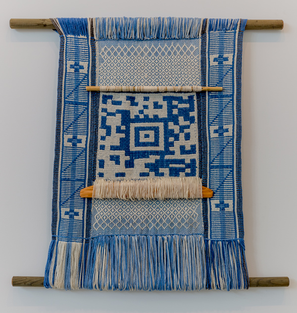
Photograph by Ronald DunlapEspecially poignant are two weavings by Chilean-born Los Angeles–based Guillermo Bert, who has embedded information-rich QR codes into traditional weavings. Scanning the large QR codes in Mapuche Portal #1 (2014) and Zapotec Poet (2015) activates additional content related to the works and their facture, and to the indigenous groups they were made by. These works address a number of salient issues, starting with the decimation that conquest brought to indigenous groups throughout the Western Hemisphere, and the disappearance of peoples, languages, technologies. The traditional weaving techniques result in objects that are supremely beautiful, and Bert’s conceptual schema very deftly intertwines idea and object.
Nicholas Galanin, Your Inane Perspective: Haa AanÍ Haa Kusteeyíx̱ (Our Land is our Life)
Anchorage Museum
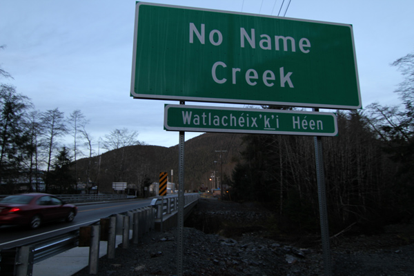
Collection.Nicholas Galanin’s work also points to the effects of conquest and the disappearance of culture; his work brings the question of cultural invisibility out of some distant past that we no longer control firmly into the present, and confronts it in its contemporary manifestations. His photograph Your Inane Perspective: Haa Aaní Haa Kusteeyíx Sitee (Our Land is Our Life), 2015, depicts a large road sign stating, “No Name Creek,” along a highway in Sitka, Alaska, where the road crosses a stream. Seated just below the large sign is a smaller one that, barely a tenth the size, announces the indigenous name for the stream: “Watlachéix’ k’i Héen.”

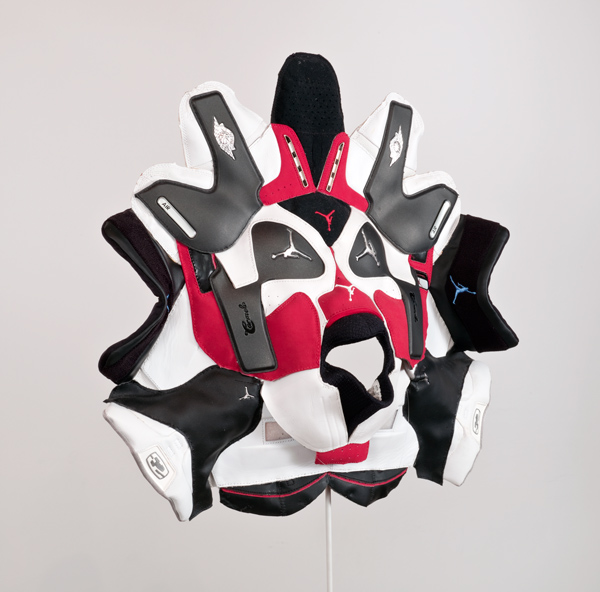
Brian Jungen, Prototype for New Understanding #23, courtesy of Debra and Dennis Scholl Upending the colonization of culture and the use of images and symbols of Native Americans (think of sports teams with mascots and names like the Indians or the Braves), Brian Jungen’s works here subvert retail sporting goods, turning them into objects that look like Native American symbols. In Prototype for New Understanding #23 (2005), he literally cuts apart Nike Air Jordans and refashions them into a ceremonial mask. With 1960, 1970, and 1980 (all 2007), he turns golf bags into totems.
Regina José Galindo, whose uncompromising performances have repeatedly confronted the abuses of power against indigenous people, political dissidents and women in her own Guatemala, appears here in a series of still images and a video of her 2015 performance Desierto in Santiago, Chile. Desierto was made in protest of the collusion between the pine-timber industry and the Chilean government, highlighting the devastation of Chile’s pine forests and the violence inflicted on the environment and Chile’s Mapuche people.
Works like these that carry the power of many stories of indigenous communities, and articulate resistance to ongoing forms of cultural imperialism and economic devastation, are juxtaposed with works that demonstrate other facets of the museum’s framework of the Greater West. Many of these works are powerful in their own right; but, at times, reconciling how they interact, or what kind of conversation they carry on with each other can be a bit of a sticking point.

Chris Burden, All the Submarines of the United States of America (1987) Chris Burden’s All the Submarines of the United States of America (1987) is an example of connecting the dots successfully. A powerful evocation of the U.S. military’s capacity, though it was made while the U.S. was still engaged in a cold war with the Soviet Union, it seems timelier than ever (in a turn that would have been difficult to foresee), given the U.S. President’s war of words with Kim Jong-un. Submarines is meant to elaborate on the “Shifting Ground” of the Greater West, which here extends beyond the region’s tectonic instability to include the awesome power we have exerted on the environment and society through our own inventions.

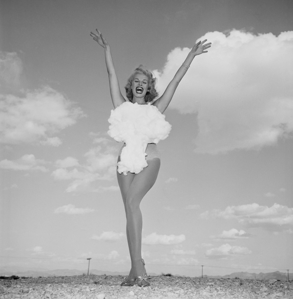
Don English, Miss Atomic Bomb, 1957 Submarines is paired conceptually with Bruce Conner’s CROSSROADS (1976), the film of the U.S. detonating an atomic bomb on Bikini Atoll, and a number of other works that address nuclear weapons and missile ranges, including Ed Ruscha’s Atomic Princess (1990). This theme is explicitly brought around to the impact on indigenous peoples in The End (1983), a painting of nuclear destruction visited on a landscape resembling the Nevada Test Site by Western Shoshone/Washoe artist Jack Malotte.
LA artist Ed Ruscha, quintessentially cool and laconic, punctuates the exhibition’s major sections in a kind of running commentary, and he is credited as a consulting curator. Ruscha’s Chocolate Room (1970), which he first created for the American pavilion of the Venice Biennale, is one of the most magnificent works in the show. Profound for its olfactory assault, its pungent, sweet smell of chocolate is enveloping. It’s tempting to call it a commentary on the colonization of the Americas, but nothing in Ruscha’s discussion of its origin suggests a political discourse embedded in the materials, i.e., chocolate’s origins in Mesoamerica and its quick absorption as a commodity and production as a luxury good in Europe.

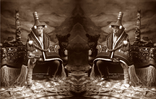
Da-ka-xeen Mehner, Da-ka-xeen, the Thlinget Artist, 2005, from the series, “Reinterpretation,” ©Da-ka-xeen Mehner But the real power is in works like Finding My Song (2012), an installation by Da-ka-xeen Mehner, which alludes to the experiences of his grandmother, when as a girl her mouth was washed with soap for daring to speak her native language, Tlingit. Along these same lines, Mehner’s “Reinterpretation” series (2005–07), photographs that subvert ethnographic conventions by substituting his own image in representations of Tlingit culture from 1906 studio portraits, and Wendy Red Star’s “Four Seasons” series (2006), reclaim authorship for the indigenous.
That the exhibition addresses the perspective of indigenous peoples, including so many examples of art that function as resistance, is one of its strengths. At times, the exhibition’s conceptual framework does not adequately address the space between cultures, or the mechanisms of cultural exchange and dynamics of power that structure such exchanges, but works by artists like Bert, Galindo, Galanin, Mehner, Red Star and others speak for themselves.
“Unsettled” runs through January 21, 2018
Nevada Museum of Art
-

Revolution and Ritual: The Photographs of Sara Castrejón, Graciela Iturbide and Tatiana Parcero
“Revolution and Ritual,” while very narrowly focused on three Mexican women photographers, seeks to address in broad strokes changes in ideas about Mexican identity through the work of Sara Castrejón, Graciela Iturbide and Tatiana Parcero, whose careers together span more than a century.
Castrejón, a studio photographer-turned-war documentarian, began photographing the various revolutionary factions as they traveled through her home town of Teloloapan in the state of Guerrero during the Mexican revolution. Her photographs, all postcard-sized—a facet of the economics of the studio photography of that era—are displayed within a quadrangle of walls and vitrines in the center of the gallery, as if in a time capsule. The works are interesting for what they convey about social strata; for example, her portraits of soldiers from indigenous areas who have been pressed into service by one faction or another, or that of Colonel Amparo Salgado (Sin título, 1911), a woman who led soldiers into battle. While many of Castrejón’s subjects adopt stilted poses, Salgado stands with a remarkable grace and self-assurance, her matter-of-fact gaze conveying a kind of unaffected, seen-it-all confidence. A few photographs hint at the violence that tore through the country: troops in front of a building pockmarked with bullet holes (Sin título,1912), an execution (Sin título,1913), and three very young revolutionaries awaiting the firing squad (Sin título,1913).
Cartografía interior #21 from the series “Cartografía interior” 1995-1996, courtesy Scripps College, Ruth Chandler Williamson Gallery. Iturbide’s photographs are a real visual feast and the most immediately engaging of the exhibit. Encouraged by her mentor Manuel Álvarez Bravo, the preeminent Mexican modernist photographer, Iturbide used photography as a means to explore her country. Her depictions of indigenous communities and rituals that held both pre- and post-Conquest significance convey a sensitivity and sophistication that permeates her work. Virgen de Guadalupe, Chalma, México (2007) depicts a large radiant mandorla from which the likeness of the Virgin is missing. The absent body evokes both a pre-Columbian past, in which the Nahua fertility goddess was enshrined, and the Spanish colonial substitution of the Christian symbol. Mujer Ángel, Desierto de Sonora, México (1979) also confuses epochs with a Seris Indian woman dressed as if from a different century, holding a 1970s boom-box at her side.
The mixed-photographic media works of Tatiana Parcero employ images from pre-Columbian and European maps and codices, biological drawings, and even diagrams from esoteric or mystical systems paired with truncated photos of Parcero’s own body printed on transparent acetate as a means to address the violence of conquest, and the many disappeared bodies both in her country of origin, Mexico, and Argentina, where she now lives. Her “Cartografía Interior” series, full of biological drawings, suggests lost bodies of knowledge and an unknowable interior; the “Nuevo Mundo” series, featuring various world maps overlaid with images of her pregnant body reiterates the magnitude of European conquest and concerns of lost identities. The recurrence of violence through various social and political upheavals, the suppression of cultural identity, and the colonization and disappearances of bodies is a theme that runs throughout Parcero’s work and unifies the exhibition as a whole.
-

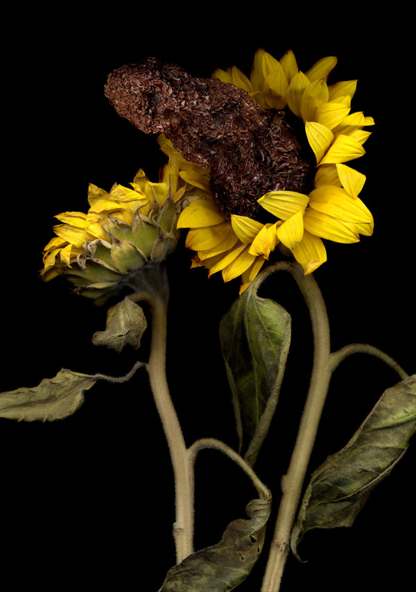
Naida Osline
Culled from five different series of Naida Osline’s photographic work since 2007, “Florescence” examines an arc of her practice that is focused on taxonomies of flora and fauna. The exhibition title, drawn from her photographic series of the same name, can be taken to refer to the metaphoric blooming of the various real and chimerical botanical specimens that are the subjects of her semi-documentary process—semi in the sense that, even when she is not devising some strange new hybrid species for her botanical portraits, she is never merely documenting.
Her work references the early wunderkammers of Europe, with their collections of flora and fauna, and botanical illustrations; by extension, she alludes to museological practices, and directly, by way of her subjects, to the European age of exploration, Europe’s colonial expansion, and the wunderkammer as an expression of imperial acquisition.
In her 2010 “Tattooed Tobacco” series, which traces the history of tobacco and its commerce between the Americas and Europe, Osline frames the plant’s drying leaves as substance analogous to human lungs or skin—organs both affected by the plant’s use. Pairs of leaves resemble lungs, the veins looking like bronchioles branching into each lobe. The “skin” of each tobacco leaf is literally tattooed, though with temporary ink, thus illustrating social, political and ritual associations with tobacco. Tattooed Tobacco No. 3 reveals an illustration of Columbus, and a depiction of one of his ships; No. 4 references the slave trade; the series becoming a kind of conceptual map to tobacco’s history and uses.

Naida Osline, Florescence No. 2, 2007, courtesy of the artist Dreamt up by Osline as recombination of botanical specimens and animal or insect parts—or even manufactured objects, the images of fauna in her 2007 “Florescence” series suggest transmutation of plant, animal, human and synthetic into something novel and sentient. Her visual inventiveness brings to mind the works of Renaissance painter Giuseppe Arcimboldo, the noted court painter to the Hapsburgs whose portraits imagined people as a sum of flora and fauna. In Florescence No. 2, multiple hair-covered eyeballs spill from the mouth of a Bird of Paradise flower; teeth and palette are exposed in No. 9. These chimera offer radical possibilities, or a kind of queering of categories, and are reminiscent of her “Deeper Skin” series (not exhibited here), in which closeup photographs of human subjects reveal strange appendages.
In the “Visionary Plants” and “Poppyhead” series, Osline creates an iconography of plants used for ritual or altered consciousness. Each plant is depicted in larger-than-life scale. Sacred Datura (2010) alludes to the ubiquity of Jimsonweed, the hallucinogen used to achieve visions. In Sex of Drugs (2009), male and female cannabis plants stand side by side. In the “Poppyhead” series, the bulbous pods stand against a foreboding sky.
The categorizing and identifying that Osline does ultimately turn into interpreting and inventing, as she revisits the notion of an archive; as she probes and offers speculative possibilities, she suggests a critique of history and presents new ways of seeing the world and moving into the future.