


")
Linda Arreola’s debut as an artist was as a sculptor and installation artist. She’s also an architect; and her show, “Architect of the Abstract,” a survey of work curated by William Moreno from 2005 to 2016, is very much the work of an architect who has crossed over into the realm of painting and assemblage art with a scope that encompasses space, movement, measurement, language and linguistics, semiotics—and yes, architecture—even (rhythmically, chromatically) music.
Her fascination is abstraction, but to call it simply geometric, minimalist or hard-edge would be misleading. Towers (2015), which might superficially approximate this description, reads as an array of red rectangles enclosed within borders of white, subdivided vertically by blue bands and horizontally by a triple “spandrel” of blue, bracketed within red borders. An implied “repeat” extends into the lower quadrant of the canvas. It reads on an abstracted, quasi-symbolic level as a fluted column fragment, but in more contemporary, even iconic terms, as a section of a high-rise tower, with its emphatic vertical thrust invoking those most iconic of towers. But shifting back to the more minimalist reading sets the viewer up for broader possibilities—rhythm, harmonics.
Consider an untitled triptych of three soft neon red squares, each inscribed within a silver or steel square border an inch from the edge, both floating within a charcoal gray field, with the surface nail-head embossed, as if the canvas were stretched over a panel of bolts; or, in an untitled work from 2013, with an electric red pulsating in a softer red field, pushing it into the realm of Op-Art. Vibrant reds frequently abide with sober grays in these paintings. Beyond Albers or McLaughlin, her most obvious precedent is Karl Benjamin; but Arreola’s range goes well beyond abstract classicism, to embrace such disparate influences as Mondrian, the Vienna Secession, Charles Rennie Mackintosh, and more. We see this especially in her use of primary colors, frequently in some conjunction with black and white (or grays). The difference is both vibrational and dimensional. An illusion of depth alternately projects away from the surface and pushes it down. But with a very few exceptions, the paintings do not exactly pursue Op-Art effects so much as incident and the surprise of unexpected juxtapositions.
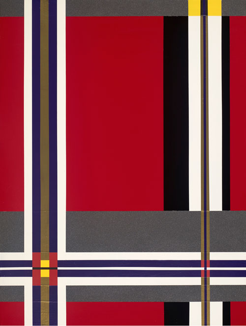
Linda Arreola, Little Red Corvette, 2015
The “braille” or pegboard-like surfaces draw attention to a consciously constructed aspect of the work, imagined and executed in 3D to render the 2D painting. Arreola gives ample consideration to materials and surfaces—especially wood—as if the works were, if not exactly architectural models, two- or even three-dimensional “swatches” for an architectural treatment.
Occasionally the sculptural/architectural impulse moves beyond panel to something that actually resembles an architectural model, as in The Offering (2005), a platformed rectilinear box “lit” on all sides by matrices of yellow circles in a green framework, vaguely reminiscent of Jean Prouvé’s 1951 Tropical House. But this is an exception. Arreola’s work pushes in the direction of movement and flow, even communication itself, which can be read as a facet of her architectural treatment—the ways in which (abstracted) bodies might move through 2 or 3D space and from micro to macrocosm. The visual poetry is what pushes it beyond architecture.
