


This whole end-of-net-neutrality panic is a bit of a mystery to me. Sure, it sucks, but what were people expecting? That businessmen would suddenly do the right thing, because, like, information wants to be free? So did Frederick Douglass, but trickle-down economics isn’t what allowed him to become somebody who’s done an amazing job and is getting recognized more and more.
The web is addictive, and its marketing—back to the days of endless complimentary AOL trial periods and the NetZero revolution—always smacked of schoolyard pusher ethics. “C’mon kid, the first one’s free! Everybody’s doing it! You don’t want them to think you’re a square, do you? You’ll feel out of this world!”
Now, everybody’s hooked and everybody’s shocked—SHOCKED!—that MacDaddy Warbucks is jacking up the toll? I’m just surprised that it took this long. Happily—in advance of the imminent global wave of digi-junkies hurling their devices out the window and bellowing “I’m mad as hell and I’m not going to take it anymore!”—a group of forward-thinking content providers have been rolling out their wares in a new medium that’s so crazy it just might work.
What these visionaries are doing is taking the feeds from their websites, blogs and social media accounts, using printers to generate hard copies in a standardized format on dried sheets of pulped artisanal plant fibers, then binding them into a presentation format that resembles a sort of analogue mono-textual tablet, equipped with tactile ergonomic interactive capabilities and subtly nuanced variations in user interface that shift considerable co-creative responsibility onto the player. They call it a “book.”
This strategy isn’t entirely new—pioneer internet meme Mr. Winkle was translated into a series of bestselling books and calendars by photographer Lara Jo Regen (Artillery’s Sight Unscene columnist) back in the early ’00s. The first actual web-sourced book purchase I made was Steve Caire’s 2005 The Joys of Engrish from the www.engrish.com repository of Asian ‘patacritical signage (and purveyor of the “I’m the national treasure and I hate noise” mousepad).
The high bar was set in 2012 by Richard Littler’s Discovering Scarfolk—a travel guide to the previously virtual northwestern English community locked in a degenerating feedback loop of ’70s public service graphic design, nightmarish social engineering and Orwellian doublespeak (at https://scarfolk.blogspot.com/). Modified or wholly invented sound effect LP covers, magazine covers, children’s games, mass-market paperbacks, T-shirts, didactic posters and TV advertisements coalesce into a surreal mashup of The Wicker Man and ham-fisted safety warning films—the book version places these already virtuosic mock-ups into an overarching vintage horror-novel narrative framework.
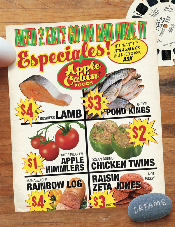
Apple Cabin supermarket circular, 2013–16 (Liartown, 2016)
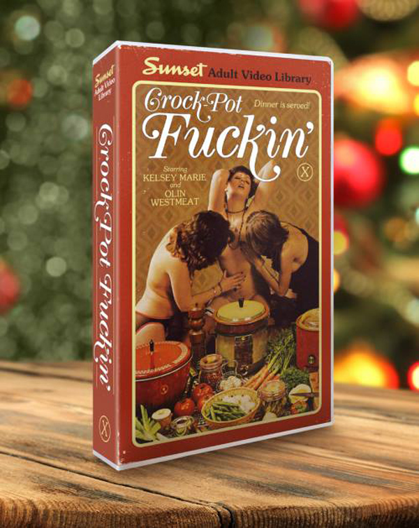
Although it doesn’t attempt to compete with Scarfolk on a grand conceptual scale, the newly-released Liartown: The First Four Years (Feral House) throws down hard in terms of layered satirical and absurdist modifications of vernacular visual cultural material, and comes out ahead in the LOL department. Which is actually saying a lot, given that the residents of Scarfolk are partial to “erotic decorative masonry” porn, rabies-themed bubblegum cards, and helpful posters reminding schoolchildren that “Not All Hypnotising Arachnoid Demons Are Friendly (If you think a demon might have laid eggs in your head without permission, tell your parents.)”
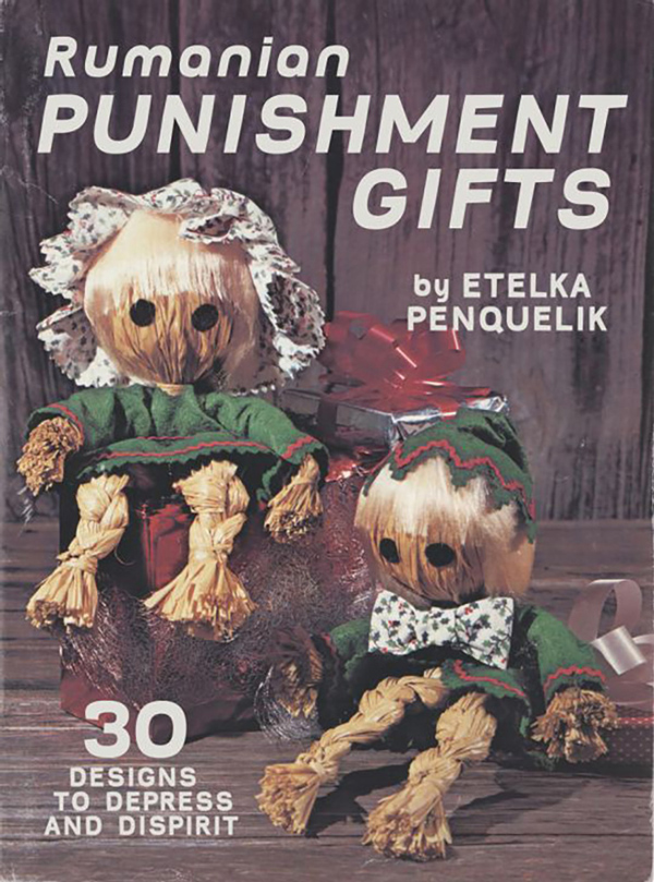
Rumanian Punishment Gifts by Etelka Penquelik, Craft magazine, 1980 (Liartown, 2015)
Liartown doesn’t make any conscious effort to create a contextual fiction for its détournéed pop culture ephemera (although a certain parallel-universe consistency emerges) and that lack of focus opens up the playing field to include the entire gamut of visual culture from the last century and a half—credit cards, tattoos, fine art, VHS tape cases,16-month calendars, billboards, junk mail, key chains, Googie architecture, punk fliers, Civil War memorabilia, thrift store records, real estate signs, collectable dishware, postage stamps, aromatherapy candles and the summary screens that pop up when you pause a movie on Netflix. And that’s even before we get to the wide range of books, magazines and other printed matter that make up the bulk of Liartown’s satirical targets.
The humor is multivalent—frequently sophomoric (promo materials for the 1975 soft rock band Shitwind), outrageous (a “Tragedy Quilts” 2016 calendar featuring gorgeously rendered fabric abstractions of the WTC attack, the Challenger explosion, and Jackie Kennedy’s blood-spattered pink Chanel suit), cruel (a ’70 s nordic kid in some Sami-inspired sweater as cover boy for “Woolen Unfuckables”) or inexplicable (the Japanese interspecies workplace abuse handbook “Secret Touch of the Elk Boss!”)
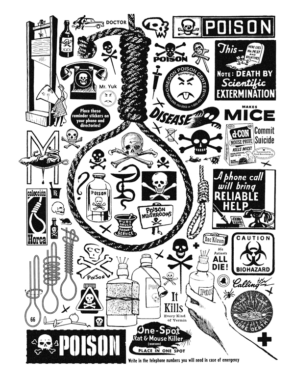
Sean Tejaratchi, from Crap Hound #1/6: Death, Telephones & Scissors, 1994/2012
Liartown’s creator Sean Tejaratchi also seems enamored of John Cage’s famous dictum “If a joke isn’t funny the first time, tell it again and again and again until you get a MacArthur grant.” It worked in the ’90s when Tejaratchi applied it to mid-century clip art, compiling huge quantities of a narrow range of thematically sorted imagery into astounding horror vacuii compositions—without commentary—in one of the best zines ever published: Craphound. And it works in Liartown—although extra-strangely, mostly at the expense of wildlife.
Thus we find ourselves laughing at the mysterious celebrity career of Glen the Seagull without being able to remember what the joke, if any, was in the first place. None of this is meant as criticism—sophomorism, cruelty, outrageousness, inexplicability and maddening repetition are among my favorite aesthetic strategies. As is overwhelming semiotic bombardment, which brings us to anther level altogether.
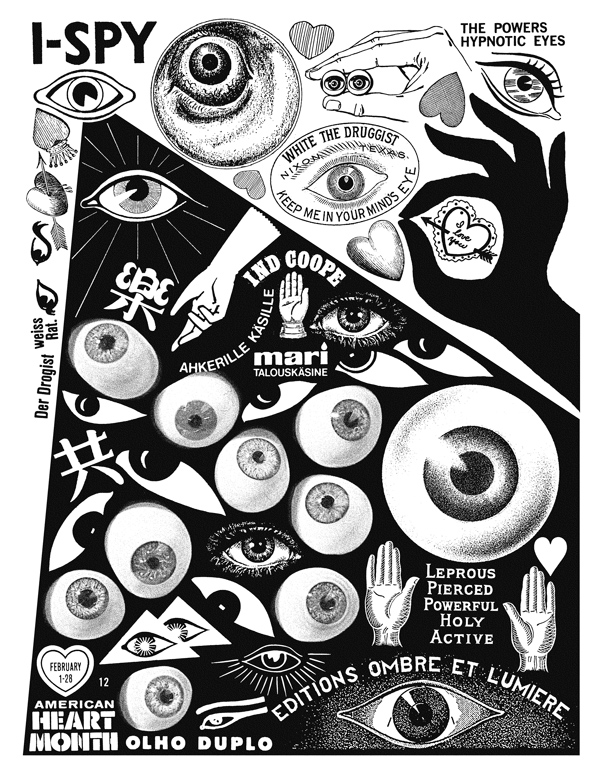
Page from Crap Hound #5: Hands, Hearts & Eyes, 1996
Once the Nation Lampoon/zen koan literary impact of Tejaratchi’s send-ups have sunk in, you begin to notice the subtle complexity of his awareness and manipulation of a vast array of graphic design tropes. Half the humor of his “what-if” speculations—as in “What if there were an entire folk art niche dedicated to carved wooden bears holding signs that say ‘Fuck You’?”—would be lost if it wasn’t presented in the form of a typographically, compositionally dead-on rendition of, for example, the Woolburn Craft Library’s “Collecting Cussin’ Bears” 1987 price guide.
A sort-of moire-pattern of hilarity ensues from the contrast between the ridiculous implausibility of the message (“2014 Turd Wrestling Calendar”) with the immaculate mimicry of the medium. For visual artists, and others with observation skills attuned to the baroque intricacies of pictographic communication in mass media, the pleasures will be amplified exponentially. Other readers get it without even noticing—the more invisible the camouflage, the more surprising the punchline. But this “book learning” can start to take hold. Why not throw your iPhone down the garbage disposal and lock yourself in a dark room with Liartown? Once the robot monkey’s off your back you’ll emerge into a brave new world!
