There was something slightly awkward about this transition – as if an appellant advocate had made his argument, and the case handed over to a panel of judges to arbitrate or come to some definitive decision. It was a difficult case to argue and a difficult decision to make; and if the panel ultimately did come to some consensus, it was not exactly what we would call a clean precedent.
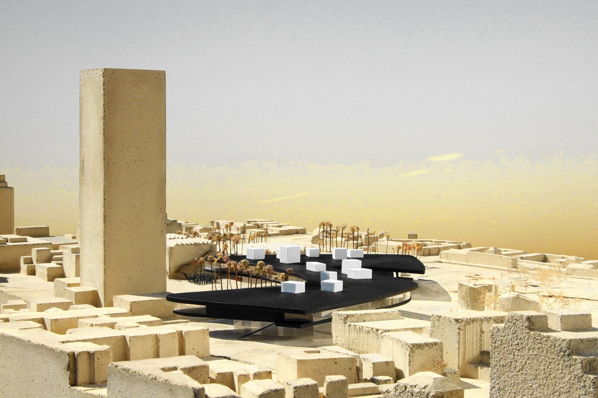
Govan had to defend what amounted to a quartet of contradictory positions. On one hand, he had to stand by the original design he’d gotten everyone worked up over to the tune of about $300 million. On the other, he had to defend the position that the changes made, though necessary and an improvement, had not fundamentally altered the original concept and silhouette for the building and site. Without going into detail about the alterations (which in any case are mostly covered in Hawthorne’s coverage), this is partially true and partially false. Although the altered silhouette has lost some of the spirit and sensuality of the original design, it is in some ways more coherent, the massing more equally (and gracefully) distributed to the north and south across Wilshire Boulevard.
The issue of ‘transparency’ was always a bit fraught, regardless of Govan, et al.’s initial hype, and for that matter regardless of hypothetical views into the galleries and perspectives onto the exterior; and Govan didn’t come close to making the case for it here. More problematic was the issue of the entrances, which were originally suppose to move visitors through the cylindrical glass columns or plinths, past storage racks of art, which would be at least partially visible to those outside. There were always issues with respect to access, preservation, movement/traffic and attendant structural stresses. But now the access points would be both reduced and more distantly placed. (And where exactly? And by what? That dreaded (by Govan, anyway) staircase? Zumthor and Govan appear not to have worked this out exactly.)
The axial shift of the museum’s Gumby-like footprint southward across Wilshire Boulevard could only strengthen the case for the elevation of the structure. But almost all the panelists expressed some concern for the (off-Wilshire) public space beneath the structure. The very fact that it would share the tunnel/channel it would create over Wilshire sets us up for a slightly darker – and less park-like experience than what might be expected or desired for a museum sited in what is, after all, a park; doubly ironic given that the Zumthor plan (in theory) returns two-plus acres to the Park.
That is to say, Hancock Park, whose original land concessions to the Museum, according to Greg Goldin, had been continually breached in its various expansions. In theory, the space would come in for much the same use as the Times Court between the Bing, Anderson, and Ahmanson buildings on the current campus. But, as Carolina Miranda, among others, suggested, the effect might seem a bit like hanging out under a freeway overpass. (Hawthorne noted that there were critics who saw the freeways as among L.A.’s greatest and most emblematic stuctures.) Not a big issue, assuming the light and space (and Park) only a few hundred feet away; but again, given the closure of those glass cylindrical supports, not exactly contributing to ‘transparency.’
Where Govan was most directly challenged (though not necessarily by the panelists individually) was the obvious (and clearly practical) shift from the flattened plot of galleries that filled the museum floor plan almost to its perimeter to a sectioned plan that gave some of the galleries double (and, from the appearance of some of the renderings, even triple or more) height. Govan’s original mandate had been for an aggressively flat, unbroken horizontal line; and Zumthor’s revised rendering had clearly breached that. There were no interior renderings to give an idea of the effect from inside the galleries, but the exterior effect was less than elegant. More to the point, the elevation no longer presented that unbroken horizontal line. Govan was insistent on a single storey museum that now had a dozen two- or even three-storey spaces. (I sort of wondered if this was the new de facto growth plan: just keep punching holes in the roof as needed.) Govan’s position now seemed all but absurd. My own guess is that this is a baseline cost issue. A second floor, however raw or partially finished, may add just enough expense to push the cost to a level the County Supervisors or certain Board members may find unacceptable.
Here’s the thing: the museum experience (as Alexandra Lange observed so eloquently) is not like other gallery, cultural or public/commercial/retail experiences. It is a place to muse, to wander, to browse speculatively. We’re not there to acquire or even experience something specific. There’s a certain randomness to the encounter, apprehending, observation that takes place in this setting. Alternatively, we’re there to look at something completely specific. Nothing is going to deter me from moving up to a second, fourth, or fiftieth floor, to see the exhibition I’ve come to see. (I was not so long ago on the 4th level of BCAM. Mr. Govan should be assured this was not a problem. This was a pleasure.) For that matter, I don’t buy it as commercial/retail psychology, either. If I’m at Barneys or Saks to look at Alaïa or Rick Owens, I’ll climb the stairs to get to whatever I’m shopping for. And then there are these things called elevators….
Alan Hess, an architect and Pereira scholar (he contributed to the anthology, Modernist Maverick: The Architecure of William L. Pereira), made a valiant case for preservation; but his argument devolved to historic/landmark terms: the historic synchrony and east-west symmetry of the Pereira art museum campus at Wilshire and Fairfax and the Welton Beckett-designed campus of the Music Center at First and Grand – both at the fifty-year mark. Miranda and others countered that there were quite a few notable Pereira buildings scattered throughout L.A. (e.g., the LAX Theme Building, CBS Television City) that had a stronger claim for preservation; and still others that would endure regardless of critical repute (e.g., the Variety Building right across the street, which Govan himself praised—not necessarily surprising given that half the LACMA administrative offices are in the building).
Sharon Johnston and Mark Lee, of Johnston-Marklee Architects, who certainly understand transparency, were thoughtful choices to fill the fourth and fifth chairs in the line-up. They’ve only recently designed a museum of their own (the Drawing Institute for the De Menil Collection); their architecture (the little I know of it) puts a kind of California, geometric spin on a post-Corbusier elegance. Both Johnston and Lee were, perhaps not surprisingly, inclined to give Zumthor a pass. (Mark Lee had a funny line about the Pereira LACMA, analogizing the Pereira oeuvre to Bobby Darin’s catalogue of hit pop songs, with the LACMA campus compared to a forgettable ‘B-side’ like “Splish-Splash.”) Johnston had an appreciation for Zumthor’s fluid tentative process and methodology, contrasting it with what she saw as a kind of presumptuous purchase on museum and site in the plan of Zumthor’s predecessor, Rem Koolhaas, who seemed to view the campus as “a totalized object,” as opposed to something that didn’t necessarily need to “reveal itself in an iconic way.” I sort of wondered what Govan might make of that, in that the Zumthor had and has a fairly well-defined, if not iconic, footprint that was probably one of its selling points.
Goldin in turn was eager to pull back the ‘footprint focus’ to the larger context of the place itself; concerned that, in ignoring the “political, cultural, historic process,” Zumthor was making a set of mistakes that paralleled Pereira’s own.
Miranda noted that she had just returned from Chile where she had an opportunity to see LACMA’s collection of Islamic art exhibited in the Santiago Museum’s expansive galleries – and how much better they had looked than in the smaller galleries and “dark halls” of the Ahmanson building. (Although not all the galleries are necessarily small in the Ahmanson, I was struck by her point walking down one such ‘dark hall’ just the other day, and into one of those smaller galleries (to look at the archival “Art and Technology at LACMA, 1967-1971” exhibit.) One thing everyone seemed to agree upon was that we’d all be happy to see the Hardy-Holzmann-Pfeiffer ‘wall’ ripped out as soon as possible.
When Hawthorne brought Govan back on stage for a wrap-up (and I thought – wrongly – audience questions), there was an almost palpable feeling of relief (even among those of us eager to toss him a few questions) – Hawthorne assuming a role that seemed a cross between the chair of a Ph.D. student’s thesis committee and Ryan Seacrest. ‘Well, Mr. Govan, you’ve passed our dissertation review and we’re happy to welcome you into the program.’ ‘So, Mr. Govan, how do you plan to juice up your next performance?’ Given Zumthor’s method, and the issues regarding transparency, gallery perspectives, visibility, Hawthorne gently raised the issue of possible “blind spots,” which Govan deftly turned to his agenda, even venturing (bravely, I thought) into the subject of the access/entrance/exit conundrum – with staircases.
“It’s not a big risk,” Govan confidently glided into seismic zones of controversy; “[Zumthor]’s already built two museums.” Then, hedging again: “It’s a worthy risk.” It might well be. But neither Goldin, nor anyone else had a chance to raise the political/financial/process/context questions Govan’s wager implicitly raised. Hawthorne might be excused for wrapping what was admittedly a long evening; but he clearly recognized the platform and privilege he had given to Govan. There’s also the question of access to this on-going process – a process that takes place largely behind closed doors between Govan and Zumthor exclusively. In Michael Govan’s world, $300 million is a mere bagatelle; even a billion won’t raise too many eyebrows. But a billion dollars is something to a city with a decaying infrastructure and where half the population struggles to pay its bills. For that matter, it was noteworthy that Hawthorne and the Los Angeles Times had been given such exclusive access to this story. Except for a postscript on Hawthorne’s piece that appeared on the Curbed L.A. site, there was no other coverage of the story. Hard to imagine The Wall Street Journal, The New York Times, the Financial Times, and the Guardian blacked out – but there you are. I’m curious about this ‘bromance’ between Govan and Zumthor. Might there be any question of a ‘bromance’ between Govan and Hawthorne?
It may well be time for a new museum building; and allowing for a few qualifications, no one is really clinging to the Pereira campus. (And did we really need that Perenchio PR stunt? Is there anyone in Los Angeles who bought that charade?) The question is whether the Zumthor/Govan museum is that building (and whether we’ll even recognize it if and when it’s completed). In the meantime, we might try to stay focused on the art we plan on putting in it.


