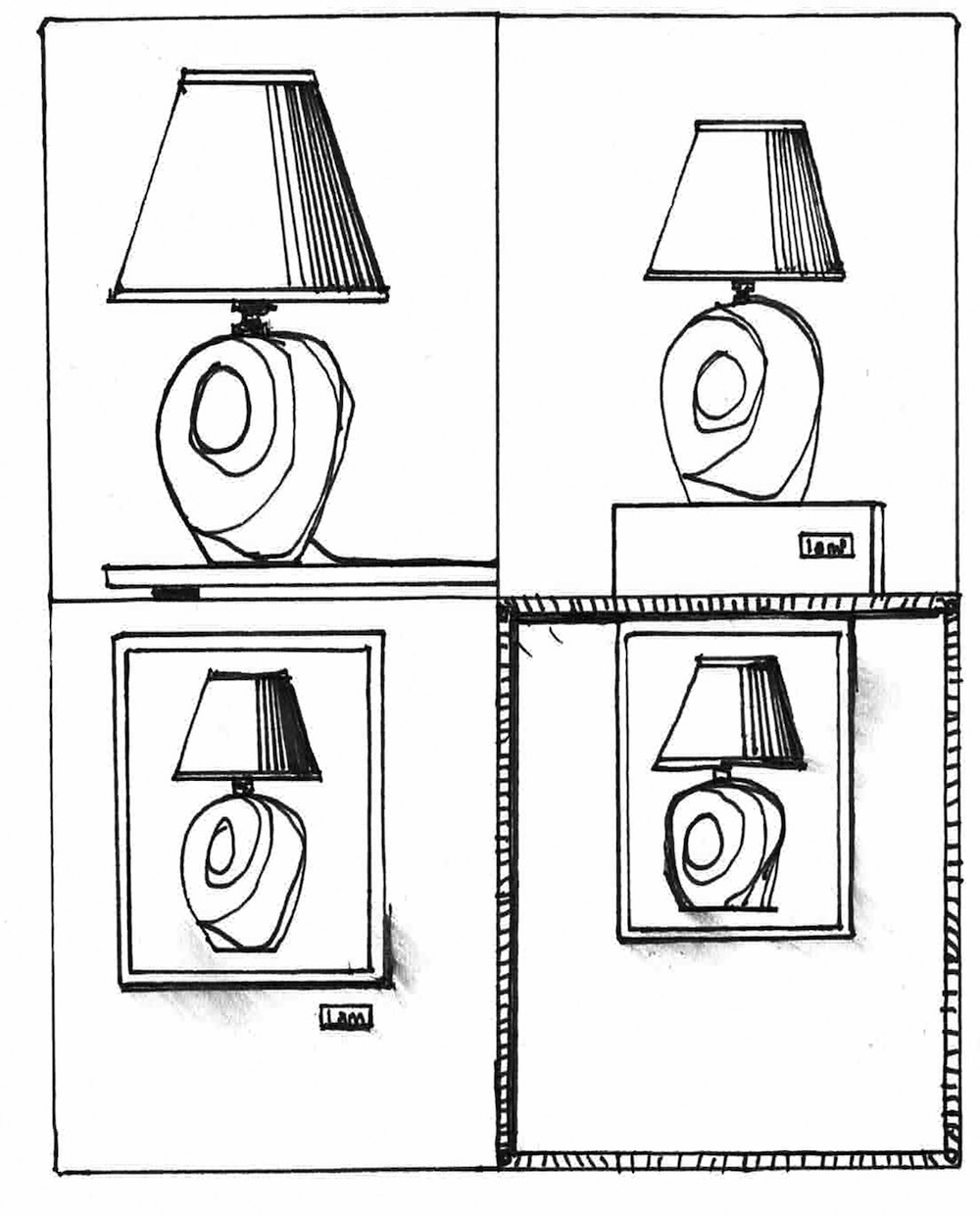
From the outside, the hotel lobby appeared to have (or be?) a gift shop—and an audaciously hip one. It said “porn” in awfully big letters, especially for a hotel lobby. I investigated.
It didn’t have a gift shop, it was just a lobby, but it was a very fancy lobby. Think now of what a splendid and splendidly expensive hotel lobby might imply: a dazzling beaux-arts concatenation of marble and arch? A playground of modernist geometry with manta-ray wing chairs and space-age lamps? Grand hotel lobbies always distill some version of their era’s taste down to occupiable form.
This particular lobby was a verdict on the Art of Context, the art historical movement that began with Duchamp, went mainstream in the ’60s, peaked in the ’90s and… is still around. It tells us what the business of figuring out where the modern upscale traveler would like to wait for their aunt has decided is desirable and sexy about the world of putting a museum label on a toy duck.
The first thing you notice is a sculpture which is a familiar parody of a popular Pop-art sculpture. Or a reproduction of the parody—was there ever an original? I don’t know. There are painted skateboard decks flanked by rows of photogenic books, a bunch of little keychains with a little guy on them like the kind you might see in a junk drawer with forgotten stuff in a house anyone might have, except they’re isolated in vitrines like jewelry, typewriters wall-mounted as if on display in the MoMA design department, jerseys of important local sports guys stretched like canvases, some fine art that was treated like fine art (with a wall label and everything) commissioned or just acquired by the hotel. Then there were framed Polaroids of some people, kitschy little animal sculptures—lots of the same one—presented on plinths and other tactics of display meant to contrast their kitschiness with the pale severity of said display tactic, Andy Warhol wallpaper (of course), paintings up-and-down the taken-seriously scale placed cheek-by-jowl, neon art, plants, mismatched vases, all flanking relatively stylish tables, chairs and chandeliers.
Visually, if you wanted to be generous, you might say it operates according to a system combining density, clarity and democratization to allow every mismatched thing, no matter how humble, to present itself as a dramatic actor in an infinite game of juxtaposition. (This may just be a crappy papier-mache leopard, but I bet you didn’t expect it to be next to taxidermy!) If you wanted to be ungenerous you might say it looks like a store.
The lobby also decisively asserts that several things the fine art world has traditionally thought of as different aren’t. The curator—whose job it is to decide which objects are worth looking at—isn’t much different than the interior designer—whose job is to make a space seem worth hanging out in. Neither are very much different than the appropriation artist—whose job is to assert one object they didn’t make is more worth looking at than all the others they didn’t make. The commercial designer—whose job is to decide on the visual specifics of the next commercial tchotchke to get sold—is not different than the artist—whose job is, well, much debated. The boardwalk painter, the skateboard painter, and the much-celebrated painter are likewise all equal, along with the typewriter-designer. And the typographer. The collectible, the historical artifact, and the image-made-for-image’s sake are all the same.
The public doesn’t care about the philosophical heft of transporting all these objects from one Sphere of Discourse to the next. In the end, it’s a lobby competing with other lobbies. You can hang out in the Parisi Udvar’s lobby or you can hang out here. Both
present visions of excess, but in different ways:
While the classically gorgeous European hotel might present the visitor with an image of conspicuous consumption represented by paying some Milanese stone mason to chisel away at an angel’s wing on top of a column for half a year, this lobby presents an image of conspicuous consumption represented by spending an equivalent amount to pay for a glass box, a white pedestal and several square feet of now-unusable floor space in a major metropolitan area to display a soup ladle. While Renaissance art patrons wanted to overwhelm us with the variety of craftsmen their money could muster and master, these new overlords want to impress us with the spare money they’ve got to waste on the space needed to display the ladle, the spare time and brain cells they have to waste on dreaming up why they’d want to, and the spare drugs they have to waste on making that seem fun.


