Your cart is currently empty!
Tag: Mark Dutcher
-
Jason Vass: Mark Dutcher
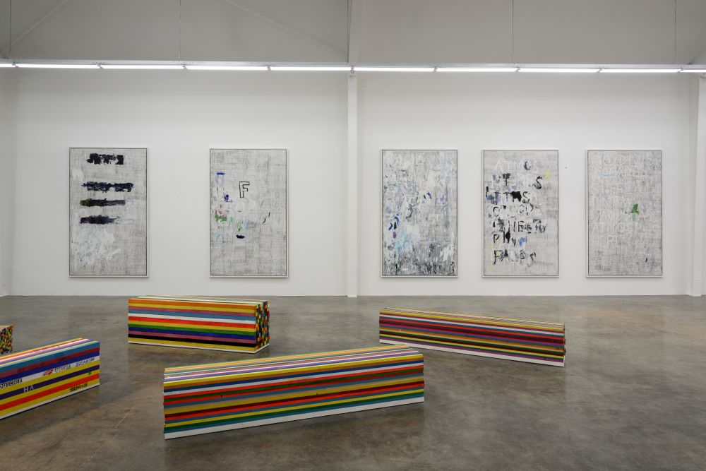
With his new solo show, “Time Machine” at Jason Vass, Mark Dutcher seeks to convey through his paintings various subjective and illusory experiences, starting with a moment of supreme clarity he felt as he stood before the Susan Rothenberg painting Blue Bars at LACMA in 1983. One work in particular bears a resemblance to that signal Rothenberg; the series as a whole suggests Dutcher’s engagement with a range of painters—notably Jasper Johns and Joan Mitchell.
Mark Dutcher, Time Machine (Decades), 2013-2015, courtesy of the artist and Jason Vass. Painted predominantly in whites with some blacks, purples and a few blues, greens, aquas and pinks, with portions of graphite-marked raw canvas peaking through, the paintings read within a white to gray spectrum. The brushwork carries hints of Mitchell’s textural accumulations with a bit more restraint—both in scale and intensity. Dutcher’s paintings feel built up over time rather than mercurially drawn, the craggy surfaces scumbled and knotted with lumps and edges, and then thinned to spread into capillary-rich rivulets and drip-like runs.
Mark Dutcher, Time Machine (Still), 2013-2015, courtesy of the artist and Jason Vass. The show also includes a painting from his Hart Crane series, a group of benches for viewing painting, made of 1 x 1 and 2 x 2 lengths of wood individually painted in various colors and affixed together in a kind of painterly bench-like minimalist object and a series of small collage-and-ink drawings.
Mark Dutcher, The Poet and the Sailor (2015), courtesy of the artist and Jason Vass. Seeking to index memories and events through a system of encoding, Dutcher has scribed each Time Machine painting with words that carry personal significance for the artist. Yet the words are only partially legible. In some instances, the reader may infer what has been obscured by the accretion of pigment; in others, the text becomes entirely lost.
Mark Dutcher, Time Machine (Utopia) #1, 2015, courtesy of the artist and Jason Vass. No matter that experience is ephemeral; Dutcher seeks to evoke or perhaps recapture for himself the elusive lightness that accompanies a singular moment. In this, “Time Machine” carries the weight of desire and serves as a metaphor for the scrim of time.
Mark Dutcher, “Time Machine,” January 30 – March 12, 2016 at Jason Vass, 1452 E. Sixth Street, Los Angeles, CA 90021, http://jasonvass.com/.
-
“Fill Your Heart….” (Part 1 of 3)
“If we can sparkle, he may land tonight….”
David Bowie, “Starman”
(from The Rise and Fall of Ziggy Stardust and the Spiders from Mars, 1972)
Sadie Barnette, Untitled (Pony ride, Compton, CA), 2015 Those readers who have followed this blog since it launched in 2007 may recall that it was originally a somewhat diaristic blow-by-blow account of my wanderings through the Los Angeles (and international) art world, with occasional detours into the domains of music, fashion and politics. This post reverts to that form not only because the week-end was more-than-usually eventful, spilling well beyond the round of gallery openings (there were a lot), but because so much of it had a much larger resonance both cultural and personal.
Sadie Barnette, Untitled (Go Go Go), 2015 I would never trust myself with the knd of wager that is referred to in betting circles as a ‘superfecta,’ – but allow me to wager a ‘win-place-and-show’ bet (with a superfecta honorary fourth) on the week-end’s shows – or at least the ones I was fortunate enough to catch. Sadie Barnette’s strong show at Charlie James took a healthy lead right out of the starting gate – and more or less managed to hold on to it clear to my personal finishing line. I’ll stop beating the horserace analogy right now – but the title and serial motives of the show certainly open the, uh, gate to it. Barnette’s title for the show is Superfecta; and the domain of horse racing figures prominently throughout the work; also the domains of pure chance and specific selection (itself variously the product of conscious analytics, subconscious motive, and sheer whimsy) and their intersections in life, memory, and art. It’s the kind of show where probability and poetry might apply in equal measure.
Sadie Barnette, Untitled (Racing Form 1), 2015 A series of untitled pieces in silken graphite with stenciled numbers (1 to 9) alternately blacken the numbers into racing form and newsprint pages, and expose the page within the stenciled outline – including horse names, race results, statistical details, along with the odd detail or horse and jockey. There’s a kind of I Ching magic to the exposed details. Elsewhere, Barnette floats words (like the title, ‘superfecta’) on various surfaces (some backed with colored plexiglas) in works that bear some affinity with Ed Ruscha’s iconic word paintings; but she stays true throughout to an aura of displaced yet tender memories. For those with the time and patience, the group show downstairs, Rosette, curated by Mary Anna Pomonis, is a bonus, featuring some very strong work by artists including Kristin Calabrese, Suzanne Adelman, Sarah Cromarty, Angel Chen and Mark Dutcher.
At Durden and Ray, Artillery’s own Anne Martens showed some striking wallpaper patterns morphing universal caution and hazard symbols into revolver cylinders in suitably fluorescent secondaries and Crayola red. I had only one question: if ‘obfuscate’ is the lingua franca of public speech, what exactly is really ‘hidden’ or ‘camouflaged’? The agenda? Maybe. We already know the guns are pointed at us. In the meantime, we speak politely and carry a big lawsuit. Martens was wearing a charming novelty chain at the opening with an orange plastic ‘yay’ pendant – smells like teen spirit to me. (Hey – we’re true to our school at Artillery.)
Steven Hull, All I Want to Do Is Forget, 2014 Steven Hull’s and Farrah Karapetian’s work – at Rosamund Felsen and Von Lintel Galleries, respectively – had far greater poignancy. Both touched on themes of the fragile vessel, shifting, unstable horizons, the uncertainty of landfall, of terra not-so-firma – Hull in his signature surreal and emphatically graphic style, with its alternately aggressively masked and abjectly sexual figures intrepid on the voyage out, yet simultaneously suffused with nostalgia; Karapetian in a series of electric (and unique) chromogenic photograms that are her own signature medium.
Farrah Karapetian, Lifesaver, 2015 Although Karapetian references concrete objects (or objectives – the title is Relief) – e.g., lifesavers or lifebuoys, life jackets, bluffs – throughout, the work also alludes abstractly to metamorphosis and transformation. (Two of the titles actually reference the Alexander McQueen Spring/Summer 2003 collection, Irere, inspired by an Amazonian tale of a girl’s metamorphosis from shipwrecked pirate waif to Amazon princess. I had to wonder if Karapetian had actually been influenced by some of McQueen’s own film projections, as well as the John Maybury film that introduced the défilé.) And then there was an installation piece Clear – the aforementioned life jacket in pieces on what might have been a piece of beach carved out and installed in the gallery – that seemed to anchor that vision and ambition. (Irere is also a species of duck, don’t ya know.) ‘Nothing … that doth fade / But doth suffer a sea-change into something rich and strange,’ – something more or less guaranteed in a Karapetian work, and no less so here in this churning, galvanic show.