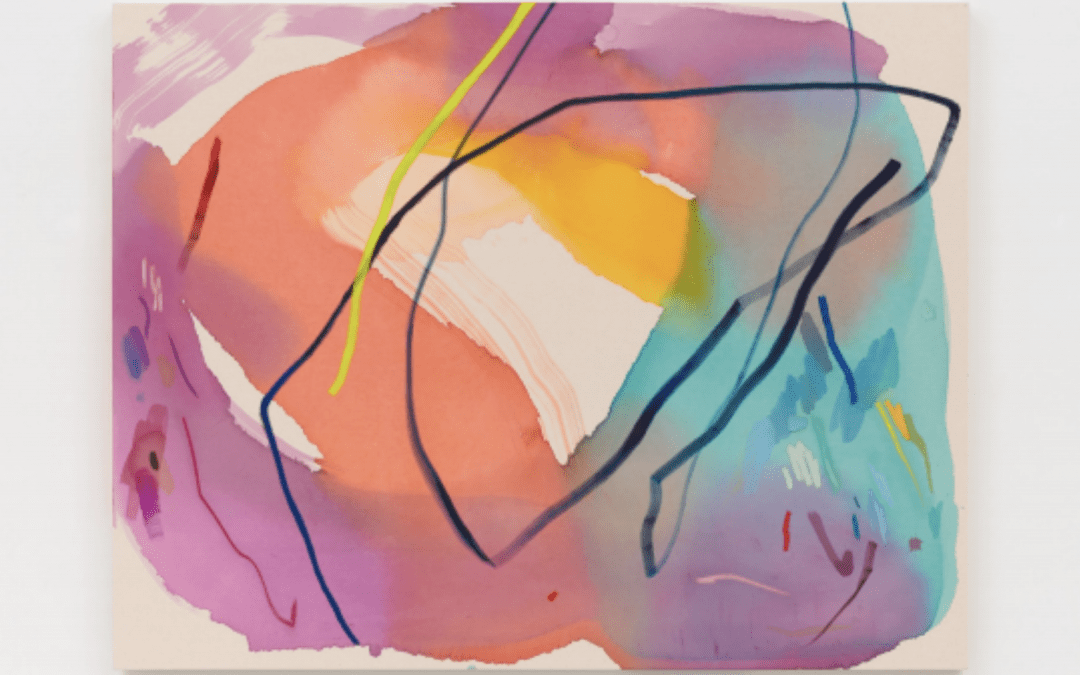
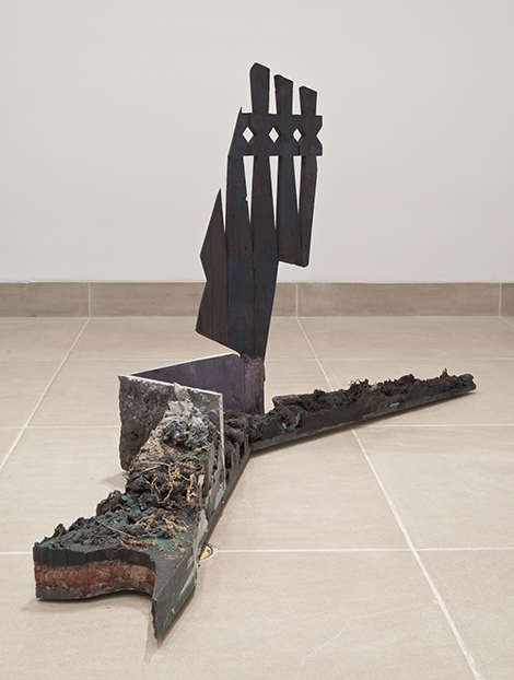
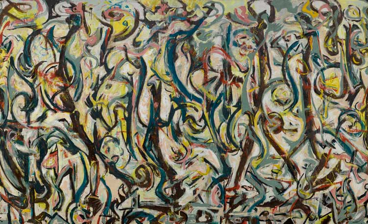
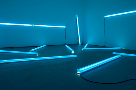
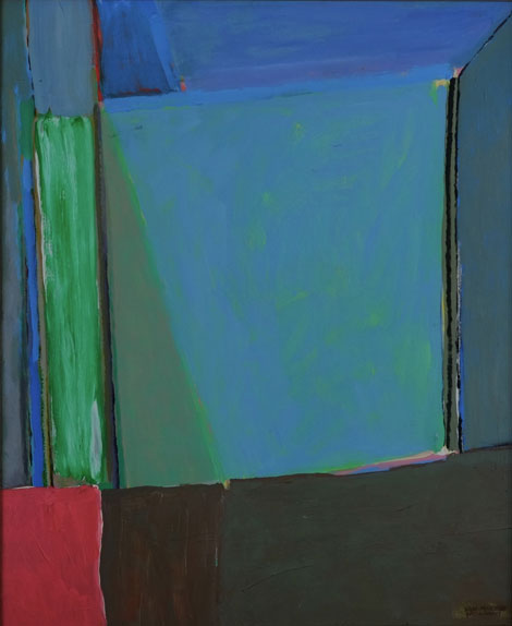
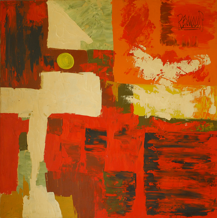
In a year when art sales floundered and galleries around the world quietly scaled back their operations, the announcement from New York’s The Hole, that they were celebrating their 10th anniversary by opening a second gallery, felt like a collective sign of hope. To...
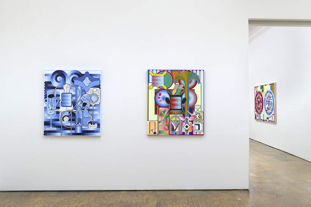
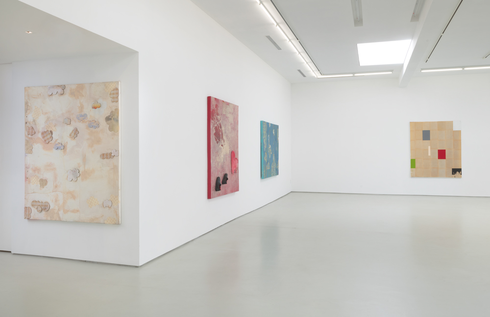
OUTSIDE LA: Eric Shaw The Hole, New York
read more