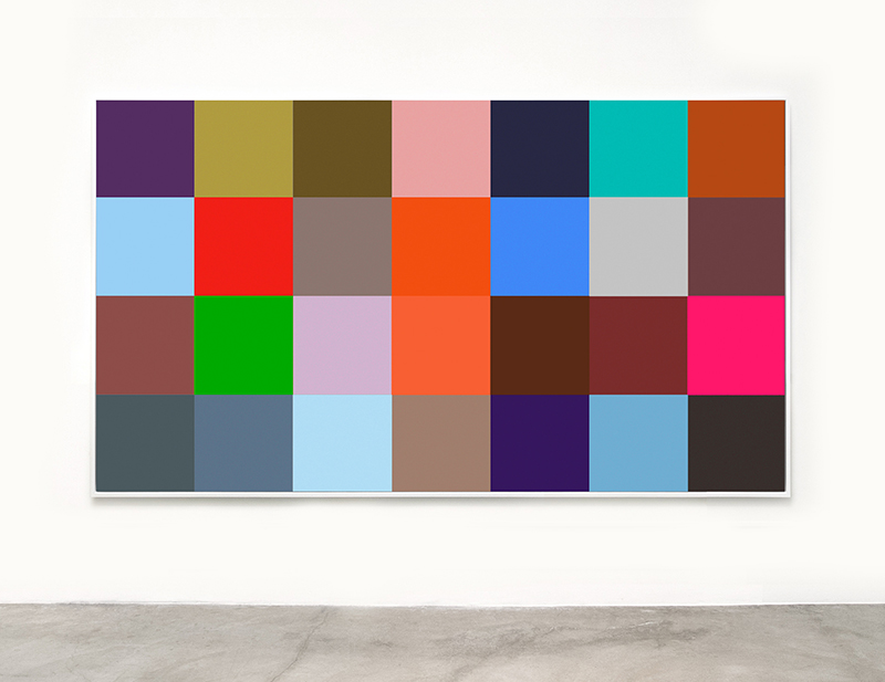
Evan Trine’s digitally generated photographic works are distillations—works that abstractly reference their sources. Trine sifts through trending online news feeds, reducing or compressing into a single element the images and headlines he finds. The colored grids and typographic collages in his solo debut, “Trending,” are synergistic works where the whole is, in essence, the digital sum of the parts. At first glance, “Trending” could be an exhibition of colorfield/abstract expressionist paintings as the works pay homage to artists like Franz Kline and Ellsworth Kelley; however, Trine’s images are photographs—flat objects purposely devoid of texture.
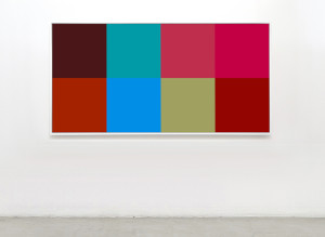
Evan Trine, Veggie (2016), courtesy of the artist and Roberts & Tilton.
Editor’s Choice (2016) is a large-scale photograph where twenty-eight approximately 12 by 12 inch colored squares are presented in a grid of seven columns by four rows. Trine begins with a photograph that accompanies a trending news article and digitally blends all the colors from that image into one. This color/pixel is the signifier of that picture, a conceptual reduction to represent its essence. In a work like Editor’s Choice or Veggie (2016), Trine lets the viewer imagine the content of the originals. For example, in Veggie, it is easy to think of the colors as derivations of photographs of vegetables.
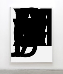
Evan Trine, Collapses (2015), courtesy of the artist and Roberts & Tilton.
In Trine’s text-based works he digitally collages—one letter on top of the other in a bold black san-serif font—every word from a trending story’s headline. The pieces are titled after a single suggestive word—Collapses, Festival, Twinkie (each 2015) —but never something too obvious or loaded. It is impossible to make out the sequence of letters as no readable words can be gleaned from the final composition. Trine plays with the essence of typography by montaging simple letter forms into complex and beautiful shapes that cannot communicate linguistically. These pieces are about the relationships between positive and negative space and the way the form holds the page. Less interested in the actual content of the stories than their significance based solely on popularity, Trine indulges in the absurdity that by visiting his exhibition one can ingest all the news that is trending.
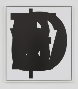
Evan Trine, Twinkie (2015), courtesy of the artist and Roberts & Tilton.
Taking this concept a bit further, Trine created an artist’s book that accompanies the exhibition. In the book the original headlines are juxtaposed with a text collage of the key word or title of the various Facebook feeds that are the source material for this project. That stories as ridiculous as 13-Year-Old Faces Assault For Kissing 14-Year-Old or Naked Man Sitting on Top of Car Causes Traffic Delays are trending news both fascinates and perturbs Trine. While he reduces real information to abstractions, his project also calls attention to the fact that what social media deems “newsworthy” is not always the most important or pertinent thing to know.
Evan Trine, “Trending,” February 20 – March 26, 2016 at Roberts & Tilton, 5801 Washington Boulevard, Culver City, CA 90232, www.robertsandtilton.com

