


")
Art Basel Miami is the art-world’s Super Bowl. With art, travel, parties and the beach, it was the perfect way to end 2018. At the end of a tiring but invigorating day of viewing art, you might have found yourself walking barefoot along a white-sand beach with a new pal, reflecting on seeing some of the best contemporary art from all over the world.
The Royal Palm
I flew in on a red eye from Los Angeles, collapsed at the Royal Palm South Beach Miami Resort, and woke up ready to begin the now-legendary art fair week. I put on my grandmother’s splendid vintage coral “statement necklace,” squeezed into white capris, and within twenty paces I was dumbfounded by Miami, as this was my first time in the beach city. My hotel was right on Collins Avenue—the postcard vision of Miami good times.
As publisher of Artillery, I was invited for Pantone’s Color-of-the-Year announcement which debuted at Miami Beach. Tribute Portfolio, Marriott International’s newest collection of arty hotels, had partnered with Pantone. The color, to my surprise and delight, turned out be Living Coral, a hue associated with lightness, girlishness and tropical good times—and my grandmother’s necklace that I had just so happened to wear with EVERY outfit that week! I was gingerly touching it as the Pantone team announced the color.
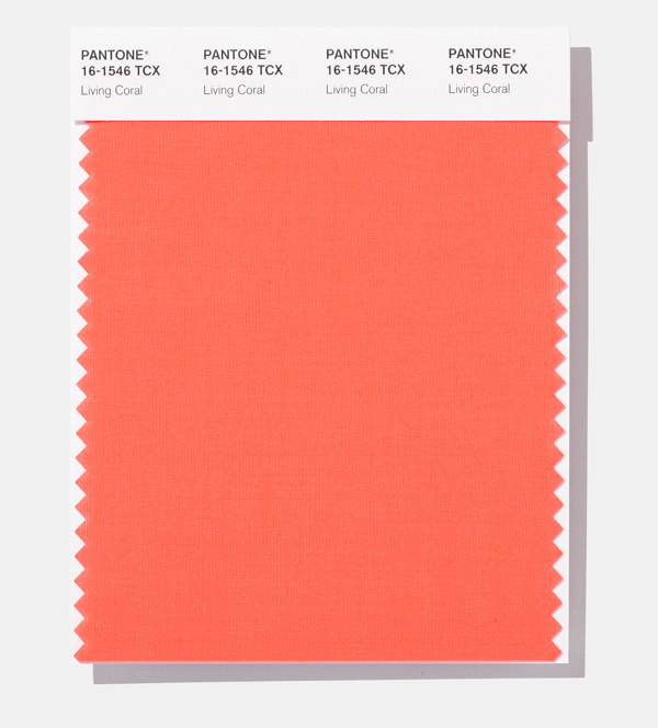
Pantone official COY image and swatches
Pantone and Tribute Portfolio utilized the hotel’s lovely beachside patio to announce Living Coral with an immersive pop-up called the Pantone Pantry. Influencers, national magazines and bloggers (I fan-girled hard upon meeting @FindingPaola!), and local artists all gathered to (literally) step inside the Pantone Color of the Year announcement in the immersive walk-in art installation. It was a cabin of sorts—half luggage-portal and half hotel. My fellow bloggers and writers—dressed to the nines in coral, gold and red ruffled dresses, satin suits, fabulous panama hats and purple turbans—were buzzing around me as I entered the adorable-sized white Pantone monochromatic “cabin,” the first traveling Pantone installation of its kind. It came off as a personalized hotel experience—the perfect room and travel pop-up shop in one. Everything you need to feel homey in your coral “hotel room” was neatly laid out.
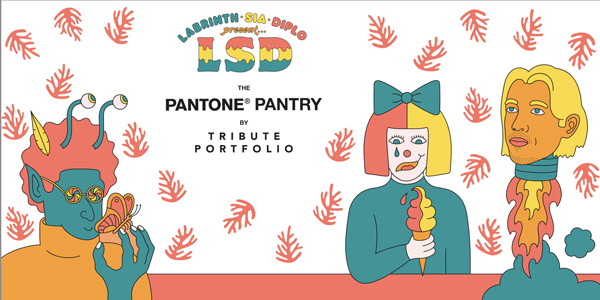
Mural by LSD
The Pantry was introduced to us as a “bellhop” wheeled out lovely mock luggage, neatly stacked on a trolly with coral luggage. The cabinets that lined the walls were conveniently equipped with blankets and mock-travel essentials—sunglasses, passport, explorer books, miniature chess sets—perfect for backpacking or a last-minute excursion. There was a cocktail set, bathroom accessory goodies, travel desk setup—all in corals, pinks and reds—right down to each rubber ducky and magnifying glass. Then you stepped in through another door into a hotel bedroom with an collective-artist LSD mural graphic. As we stepped out the back of the Pantry to a flood of neon lights, the side of the pantry opened up as a mural for us to paint on. We were handed brushes and buckets of creamy Pantone paint. You didn’t need to tell anyone in this crowd to begin.
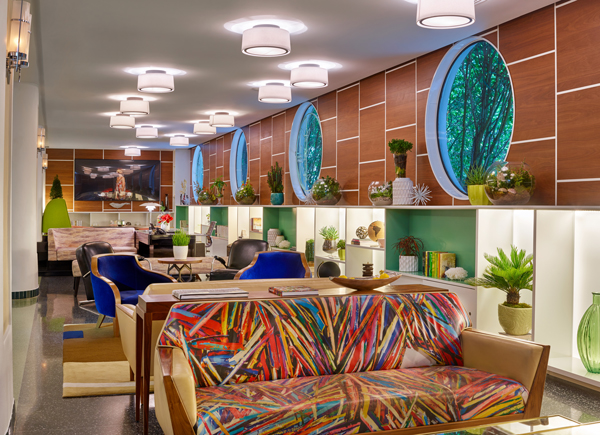
Coral is an optimistic, feminine color. Politically, women had it tough in 2018, so it was a sweet nod to be remembered. The luxurious blend of pink and orange makes one think of travel, adventure and discovery, along with a garnish of lazy lolling about with a cocktail or Cuban coffee in hand, Miami-style. Every time I stepped inside the lobby of the Royal Palm, I was greeted by circular, submarine windows, fresh flowers and a narrow row of comfy sofas and coffee tables with an art deco, Old-Havana feel.
The Slaak in Rotterdam
The Royal Palm is now one of the series of boutique Tribute Portfolio hotels, and its closeness to the sorbet beach sunset, the twinkling lights of the coast-side bars, and constant salsa music blaring from South Beach was exhilarating. In the lobby, at the restaurant, at the neighboring cafes and restaurants, you were able to make personal connections with creative people from the global party life of Art Basel Miami.
It’s the color kicking back, and maybe being a little naughty. Art Basel Miami is just that—the American-art world’s opportunity to party, let loose and make bad decisions—while making serious business moves, and sneaking naps in our hotel rooms, of course, with the lovely coral color lulling you to sleep.
For more info: https://www.pantone.com/color-intelligence/color-of-the-year/color-of-the-year-2019http://news.marriott.com/2018/12/tribute-portfolio-hotels-partners-with-pantone-combining-the-power-of-color-and-the-joyful-pursuit-of-travel/
