


A standout artist in 2023’s “Made in L.A.” biennial, Ishi Glinsky often plays with scale in his sculptures, paintings and drawings that reflect the customs of his tribe, the Tohono O’odham Nation. Fusing the past with the present, Glinsky examines pieces from his community, both contemporary and archival, some made a thousand years ago. His sculptures include giant pairs of beaded earrings and necklaces that span an entire wall and a 10-foot-tall studded leather jacket with the name of his tribe on the back. Feeling the importance of painting both a friend’s woven basket and items from his cultural center at his reservation, Glinsky is dedicated to honoring and carrying indigenous knowledge. For this issue’s “Peer Review,” Glinsky discusses the work of Los Angeles–based painter Kristopher Raos, his longtime friend, and Raos’ recent show at Charlie James Gallery.
When you come across one of Kristopher’s paintings, you’re hit with a tidal wave of color. The depth comes from his hyper-meticulous techniques of his own development. His understanding of process and material is beautiful, and as a technician, he is really inspiring. His paintings are almost sculptures because of the way he makes his stretcher bars; the canvas is reinforced to stretch around a curve, like upholstery. In his recent show, there was a large painting, Untitled (Shell becoming around) (2023), that zooms in on an advertisement for Shell. I wasn’t aware until I was standing in front of it that it is two pieces, so effortlessly stretched and fitted perfectly that it looks like one. Another version of this is Untitled (Boing, Spank, Wave goodbye) (2022), which features a Michelin Man arm interacting with a cool, curved shape—there’s a lot of talent and hidden labor that goes into these forms.
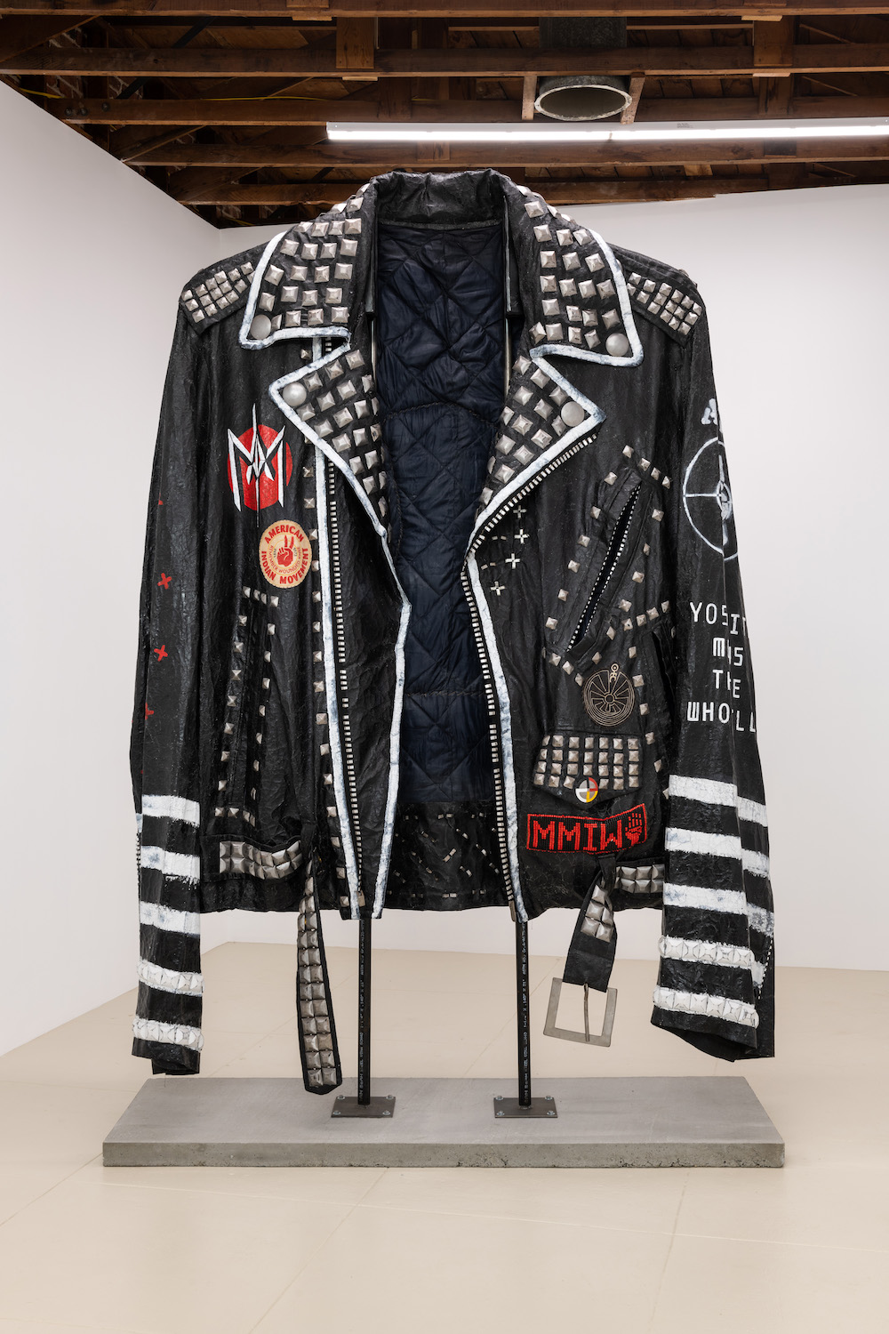
Ishi Glinsky, Coral vs. King Snake Jacket, 2019. Image courtesy of Chris Sharp Gallery.
Looking at the work, I feel like I’m in the passenger seat, either going 150 miles per hour or sitting bumper-to-bumper in Los Angeles, peering at a homemade sign. I love that I can envision where he’s taken typography or hand-painted words from. He can call out map points in LA, and say Sunset and Hyperion is the inspiration of a painting. The reference could be a homemade business sign that’s a little filthy from the soot, and turns it into a really sharp, abstracted version of it, working with these visual keys that are in the city.
In my own work, there are these moments in history where I zoom in, and I like Kristopher’s editing process, how he picks parts of these logos to make them contemporary and minimalist. I respect his decisions, and I get a lot of joy from viewing his work, which is needed. Some pieces are so serious, and you have to emotionally prepare. With his paintings, just my retinas have to prepare. Throughout the years, he’s developed his steps to communicate so cleanly and morph maybe lower-quality materials into something extravagant, and I feel confident that he gets a seat at the table of hard-edge and minimalism.
—As told to Alex Garner
