I had never heard of Lancaster, let alone gone there, before I drove up the 405 and the 14 last November to see “Being Here and There” at the Museum of Art and History. It was “worth the trip,” as the Guide Michelin says of exceptional destinations. Almost all the 26 photographers in this ambitious SoCal landscape show were present that evening for the opening, including Sant Khalsa, who had also curated and installed the exhibition.
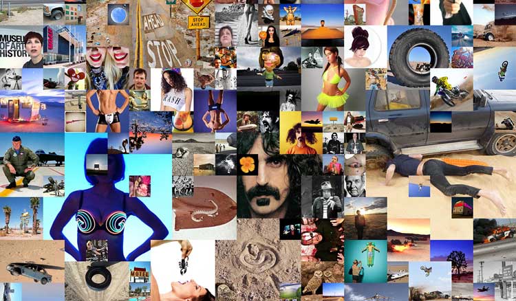
She did so with an acute sense of visual drama, as when Andrew K. Thompson’s tiny color prints on stitched cloth were placed between more imposing work by Laurie Brown and Meg Madison. Equally astute was Khalsa’s feel for how compositions might relate on the wall. Doug McCulloh’s vertical mash-up of Google images from the “Antelope Valley,” for instance, was juxtaposed with a Lewis deSoto panorama equally cluttered with junked cars. The comparison the two compositions invited underscored the range of styles on view, from deSoto’s traditional documentary approach to McCulloh’s contemporary, web-surfing appropriations.
But let me turn my attention to the exhibition catalog rather than the installation. I do so partly because the exhibition itself is now closed, but the catalog is still available through Blurb (http://www.blurb.com/b/5706178-being-here-and-there). And it is equally engaging in its own, different way. Here the photographers are each given two pages and are presented in alphabetical order, which is to say that no aesthetic choice is entailed. Nonetheless, there are moments when you turn from one photographer’s double-page spread to the next one’s, and realize that there is an enlightening relationship between them despite the indifference to art of an alphabetical sequence.
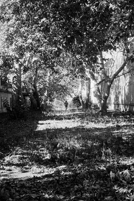
I’ll use two of the photographers just mentioned as examples: deSoto and Madison. DeSoto’s 2012 panorama of an “auto recycle yard” (as he calls it in his brief text) is followed by a 1996 John Divola work titled As Far As I Could Get, 10 seconds, R02F33. The black-and-white Divola vertical couldn’t be more different from deSoto’s extreme horizontal, as the text each has written underscores. Whereas deSoto’s text reinforces the emphasis on ecological issues that his photograph would seem to raise, Divola’s commentary, like his image, focuses on himself.
Divola’s photograph is from a series in which he has set the timer, then run away from the camera into the landscape on which it’s focused. It’s his own ecology, rather than nature’s, that he’s concerned with. This image contains a “personal note,” he writes, having been “made…as I was approaching 50 years of age.” Nor is it nature into which he disappears here; it’s “the grain of the image [into which] I am being absorbed.”
DeSoto, by contrast, speaks only of the history of the landscape he’s photographed. This “graveyard of cars,” he tells us, “is within sight of the first Christian graves in the valley.” It is a “sea of cars [that] sits in the washout zone of the Santa Ana River.” I’m not condemning Divola’s self-consciousness or preferring the other-directed sense of deSoto’s photography. Every camera has two sides to it, the one that faces the subject and the one that the photographer faces. Whichever way we look at a photograph, the interplay between self and other, for which the camera is the demarcation line, is what gives photography its power.
The point I’m making is that issues essential to all photography will emerge even from an indifferent juxtaposition of images, if each is powerful enough in its own right. It’s not surprising that a significant relationship could be found between Divola and deSoto, who are both veterans of the medium and revered artists. But later in the catalog, I found a relationship as significant in an equally chance alphabetical sequence between two photographers heretofore unknown to me, Steve King and Meg Madison.
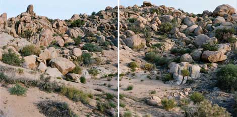
Madison’s 5-foot diptych, Where to build a house, Pioneertown (2014), is the latest phase of a project photographing boulders in Joshua Tree so that hikers could find each one “with the aid of a Google map.” She quotes Jean-Jacques Rousseau on how “the fruits of the earth belong to us all, and the earth itself to nobody.” Her photographs are a conceptualist piece determined by the way a 100-foot rope extended into the landscape. She challenges the overdevelopment going on in the fragile ecosystem of the desert. Her work is, in effect, a repudiation of the King image that precedes it.
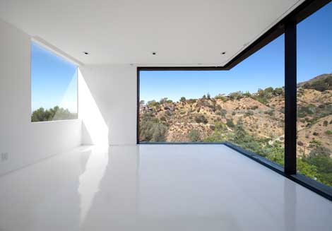
Not that King’s 2010 Nakahouse|XTEN Architecture, Hollywood Hills, CA can’t defend itself. On the contrary, as strong a plea to preserve nature as Madison’s work is, King’s photograph strikes me as the most affecting single composition in the show. The innate power of his one image is equal to the higher theme that her work serves. His view of the landscape outside, seen through complex windows in an empty white room, could easily be mistaken for a large-scale photograph of that landscape installed in an art gallery. This ambiguity between inside and outside—between art and nature—is an effect enhanced by the way a shaft of light on the opposite wall falls symmetrically inside and outside another window.
King’s image entertains both sides of the argument that Madison would resolve; it employs an illusion to argue for artifice as the essence of art. Moreover, his ability to pull off this coup undoubtedly results from the fact that he’s an outsider here, a professional architecture photographer among landscape art photographers. This, too, is characteristic of photography in my experience—that someone approaching a subject or a theme obliquely may come up with a more powerful image because the medium itself is so powerful that it’s hard to master head-on. Both this exhibition and its catalog illustrate many home truths about the medium in general as well as the subject at hand.

