


In artist-filmmaker Morgan Fisher’s fourth solo show with International Art Objects (formerly China Art Objects), vintage 1930s house paint samples are enlarged to three-by-four-foot panels and rendered in modern acrylic house paint. These color fields are taken from original 1935 designs by General Houses, Inc. and their Exterior and Interior Color Beauty booklet. It’s tantalizing to picture a wide shot—a pre-War suburban Los Angeles street, the Bakelite tones of 4 (Silver Gray, Sky Blue, Terra Cotta, Red) (2013) starring as doors, window jambs, and stucco swaths, shimmering in a neat row.
The 1930s home is both a respite between World Wars and a refuge from the world outside. Domestic and political stopover of sorts, the 1930s reflect a comedown from a time defined by bread lines, Ziegfeld Follies and economic immobility. As a more intimate counterpoint, Fisher’s colors lay a blueprint to the inner life of the decade, its dream of home and its fantasy of domestic comfort.
There are equal parts family legacy (General Houses was his father’s prefab company) and minimalist art renaissance in Fisher’s neat color squares. His oversize paint chips also act as set design for our imagination, a domestic period-piece in the abstract.
Concise color families neatly rephrased by Fisher’s hand become full-blown environments to walk through in the privacy of one’s own imagination. General Houses’ vintage color formulas, faithfully appropriated by Fisher, have encyclopedic titles as in 5 (Colonial Yellow, White, Terra Cotta, Vert Green, Silver Gray) (2013), building linguistic depth, nostalgia and an entry point into the work.
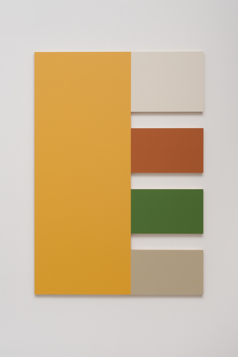
Morgan Fisher, 5 (Colonial Yellow, White, Terra Cotta, Vert Green, Silver Gray), 2013. Courtesy of China Art Objects Galleries. Photo by Robert Wedemeyer.
Fisher’s “Interior” series references a more tightly designed aesthetic program than the “Exterior” series. Its five-color swaths were originally designed to narrate a transition from outer to inner space as one walks deeper into a 1935 home. Part chromatic timeline and part homeowners’ catalog, “Interior” satisfies both our desire for schematization and our virtual-consumer imaginary. Beast of logic and beast of leisure, we operate in twin universes as we walk into this space.
Fisher’s work points to both the Interwar domestic market and prescribed ways of viewing art in 2014. His color facsimiles are artifacts of consumer supply and demand but are also stories we are meant to write ourselves into, simultaneously then and now. Blown up and reexamined 79 years after the publication of the General Houses booklet, Fisher’s domesticated art suggests a place where the Interior of home meets the Exterior of industry.
The fiction of consumer marketing narrative and of domestic space in miniature touches on the utility of make believe, the trope of domestic pleasure and leisure, and the unreal space of art itself. The world flattened into the logic of color seems almost comforting because it holds and limits our vision. Fisher’s islands of color were originally meant to be places for people to imagine, to model in their minds, to pretend that they own, and they still hold the magic of that perennial consumer fable.
