


I came to this show of Martha Alf’s work as a novice. (I mean that almost reverentially—it’s the sort of work that sends me back to a kind of intellectual nunnery where I feel compelled to repent my inattention and failure to carefully and precisely observe.) Alf’s work generally, and this beautiful, thoughtfully curated exhibition in particular, take us back to first light, first sight and first principles.
The banal character of her subjects—only a few utilitarian degrees removed from ‘primary (geometric) structures’—immediately confront the viewer with notions of intentionality, characterization, and self-consciousness. ‘What do we see? How did we come to see it? How did we come to appropriate this form to a purpose at some remove from its abstracted contours (to say nothing of other orders and varieties of perception beyond human capacities)?’ Color—that is to say light—takes this to another, existential level. In its absence, the character of the form—or certainly our apprehension of it—would change, subject to our dimmed or otherwise altered perception. (I’m suddenly reminded of a couple lines from a favorite children’s book, “Would I be so terrible if I were pink? Or blue?”)
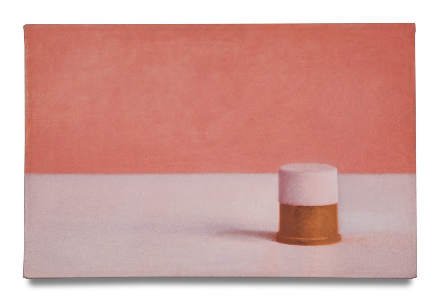 We see this in some of the first works in the show. Alf sets us back on our heels with the flattened atmospherics and already surreal, almost hallucinogenic carnelian-pink of the upper rectangular ‘background’ portion and the dustier grayish-pink undertones of the off-white support/surface of the ‘foreground’ against which the no less ambiguous contrasting Spray Deodorant Caps (1970) are set, slightly off-center, casting their slight shadow to their left and the center of the painting. (If not for the color contrast we might question whether there were actually more than one; they seem to form a single cylinder.)
It’s worth considering that when Martha Alf’s work appeared in the 1975 Whitney Biennial, Minimalism was still highly influential in the art world internationally, and that she began her career at a time the movement was just emerging. But Alf is grappling with a more expansive and complex array of phenomenological issues in these works that gloss and glide through a diverse range of 20th century movements and styles, from Surrealism and Fluxus, through Pop and post-Pop work along the lines of Johns and Oldenburg, even (arguably) to Post-Impressionism and Cubism. But Alf veers sharply away from Oldenburg’s soft, collapsible (or hardened/blown-up) forms and Johns’ flattened primaries, and into an approach that acknowledges a set of relationships—with light or light sources (its composed illumination and the light that connects the subject or the work with the viewer), its contours as shaped and modeled by light moving in space, its placement, its composition or relation to something else—which in turn acknowledges a surround, a context, its presence and availability to observation (and the notional observer)—relationships she is keen to test and tease, to provoke.
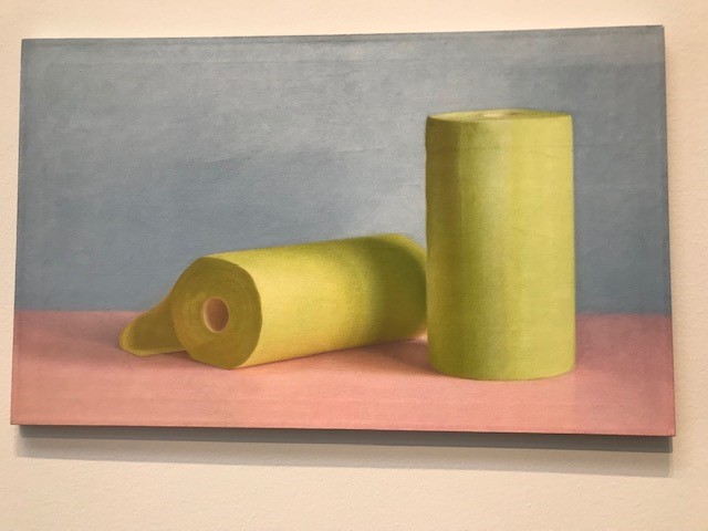 In ZEE GREEN (1971), two paper towel rolls (presumably inspired by Crown-Zellerbach brand products)—one ‘standing’ vertically, the other rolling out on its side, diagonal and to the left of its vertical counterpart—literally unravel the relationship. One solid, standing, ‘intact’; the other flat against the pink foreground ‘surface’/support (Formica?—I can recall odd shades of the stuff being produced at one time), depleted, seeming diminished, tentative. Even the shadow cast by the standing roll against the other telegraphs imbalance, uncertainty, time’s passage. The upper background portion of the canvas is a kind of grayed-down blue lit slightly by an under-layer of white—like no blue-grey I’ve ever seen in nature or man-made interior space. And that green—hard to say if Crown-Zellerbach ever manufactured colored or patterned paper towels, but one thing we can be pretty sure of is that it never produced a towel in this color—which would be more accurately described as something between an acid-yellow and Chartreuse-green or absinthe. Alf uses color—and color transformation—as a kind of baseline test of apprehension, characterization and intentionality. (The viewer is immediately shaken to attention: this is a test.)
She’s testing the integrity of these spatial, perceptual relationships—and she just keeps pushing them. Alf hardens the terms in Costa Brava Yellow (1972)—going back to the primaries, then lighting a fuse. Against a deep, dense (but not pure—we see the underpainting) blue, and deep, shiny (we see the ‘reflections’) red (also shot through with orange and magenta), she places two fluorescent orange toilet paper rolls dead center. (Go ahead and ask questions, the picture dares us. Imagine someone wiping their tush with some of this.) And she keeps changing it up: pushing the cylinders together, apart; in equally radioactive colors (fuschia red against mottled scarlet and orange, chalky Prussian blue against washed-out orange, bright yellow, sick greens against dusty pink); moving the light source, charging the atmosphere. “Costa Brava” my ass—we’re not on holiday here.
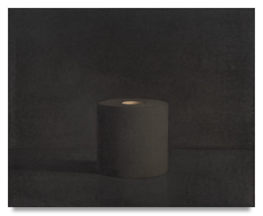 This is made clearer in later studies (also oil on canvas) between 1974 and 1975 where solitary Cylinder(s)/toilet rolls are grayed-out or blackened, as if by coal or charcoal. In Cylinder Black (1974), the charcoal gray roll sits in an almost undefined space, a miasma of grays, the supporting surface defined only by the object’s shadow and an almost meaningless paler thread about a third of the way up the roll’s elevation. (This study in particular shares affinities with Vija Celmins’ painting and drawing—a distant cousin to Alf’s work.) And maybe this is the point—a ‘meaningless’ shade of pale against solitary yet proliferating black holes. Hard to look and harder to look away—sort of like life and death.
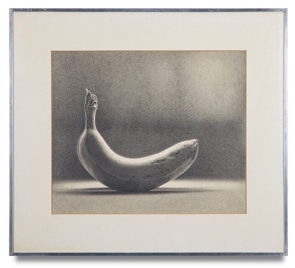 Against these hard terms, Alf’s drawings come as a kind of second revelation—miraculous in their graphic and chromatic poetry. Her gift is evident from the start. A 1976 pencil drawing of a solitary banana, Bananas #4 (1976—presumably, one in a series), with its faithfully, meticulously-rendered surface—every contour, speckle, bruise available to us—turning the anterior surface of its crescent to the light which seems to hover in lapping atmospheric rivers of gray in the upper portion of the drawing, its shadow a bisected, narrow ellipse. It’s almost a reversal of that stark gray Cylinder Black that came only two years earlier—as if a ‘perpetual light’ were actually determined to shine on it through the gathering darkness.
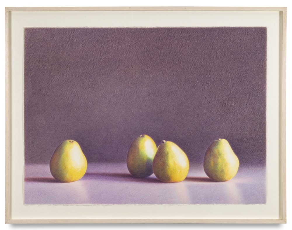 The style owes something to Irving Penn, also Monet (e.g., Haystacks). Alf was clearly a natural, but also a classically schooled draughtswoman. It’s a classic, oblique single-hatch style, variably serene and energetic, acute to the dynamics of pressure and density—something we see in master drawings from the High Renaissance all the way through to Degas. Most of these are from the 1990s, and they are as breathtaking as her best paintings. The slightly clinical aspect of her stark ‘primary’ domestic geometrics gives way here to a more organic, random, even socialized order of composition. A quartet of pears (1989), pale green, shot through with gold and amber, sit in what seems to be an undefined ‘landscape’ of grayed lavender and pale mauve (Alf owns these colors)—the two pears at the center foreground slightly inclined toward each other, another sitting somewhat diffidently to their right, with a fourth pushed slightly forward to the light on the left—like a Las Meninas of the vegetable world. Nature was never less morte. In Two Bosque Pears, Venice Beach (c.1995), she gives two magenta-hued specimens the magic-hour treatment, with a rosy sky descending into the last light moving across a horizon-line embankment to touch them with its glow. If aliens chanced upon the planet at such a moment, you have to wonder if they would seize upon such specimens as the only really intelligent, or at least sympathetic, life forms.
Alf herself is seizing upon something slightly different. The drawings constitute a critique that shifts toward the perception of relationships—both the relationship of the organic to the ‘primary’, the abstract or conceptual, and the relationships between objects (natural or abstract; living or non-living—the pears after all have been plucked from their trees). This is addressed both broadly and with great, even granular, particularity (cf., her 1975 Drawing(s) of Woven Canvas). It’s as if shadow precedes the light. We come to perception on one level or another out of darkness. Intentionality contours the objects, composes the image; yet its unraveling, its disintegration is also implied. The light dissolves and moves on—to the next objects, the next percipients. Considered in the abstract, it seems more than slightly reductive and absurd. Yet Alf makes sympathetic magic out of it. (Alf’s own words summarize her approach and intention with almost breathtaking eloquence: “It is about the perfection of the banal and the seriousness of the ridiculous.”) This superbly curated show is nothing less than a poetics of perception.
Martha Alf: Opposites and Contradictions runs through August 5, 2023 — at Michael Kohn Gallery, 1227 N. Highland Avenue, Los Angeles 90038.
