As soon as I entered the recent exhibition “Ocean of Images: New Photography 2015” at New York’s Museum of Modern Art (MoMA), things took a turn for the worse. Or anyway, I did. Because it was the last day of the “New Photography” show that MoMA does every two years, the gallery was packed. I turned to the only piece in the first room that offered an unobstructed view: photographer Natalie Czech’s A Poem by Repetition by Allen Ginsberg (2013). The repetitive title is a clue to the hall of mirrors I was entering—not only with this work, but also with many others in the exhibition.
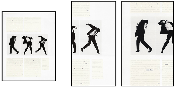
Natalie Czech, A Poem by Repetition by Allen Ginsberg, 2013, courtesy Capitain Petzel, Berlin and Kadel Willborn, Düsseldorf, ©2015 Natalie Czech/VG Bild-Kunst, Bonn, courtesy Capitain Petzel, Berlin and Galerie Kadel Willborn, Dusseldorf.
Czech’s A Poem is composed of three separately framed photographs, each incorporating some of Robert Longo’s 1980s series of large black-and-white drawings in which contorted men seem to be falling as they writhe in pain. Above and below the Longo figures are excerpted prose passages in which a word here and there is highlighted. As the text panel next to Czech’s work written by a curator explained, these passages are from a 2010 interview with Longo in which Czech has found and highlighted all the words in a poem by Allen Ginsberg that started out as a fragment in his 1951 journal, and that he was later encouraged by the poet William Carlos Williams to turn into a poem, and… .
At first glance, Longo’s men might be falling just because they’re clumsy: was this what earned them a place amidst the clumsiness of Czech’s own art? Without a curator’s explanation, the photographs—whose content is all of work by other artists—would make no sense whatsoever. And even with the explanation, Czech’s imagery seems arbitrarily, pointlessly obtuse. It’s as if the whole purpose of the piece was to require some curator to provide an explanation for any hapless museumgoer who might puzzle over the piece. Unfortunately, this text-panel dependency was typical throughout the show.
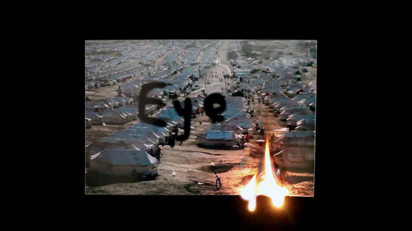
Zbyněk Baladrán (Czech, born 1973). Diderot’s Dream (still). 2014. Two channel HD video. 13 min., 29 sec. Courtesy the artist and Hunt Kastner, Prague. ©2015 Zbyněk Baladrán.
I noticed that in some text panels the photographers were said to “examine” or “interrogate” or “investigate” their subject matter, as if they were detectives on Law and Order. The intensity of such terms seems melodramatic; it suggests that there is always a truth that is secret or hidden to be uncovered. But the worst excesses of these texts ranged from the blithe way in which some attempted an intellectual snow job to the presumptuous way others told you how you are supposed to feel about what you see. Subtitles in Zbynek Baladrán’s video Diderot’s Dream are, we were told, “loosely based on works by Denis Diderot… and Anatoly Lunacharsky, the first education minister of the Soviet Union.” What these intellectual sources have to do with this work’s dreamy stargazing one can’t imagine. Basim Magdy’s aptly titled The Hollow Desire to Populate Imaginary Cities (2014) comprises a grid of photographs shot on film, its mostly monochromatic prints colorized. We are instructed to find “eerie” these “acidic colors and emulsion deterioration.”
Giving people a chunk of text to read beside every piece in an exhibition has been a growing museological trend in recent years. I’m against it. The average, educated, middle-class visitor to a museum is uncertain about how to look at a picture, but he or she does know how to read. So reading the text becomes a substitute for looking at the image. The museumgoer might spend several minutes or more reading, then glance momentarily at the work of art before moving on to the next text panel. Until recently, photography had been fairly exempt from this practice, partly because it was considered by its history and its nature an independent medium more available—less esoteric—than other visual arts media. But no more.
Photography began its elevation in art status with the arrival of postmodernism in the late 20th century. Now digital technology, which has made the use of film almost obsolete, has further both elevated and complicated the role of photography in the visual arts. No one seems more aware of this than MoMA Chief Curator of Photography Quentin Bajac, who arrived at the museum from Paris in 2013. All of his predecessors in that post since the 1930s had been Americans, and when The New York Times correspondent Philip Gefter asked Bajac why he felt he was chosen, he said he thought it was because “someone who is not American, who is not linked or connected to that long history of photography, is more appropriate now.” The long-held view of history he refers to is the Modernist one of photography as a documentary art form; an art form unto itself that was, at MoMA as elsewhere, separate from the history of Modernist painting and sculpture. That outsider-art status is what postmodernism revoked.
But I digress. Back at the exhibition, as I wandered through the other five galleries that eventually brought me around to the first one again, I saw that even the most personal and autobiographical photography must present a public issue in order to be considered museum-worthy now. In the second gallery, the text on David Horvitz’ Mood Disorder (2015) began, “Having taken an image of himself, head in hands, Horvitz uploaded it to the Wikipedia page on mood disorders.” This is a very right-now work because the Internet has given us all an opportunity—indeed, an obligation—to go online and bare our souls to the world. The irony of the piece, presented as an “artist’s book,” is that Horvitz had to print out retrogressively, for the museum display, a hard copy of the Wikipedia page.
The points of view in this exhibition ranged from the introspective one taken by Horovitz to the astronomical one taken by Baladrán. As much as I was put off by the arbitrary obscurity of some imagery in the show, and the curatorial pandering that wall texts paid to visual mash-ups and oblique views, there was one tendency that I found at least interesting, and even perhaps promising, although none of the texts for the exhibition acknowledged it. This was the ambition, in at least a half-dozen instances, to expand the photograph’s existence in two dimensions to a 3D experience.
This latent theme caught my attention because four of the examples were found in the second gallery alone. The most obvious was Marina Pinsky’s Role Model Three (2015) in which, on one of the installation’s two facades, there was a life-size blowup of children looking into what seemed to be a model-train display enclosed in a glass case at a shopping mall. Mounted on the backside of this freestanding installation several feet deep, was a life-size blowup of a young man sitting in a bus-stop kiosk similar in structure to the train display. The bus stop was also backed, inexplicably, by an architectural drawing, in forced perspective, of a classical building. Pinsky, a recent MFA graduate in photography from UCLA, was in effect straining against the limitations of photography’s two-dimensional illusion of three dimensions in an attempt to realize that third dimension.
Then, in the middle of the gallery, was the provocative way in which Edson Chagas presented his Found Not Taken, Luanda (2013). The subjects of his photographs are objects he found on the streets of his hometown in Angola, where they had been thrown away. These photographs were presented as poster-sized reproductions that visitors were encouraged to take home with them, the way he took home the original objects. Although reproduced images stacked on skids is an idea used some years ago by Felix Gonzalez-Torres, Chagas made it his own. The installation and, indeed, the way in which the photographs were being consumed, replicated as a three-dimensional experience what he had done on the streets of Luanda.
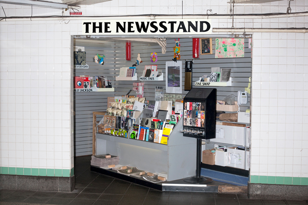
LELE SAVERI (Italian, born 1980) The Newsstand, 2013–2014, Mixed-medium installation Dimensions variable Produced in collaboration with Alldayeveryday. Courtesy the artist
Finally, in this gallery, there was also Lele Saveri’s The Newsstand (2013–14), a full-scale reconstruction of a faux newsstand Severi had had in a Brooklyn subway station during those years. Then, as in the MoMA installation, he stocked it with artworks, records and zines rather than newspapers and the mass-market weeklies or monthlies customarily found on newsstands. I imagine that he was able to get ahold of an actual newsstand for a couple of years because they’re being driven out of business now that everybody can download their New York Times to their iPhone each morning. The whole project made me wonder whether, instead of building a replica of his newsstand, MoMA couldn’t have just printed it out on a 3D printer.
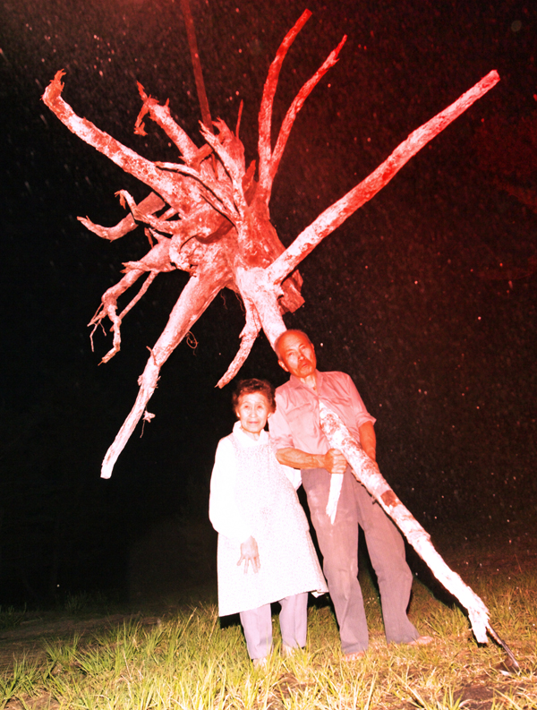
Lieko Shiga, Portrait of Cultivation from the series “Rasen Kaigan,” 2009, chromogenic color print, courtesy the artist, ©2015 Lieko Shiga.
In the next gallery and the one after that were two more installations that used their disposition in space in order to walk you through the subject matter rather than let you view it, passively, on a wall. Lieko Shiga’s “Rasen Kaigen” (2009–12) is composed of 11 large-scale prints realized from a total of 250 exposures Shiga made in a village where she was living when it was hit by the 2011 Tohoku tsunami. The large unframed color prints—done, it appeared, on lightweight metal—were leaning haphazardly against the walls of the gallery, as if they were metal siding ripped off the village houses by the natural disaster. Walking through the installation was intended as an approximation of seeing the damage firsthand. In the next gallery was another installation intended as a walk through a Japanese community, albeit one that has survived intact for four centuries.
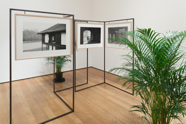
Yuki Kimura, KATSURA, 2012, Nine gelatin silver prints, frames, iron, and plants. Courtesy MoMA NY and Committee on Photography Fund.
This was Yuki Kimura’s Katsura (2012), in which photos of the buildings that comprise this classical Japanese villa were mounted on lightweight stanchions arranged in a kind of labyrinth, approximating how the buildings themselves were situated in relation to one other. This was an interesting idea, though its biggest drawback was in the photographs themselves. They were reprints of ones the artist’s grandfather had made in the 1960s—work that, by the look of it, an amateur photographer had made on vacation. Despite the risk of reverting to that “long history of photography” Bajac wants to leave behind, there’s an important point to consider: this subject was owned by another Japanese photographer, the late Yasuhiro Ishimoto, who, a decade before Kimura’s grandpa, did a study of Katsura that changed the way architecture is viewed in Japan.
Because the spindly stanchions and occasional potted plants meant to evoke the grounds of Katsura made one feel as if this were a product display at a second-rate trade show, the installation seemed appropriate to the work. Whether this was intentional, I can’t say. The wall text urged you to take the installation more seriously. “Through their physical movement,” it said, “viewers can reconstruct the Imperial Villa in their minds, mimicking the paths of… 17th-century emperors.” This, too, was the sort of hype one would find at a trade show. While the curator’s text was unquestionably meant in earnest, I decided in the end to give Kimura the benefit of the doubt. That is, I decided the whole thing was intended as a put-on.
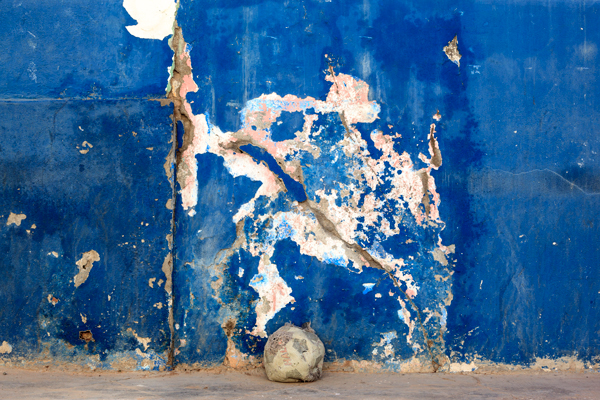
Edson Chagas, from “Found Not Taken, Luanda,” 2013, installation of inkjet prints on pallets, Zeitz Museum of Contemporary Art Africa, courtesy the artist, APALAZZOGALLERY, Brescia, and Stevenson, Cape Town and Johannesburg, ©Edson Chagas
So, let me try to swim ashore in this “Ocean of Images.” At the time of such profound transition in the technology, when possibilities seem limitless, the work itself is bound to seem limited at first, precisely because there are so many ways you can go that you can’t get your bearings. One advantage of film that had to be developed and printed in a darkroom was that it entailed a lot of difficulties and limitations the photographer had to push against. Digital photography, seeming (at least for now) limitless in its possibilities, is for that very reason much more difficult. At first photographers are going to get carried away with a lot of pretentious ideas leading to banal results. We’ll have to wait and see how much of what’s in this year’s “New Photography” at MoMA still looks new and fresh a few years from now.
When John Szarkowski was MoMA’s photography curator from the early ’60s to the early ’90s, the department had a policy that they would look at any work a photographer dropped off for review. So much material came in under the policy that no photographer got a written or verbal response. Because the curators couldn’t respond, Szarkowski always considered it a very unsatisfactory process. But he didn’t discontinue it because that was usually how they discovered new work to put in the then-annual “New Photography” shows. It was a bottom-up procedure by which they depended on the photographers to bring important new work to their attention. Now there is a top-down procedure in which the department pre-selects some photographers from whom to commission work. Does that make this year’s show better than past ones? Not so far as I can see. The exhibition is still a crapshoot. On the other hand, the field is so much bigger, more intense and more ambitious now than it was in Szarkowski’s early years that just looking at what got dropped off might be an entire staff’s full-time job.
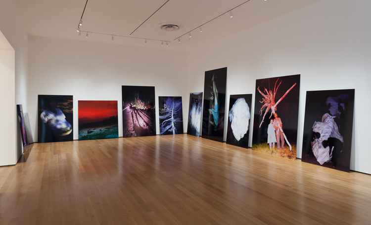
Installation view of Ocean of Images: New Photography 2015. The Museum of Modern Art, New York, November 7, 2015–March 20, 2016. © 2015 The Museum of Modern Art. Photo: Thomas Griesel
Another Bajac policy that is politically—indeed, in every way—correct nonetheless leads to more confusion and seeming fragmentation. I’m talking about the show’s international nature, which makes it more inclusive but also makes it less coherent. Everyone hopes that digital technology will make photography truly the universal language that it has aspired to be since the beginning. But for now, with photographers from so many cultures coming in for international recognition, the effect is polyglot, even cacophonous, at times. We—and Quentin Bajac—will just have to wait and see.


