It’s that time of year again. The clocks have gone back, the streets are strewn with fallen leaves and there is culture, culture everywhere. Not only is the London Film Festival in full swing but there is Frieze Art Fair—with ever more American and Asian galleries making a debut showing—and it’s the Turner Prize season too. Now in its 28th year, this once rather shock-horror affair has become as much a part of the British social calendar as Wimbledon or the Royal Academy Summer Exhibition. Last year, when it decamped to northern climes at the BALTIC gallery in Gateshead, it added a certain frisson for those in need of maps and special travel equipment to leave the comfort of the metropolis. But this year it’s safely back in the hallowed portals of Tate Britain. Four very disparate artists—I was going to say “the good, the bad and the ugly”—but that doesn’t quite work—but you get the point, are up for the prize. Sometimes I wonder if anyone would care if it wasn’t set up like some beauty contest—with all the possibility for tears and gushing Academy-style acceptance speeches. But prevailing PR is that it’s the annual barometer of the newest and the best of British art; though in truth it’s really no more than the five judges’ current fave artists.
It kicks off with Paul Noble, the most obviously traditional of the contenders in that he makes graphite drawings on paper, producing works with the consummate skill of a surreally dystopian, fictional city called “Nobson’s Newtown.” Get it? ‘Knobs On.’ (For my American readers this is a bit of naughty British slang). Though, actually, it refers to the name of a blocky-looking typeface. Each drawing starts with a word at its center, spelling out its subject, which is then woven with a web of eclectic visual narratives. Intricate and scatological, from a distance they look like plans for a renaissance garden or a futuristic science laboratory. But get up closer and they’re full of rubbish bags and curious flora, as well as strange turd-like columns. Excreta seems to be a recurring theme. Noble’s is a futuristic world devoid of human presence so that it gives the appearance of being created by someone with Asperger’s syndrome but with inbuilt references to modernist art, including the sculptures of Henry Moore and the dreamscapes of Giorgio de Chirico.
Two of this year’s contestants are video artists and I found myself much affected and engaged by Luke Fowler’s work, All Divided Selves, 2011, the third in a trilogy of films that explore the ideas and legacy of fellow Glaswegian, the anti-psychiatrist R.D. Laing (1927-89). I’m just about old enough to remember the effect of reading Laing for the first time in books that radically challenged the orthodoxy of psychiatric practice of the day and placed “madness” firmly within the arena of “society.” The matrix of archival material, intercut with clips from his own life, is too long for The Turner Prize to do it justice but evokes this truly revolutionary period with its complex philosophical and, at times, moving discussions that were carried out in smoke-filled rooms by those who might now be considered in need a good wash, a shave and a haircut. Still only 33, Fowler has produced a thoughtful and complex work that maps changing social mores and ideas.
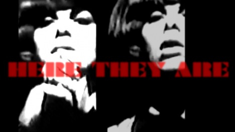
The clever money is on the relatively unknown Elizabeth Price and her 20-minute The Woolworths Choir. Price uses archive film, diagrams and sound to create a work that’s part power-point lecture, part computer game. Using different sources—an Open University film on church architecture, clips of a girl band and some 1970s news footage of a terrible fire, she creates a potent mix. The first part is an illustrated lecture on ecclesiastical architecture of the 13th century. Using black-and-white archival photographs and textbook illustrations to define the shifting meaning of terms such as choir, quire and misericord, she takes us on a virtual tour of a Gothic church. The second half of the film tells the horrific story of how the Woolworths fire started. A stylish and sophisticated work, it plays with the shifting entomology of words, making reference to the Greek chorus which transmutes into the church choir and is cleverly linked to the girl bands. Though highly original, in comparison to Fowler’s baggier and felt work, it feels cooler and more contrived.
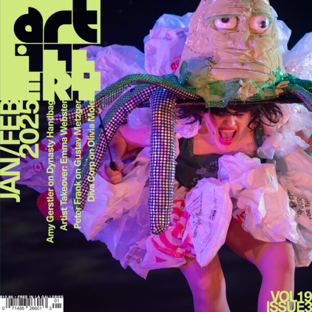
That just leaves Spartacus Chetwynd—and with a name like that who needs to worry about the art? At the private view I just missed her performance and found her cast of characters standing around with smudged face-paint dressed as trees, root vegetables and monsters like lost children after the school nativity play. The worthless performance may have been fun on the night but going back to the gallery on a weekday there’s nothing left except the empty props.


