The subtitle “Works from the Orange County Museum of Art” made it clear that the exhibition on view there January 11 through March 9 was a collection show. But the main title, “California Landscape into Abstraction,” at first seemed an awkward and obscure attempt to tell you what the show was about. Before you were half way through, however, the exhibition’s visualization of its theme had taken over and was making marvelously clear what the title’s verbalization had not.
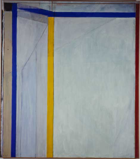
The show began in the museum’s lobby and continued through 10 galleries inside. By the time you got to the fourth one, what remained fuzzy in the title and texts was coming into sharp focus on the walls. In that gallery, for instance, what at first seemed an improbable juxtaposition caught your eye. The image commanding the room was Richard Diebenkorn’s Ocean Park #36, from 1970, a post-abstract expressionist canvas nearly 8 x 7-foot that is among the finest paintings in OCMA’s collection. Painted early in the 18-year period when Diebenkorn had moved from Northern California to Santa Monica, it’s a prime example of the series that gave it its title. The incongruity attracting your attention was that on the adjacent wall was a California seascape—Pale Moonlight, a painting done by Frank Cuprien in 1943 on a piece of masonite the size of a sheet of typing paper—that seemed almost insignificant by comparison to Diebenkorn’s abstract masterpiece.
The exhibition catalog describes Cuprien as a “debatable figure [who] managed to bridge the divide between genuine impressionist impulses and savvy self-marketing.” Even that seems an over-estimation, for by 1943 how genuine could impressionist impulses be? According to exhibition curator Dan Cameron, Laguna Beach, in whose 1920s art scene Cuprien became a leading figure, was “far enough from Los Angeles” to be “a haven for California impressionists.” Cuprien was as far behind the times as Diebenkorn was ahead of them. Still…there was a provocative resonance between the Cuprien and the Diebenkorn. The flickering band of “pale moonlight” in the former’s painting spoke to the vertical strip of hard-edged yellow at the center of latter’s canvas. The wanness of Cuprien’s gesture suggested that it has a remote but real relationship to the bold composition by Diebenkorn, whose view of the Southern California light and landscape outside the window of his Santa Monica studio almost certainly affected his painting, even if not as literally as that view of the sea affected Cuprien’s.
The juxtaposition of Cuprien and Diebenkorn exemplifies the way that the installation of the art kept returning you to OCMA’s home ground in Orange County. The exhibition contextualized art in the collection that is universal in its significance as art that remains, for all that, regional. Another example of the exhibition’s strategy was in the second to last gallery, where an Anthony Hernandez photograph on one wall faced a photograph by Dorothea Lange on the opposite wall, and on the wall connecting those two was an “original sketch” over three-and-a-half-feet long for a public art piece by the late SoCal muralist Terry Schoonhoven.
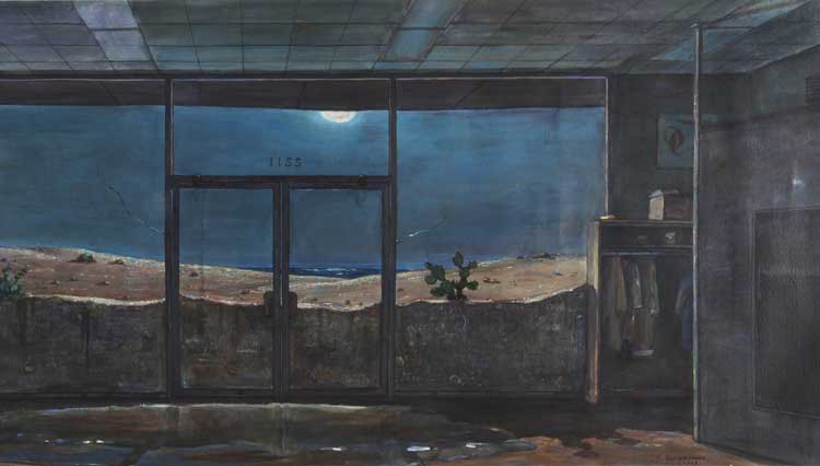
The Schoonhoven work is an example of what the catalog calls his vision “of local nature dramatized within unexpected formats and locations”—in this case, the darkened, seemingly abandoned interior of a bookstore whose plate-glass windows and double doors are silted up by the moonlit desert landscape outside. The Hernandez to the right of this image, Landscapes for the Homeless #24, (2003/04) looks straight down at a patch of desert littered with cigarette butts and other refuse. More than twice the width of the Schoonhoven, this chromogenic color print was framed in a way that divided it in half, as if it were two square images pushed together.
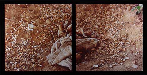
Anthony Hernandez, Landscapes for the Homeless #24, 2003-2004, Collection OCMA, Museum purchase with funds provided through prior gift of Lois Outerbridge
Between the subject matter and the effect of the frame, the Hernandez looked like a blow-up of Schoonhoven’s double doors embedded in sand, and the Lange photograph on the other side, A Very Blue Eagle: Tranquility Vicinity, Fresno County, (1936) also had a formal relationship to the Schoonhoven. A dead eagle strung up on a barbed wire fence, its outstretched wings spread across the frame in a way that resonated with the wavering line of the desert sand piled against Schoonhoven’s plate glass. Though it went farther afield, to Fresno, this run of images sharing a dark mood gave visual life to the hyperbole “Paradise Endangered” that was the title on the gallery’s introductory text panel.
The fact is that the exhibition contained more photography, by far, than work in any other medium, and the photographs were often the visual glue that held the work in a gallery together. The overture to the exhibition in the lobby area culminated in Penelope Umbrico’s sensational Sunset Portraits on Flickr, (2013) which was a grid, in this installation, of around 1,300 snapshots lifted off the Internet. And the exhibition’s finale, in Gallery 10—the gallery after the one in which the Schoonhoven was bracketed by the Hernandez and Lange photographs—was a group of 29 photographs drawn from a single body of work by one photographer, Louis Baltz’s 1974 New Industrial Parks near Irvine, California. This was the series representing Baltz in the 1975 exhibition “New Topographics: Photographs of a Man-Altered Landscape” that shifted attention in landscape photography in general from the earlier Northern California vision of Ansel Adams and Edward Weston (both of whom are also in the OCMA exhibition) to the SoCal landscape in Orange County.
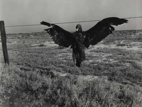
Dorothea Lange, A Very Blue Eagle: Tranquility Vicinity, Fresno County, 1936, Collection OCMA, Museum purchase
The predominance of photography was what first piqued my curiosity about the exhibition, because I was for many years a photography curator and have also served as the director of the California Museum of Photography at UC Riverside. Because photography exhibitions often contain well over 100 works, a curator of that medium feels especially the need to help viewers see how a visual theme can connect one image to another, in order keep the visitor to the exhibition from being overwhelmed by the sheer mass of material.
This is a knack that Cameron, faced with a checklist of more than 120 objects by 89 artists, applied across all the media in his installation, including and especially the photography. The approach served him well, giving an important collection that’s hard to sum up in verbal terms the kind of visual coherence that is what an effective exhibition always needs anyway. By the time you emerged from the exhibition, you did understand how the landscape art of earlier generations fed into the abstract art of a later one. The exhibition achieved this by being autochthonous, grounding the exhibition in the collection from which it came, and in its sense of the place where the collection resides.

