


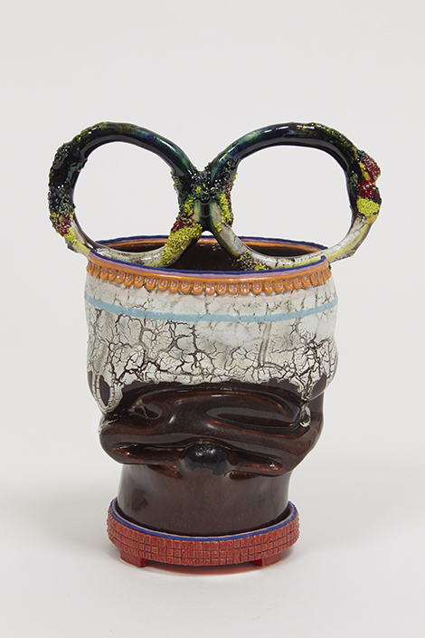
Looking like contorted urns collapsing inward or twisting outward, the 16 new cup-sized works that comprise “The Weight of Color,” Kathy Butterly’s fifth show with Shoshana Wayne Gallery, demonstrate her strength as an innovator. Working within the confines of a long and established historical convention, Butterly’s evocative ceramic sculptures aren’t only imaginative and refreshing, but they also invite viewers to pause and contemplate the impact that each work’s disparate entities have upon one another.
Each sculpture contains a sequence of contradictions. Vitreous glazes morph into crackled surfaces while exacting details embellish unintentional bends. Despite these bold contrasts, each piece is grounded by an unexpected congruity. Exemplary of this is Middleclassiness (all works 2015). The sculpture gives the impression of two teapots awkwardly fused by some catastrophe. Divided by a green cincture, the bottom half’s smooth and bulbous shape creates a clear contrast to the top half’s warped and crumpled walls. These contrasts, however, are only the obvious ones. A walk around the work reveals more mysterious constituents that include pearl-like strings, delicate thin ribbons, and amorphously knobby appendages, all of which uncannily converge into a prevailing sense of harmony.
While Butterly’s ceramics bring to mind George Ohr’s crumpled pots, they still stand in a league all their own. This is partially due to Butterly’s aptitude for imbuing a sense of urgency into her work that often stands in opposition and is unique to the self. These opposing attributes are perhaps most evident in Koolaide. Like a crumpled soda can, the predominately white piece bends into its midpoint, creating a dark crevice that extends the width of its diameter. This distortion is emphasized further by a red and orange encircling outline, suggestive of a mouth stained with lipstick. The allusion here to femininity is clear yet at the same time is countered by two white rippled ribbons, protruding outward along the outline’s upper edge like hungry, gnashing teeth.
Kathy Butterly, Flat World, 2014,
courtesy Shoshana Wayne Gallery.
Equally intriguing is Butterly’s use of color as a conduit for both tension and unity.
In Feeding Venus, for example, a crackled blue glaze disrupts the fluidity of the sculpture’s smooth white surface while delicate yellow details placate any semblance of imbalance. Similarly, in Flat World, a messily-applied white glaze runs out and over an impeccable brown body while crude and intricate details painted pink, blue and violet allow for an unwieldy yet compatible coexistence.
Every one of Butterly’s meticulously worked ceramics is the result of a series of reactions, a process during which Butterly yields to her materials for guidance. Her ability, however, to successfully mingle formalism with elements of abstraction and figuration is what gives her work a true innovative edge. By inventively integrating content, shape and color to emit a distorted yet harmonious sense of balance, Butterly not only disproves the notion that ceramics is no more than a craft but also demonstrates that it can be just as intriguing as any other fine art form if not more so.
