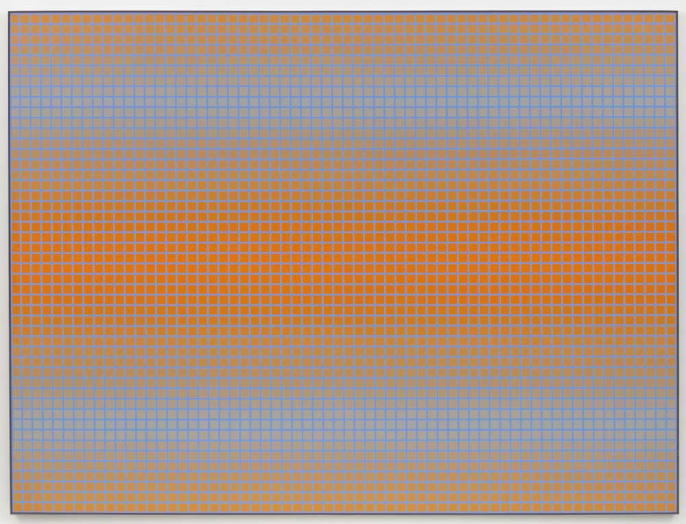
I had some idea of what to expect when I walked into the Julian Stanczak show at the Diane Rosenstein Gallery a couple Saturdays ago (this is the artist’s fourth exhibition with the gallery). Almost from the outset of his career, Stanczak was identified with the ‘Op Art’ movement that began to evolve long before the 1960s and is most closely associated with Victor Vasarely, especially the graphic work produced by his studio during the 1970s. But Stanczak, whose work was never as formulaic as Vasarely’s (nor, strictly speaking, formulaic at all) and far more chromatically subtle than Vasarely or any of his imitators, had a very different foundation—shaped and influenced far more by the theory and color and geometric studies of his one-time teacher, Josef Albers (with whom he studied at Yale). It was clear very early on in his career that his preoccupations were with light, movement and chromatic modulation. Graphic elements are very much put to the service of the chromatic dimension.
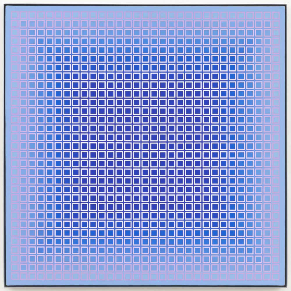
Julian Stanczak, Brisk, 1980, Acrylic on canvas, 32 x 32 inches (Courtesy Diane Rosenstein Gallery, Photo by Robert Wedemeyer)
It is not work I ordinarily gravitate towards; but I am hardly indifferent to its pleasures. The title of the show is The Light Inside, which pretty much sums up what I found there. The exhibition singles out series of paintings (almost all acrylic on canvas), made between 1972 and 1987, as particularly resonant with the California-centered Light and Space movement. It’s hard to draw specific parallels, but they definitely concern the play of light over space. I was struck by a reference in the press release that the artist considered these op-minimalist mappings “emotional landscapes that express[ed] his desire to transcend the surface containment of the painting as object….”—one irony being that they are supremely self-contained art objects. But they are also a kind of landscape.
Not unlike a few billion other fellow earth-bound humans, I am gripped by wanderlust in the aftermath of a pandemic that has ground on for more than two years. The Huntington tapped into this in their fascinating exhibition on the blurred lines between geographically factual and fictional cartographies in literature and narrative art (Mapping Fiction). Stanczak’s work is a mapping, but also a modeling or contouring of pure line and color—gradients plotted graphically along the lines of a modular or cellular grid in which both grid line and modular interior and exterior squares (and/or, in at least one instance, inscribed circle) elements are subtly modulated across the rectangular field. Through these two decades of work Stanczak studies and plays with the way pigments (mostly acrylic) absorb light, returning it to the viewer’s eye and shifting or projecting that viewpoint by graphic device across the picture plane, gently ambiguating the sensation of how the space is shaped—whether by line and color or simply the viewer’s perception of these effects.
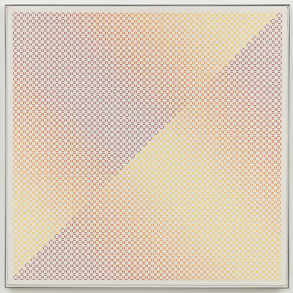
Julian Stanczak, Centered Duality, Pale, 1981-82, Acrylic on canvas, 30 x 30 inches (Courtesy Diane Rosenstein Gallery, Photo by Robert Wedemeyer)
The variations are expansive and almost infinite, in part because Stanczak’s color—always adventurous—is nevertheless slightly counter-intuitive, always catching the viewer slightly off-guard—‘my color, or your way of looking at it?—you figure it out.’ He’s not reticent about deepening or brightening the color or tamping it down. In most of these paintings, the gradient palettes veer into ‘gray areas’ (literally in at least one instance) that roll the picture plane ‘away’ from us or seem to all but disappear. The flip side of shimmer turns out to be a kind of ‘ghosting’. But there’s a topological aspect to it—plotting a ‘recessive’ space to hold a pool of light and color, or a convexity, off of which it seems to float and evanesce. Or he will play with several effects simultaneously, seemingly folding the space back and forth and channeling the light and color along folds or transversals of variable definition. These effects are accomplished brilliantly in Centered Duality Pale (1981-82), which has a quasi-lenticular effect in which the gradient aspect is achieved not so much by color fields (the dominant color is white), but the suppressed vertices of the square ‘modules’, which give the effect of gradient double bonds in purple, red, orange and yellow.
He is not beyond playing with the conventions of landscape itself, floating ‘mirroring’ ‘horizon’ lines, as if to register the effect of plotted color (blue) fields floating in parallel zones, separated by a warmer (orange, red) field that itself appears to alternately rise and fall in the picture’s mid-section (Mirroring Blue, 1973). Obviously he’s testing the definition of edge—also expressed as membrane, border, division, frame. (Stanczak’s work stands some distance from Albers, yet Albers’ tutelage clearly stood him in good stead.)
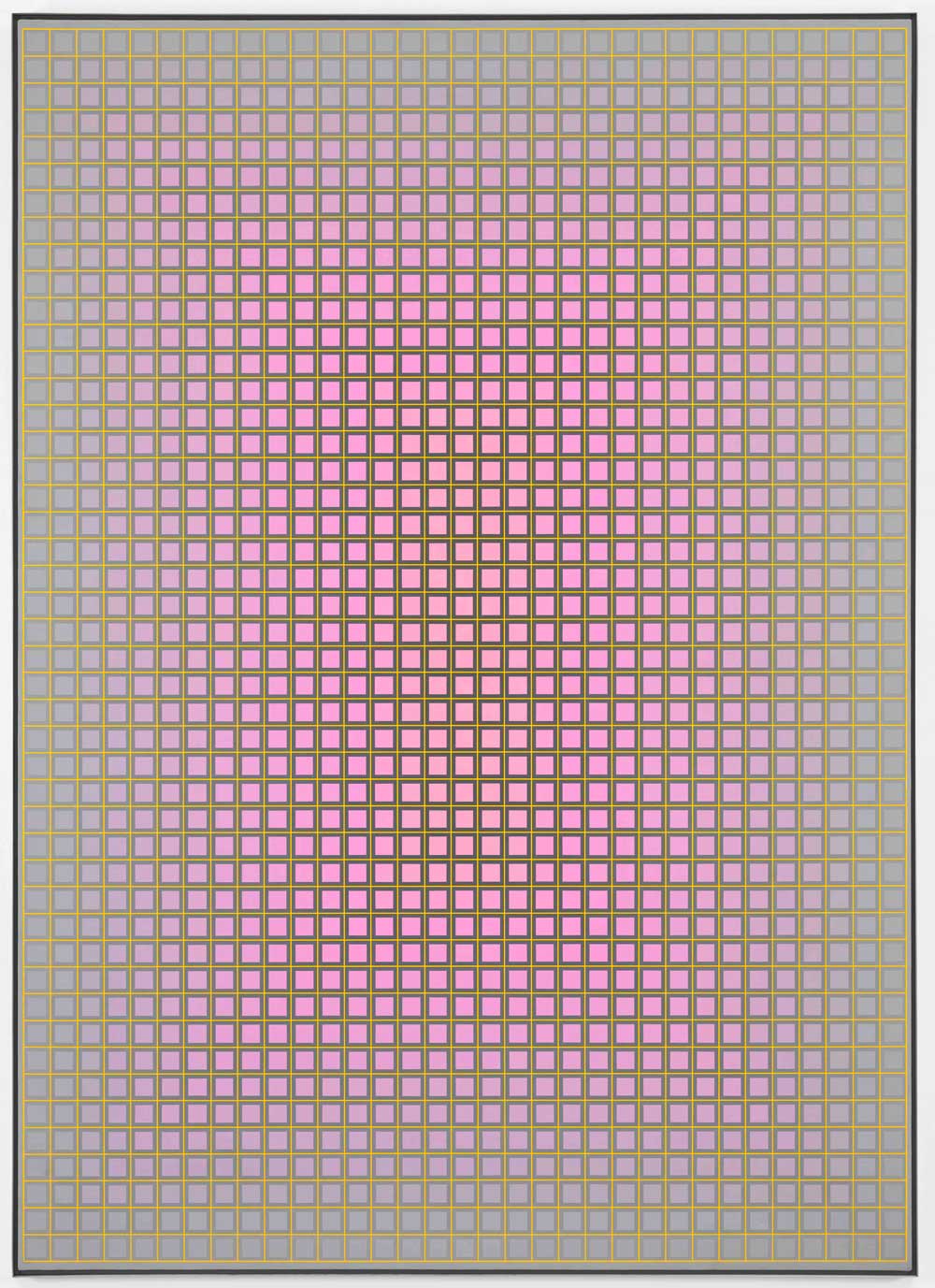
Julian Stanczak, Glow, 1973, Acrylic on canvas, 70 x 50 inches (Courtesy Diane Rosenstein Gallery, Photo by Robert Wedemeyer)
Then, too, several of the paintings test out all these ideas simultaneously: the frame or border, the ‘float’ or ‘sink’ (recession or depression—as I would have been inclined to put it the particular day I visited the gallery); mirroring or reversing; folding, rolling, or ‘ghosting’ (‘emotional’ landscapes, indeed). What refuses to be ‘contained’ here is the color and light. Stanczak’s gift for the graphic gradient is matchless. The pink and blue modulations have an astonishing clarity that is Stanczak’s alone. (They live up to their titles, too: e.g., Aqueous (1975)—with its distinct ‘framing’ and sunken center; Pluvial (1974)—with its cloud-pale central mesa; or Late Swell (1983)—‘pallor’ here conveying something closer to ‘power’. Or as to the pinks, a deceptively simple title for a marvel of, well, Glow (1976), with its hyacinth pink emerging, exhaling, at the center of its verdigris (or verdi-greiged) bordered space.)
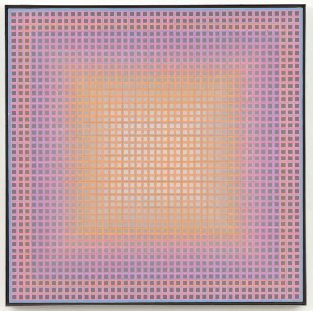
Julian Stanczak, Soft, 1981, Acrylic on canvas, 28 x 28 inches (Courtesy Diane Rosenstein Gallery, Photo by Robert Wedemeyer)
There’s a vibratile quality to every one of the canvases that is difficult to capture in a photograph. They’re reactive with the light of the room—and presumably any space in which they’re exhibited. (Wondering now how the metaverse will replicate such effects even in 3-D virtual simulations.) The Light ‘Inside’ doesn’t necessarily stay ‘inside’ or ‘within’. That sense of color ‘respiration’ is probably, not unlike the visual effects, attributable to the viewer alone—but no less remarkable for it. In other words, it’s the kind of show that doesn’t just play with a viewer’s visual perception, but her respiration.
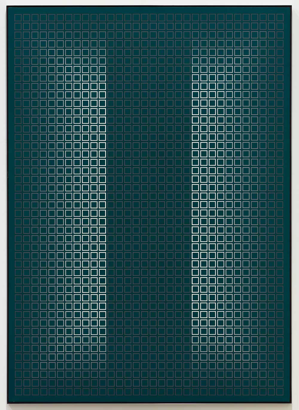
Julian Stanczak, Vertical, 1973, Acrylic on canvas, 70 x 53 inches (Courtesy Diane Rosenstein Gallery, Photo by Robert Wedemeyer)
In an attention economy on overdrive, the physical world, magnified by its mediated transmissions and the virtual dimensions of the digitally constructed world as well as the imagination itself, constantly pushes us to the limits of our perceptual capacities; also our psychological capacities. It’s not always easy to ‘refresh the screen’ when the screen is a kind of black mirror. Still we’re always looking for other ways to look, to see; sometimes for other places, whether in the physical world or the imagination (one’s own or someone else’s)—or just a notional way to get to them. Or simply a different light over a different kind of horizon. There’s no such thing as a ‘safe place’; but sometimes a fresh horizon is enough.
Julian Stanczak: The Light Inside runs through April 2, 2022 at the Diane Rosenstein Gallery, 831 N. Highland Ave., Los Angeles, CA 90038.

