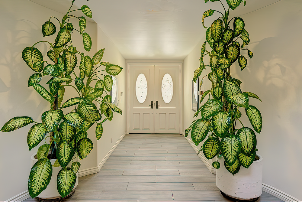
During the early months of the pandemic, Judy Fiskin needed a new way of working in which she did not have to leave the security of her home. Fiskin happened upon a real estate website with interior images of houses for sale and realized “I had thousands of photos of rooms, furniture and decor at my disposal.” Rather than photograph architecture and her surroundings, as she had done in the past in many of her earlier photographic series, and more recently her video work, she drew from the vast array of images presented on real estate websites, changing what she found to suit her needs.
Studying these websites begged a number of questions: How are homes for sale presented? What draws people to certain types of interior views rather than others? What would the ideal home look like? Are real estate agents trying to present spaces that follow trends and appeal to the differing tastes of their clients?
In Fiskin’s re-decorations, things are a bit off. Each of the 16, untitled, modest-sized digital prints presents a different interior—be it a bathroom, den, wine cellar, TV room or attic, or even an exterior space like a building’s facade or a view from the deck. As Fiskin’s photoshopping is seamless, it is impossible to know what was in the original and what she added or took away. In one image depicting a bathroom/laundry room shot with a wide-angle lens, the walls are covered floor to ceiling with a blue-toned, mountainous Asian landscape that contrasts with the gray-and-white geometric pattern of the parquet floor. The one window at the back of the room frames a few trees separating this home from the next. Lined up against one wall is a bathroom sink with ornate faucets, a small blue-tiled bath, as well as a washer and a dryer. Two vintage light fixtures emitting a warm glow hang from the ceiling. Easy to overlook, but key to the image are the arm and head of what appears to be a teddy bear seated in the bath, inserting a quasi-human element into the scene.
A Google search for “pink flamingos” returns rolls of wallpaper available at Home Depot (Horace Pink Flamingos) indicating that the bathroom covered with this pattern and depicted in another of Fiskin’s bathroom images is more generic than unique. The suite of photographs ranges from cluttered and ornately decorated rooms to those that are eerily sparse, as in Fiskin’s photograph of an empty room with deep green painted walls, a subtle white cottage-cheese ceiling and badly vacuumed beige carpet. Green, brown, beige and white translucent drapes cover a window with horizontal blinds. In the corner, just to the side of the window, is a television set on a modern stand that predates todays’ flatscreens. This room is more off-putting than welcoming.
Hot tubs might be a selling point for many home buyers, but one tucked into the corner of a low-ceilinged room without a view (the only window in the space is frosted over) is not particularly desirable. A similar feeling of claustrophobia occurs in Fiskin’s photograph of an empty attic with a golden aura that comes from yellow walls and gold-toned drapes that extend from floor to ceiling to cover a distant window. The only other object in the room is a ceiling fan trimmed in gold.
Many years ago, there was a billboard on the freeway as you approached Valencia (where CalArts is located and Fiskin still teaches) that proclaimed “If you lived here you’d be home now.” It was an advertisement for a new community that was being developed on the outskirts of Los Angeles to lure those fed up with city life. The places depicted in Fiskin’s images are more dystopic than utopian: they are displays of bad taste masked as good taste and a seller’s idea of what might be appealing to generic audiences. While the pandemic redefined isolation, it is interestingly counterintuitive that Fiskin chose to composite images that reinforced that notion, rather than explore more desirable fantasies.


