


")
We recognize the legacy Jacqueline Humphries is working from the moment we set foot in Matthew Marks’ two gallery spaces; yet something throws the viewer slightly off. It’s the echt gestural vocabulary of post-World War II art, but as if viewed through a scrim or screen, which in more than one sense it actually is—a highly processed, thoroughly post-modern actuality, in which the processing itself breaks down with pigments dissolving, disappearing, reappearing through, or floating above an interwoven mesh of screens, coding, and emoticons.
The residuum of Humphries’ gravitation towards certain well-defined styles and gestures is fairly manifest—e.g., mid-1950s Philip Guston, Clyfford Still, or color field painters like Helen Frankenthaler. But Humphries resisted the figurative direction of so many of her neo-Expressionist peers to meet the screen(ed) world of the media-saturated Pictures Generation head-on. Four decades later, her interrogation is even more foundational, almost ontological: not simply the perception, projection, or reflection—the materials of her art—but messaging, meaning, and interpretation; the ambiguity of figure and (always shifting) ground; and what one view tells us about the next.
Screens complicate the traditional picture plane; and Humphries throws the viewer through a screen (or screens) very darkly from the onset. JH456 (all paintings 2024) floats a volcanic storm of black cinders over Still-esque pours and drips of crimson and anthracite against a fine mesh that itself shadows chalky blue ‘shadow’ pours or underpainting. And as for the pours—are they actually? Or just more stencils? The artist’s title/signature initials in the upper-left quadrant just barely gives that away. Gravity will have its way in this ambiguous domain of the pre-determined and free-floating. (Or will it? Humphries might conceivably rotate the linen panel to further confuse or ‘cross-examine’ figure or ground or both.)
Jacqueline Humphries, JH123, 2024. Photo: Ronald Amstutz. © Jacqueline Humphries. Courtesy of Matthew Marks Gallery, Los Angeles.
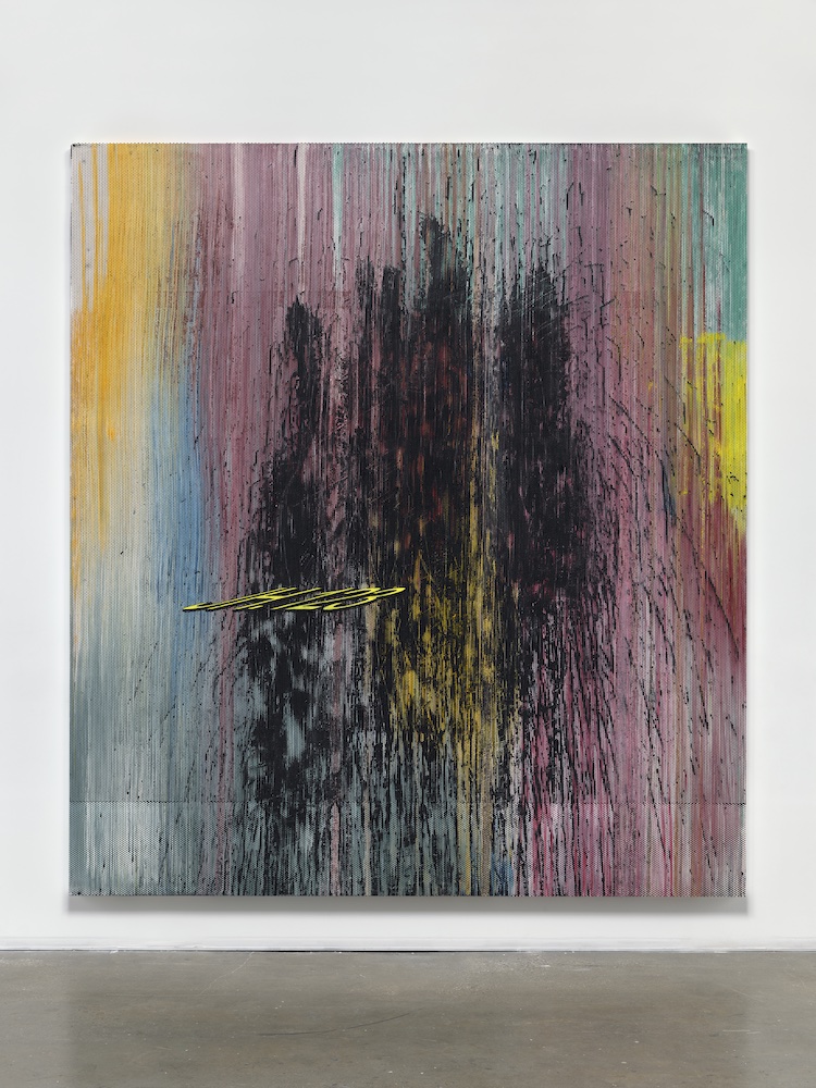
The largest of the paintings, JH123 (127×114 in.) gives us a waterfall of slightly pallid rainbow pours in amber yellows, pale blues, and pinks, from the center of which looms a cluster of black hulking, almost exploding fountain of pours—conceivably as stenciled as other parts of the painting. But pulling back from the painting dead center, we register horizontals parallel to the upper and lower edges; and we’re suddenly made aware of another layer of painting/stenciling that could make something else of this entirely. It’s impossible to say whether Humphries played with a Johns style array of block letters or numerals (or if such effects were stenciled on and immediately washed over); but it was hard not to be reminded of those classic fluorescent half-tone Colby Co. posters that once blanketed southern California, advertising everything from rock concerts and prizefights to business liquidations and the 2012 Hammer Museum Made In L.A. biennial. Here (as elsewhere), Humphries floats a quasi-anamorphic stencil of her initials and assigned number for the work (or series of works), as if to assert both authorship and a certain detachment from these ambiguous and slightly volatile conundrums.
Amid these first few paintings, we start to reconsider relative definition and uncertainty as it enters into the moment of conception and execution; that everything is mediated between image and object on either side of lens and retina. That uncertainty (and some drama) is at play in “Crimson Shatter”✨, which bears some resemblance to JH456, but on a slightly larger scale (111×100 in.), magnifying its impact. Their similarity alone throws the determination of pours/drips and stencils (as well as underpainting) into question—the three larger stenciled pours of JH456 here reduced to a kind of rent in the ‘fabric’ (that ‘bleeds’ black), and even the ‘sparkle’ emojis screened mostly in black and sinking into the underlying screen mesh. Between this vivid crimson—slightly brighter than actual blood—and that coal black of JH456, it’s hard to resist a mental leap to associations with disaster. Paler, cooler underpainting, whether pink, blue or grey, only seems to magnify the violence.
Our culture has evolved a fascination with encoding clearly shared by the artist. But Humphries also seems conscious of the dubious filtration of screens, a kind of passive suppression such media ‘shorthand’ can willfully or inadvertently promote. The pours (conceivably accompanied by other applications, whether by stencil, brush or both)—mostly in deep red—are almost entirely obliterated beneath a larger black mass in JH123✨, except for a cloudy cluster of red that drips to the edge of the panel; and suppression seems to be half the point; also fracturing.
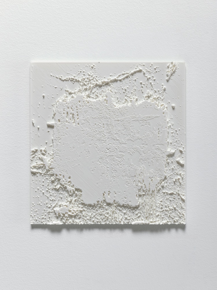
A 3-D printed panel in white enamel on PLA (a kind of biomass plastic), Untitled (2025) recapitulates (at about 10 percent scale) the screen/pour/drip imprint of JH123✨, with the clear difference that the sparkle emoji screen printing—deeply embedded, though almost ghosted (grey)—in the painting, scarcely appears in the panel. It made for a coolly analytic bridge between the slightly violent chromatic drama that seemed to scream off several of the linen panels preceding it, and the latent violence that wafted off of Humphries’ series of aquatint etchings of Paul Schrader’s scenographic outlines (all handwritten by the director in blue and red ink on yellow legal pads)—clearly an hommage to the director/writer. (Humphries is an admirer of the filmmaker—apparently not just for his films, but also his insight into classic noir cinema.) Mishima and the iconic Raging Bull to one side, the range of Schrader’s film work is riveting.
Jacqueline Humphries, Untitled, 2025. Photo: Ronald Amstutz. © Jacqueline Humphries. Courtesy of Matthew Marks Gallery, Los Angeles.
After the drama in the main gallery, the works in the galleries facing Santa Monica Boulevard seemed almost coolly elegiac. An all-over stenciling of large green dots that seemed to uncannily cluster like grapes over dripping black puddles and pours in a smaller Untitled were a nod to Roy Lichtenstein’s Benday dots and his own comic-book graphic send-ups of AbEx heroic gestural brushstrokes—these, including equally organic-looking splotchy white overpainted drops in the upper section, decidedly less heroic and almost deliberately pathetic.
One of the most striking paintings in the entire show) was a second JH123✨, in which the sparkle stenciling takes on an exceptionally ironic cast. That suppressed sparkle quietly underscores Humphries’ re-cast definition of the work—articulating form and processing into a far more complex statement. The tumbleweed mass of black pigment of the first painting is rotated slightly off center here, with new bits of underpainting and drips or ‘spray’ exposed (although the lower edge is strikingly similar). Beyond rotating the stencil(s), additional screens, stencils or under- or overpainting shadow the upper-left portion of the off-center mass, almost bleaching away its right section—placing this ‘absent’ mass at its rose-pink scrimmed center.
This latest body of Humphries’ work comes at the viewer with an almost existential directness and estrangement. Without sinking into the quicksand of over-interpretation, disaster seems to float towards us amid these ambiguous archipelagoes of form and re-cast, re-framed, re-screened gesture. But the work also moves the viewer towards a reconsideration of the ‘ground’—or the void beyond the ground. Humphries meets her viewer in a familiarly skeptical terrain, where fear or dread are less significant than the disintegrated actuality—the flip side of the ‘sparkle’, if you will, which is an infinitely twilit absence.
Jacqueline Humphries
Matthew Marks
1062 N. Orange Grove
Los Angeles, CA 90046
February 20 – April 5, 2025
