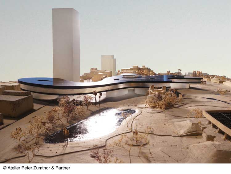
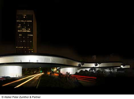
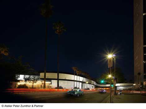
From the beginning, the plans for the new Los Angeles County Museum of Art building have been a private collaboration between Director Michael Govan and the Swiss architect Peter Zumthor. This latest chapter in the quest for a new building for the county museum began at a preview I attended in the LACMA auditorium for the exhibition The Presence of the Past on June 3, 2013. More than a preview, it was a show of its own for a project that had advanced without public review, all the way to finalizing the mass, the shape and the exterior circulation of an apparently unconventional new building.
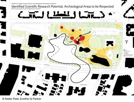
The press event unfolded smoothly. Govan, sharp and charismatic, with Zumthor dressed down as a frumpy architect-sage, made a team show of replacing three existing mismatched buildings with a sweeping gesture—an immense, flat, low-slung amorphous form that rejected the conventional central entrance in favor of multiple points of access from underneath: and from the inside, along a wavy perimeter promenade. Govan wanted a horizontal one-story building—Los Angeles is nothing if not horizontal—with transparency from the new LACMA grounds that would become a park with a museum suspended above it on glass drums. The museum is to be contained within a smoothly undulating perimeter, its shape suggesting the timeless tar pit next door. It seemed to have a lot going for it—until they showed the floor plan.
When it finally appeared, the plan showed a massive grid of square-ish rooms with no relationship to the flowing sense of circulation outside the building or to the interesting promenade around the perimeter. There was an odd sense of conspicuous omission, as though the presentation had been all about selling the shape, relegating the galleries to an incidental, minor problem to resolve later. The spaces for the art would be a field of boxes as vast as the museum itself, all about the same height and all similar in size. Zumthor said, with some pride, that “all of the partitions would be concrete.” During questions following the presentation, I waited to see if someone would say something. No one said a word.
On the eve of the press preview, Los Angeles Times critic Christopher Hawthorne gave a favorable review of the building. A month later he issued a revision, observing that the plan for the galleries was unclear, and the design needed updating, as it “relied for much of its visual power on an exaggerated pancake-like flatness.”
On July 18 in the Los Angeles Times Book Review, the seasoned international architecture critic Joseph Giovannini placed the flat pancake design with its uniform interior boxes front and center to the problem of the proposed building and its hermetic architect. He elaborated eloquently and at length, asserting that Frank Gehry—one of our own with roots in the Los Angeles Light and Space movement with a brilliant record for designing museums—would be a more appropriate choice of designer for a major museum in LA than a Swiss sage from the Alps immersed in the austerity of the box.
Think about this for a minute: We are talking about 800,000 square-feet of space with a vast array of galleries sharing a uniform ceiling height, with natural light available only from skylights. Whatever finesse finally goes into the concrete walls squeezed between the flat solar roof and the flat floor, nothing will save it from the monotony you will encounter inside the building where the undulating glass perimeter and notions of tar pit romance lie maybe 50 yards away from behind dozens of obdurate concrete partitions. You will be alone with the art in concrete cells, hoping to find your way out before you starve.
And what about the art? A flat building with a single floor of boxes promises little in the way of addressing variations in scale, content or point of view in an exhibition. No matter what kind of art it is, viewers will see it from the same plane, the same eye-level point of view, and the same enclosure with the same flat ceilings or skylights. Curators will be confined to this prescription no matter what the content or size of the objects suggest. The potential for allowing work to expand and breathe in concert with changes in the height, shape or flow of the space, its natural light or the rise and fall of its floors, will be lost. Using the simplest possible example of Gehry’s work: the pleasures of height, inclined floor plane, and variation in viewing experience offered by the Geffen Contemporary, illustrate my point.
At the heart of what is missing here is consideration for the potential in the Z-axis—the vertical dimension in a 3D diagram. Conceptually, the Z-axis suggests more than the height of the walls; it contains within it many potential iterations of height and plane including the fracturing, tilting and extension of the floor or datum line, the ceilings, the typically upright square walls—as well as a challenge to any social, political or aesthetic convention the box might represent. All these permutations are expressed as the oblique function, explored with exquisite imagination and persistence for over 50 years by the undaunted pioneering French architect Claude Parent. (I speak not from architectural training, but from lengthy conversations with Parent and exposure to his ideas through family ties).
This theory has been abundantly actualized in contemporary architecture with digital workflow and software-enabled custom part-making. The talking points of Govan and Zumthor—a continuous promenade for circulation, horizontal massing and exterior transparency—can be accomplished with a stellar array of interesting alternatives to a grid of cells trapped between the two flat planes of a curvy pancake. Ramps, helixes, mezzanines, split levels, as well as variations in height, point of view and light transmission are all possible, with a payoff for the exterior of structural and aesthetic congruency with the interior, a quality that is conspicuously absent in Zumthor’s design.
The interior plan has been called a “rat’s nest.” Whether it is that, or beautifully austere boxes may depend on whom you ask. But there is little doubt that this building, with its omission of a significant helping of contemporary architectural possibility lacks the excitement and risky beauty we hope to see in a new major museum on Wilshire Boulevard. It’s not too late to change that, but it would require changes so substantial that the only change practicable would be to begin again with another architect.

