


As regular visitors to awol are familiar with by now, I tend to veer off the track a bit, linger a bit too long over this curiosity or that novelty (hopefully without pushing you all into a full-blown meditation – I assume you have your own facilitators for that), or alternatively, come at you fast and furiously with something that just exploded on the scene – meaning right in front of me.
Every once in a while, though, I have no choice but to go straight to the main event. (It helps when it is a ‘main event.’ E.g., the L.A. Philharmonic Così easily satisfied these criteria.) A bit of focus and urgency are warranted when the constraints of time and logistics are pressing.
So get out your calendars and agendas (or tablets) and start setting aside a few dates – beginning with this week-end. Aside from the fact that two of these items are ‘last-chance’ alerts, between fairs, festivals, beach trips, vacation plans, family concerns, you know you’re going to run short of time, so start penciling in the dates now. I know the 2014 edition of Made in L.A. is coming up at the Hammer next week, and the line-up is very promising; but there will be time enough to preview its best work in the next few weeks. Right now, here’s what can’t wait:
Last Chance
If you haven’t already seen Caught Looking at the Armory Center for the Arts in Pasadena, you have exactly three days to do so. The show of five Los Angeles-based artists, all women – painters all, but with a very open, playful and adventurous approach to medium and materials – was curated by the Armory’s chief curator, Irene Tsatsos, inspired by, among other things, the cultural-political circumstances that shaped the Armory’s founding and its evolving role in the community, and more specifically referencing a quasi-classic feminist text, Caught Looking, a collection of essays on feminism, pornography and censorship in the post-second wave feminist dialectic. The original Caught Looking addressed issues surrounding, among other things, the ‘objectifying gaze’ – sexual objectification, exploitation, aggression, violation and violence, misogyny; and the reflexive impulses and rationales for censure and outright censorship. The essays vigorously countered these reflexive and reactionary tendencies and their implicit surrender to an inherently patriarchal and repressive legal construct.
Each of the artists – Simone Gad, Tracy Nakayama, Ruby Neri, Lauralee Pope, and Mary Weatherford – take up the notion of the ‘objectifying gaze’ in both the social/sexual/erotic and a much larger sensual, conceptual and philosophical sense. Each of the artists in her own way up-ends the terms of the ‘look’; sustains the furtive glance into a longer, more deliberative consideration; socializes and contextualizes the furtive, the fetishized or exploitive into something discursive, contingent, mindful, and exploratory.
Speaking of the ‘look,’ I realize I haven’t given you the slightest visual sense of the works on view. You’re just going to have to trust me. It’s a very broad range; and there are a few other things I need to jump to. Just GO – and watch out for the Pasadena parking Nazis.
The Land Where the Good Paintings Go
That would be, believe it or not, the Resnick Pavilion at LACMA, where Timothy O. Benson has curated (or co-curated? – a slightly different iteration of the show debuted at the Kunsthaus Zürich) one of the most spectacular shows of painting (and drawing and graphic work on paper) this museum has ever seen. Expressionism in Germany and France: From Van Gogh to Kandinsky, which explores the nexae between French Post-Impressionism and German Expressionism, and their immediate offshoot movements (the Fauves, the Brücke and Blaue Reiter), promises to be the must-see show of the summer. If I seem to give undue notice to the painting, the fault (if that’s the word for it) lies with the painting itself – its sheer, gorgeously vibratile light and color – its vibratility set off still further by walls painted sapphire blue within painted black ‘faux-boiserie’/‘shadows.’ (The installation is by David Ross of Frederick Fisher and Partners.) 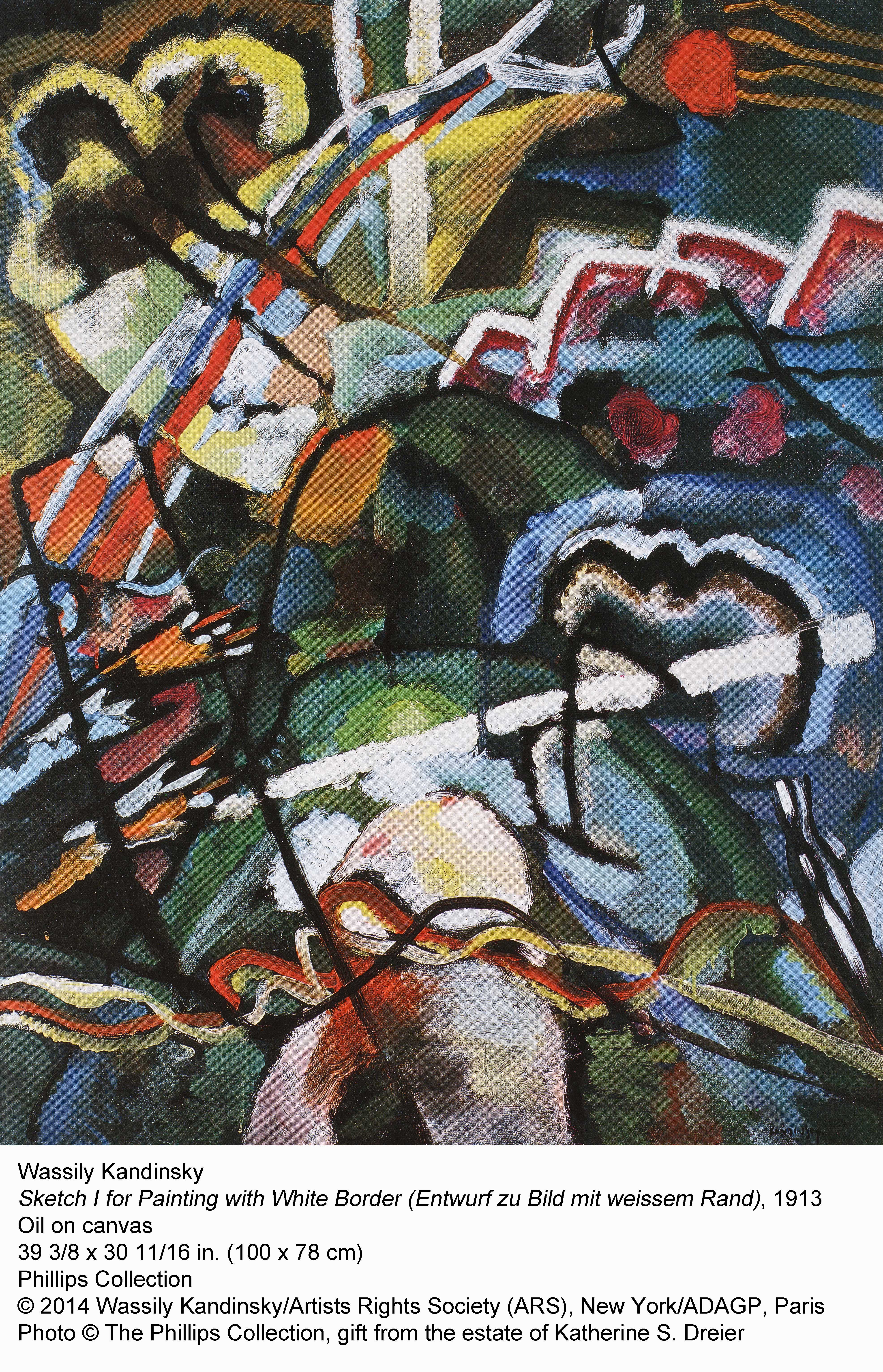
It’s hard not to become a bit jaded by historical survey shows at any level. I mean, how many is the average art viewer exposed to over, say 20 years? (To say nothing of an arts (primarily) journalist of more than 30?) Although there have been a number of shows at various major museums over the years distinguished by their historical or theoretical rigor and clarity, most of the very best share one characteristic: the quality and uniqueness of the work on view. All too often I’ve walked through shows that featured between, say, one and four first-rate pieces practically lost among second-rate and mediocre examples. That is unacceptable.
The work on view here is a mix of somewhat familiar and vividly fresh, if not completely unknown, masterpieces drawn from some of the best museums and private collections all over the world with that one thing in common. They’re all of the very highest caliber, the absolute best. By the time I got through the show Wednesday morning, I practically had to pick my jaw up off the floor. It’s almost staggering to think how Benson and his staff pulled off this curatorial feat. I have never seen a show of this consistency of quality at LACMA. (And rarely for that matter, even at the Met.) It’s as if the Frick dropped an entire wing into the Resnick’s west galleries.
The Feral Boy of Summer
 As if that weren’t enough (and speaking of the ‘objectifying gaze’), the most feral of the Ferus bunch, John Altoon, is being given his first (believe it or not) retrospective in his hometown. Those of us who have known Altoon’s work for most of our lives (and wonder what took so long) are already familiar with his virtuoso draughtsmanship; but his range as a painter and stylistic breadth are also astonishing. The variability and richness of his color palette surprise anew for those of us who haven’t seen his painting in some time. Ab-Ex influences filter beautifully through his California sunlit lens – from Ocean Park cool to richly mineral or jewel-tone. The musicality with which he moves between richly harmonic color fields to white, neutral or airbrush/patterned space for his choreography of graphic imagery and biomorphic abstraction could be compared to jazz. There’s a marvelous synthesis of influences: the coloristic affinities he shares with Gorky, Guston and possibly Sam Francis; De Kooning’s figurative abstraction; the jagged, enervated graphic line that, however filtered through such disparate sources as Steig, Picabia, Giacometti and commercial illustrators, is his alone; the choreography of biomorphic abstract forms that owes something to Tanguy (and possibly Miro) – all filtered through the California commercial environment – but which, again, he makes entirely his alone (and as such has clearly influenced successive generations).
It’s really quite breathtaking and I must urge you to see it again and again, after which you should head to Amoeba, pick out some Charlie Parker, Freddie Hubbard, and Frank Zappa/Mothers discs and go home to drench yourself in the music. I have a few minor issues with the installation – if there’s one artist who doesn’t need any ‘pull quotes,’ it’s Altoon (Ruscha’s is just barely passable); and some of the other wall texts might be trimmed (are we really worried about ‘political correctness’ with a show like this? come on); and, uh, Laura Owens?? Otherwise the show is beautifully installed; and Carol Eliel has curated the show brilliantly.
[And don’t forget Kaz Oshiro ‘s show at Charles White Elementary School.]So clear a date on your calendar for the west side of the LACMA campus and get ready for Radio City Music Hall-length queues. L.A. (and possibly most of the world) will be descending upon the museum in droves and Godzilla wouldn’t be able to keep us all at bay.
The Figurative, The Abstract, and the Sensational
All at Susanne Vielmetter Los Angeles Projects in Culver City. The ‘figurative’/representational would be Raffi Kalenderian; and although he’s been working in L.A. for some time (he studied – and later showed – with Roger Herman), his work was new to me. The paintings might be viewed as a species of portraiture, but are really subjects in their environments, stark and roughly hewn, but very articulate and richly evocative in physical and psychological detail. They reflect a prescient dystopic unease, contemporary alienation; the still, abstracted moment before the….[fill-in-your-disaster-or-personal-crisis-of-choice]. The details are alternately teasing and telling. You could write an essay on the way he uses the color white alone. 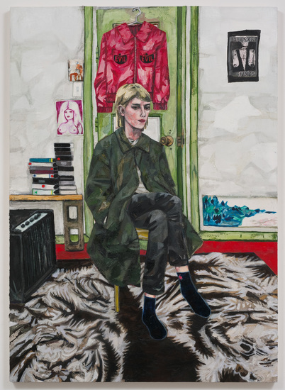
As abstraction goes, Nick Aguayo’s work is pretty great; and his handling of palette, composition, is nothing short of masterly. In that mastery, Aguayo has clearly absorbed some significant influences (there are several that come to mind, including for example, Howard Hodgkin; also other North and Latin American painters); but the work manages to stay in the contemporary moment – which is quite a trick. The palettes range from the coolly neutral to fresh juxtapositions (orange, pink, green); and Aguayo has some penchant for juxtapositions generally. (The question is – is that enough?)
I’ll just admit right now that I favor the Kalenderian work – it’s just so starkly original, of the moment, and profoundly moving. But both painters are clearly first-rate talents; and between the two of them, the shows are exhilarating. If you’re in that neighborhood and you feel like you need a visual vitamin/O2 blast, check into the Vielmetter space. You won’t regret it.
MixMaster – Ed Moses and Larry Poons at William Turner Gallery – Bergamot Station, Santa Monica
Speaking of jazz, the Ferus boys, and color field abstraction, William Turner chose to let these two established masters jam expansively in his spacious Santa Monica gallery. Although both painters are well known for their rich color harmonics (and Moses has been producing some of the best work of his career in this vein recently), the dialogue (styled by Turner, as The Language of Paint: Selected Works) was as much about materiality, texture, the notion of painting itself, as about the harmonics (or for that matter, the language) of color and composition. If anything the Poons paintings seemed to neutralize the color – frequently to a beige-y pinkish faux-flesh tone (though – true to his color-field past, all-over and covering the canvas), in thick folds with an oatmeal-like texture that looked like rolls of flesh rippling off the canvas.
 Although Moses’s work in recent years has addressed materiality, tactility, texture (also ground, surface, metamorphosis, decay), the work he’s showing at Turner takes a far more varied approach, reaching both forward into his crepuscular color waves and backward towards the grids and lozenges that were once a signature style. (The sense of decay is especially pronounced here in terms of both color and light and time itself.) In between are the shimmery moiré cascades of fading sunset-jewel colors looping over black hollows and grounds that evoke both Morris Louis and something much, much darker. There’s something almost elegiac about this work.
