


To find a curatorial through-line for the wildly varied career of Frank Stella must be an enormous challenge. Hanging opposite the elevators on the new Whitney’s fifth floor, as a kind of preamble to “Frank Stella: A Retrospective,” are Pratfall (1974), a precise arrangement of 12 concentric squares in contrapuntal grays that sucks the viewer into its black core; six untitled photographs, from the late 1980s, of curling smoke that looks like jellyfish, or ink dispersing in water; and Earthquake in Chile (1999), a 40-foot-long, turgid mess of a painting. (The wall text tells us that this work “ …communicates …the massive brutality of a catastrophe.” Indeed it does.) The thesis seems to be that, whether orderly or chaotic, Stella’s forms are derived from the study of nature—e.g., gravity, molecular physics, plate tectonics. Surprising, because I always figured he was basically industrially-minded, a springs-and-sprockets kind of guy.
This must-see exhibition is curated by Michael Auping of the MAM of Fort Worth “in association with” the Whitney. It will travel to Fort Worth in April, then to the de Young in San Francisco. At the Whitney, the show proceeds in loosely chronological order, but the open plan of the Museum’s fifth floor allows visitors to slip through the gaps between walls as if they are wormholes in space-time. You can glide from the striped late 1950s “black paintings” that originally put Stella on the art world’s radar to the enormous, nutty build-outs of the ’80s and back to the “running v” series of the ’60s without breaking a sweat. (Stella had a hand in the installation.) In this section, three striped aluminum paintings from 1960 look especially awesome; the photogenic illusion of folds or creases is insignificant in the presence of the aggressive frontality of these works. Surface trumps space.
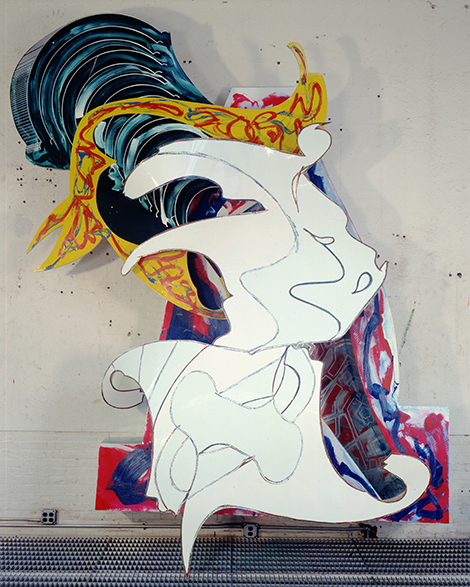
Frank Stella, The Whiteness of the Whale (IRS-1, 2X), 1987, Private collection. © 2015 Frank Stella/ARS, New York. Photograph by Steven Sloman
An immense, technically dazzling 67-color print made at Tyler Graphics and utilizing several techniques, The Fountain (1992) is Earthquake in Chile done properly, a thousand times better: the interior scale—in particular, of the undulating areas of black—is clear, legible and engrossing. Palmito Ranch (1961) is a surprise in a show with too few of them. Equal-sized horizontal bands of Benjamin Moore yellow alkyd paint, separated by slim unpainted interstices, cover the entire square surface.
Stella’s early work, of course, was in a proto-Minimalist vein that eliminated relational compositionality, but for some time he’s been an utterly relational sculptor, his work pretty much about part-to-whole dynamics. The thrillingly ungainly St. Michael’s Counterguard (1984) might be the tipping point in this evolution—it is 13 feet tall and nearly as deep—where sculptural space begins to outweigh pictorial space. By the time we get to Circus of Pure Feeling for Malevich, 4 Square Circus, 16 parts (2009), wee sculptures arrayed in four groups on sawhorse-and-plywood tables, any hint of picture-ness is gone.
The exhibition catalog includes images of delicious little things, some of which are in the show: working drawings and tiny sketches, and six relatively ragtag maquettes for the “Indian Bird” series of the 1970s. In the foreword we are told, a bit arrogantly, that “whether one loves a particular body of work or not is beside the point,” which sure sounds like an attempt to mitigate how obviously awful some work looks now. But unsuccessful Stellas are as fun to look at as good ones—maybe more, because the scale of failure is spectacular. Nine feet high, ‘At Sainte Luce!’ [Hoango] [Q#1] (1998) looks tossed-off, phoned in, like short-term storage of spare parts from other works. Grajau I and Grajua II (1975) date from a transitional period between the winningly klutzy “Irregular Polygons” and the calculated gaudiness of the 1980s work, without turning either quality into a virtue.
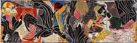
Frank Stella, The Fountain, 1992. Whitney Museum of American Art; gift of Marabeth Cohen-Tyler and Kenneth Tyler 2015.97a-c. © 2015 Frank Stella/ARS, New York. Photograph by Steven Sloman.
Then there are those Stellas that are maybe great and maybe awful. Raft of the Medusa (Part I) (1990) is a hulking conglomeration of debris-ish steel welded to a clunky armature and draped in frozen cascades of melted aluminum. Its very intransigence is like nature, like a storm system, like a rocky outcropping. It is fully itself, inarguably the embodiment of its formative process. Resistance is futile.
The placement of Raft at the glass-walled western end of the Whitney’s fifth floor, against the backdrop of the Hudson River and the Hoboken waterfront, picks up the physical-science conceit that was floated at the exhibition’s start. It suggests another way to look at this artist’s protracted project: less about design and industrial methods, more about materiality and equilibrium. The argument doesn’t quite gel, but it is intriguing to think of Stella as a sort of Mr. Natural for the post-medium age.
