Roughly a generation separates me from artist-curator Joshua Nathanson; but we clearly live in very similar moments in very similar cities. (My understanding is that he is based here in L.A., but he was born in Washington, D.C. and studied in New York prior to grad school so there’s definitely some overlap.) By that I mean our respective experiences, our consideration, processing and thought, and ultimately our acceptance or perhaps more precisely resignation to it, run closely parallel. “In our paradigm [a word I would not have used – but I applaud the vestigial idealism] the city is rarely an overt subject but rather the de facto setting for art’s production and reception – where the city’s emergent forces manifest.” Yes, exactly – with an emphasis on the ‘de facto’.
‘Maybe that’s it,’ I think, as I look at the press release/curator’s statement a second time. Nathanson “grew up with the feeling that our cities would evolve toward some kind of extreme state….” I never did. Growing up in or near New York and Los Angeles both, I thought they were quite extreme enough – especially Los Angeles. In fact, I really didn’t think New York was extreme at all; setting the Bronx and Staten Island to one side, I thought it was kind of perfect. I was always “comfortable with its dysfunction, cozy in its chaos.” Today, in extremis, it’s unquestionably less cozy; and Los Angeles? Well, chaos is its very texture and I can’t say I’m too thrilled. (Can never get over why anyone would think we needed Heizer’s Levitated Mass here; there aren’t enough ‘negative’ sculpture/formations in the pitted and potholed streets already?) Yet I continue to live and work here.
“The city is a churning mess of ancient/current/future. Grand hopes now seem naïve and it’s really a bummer.” Tell me about it.
He does in this slow/fast, flashing/slashing, burn/brew of a show at Various Small Fires. Nathanson seems to have filtered the dystopic urban/suburban mental and physical actuality of Los Angeles through a kind of anti-flâneur sensibility, or possibly a somewhat better conditioned flâneur of the gutter. No cosmopolitan ‘arcades’ or Baudelairean (Benjaminean?) boulevards on this horizon; this flâneur loiters around the mini-malls. Or maybe bars at 4 a.m. – that’s two hours after last call in L.A. – unless it’s after hours – and maybe after something…. Which is my way of saying that I felt thrown off balance just walking through Nelson Harmon’s sound corridor (is that his real name?) and between two installation pieces by Mateo Tannatt (one of which actually conveyed the sense of a Giacometti-styled bar-crawl-assault – the ‘Lehmbruck’ figure/title here simply to throw us off the track (maybe under a bus). But maybe that’s the point of a warm-up like that. The rest of the show went down as smooth as my husband’s whiskey with a Thunderbird chaser.
The show is a maze of signs and signifiers, beginning with Body by Body’s (the collaborative persona of artists Melissa Sachs and Cameron Soren) pale peach-colored polyethylene panel embossed with floating silhouettes of gazing figures regarding nothing in particular and opaque gestures, further punctuated by round holes, one sawtoothed and slightly ballistic looking. The thing is inherently, materially anti-ballistic (behind its striating steel bars). And the holes? Bubbles or suction? Each stop light is an orchid imitating your “walking” … you are a wasp (the title) – yes, we are wasps; and the ‘stop lights’ are pretty random points of nesting (or arresting) and departure. The city’s spectacle, its rhythms and motion, distract us from its points of efflorescence beneath and amid the detritis.
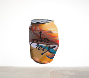 We pick up the flowers and the detritis here – passing by Nathan Zeidman’s dingey botanica and flower shop windows – gotta love the titles (e.g., Not Yet Titled (Pink and Yellow Flowers)); and looking up to Asha Schecter’s inkjet prints (on vinyl) of a broken lightbulb, a bruised (or just bad) persimmon, “chewed” drinking straws, and (with the 2011 Philips Bulb, most strikingly), the “crumpled” Pamplemousse La Croix aluminum can, Oldenburg-oversized and floating overhead between the other works. It’s inherently vivid and performative, simultaneously floating and arrested, discarded and at rest, ready to decay, to become something else. It’s the way we hold or elevate anything in our sightlines, hold it in our memory, magnify its significance – though we really don’t have to. I loved that B. Thom Stevenson (a Brooklyn artist) rendered some of his messed-with graphic appropriations as rugs, which carried just a whisper of that whimsy of those quasi-ethnic shlock rugs peddled at gas stations (not infrequently graphic themselves) – his in black-and-white, pastiching variously pop/protest/punk graphics, Picasso (e.g., his “Crying Women”), Redon or quasi-Symbolist graphic art – all with an admixture of cartoon chicanery and Dada mischief.
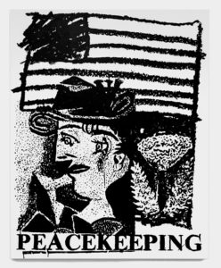
If Stevenson’s muse here is Picasso (or protest?), Vanessa Conte gives us machine age melt-down in canvases of careering wheely figures that filter Léger through something like Elizabeth Murray. Then as if facing off Lothar Hempel’s dramatic installation-scale sculptural configuration of Acid and Iron, a winged victory of the post-apocalyptic, Natalie Labriola turns us away from the street and inward to the sequestered, the hidden – and slightly sinister. The painted latex gloves hung on the racks of her Glove Compartments (actually metal lockers) seem suspended in a space closed off from time – yet as if ‘curing’ for some purpose yet to be determined, or simply forgotten. Her Detoxification Floor (Blue) (of ‘anti-fatigue’ foam mats) is tomorrow’s dance diagram (Warhol anyone?), turning us around ourselves upon that ‘nowhere’ place we can find ourselves anywhere in that accumulation of toxicity we frequently call home even as we’re determined to leave it outside.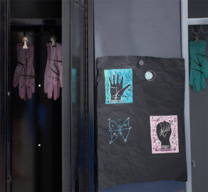
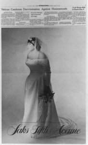
Ellen Berkenblit’s 120×312 sq.in. canvas, T vs W seems to all but swallow its corner of the gallery. It’s the culminating exclamation point to Robert Gober’s 1996 postscript-in-retrospect. We’re always smack up against the past in the city, treading and re-treading it until it’s crumbling asphalt; and Berkenblit’s ‘T’ and ‘W’ seem to swim in it (albeit with flowers predictably floating in the muck). The ‘tiger’ or cat is a familiar silhouette in Berkenblit’s work, as is the heavy-lashed, rapturous – or here, raptor-esque – girl, wench, ‘witch’ (as the figure has occasionally been described). But there’s a bit of role-reversal at play here, with the ‘witch’s’ silhouette configured in an almost gothic ‘T’ formation, facing off the inverted ‘W’ of the tiger’s silhouette. Which is ‘witch’? The ‘witch’ nose is sharpened to a projectile here, with jaw fully opened to swallow everything in its wake – flowers, cat and all; where ‘tiger’ is all surprise and, well, wonder. I realize this is literalizing something quite abstract; but the energy of the work sweeps all of this into it – the rapacious wonder of it all. In Gober’s Untitled photolithograph, a ‘bride’ clearly past the runway hulks through a doctored Saks Fifth Avenue ad on a page from a 1992 New York Times – a Havisham for the 1990s – or today – heading out and moving on. It’s all we can do.